
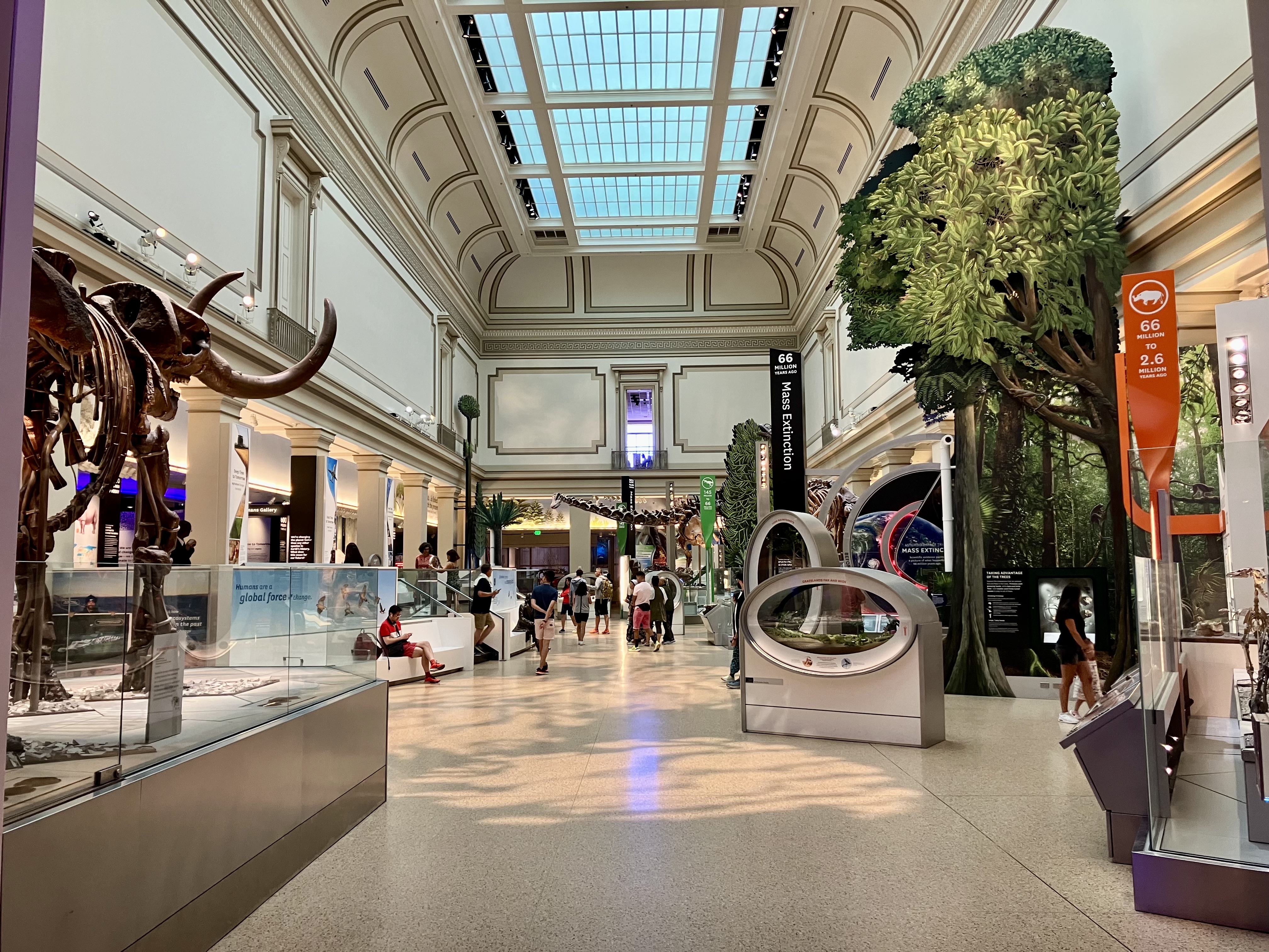
It’s no secret that I love Deep Time, the National Museum of Natural History’s recently renovated paleontology hall. From it’s spacious, open aesthetic to it’s narrative that connects charismatic fossils to global environmental change, this is one of the best presentations of the history of life in any medium, bar none. But like any creative project, it’s not perfect. Creating an exhibition on this scale requires the combined efforts of hundreds of individuals, constantly fighting against the realities of budget and time. Inevitably, compromises have to be made. But I’m happy to report that this year, some of Deep Time’s most significant shortcomings has been corrected.

Exhibitions of any size have a graphic design “system.” Within the exhibition, there is a limited number of graphic panel types, and each type contains a particular kind of information. Ideally, visitors will understand—consciously or not—what kind of information can be found on what kind of panel. Deep Time makes heavy use of reading rails—long, rectangular panels mounted at an angle in front of specimen displays. These reading rails are all laid out in approximately the same way. There’s a header on the left side (“Bridges Allowed Migration” in the example above) that summarizes the topic of the display. Most of the real estate on each rail is taken up by short paragraphs and images that contextualize the fossils nearby, usually with stories about the time and place they lived in, or the evolutionary lineage they belong to.
Above these contextual stories is a narrow strip that graphically reminds visitors of the time period the display in front of them is concerned with. And above that strip is a white band which identifies the specific fossils on display. Each specimen gets an ID block (sometimes called a tombstone), which lists the common name, scientific name, age, location of discovery, and catalog number. It’s well established from studies of how people use exhibits that ” what is this thing?” is the number one question visitors have at any given time. So it’s good design practice to place the ID blocks in a standardized location that visitors can find at a glance. This is one of many areas where Deep Time is a stellar example of a thoughtfully-constructed exhibition.
The trouble comes from the skeletal diagrams that accompany each ID block (for the tetrapods at least—not all of the fish, invertebrate, and plant fossils have them). The problem isn’t with the quality of the illustrations, which are excellent—I believe all or most of these were drawn by the irreplaceable Scott Hartman. The diagrams are shaded to show which parts of the fossil specimen on display are real and which are reconstructed. As originally designed, real elements were white and reconstructions were gray (see example above). Unfortunately, the color distinction was too subtle. This coupled with the small size of the diagrams (about two inches long) made them basically unusable for their intended purpose. The key included with each diagram—a gray square marked “cast”—was also confusing. I wouldn’t be surprised if many visitors did not even notice that the diagrams were color coded and assumed that the “cast” squares were telling them that every single fossil was a replica.
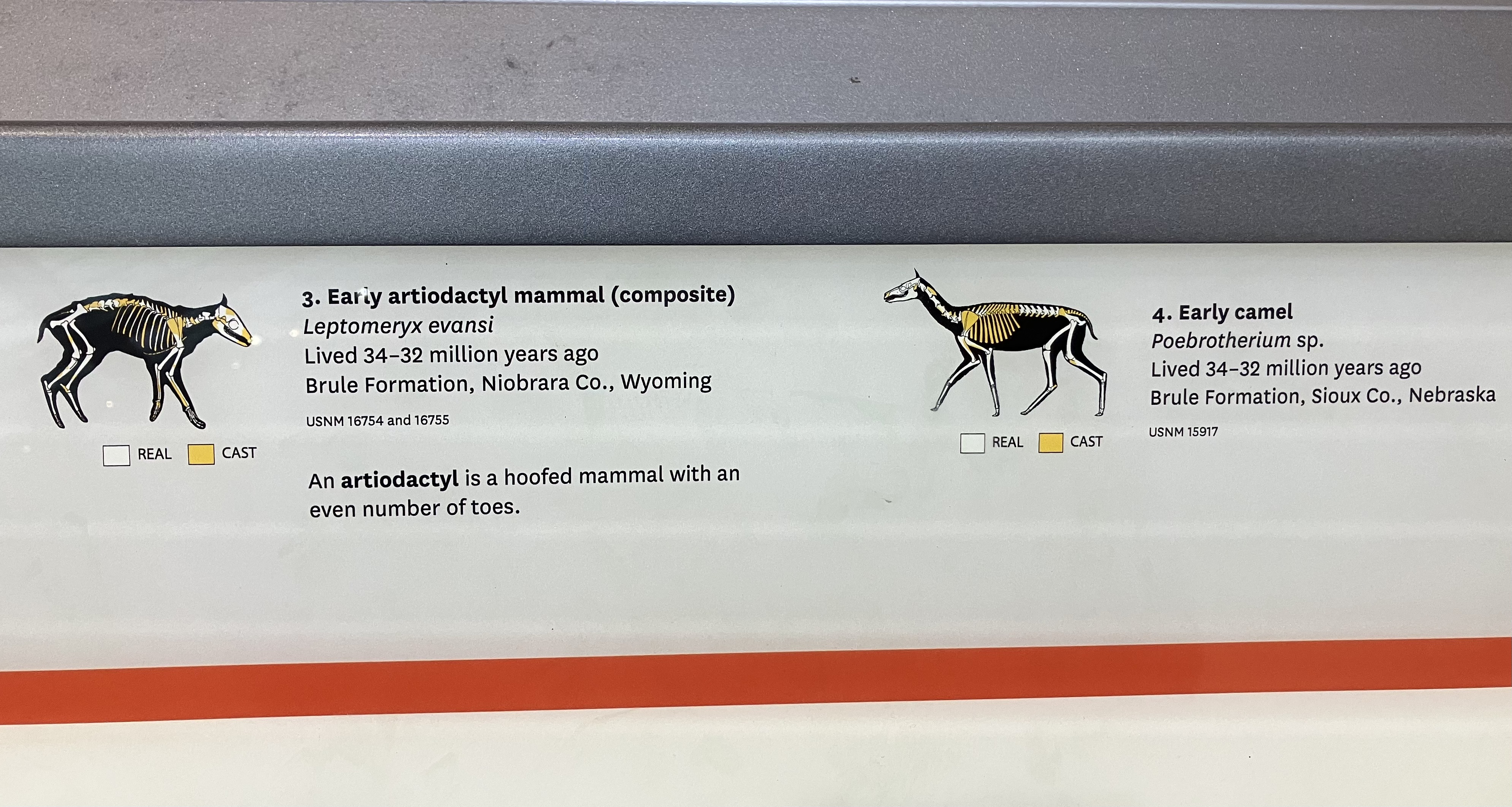
At some point between March and November of this year, every graphic panel in the exhibition that includes ID blocks was reprinted with subtle but significant design changes. Each skeletal diagram is now much larger, about twice it’s original size. The reconstructed sections are now yellow instead of gray, and the key beneath each diagram includes two squares: white for real and yellow for cast. This is a tremendous improvement. The intended message of these diagrams—that most of the fossils on display are a mixture of real and reconstructed parts—is much more obvious. And for anyone interested in which particular parts are original fossil, the larger images make that possible.
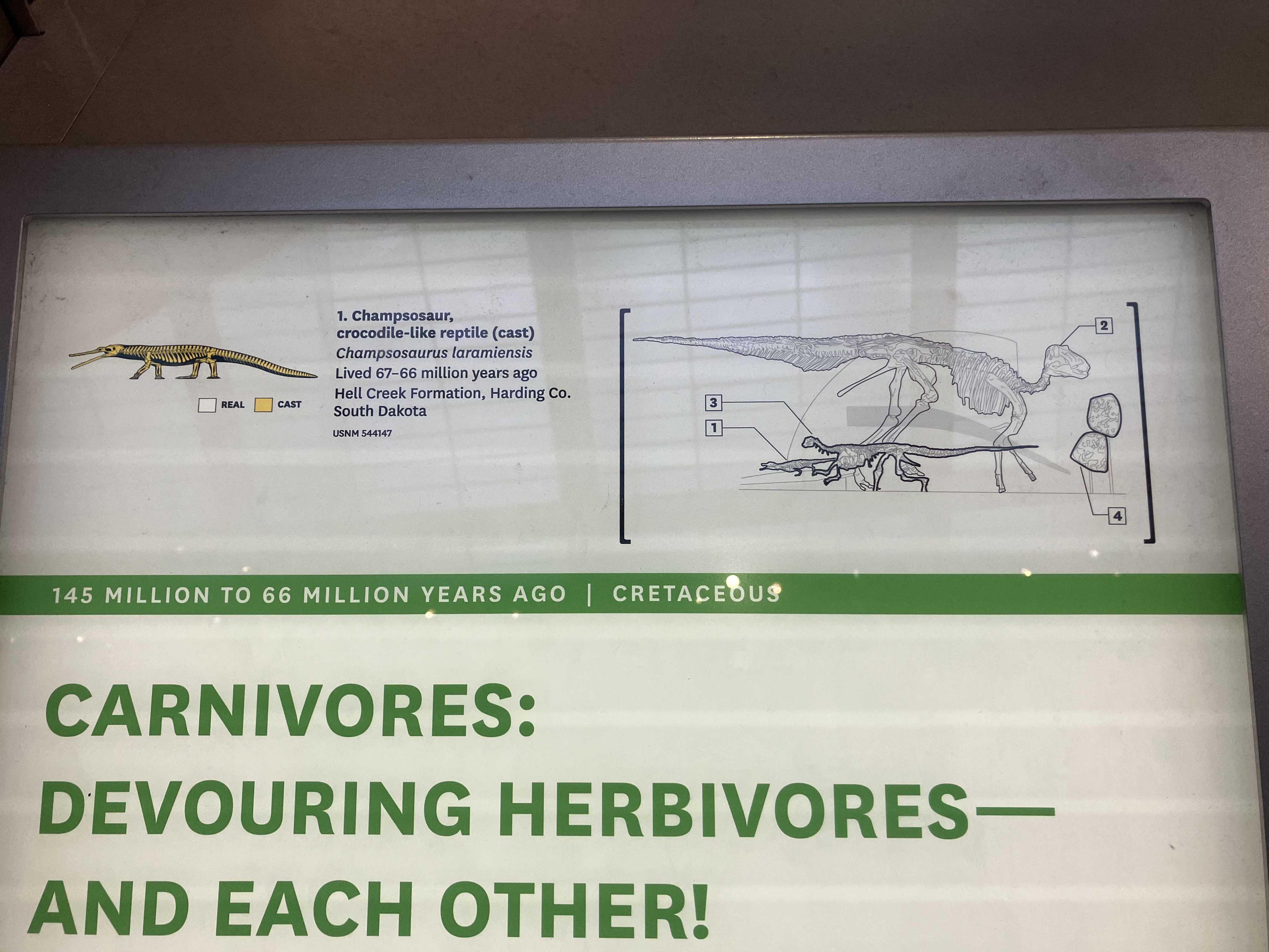
In addition to the re-designed skeletal diagrams, new schematic drawings of the displays have been added to many of the rails. These are simple line drawings of the specimens as they appear on exhibit, with numbers that correspond to the ID blocks. Another shortcoming of the original design is that the skeletal diagrams are all in standardized, walking poses, which do not match the often dynamic poses of the mounted skeletons. Although there are numbers associated with the specimens in each display, I imagine many visitors still struggled to match the images on the rail with the fossils in front of them. The schematic drawings help bridge that gap, but there is still an extra step involved. Visitors must match the number of the specimen in the display to the number on the schematic drawing, then match that number to the nearby ID block. I think a better approach might be to create skeletal diagrams with same poses as the mounted skeletons.

I noticed one more change to the Deep Time reading rails. Many of the rails throughout the exhibition include a note in the corner that discusses the mix of real and replica fossils on display. This is a common preoccupation for visitors, so it makes sense to address it frequently. However, I was never sure that this recurring text as originally written was really answering the right question.
Are These Fossils Real?
Most of the fossils you see are real, but some are casts. Museum-quality casts and scanned replicas aren’t “fakes.” They’re exact copies of real fossils that capture minute details.
This original text from the 2019 version of the exhibition sounds kind of defensive. And by declaring a distinction between “replica” and “fake,” it’s bringing up a more existential discussion about the reality of physical things than I think most visitors are interested in grappling with. The new 2024 text is much improved:
Why Does the Museum Display Casts?
Some fossils are too fragile for exhibition and must be stored to protect them for further scientific study. The Museum displays exact casts so that you can learn about these fossils, too.
This text better addresses what most visitors are likely concerned with. It establishes that some, but not all, of the fossils on display are replicas. And it clearly states the reason that some of the real fossils in the museum’s possession are not on display. Technically, it doesn’t address the casts of fossils held by other institutions, but given that the idea that museums even have behind-the-scenes collections is news for a plurality of visitors, it’s reasonable not to get too in the weeds.
I want to commend the NMNH team for taking the time to make these improvements. Large museum exhibits are organized and funded as projects with discreet timelines, so it’s often difficult to go back and change things. This means that imperfect exhibits can languish for years or decades, so it’s great to see the museum identifying an issue and addressing it just a few years after opening.

