
Over the last few years, I’ve gradually been assembling what I imaginatively call the Big Spreadsheet. It’s a record of every single vertebrate fossil on display at a number of natural history museums, mostly in the United States (so far I haven’t been bold enough to include invertebrates or plants). The Big Spreadsheet tracks basic “tombstone” information about each fossil—what it is, where it was found, how old it is, and so forth. Where possible, I’m also tracking collectors, preparators, original display dates, remounts, and trades with other institutions, among other things.
The Big Spreadsheet differs from things like the Paleobiology Database in that I’m specifically focused on what is or has been on public display. Museums only display a fraction of their collections, and the decisions concerning what is worth displaying are made by people with varying preferences and goals. Perhaps the objective is to showcase what’s unique or unusual in the collection. Or perhaps it’s to comprehensively tell the story of evolution. Maybe there’s a focus on local fossils, fossils collected by specific people, or fossils that represent species that visitors would (or wouldn’t) recognize. There’s no one right way to make a fossil exhibit, but the choices that individuals make nevertheless influence how audiences understand the history of life on Earth and how we come to know about it.
My hope is that the Big Spreadsheet will eventually be complete enough that it can be used to tease out quantitative answers to the questions that vex those of us that are interested in how the public thinks about prehistory. For example, maybe it could illustrate which taxa are over or under-represented in public displays, or if narratives are skewed toward certain localities. Maybe we could see the influence certain individuals (say, the Sternbergs) have had on the public’s view of paleontology. Or maybe we could track the degree to which western museums exploit specimens extracted from colonized lands.
I don’t think the Big Spreadsheet is ready for any of those questions yet. But it is interesting to take a peek at how certain museums measure up to one another with their display collections. The charts below divvy up the data from some of the biggest natural history museums: the American Museum of Natural History (AMNH), the National Museum of Natural History (NMNH), the Field Museum of Natural History (FMNH), the Royal Ontario Museum (ROM), and the Natural History Museum in London (NHM).
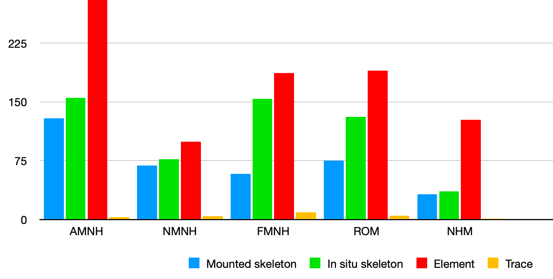
Here we can see the overall number of vertebrate fossils on display at each of these museums, and how they sort out by type. One obvious conclusion is that AMNH has an outrageously high number of fossils on display compared to its peers. Note that the difference between a mounted skeleton and an in situ skeleton is sometimes a judgement call (many skeletons displayed in relief are not fully removed from their matrix, but have been partially reposed or have missing elements added).
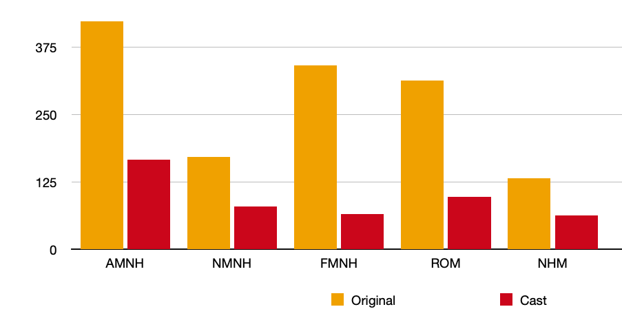
This chart shows how many fossils on display at each museum are “originals” versus replicas (I’ve counted anything that includes at least some real material as original). These five museums mostly display original fossils, although the ratio is highest at FMNH and lowest at NHM and NMNH. Fish fossils really throw the score, however—these numbers would look different if we were only considering big, charismatic tetrapods.
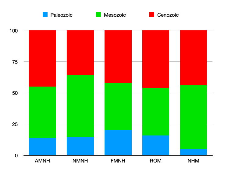
This chart compares the percentage of fossils on display from each era of the Phanerozoic (the last 541 million years). The Paleozoic gets shorted across the board—it represents about 50% of the Phanerozoic but the percentage of Paleozoic vertebrate fossils on display never tops 20%. Meanwhile, the Cenozoic (12% of the Phanerozoic) seems quite over-represented—that is, if temporal proportionality is ever a goal in creating these displays.
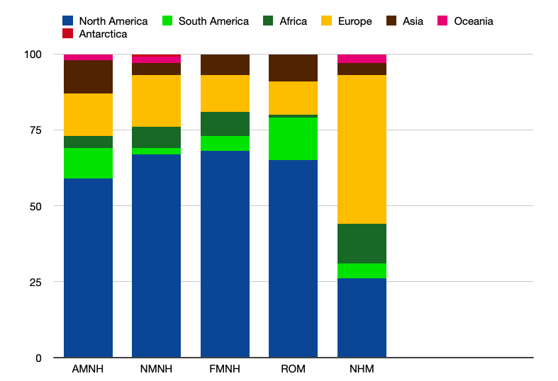
Here, we compare the percentage of fossils on display by region. Any passing familiarity with the history of science will make the focus on North America and Europe rather unsurprising.

This last chart breaks down the percentages by animal type. I’m sure the categories will make some readers squirm, but I’m going for culturally meaningful categories here, not evolutionary meaningful ones. It strikes me that just looking at the numbers of fossils in each category doesn’t necessarily capture the impact on visitors. For instance, dinosaur and mammal skeletons tend to take up a lot more space than fish. I wonder if there’s a way to control for square footage of gallery space and come up with an “impression score” of some kind for each of these groups.
If anyone’s interested in collaborating on the Big Spreadsheet, please give me a shout! I’m particularly keen on connecting with folks with a better statistical background, as well as anyone interested in tallying up fossils on display in the western United States and Canada.


Would love to have you visit at the ISM in Springfield!