
I’m a big fan of Deep Time, the recently overhauled paleontology hall at the National Museum of Natural History. On this blog, I’ve called it a “masterpiece,” a “standard for excellence in natural history exhibitions,” and “one of the best presentations of the history of life in any medium.” In my own exhibit work, I often look to Deep Time for guidance and inspiration. But all of that is ultimately just the opinion of somebody who spends an inordinate amount of time visiting and thinking about paleontology exhibits. The best tool we have for understanding how an exhibit is serving its primary audience is a summative evaluation. NMNH commissioned just such a report back in 2021, which is now available to read online. Apologies in advance for the second post in a row full of graphs and numbers.
The summative evaluation was carried out by RK&A, Inc (since rebranded as Kera Collective), a private company that specializes in museum audience research. First, the evaluators conducted a timing and tracking exercise, which basically means surreptitiously following randomly selected visitors through the exhibit. Evaluators recorded where and when visitors entered and exited the space, where they stopped and for how long, and observable descriptive details like group composition and approximate age. The evaluators also gave questionnaires to a separate set of visitors to determine what they were learning or taking away from the experience (a control group answered the same questionnaire without seeing the exhibit first). The evaluators provide their own conclusions in the report, which I’ll supplement here with a few of my own interpretations (which they may or may not agree with).
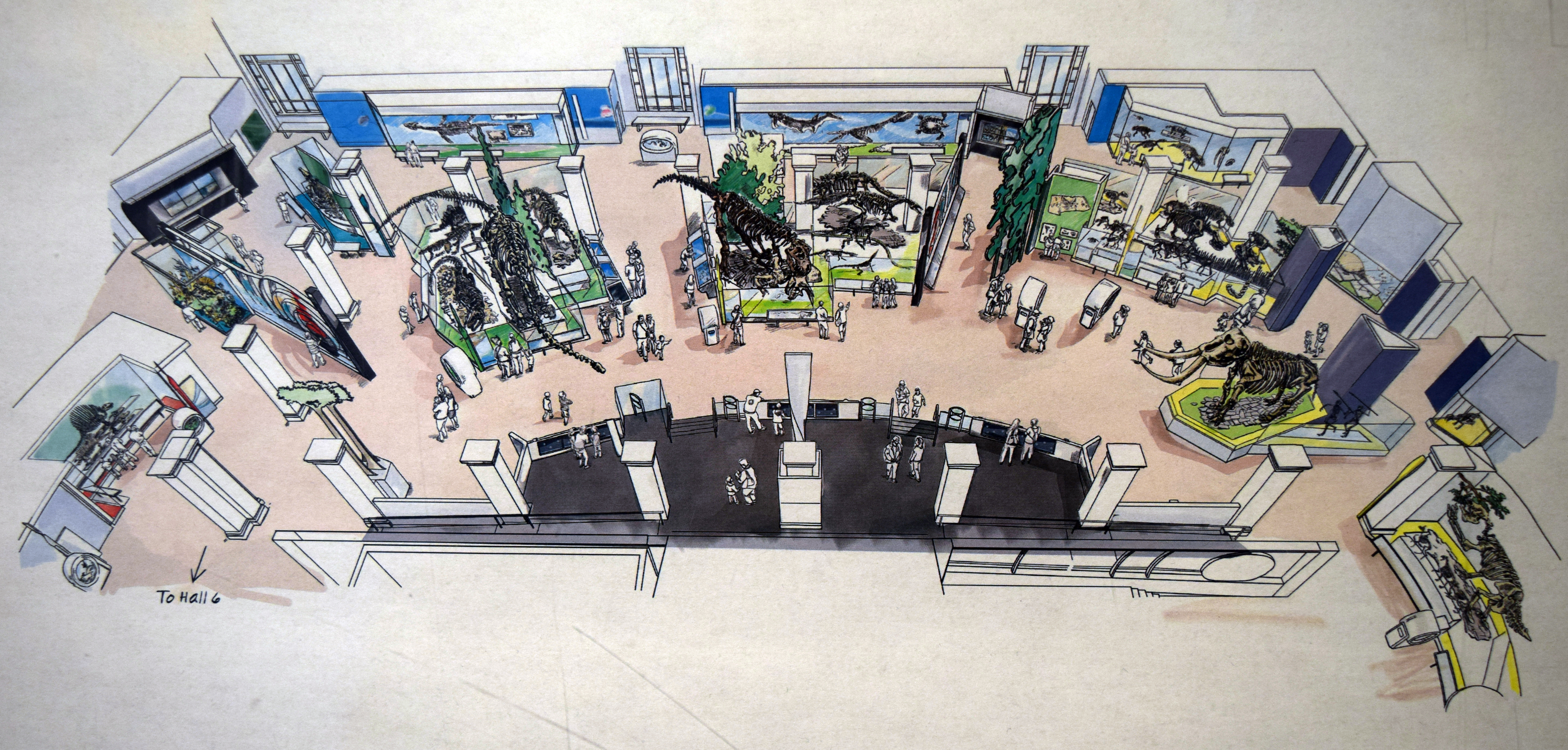
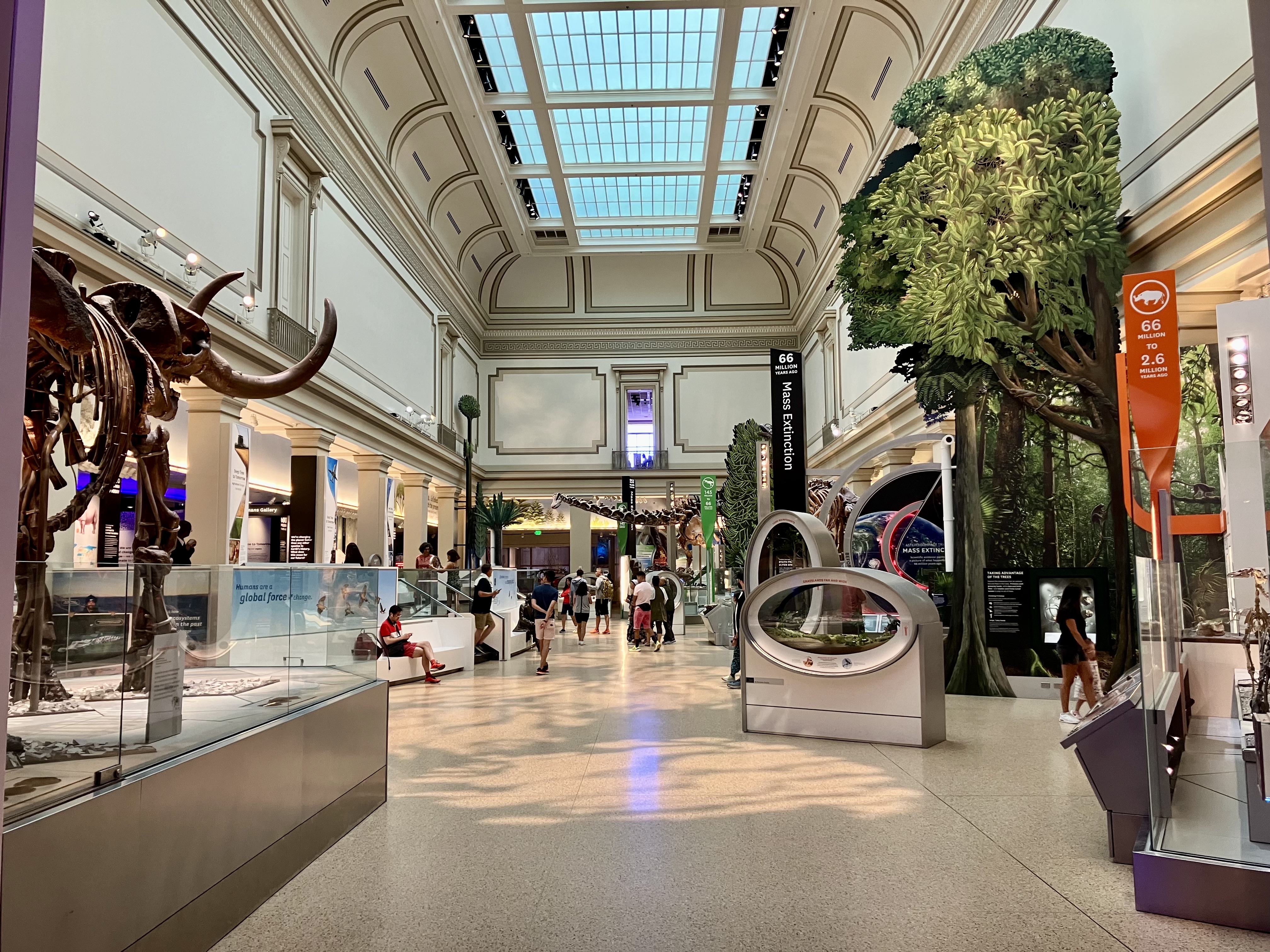
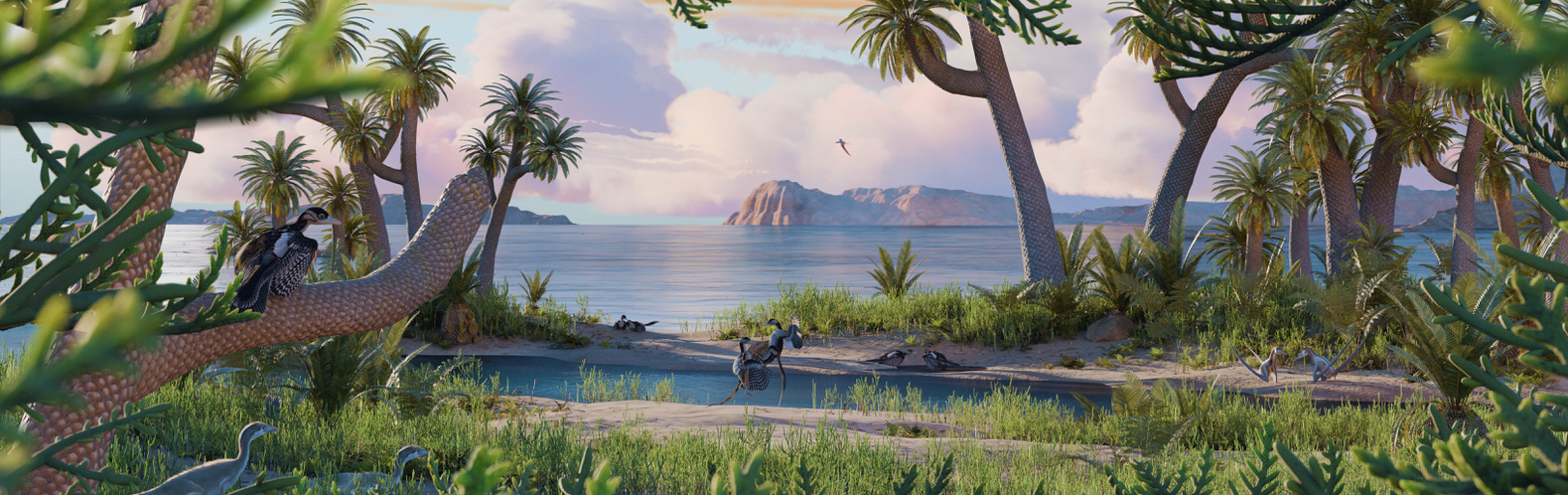
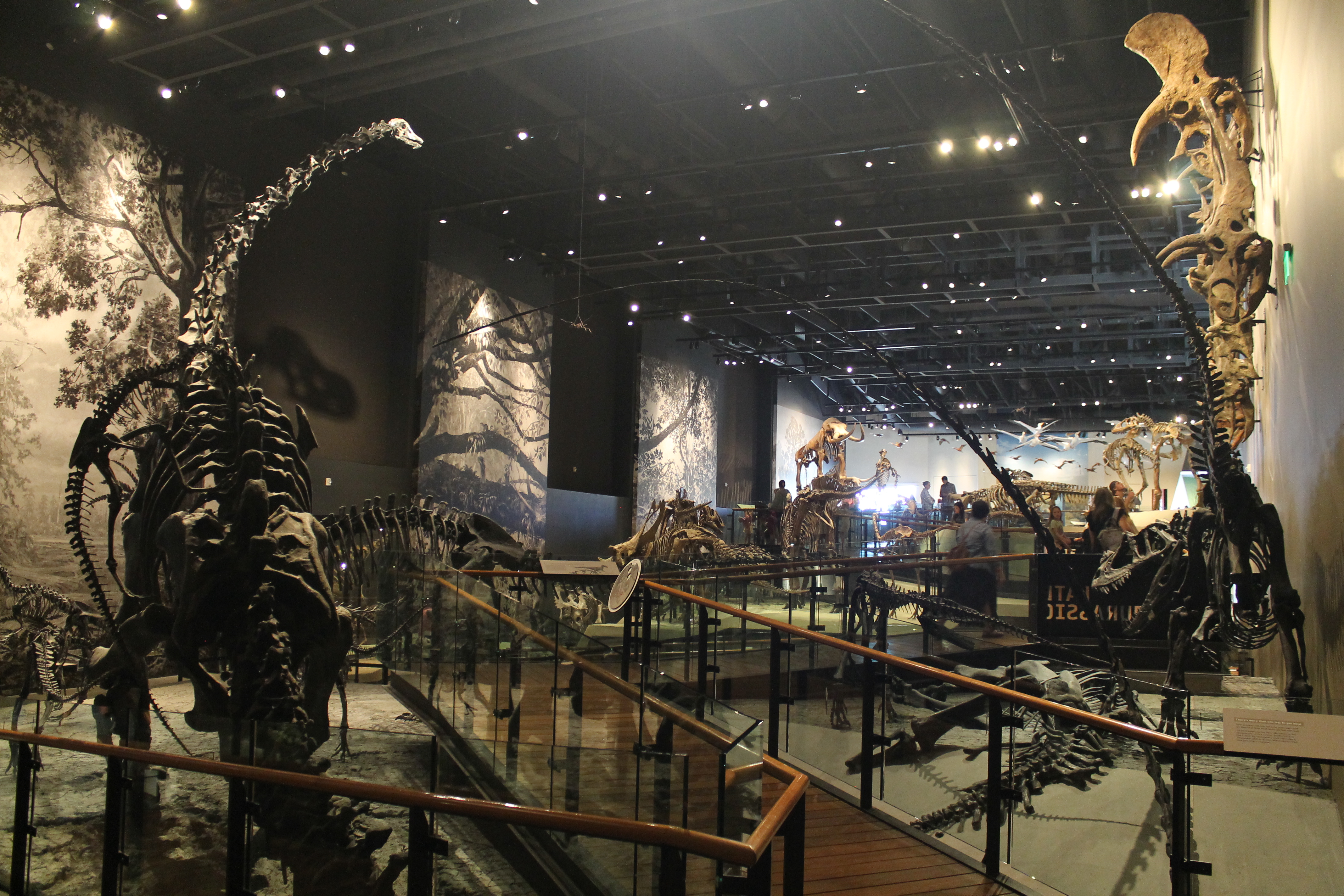
If you’re not familiar with the layout of Deep Time, you can explore the exhibit virtually here. The concept art above also provides a helpful overview. Generally, the exhibit is a wide open space that visitors can explore freely. Displays are arranged chronologically, but visitors arriving through the primary entrance (right side of this image) are starting in the Pleistocene and moving backward through time. The words “to hall 6” in the lower left indicate where the exhibit continues into a smaller gallery which features a windowed fossil prep lab and displays about early life.
Natural history exhibits are social experiences
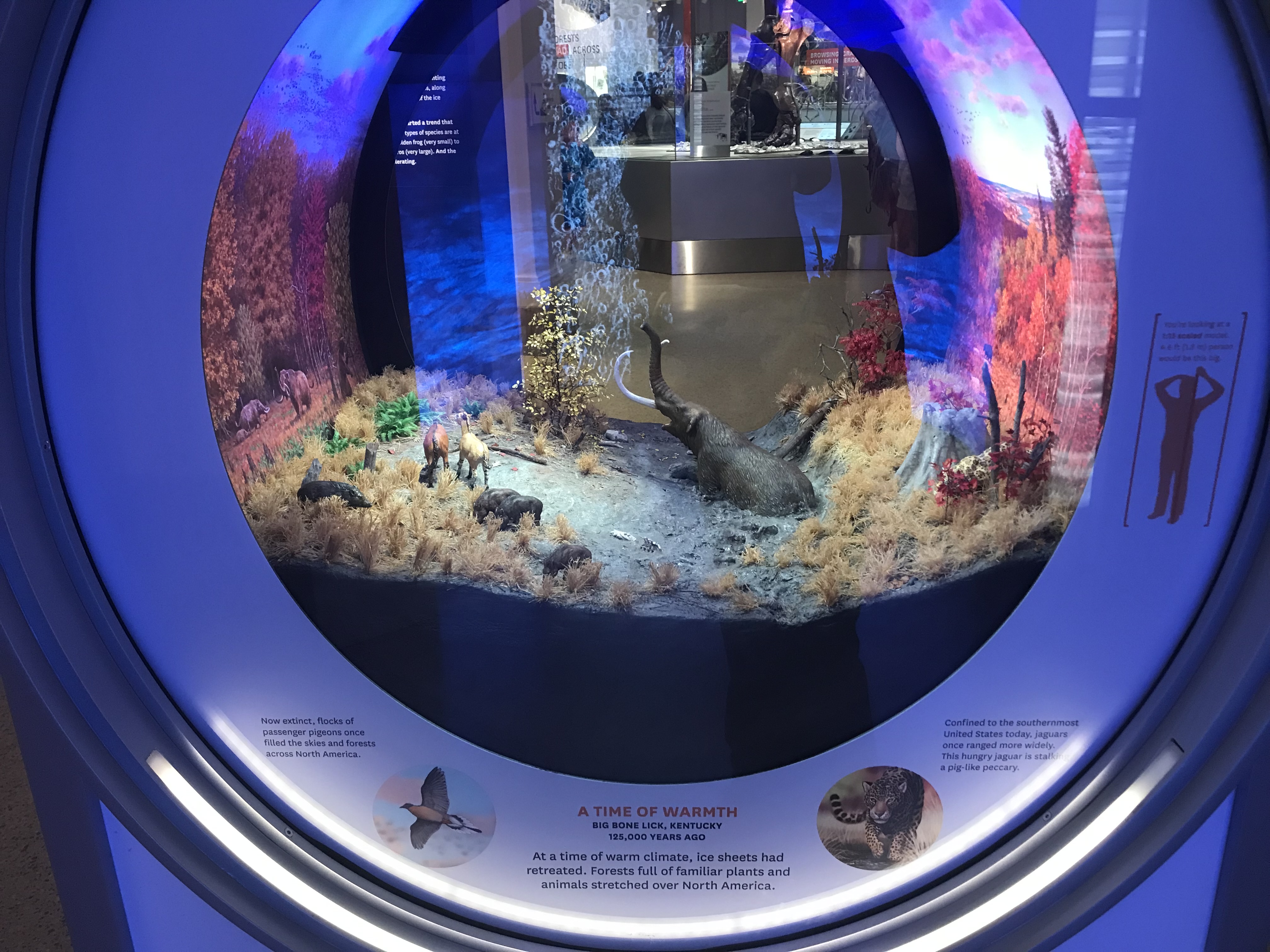
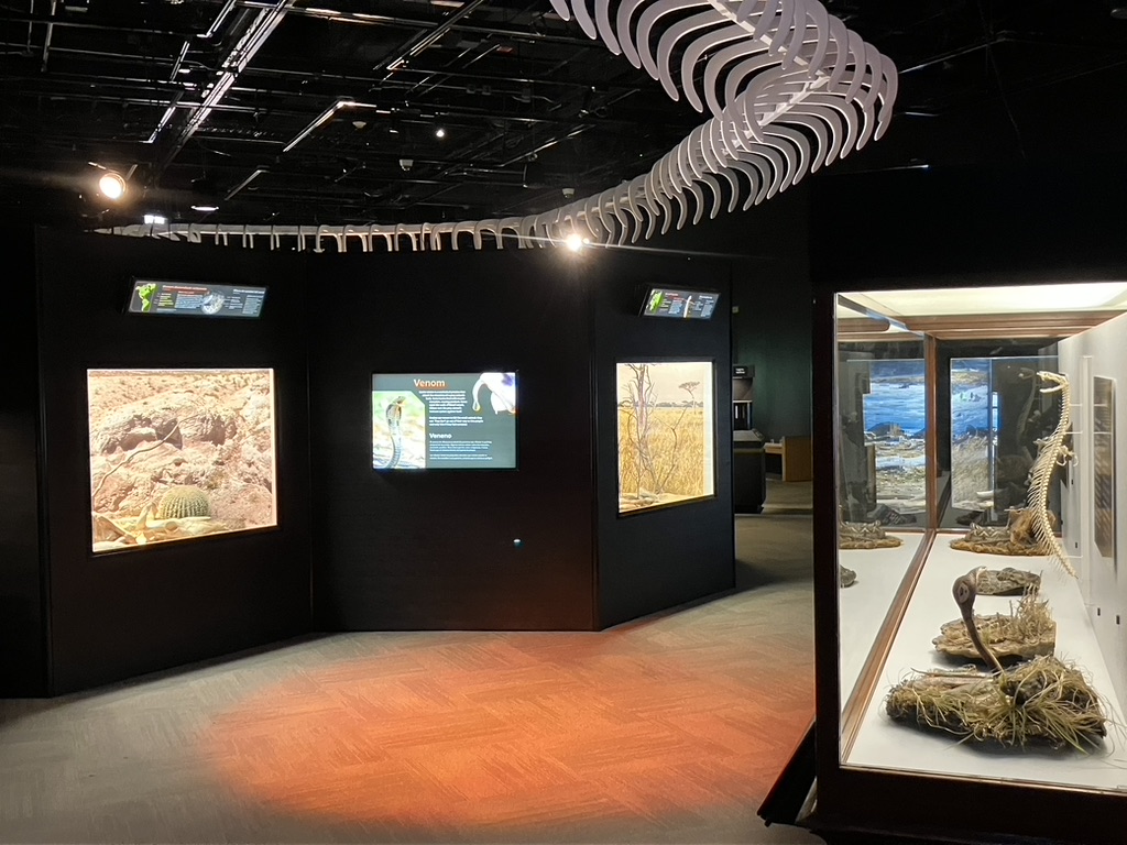
Most people visit natural history museums as families or in groups, and they use the exhibits to facilitate interactions among themselves. I basically treat this as dogma, so it’s nice to see it reinforced by data now and then. RK&A found that 82% of visitors to Deep Time came as part of a group—either mixed-age (i.e. families with kids) or same-age (all adults or occasionally, all kids). Group visitors spent more time in the exhibit than solo visitors, and they looked at or interacted with a greater variety of displays. The nine dioramas scattered throughout the exhibit were particularly appealing to group visitors, who spent more time engaging with them than solo visitors did. With lots of hidden details to discover and point out, dioramas are inherently a good group activity. I suspect the washing machine-like design of the Deep Time dioramas only enhances this, since groups can easily gather around them and view them from both sides.
I don’t think there’s much to add here other than to reiterate that natural history museums are communal places. Whenever we (and I include myself here) are tempted to complain that an exhibit is too surface-level or doesn’t provide enough nuance, we need to remember that an exhibit is not a book. The information provided needs to be accessible to someone who is primarily there to spend time with friends or family. It does not need to exhaustively cover ever last nuance of a topic, because that isn’t appropriate for the medium or the audience.
People don’t spent much time in exhibits
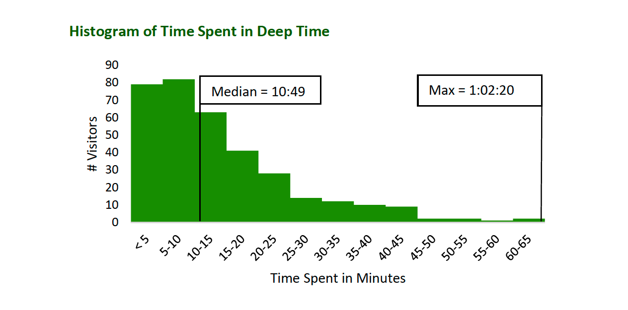
Given how long it takes to conceptualize an exhibit and design it down to the inch (a year per 3,000 square feet is a decent rule of thumb), it can be demoralizing to see how little time audiences actually spend there. Deep Time occupies 31,000 square feet and contains 83 individual displays. RK&A evaluators found that the median dwell time was 10 minutes and 49 seconds, with a median of 11 displays visited. Notably, longer dwell times did not correlate with a higher number of stops. Dwell time was higher for visitors that entered from the main rotunda than from African Voices, suggesting that sight lines might play a significant role in what visitors choose to look at.
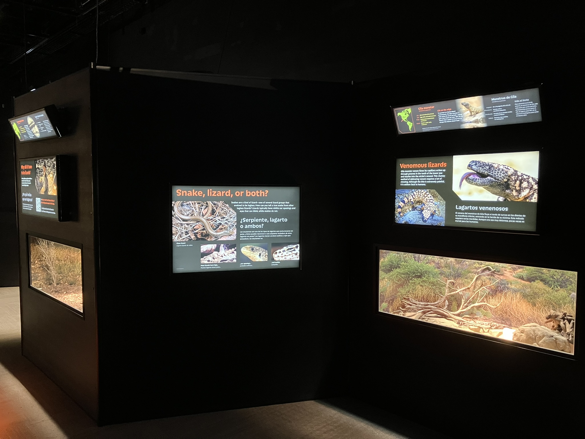
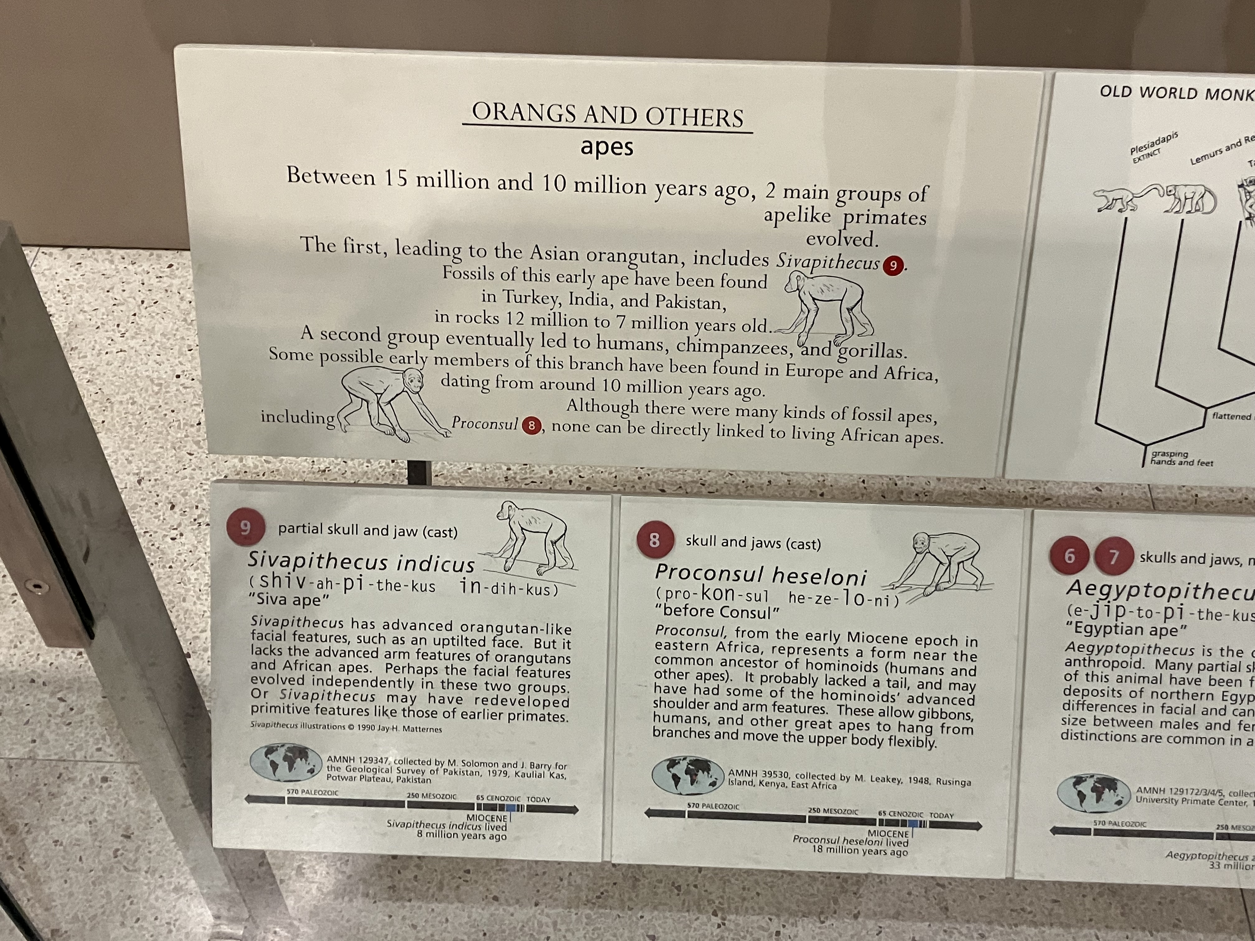
The evaluators also found that 79% percent of visitors looked at at least one label. That means one in five visitors passed through the exhibit without reading any words, presumably using their existing knowledge to make sense of what they were seeing. The evaluators didn’t track anyone who appeared to be under 10, so being below reading age shouldn’t be a factor. I think this data reinforces how important it is for exhibit creators to find non-verbal methods to tell stories (artwork and dioramas, for example), rather than assuming that visitors will read lots of text.
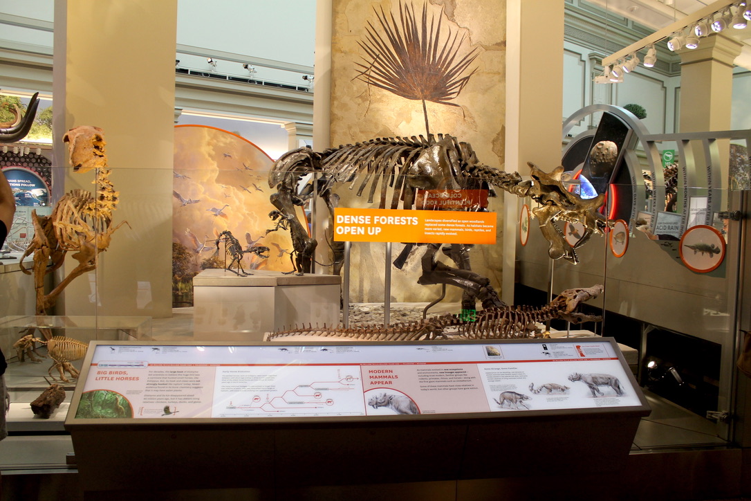
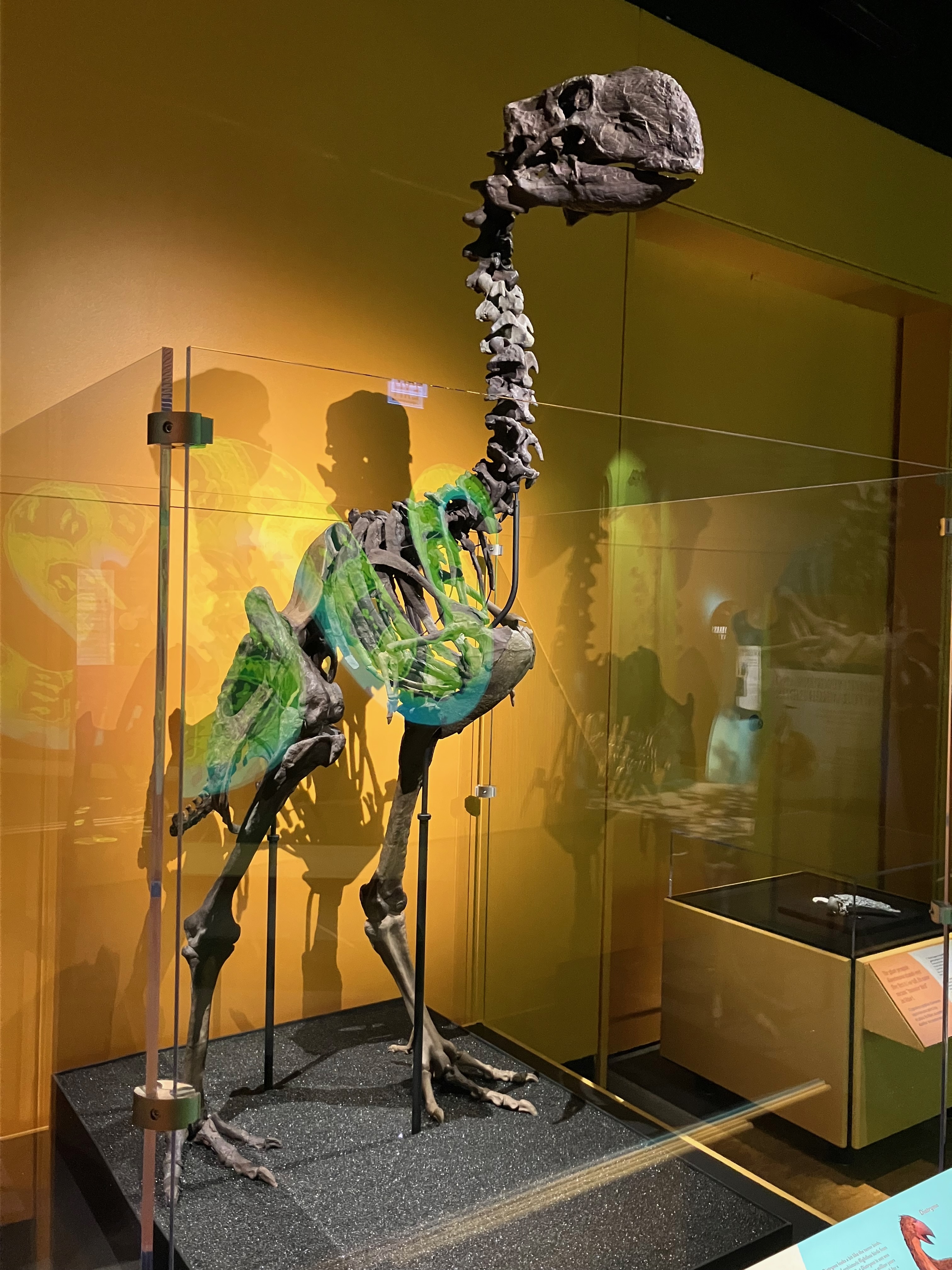
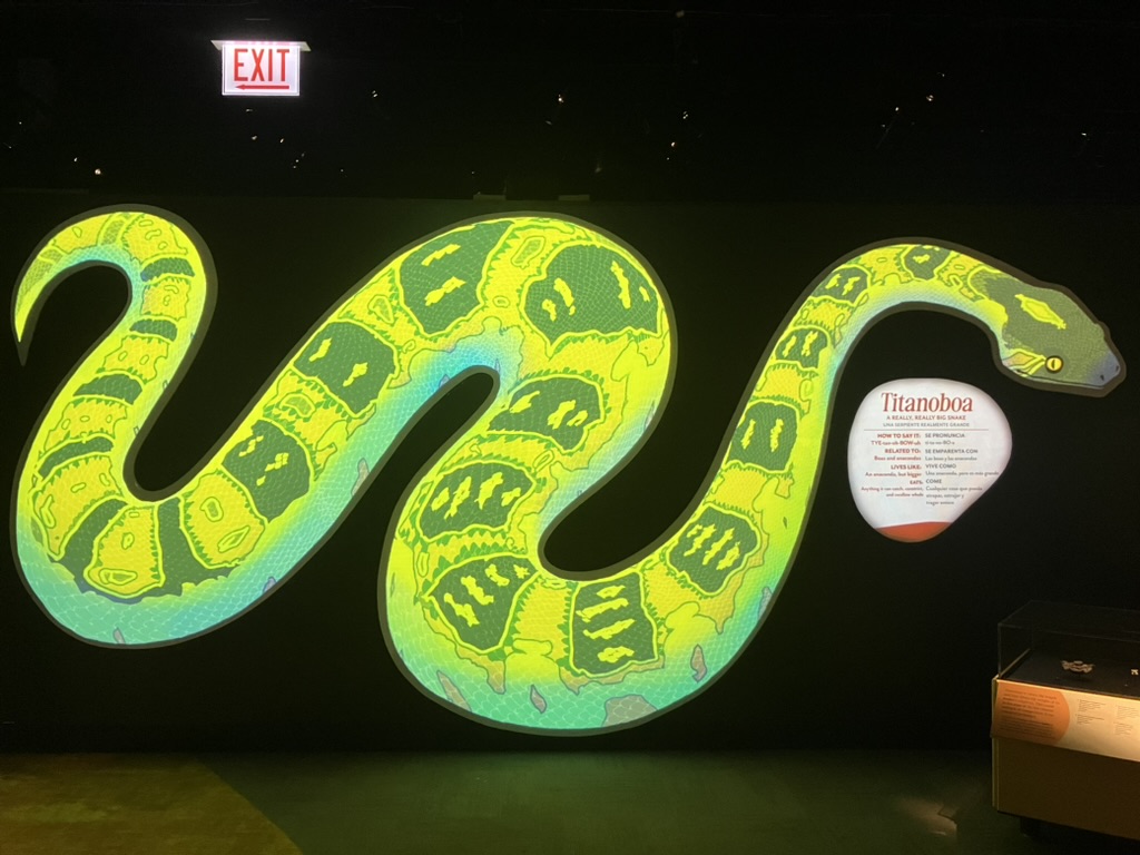
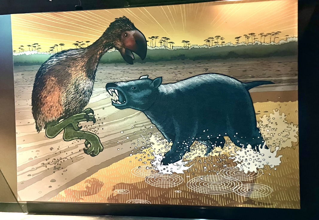
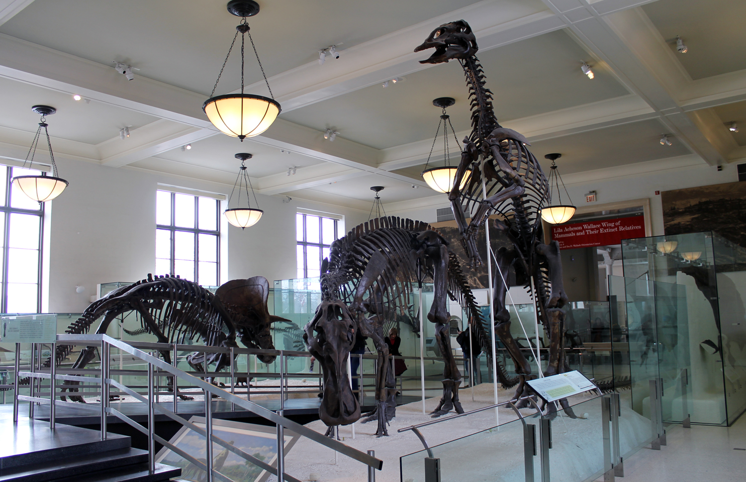
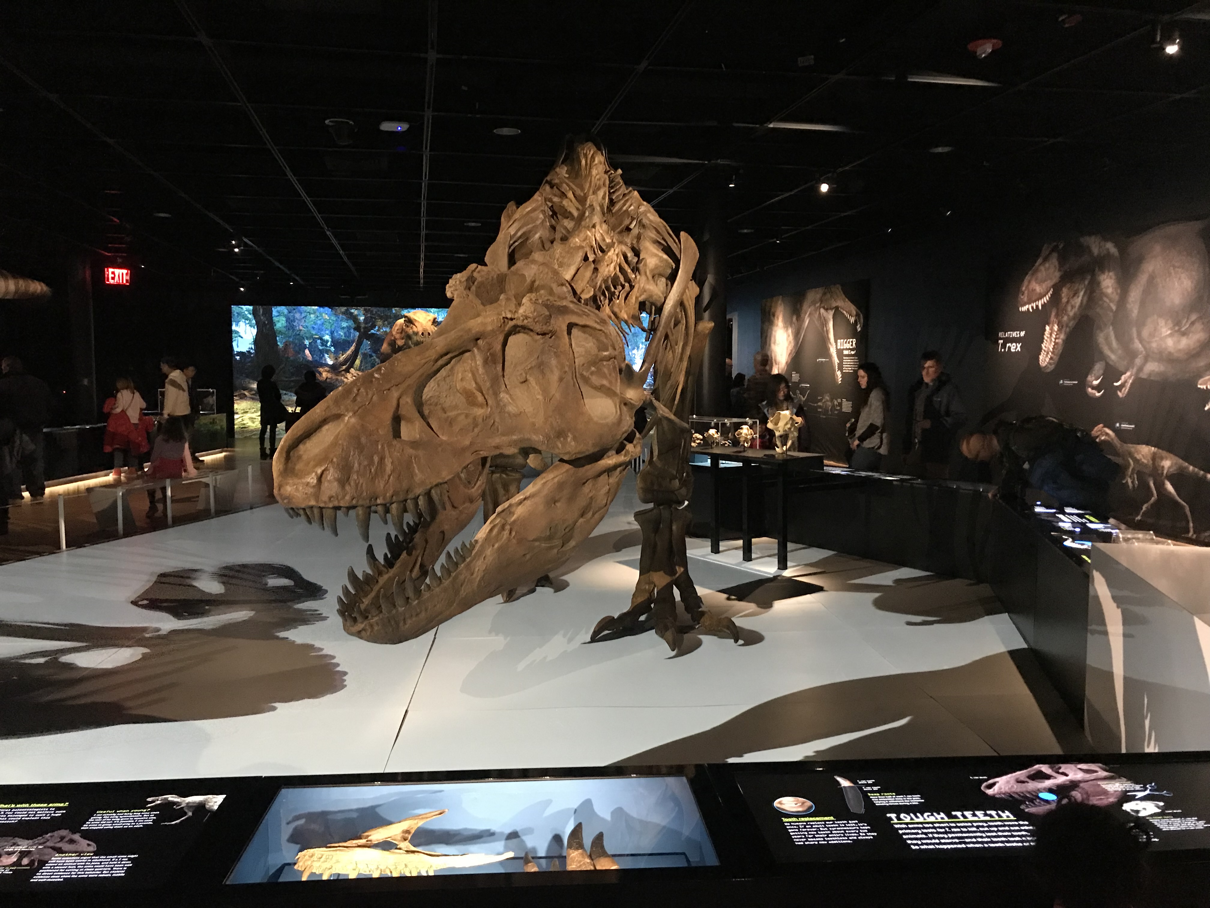
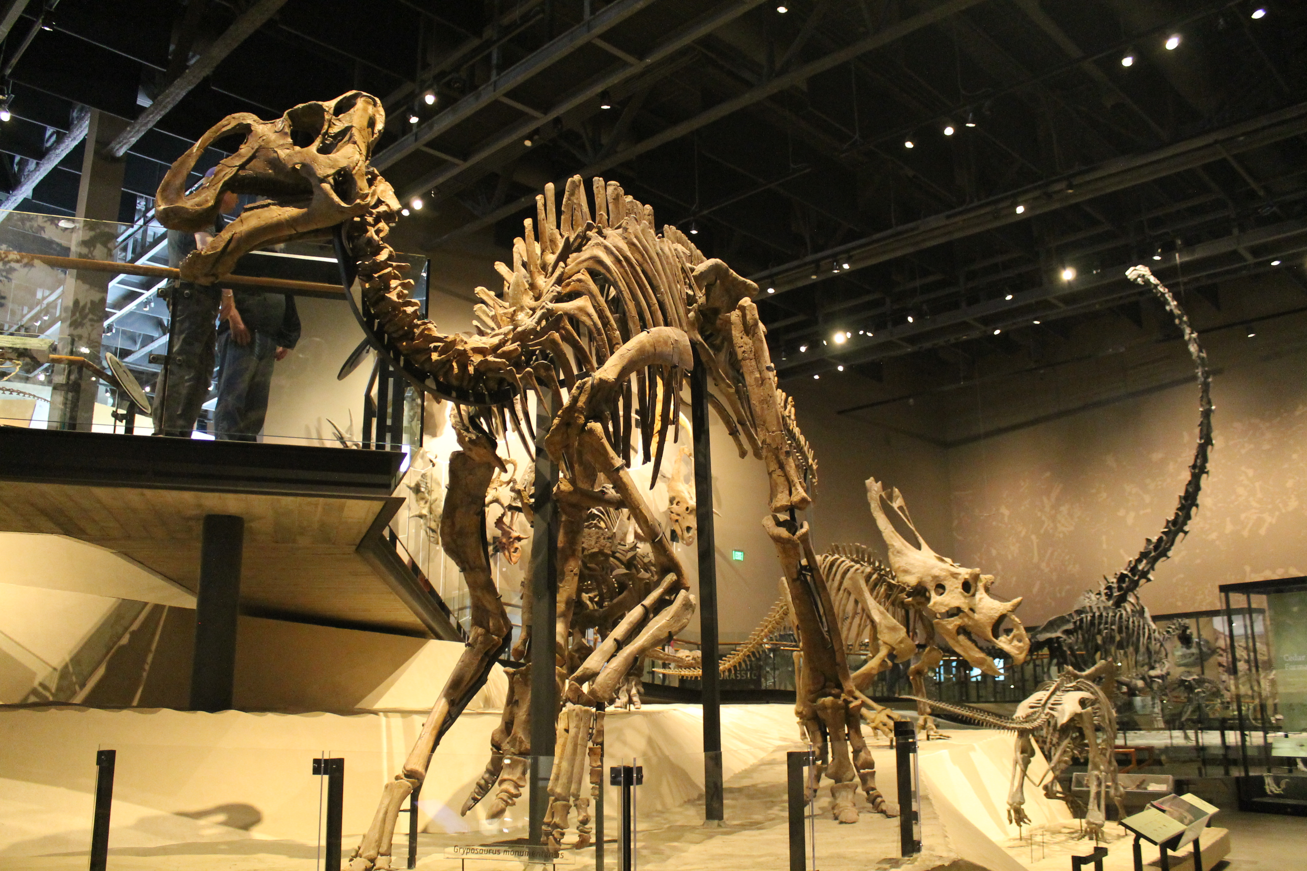
Dinosaurs are king (especially T. rex)
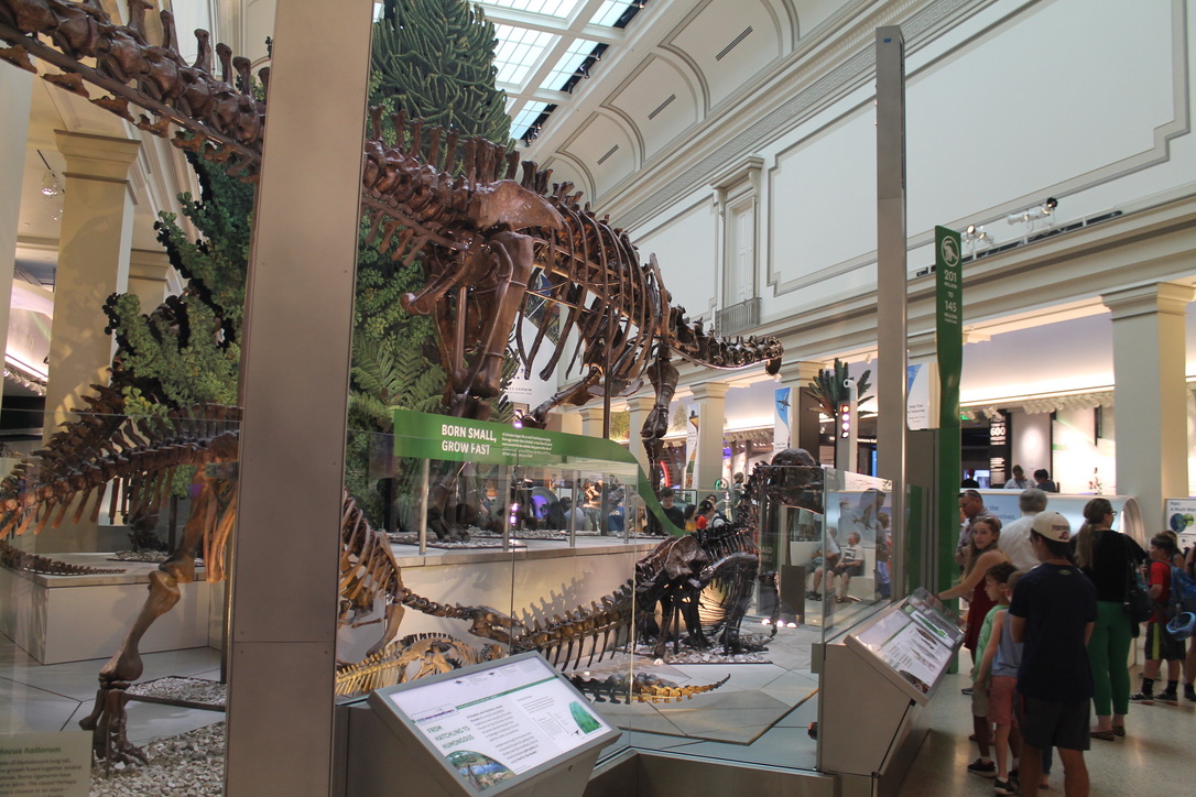
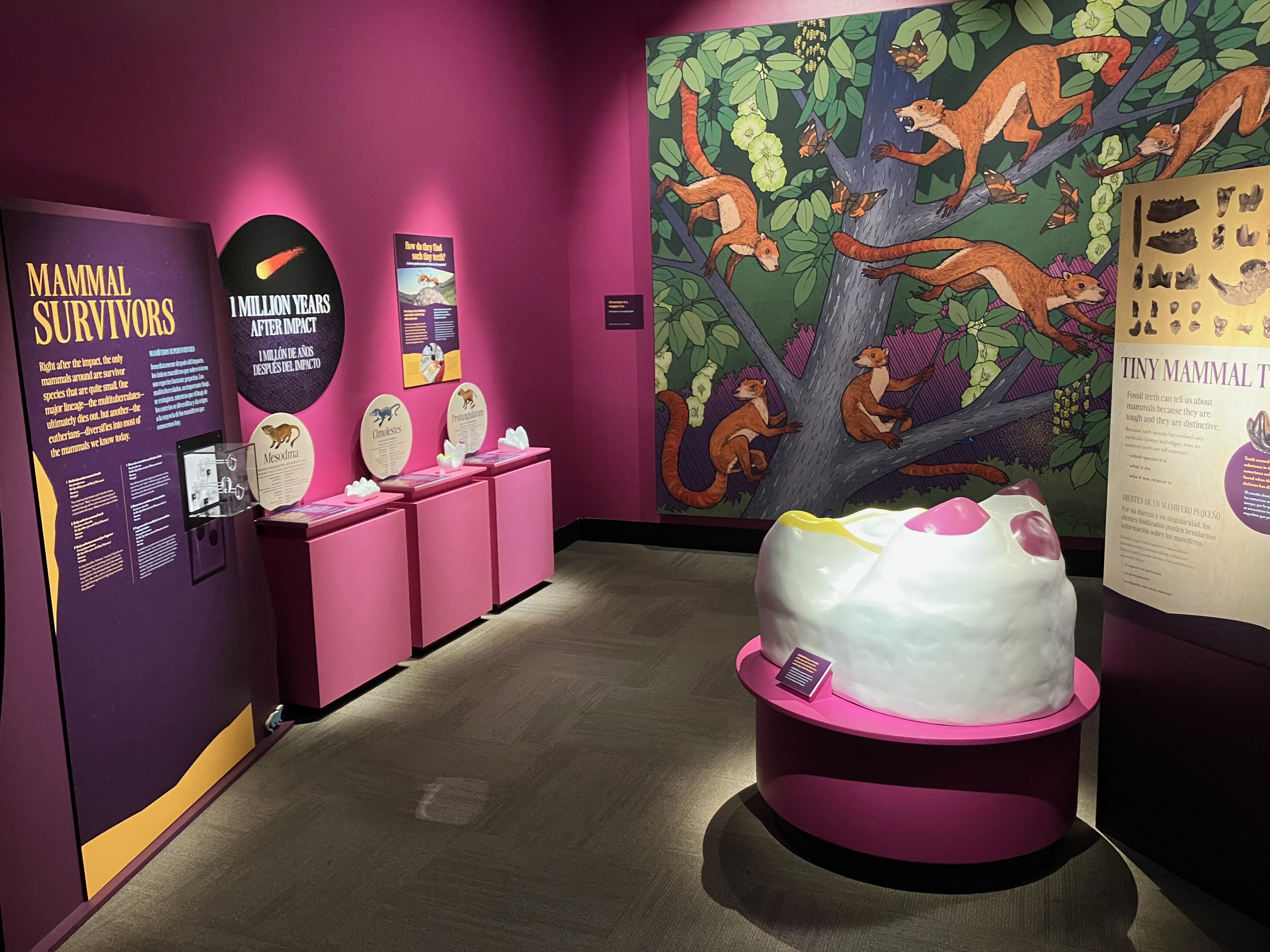
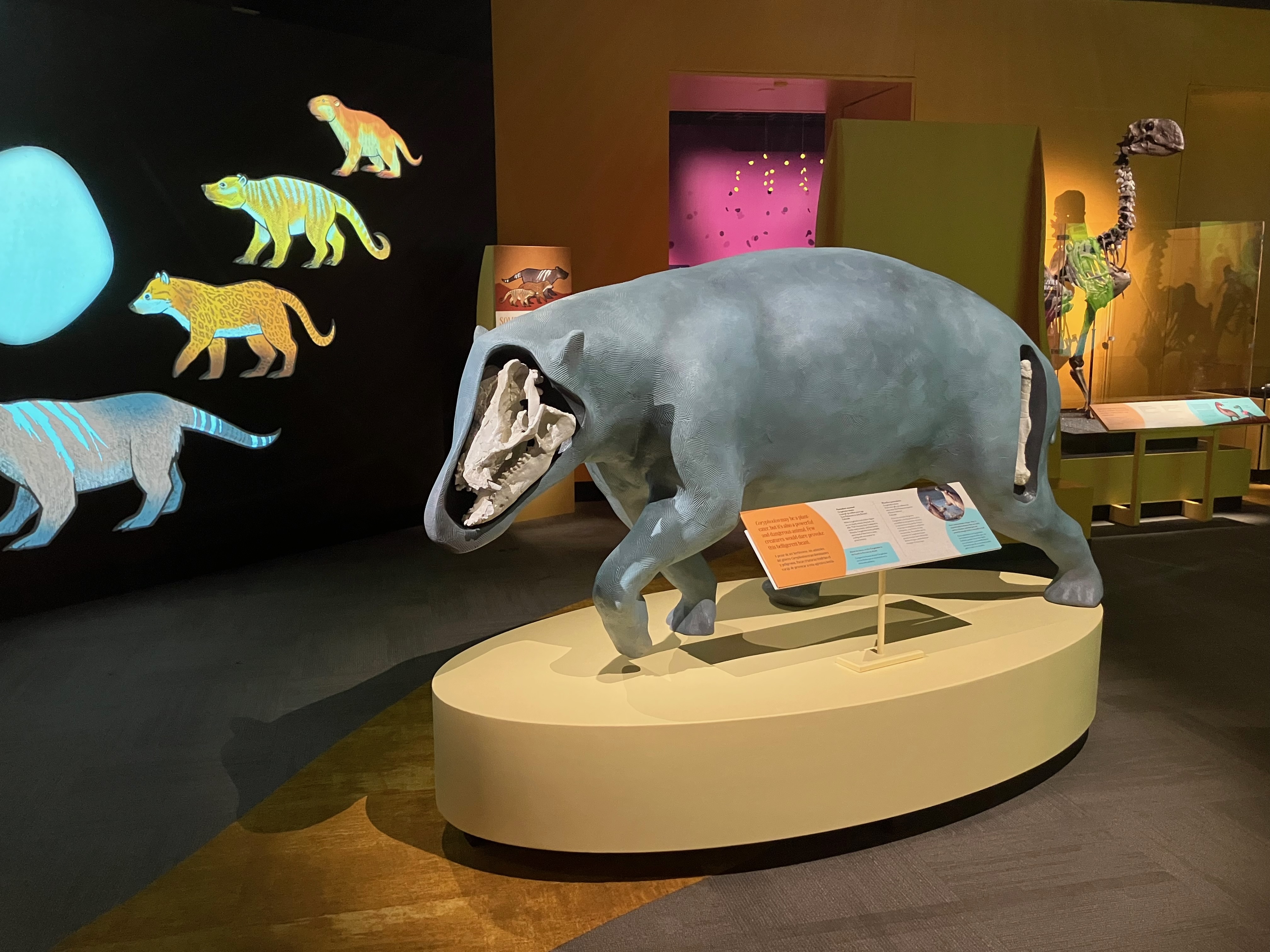
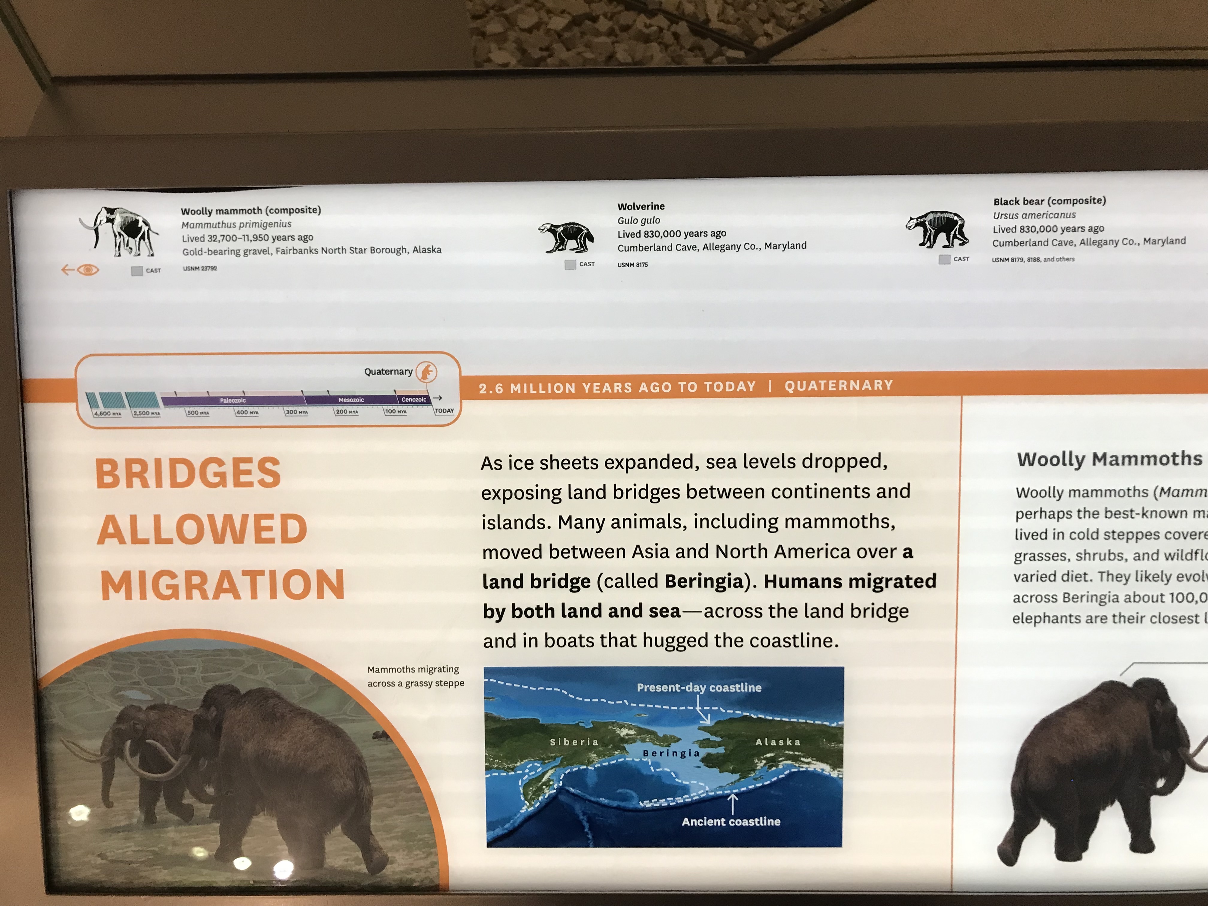
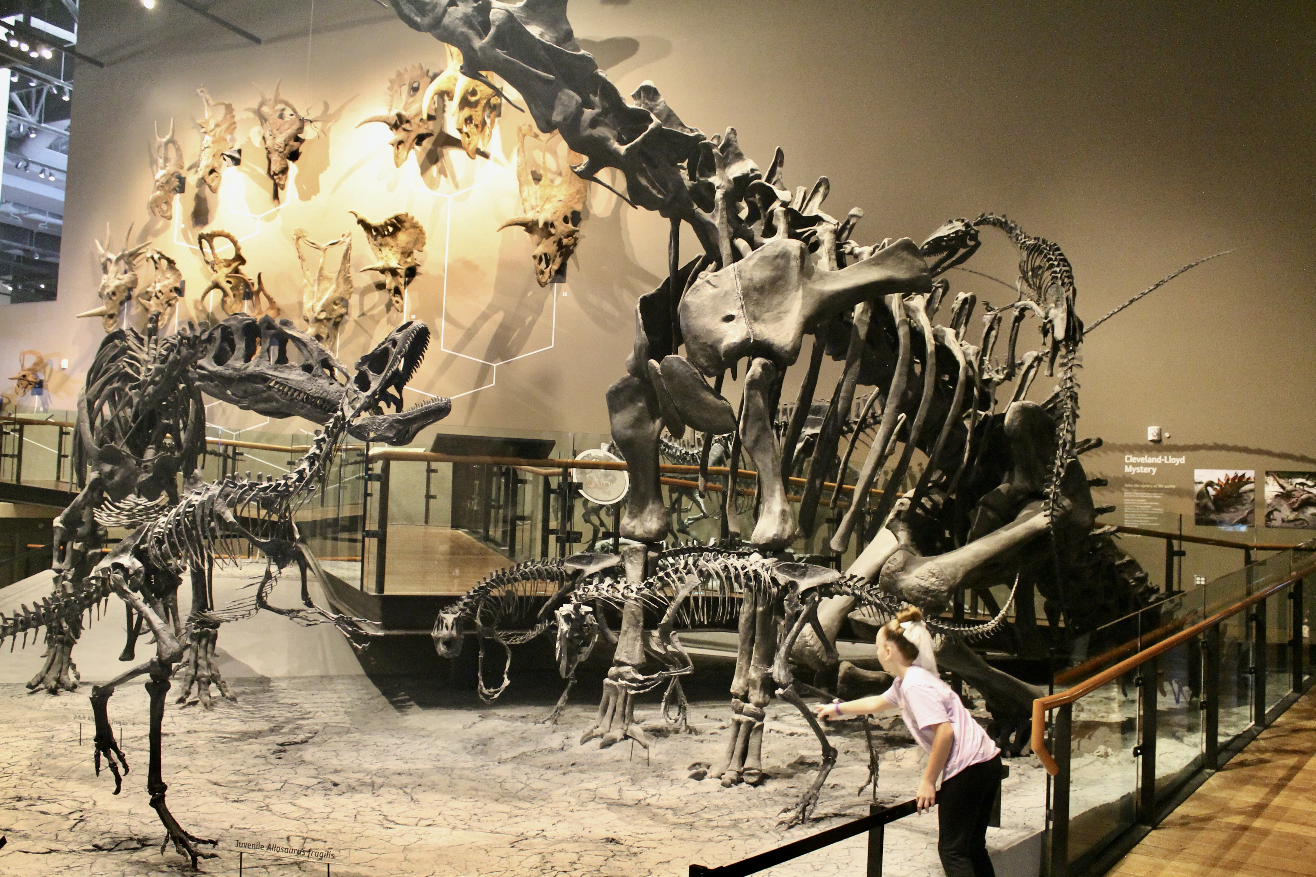
One of the stated goals of Deep Time’s creators was to help visitors understand that the history of life on Earth wasn’t just about dinosaurs. “Are we doing a disservice by overdoing dinosaurs?” is a common refrain among folks who worry about how we relate paleontological science to the public. Whether or not this is a real problem, Deep Time seems comparatively constrained when it comes to dinosaur content. According to my Big Spreadsheet, NMNH has fewer dinosaur fossils on display than is typical among its peer institutions. Just 18% of the included vertebrate specimens are dinosaurs, and these are almost always intermingled with the other animals and plants that made up their ecosystems.
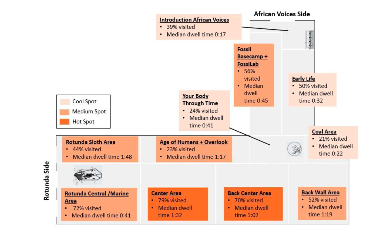
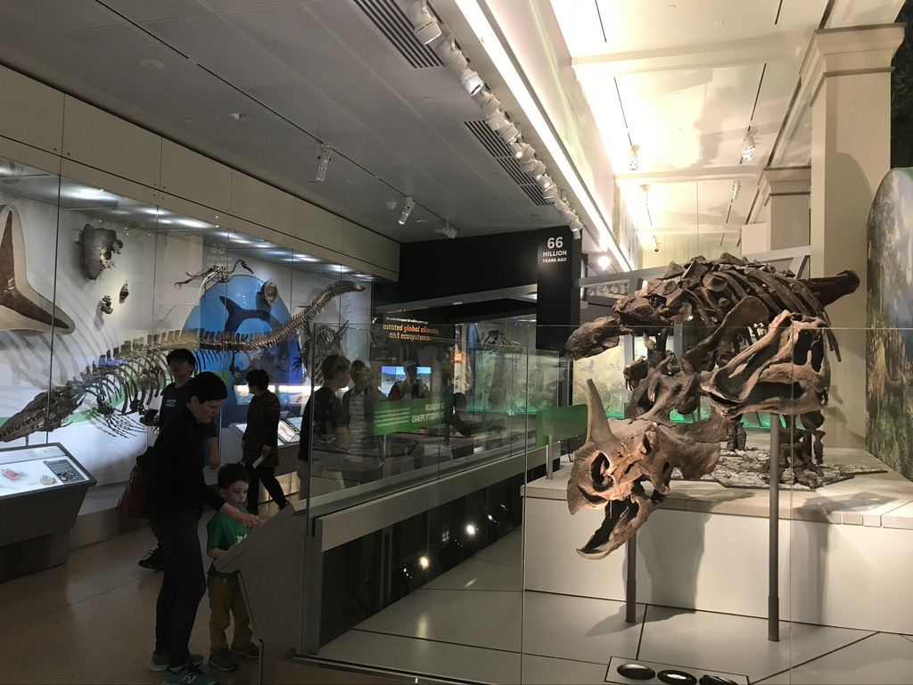
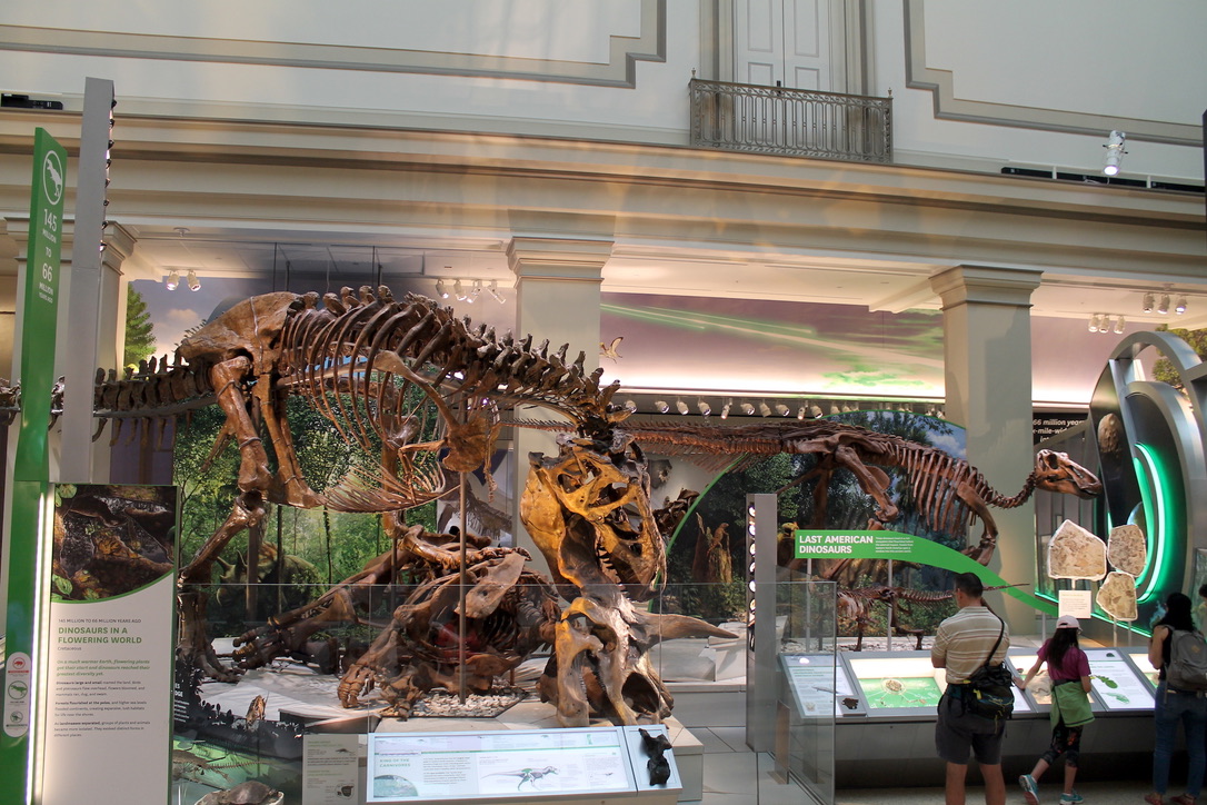
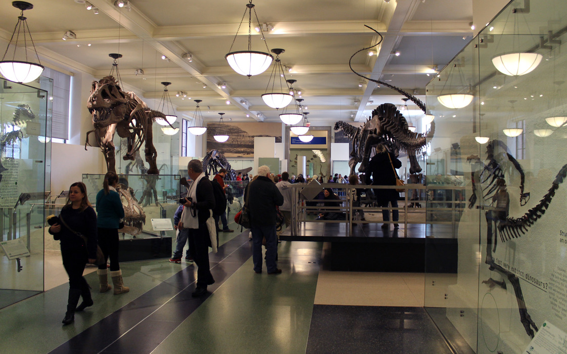
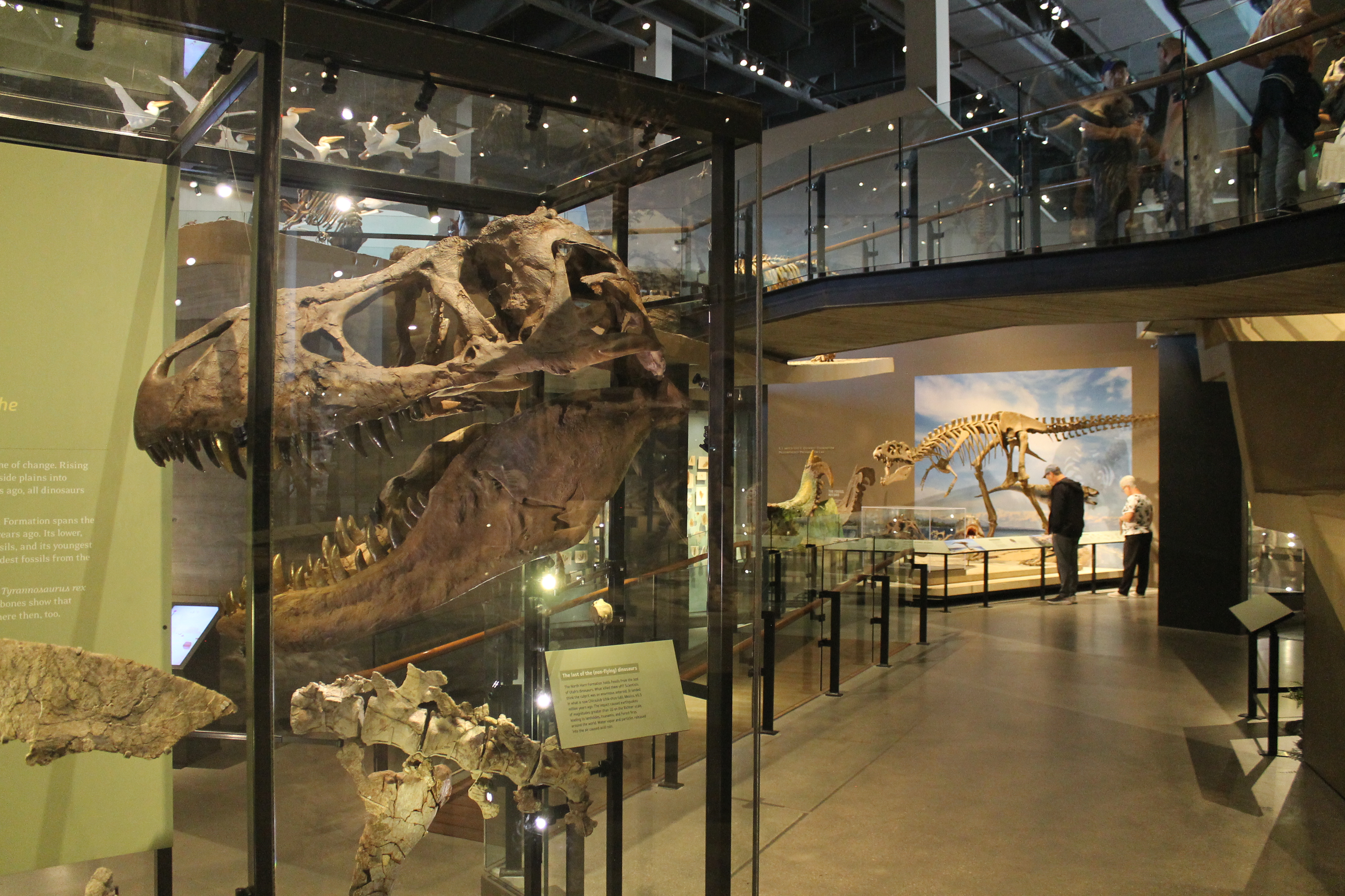
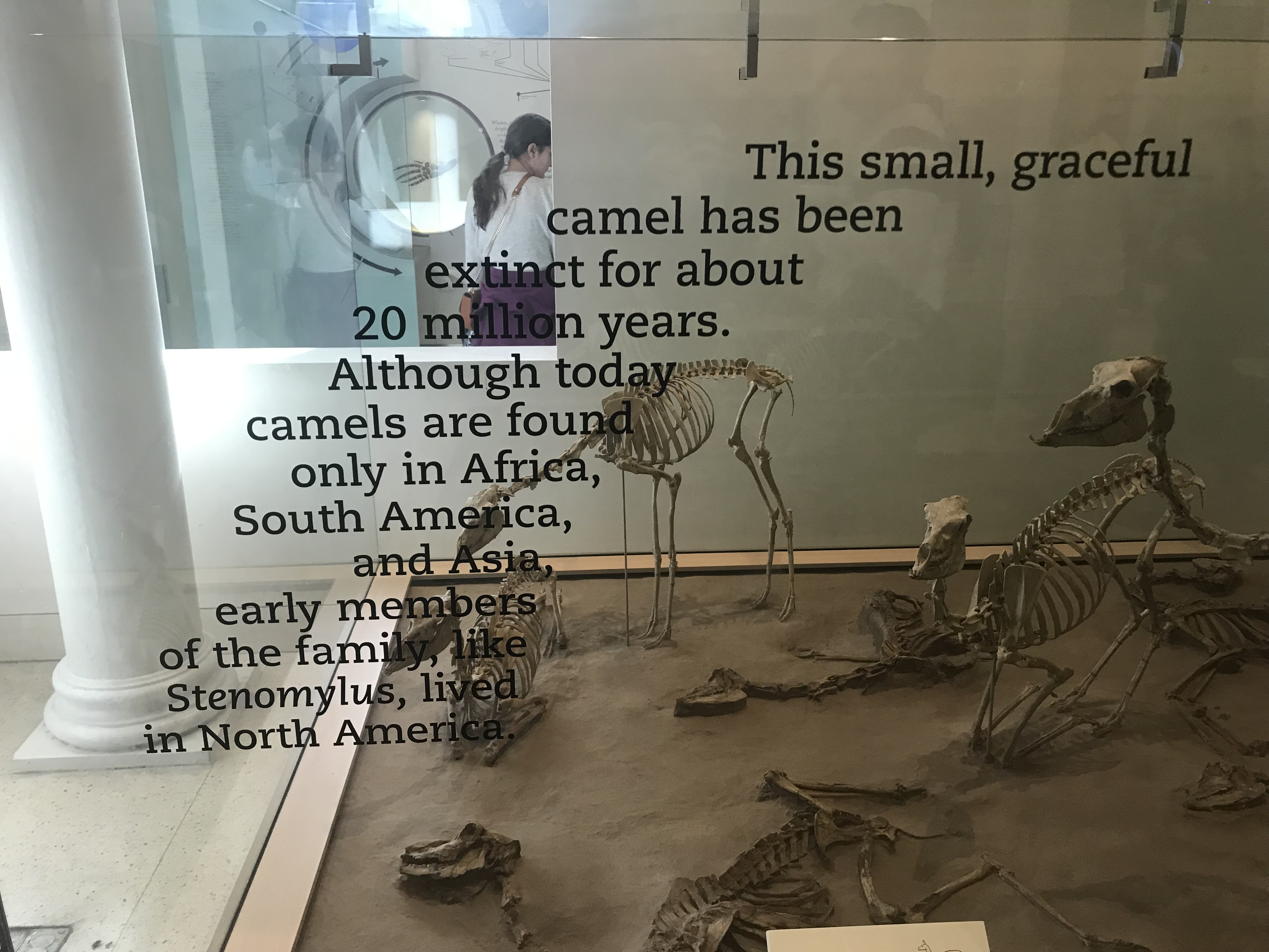
But in spite of these efforts to keep dinosaurs in their place, evaluators found that the terrible lizards still had more drawing power than anything else in Deep Time. Most of the dinosaur fossils are concentrated on the Cretaceous and Jurassic platforms in the middle of the hall, labeled the Center Area and Back Center Area in the image above. More visitors stopped at the Hell Creek display in the Center Area (where the Tyrannosaurus rex skeleton is located) than anywhere else in the exhibit. And of the top ten most-visited displays, eight of them featured dinosaurs (the other two were the mastodon and the windowed fossil prep lab).
My takeaway from these results is that the public wants what the public wants, and that’s dinosaurs. Even when you fill a massive space with mammoths and brontotheres and phytosaurs and every other cool prehistoric creature under the sun, people gravitate toward the dinosaurs. And they’re gravitating toward the T. rex in particular, which is noteworthy in itself. As with dinosaurs in general, there’s a fair amount of handwringing that too much attention is paid to the tyrant king. That may well be the case, but the data here implies that even when provided with other options, people are still drawn to T. rex. And if T. rex still has the power to excite people about the natural world after 120 years, I think that’s something museums and educators should continue to bank on.
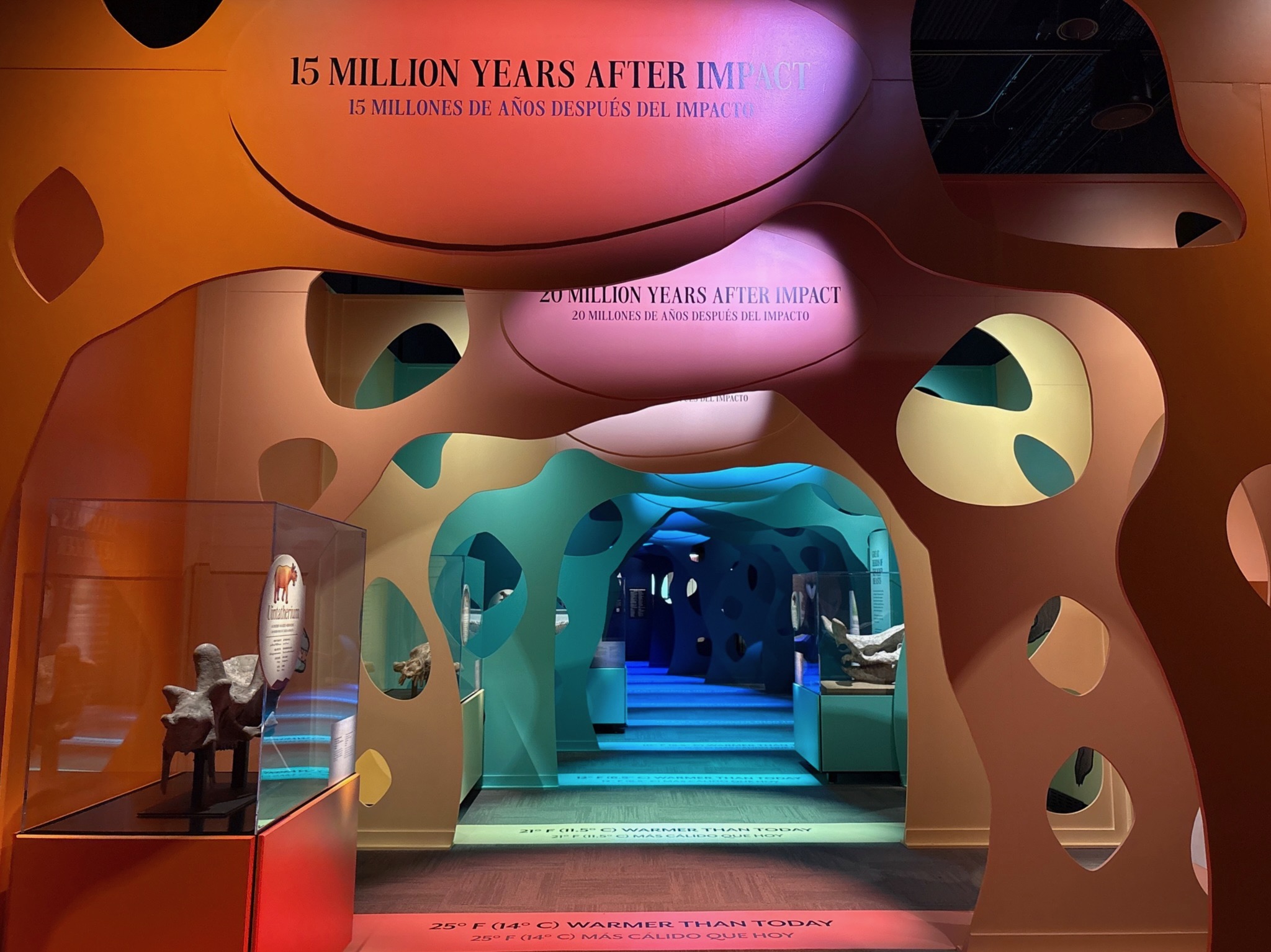
Most people miss the time indicators
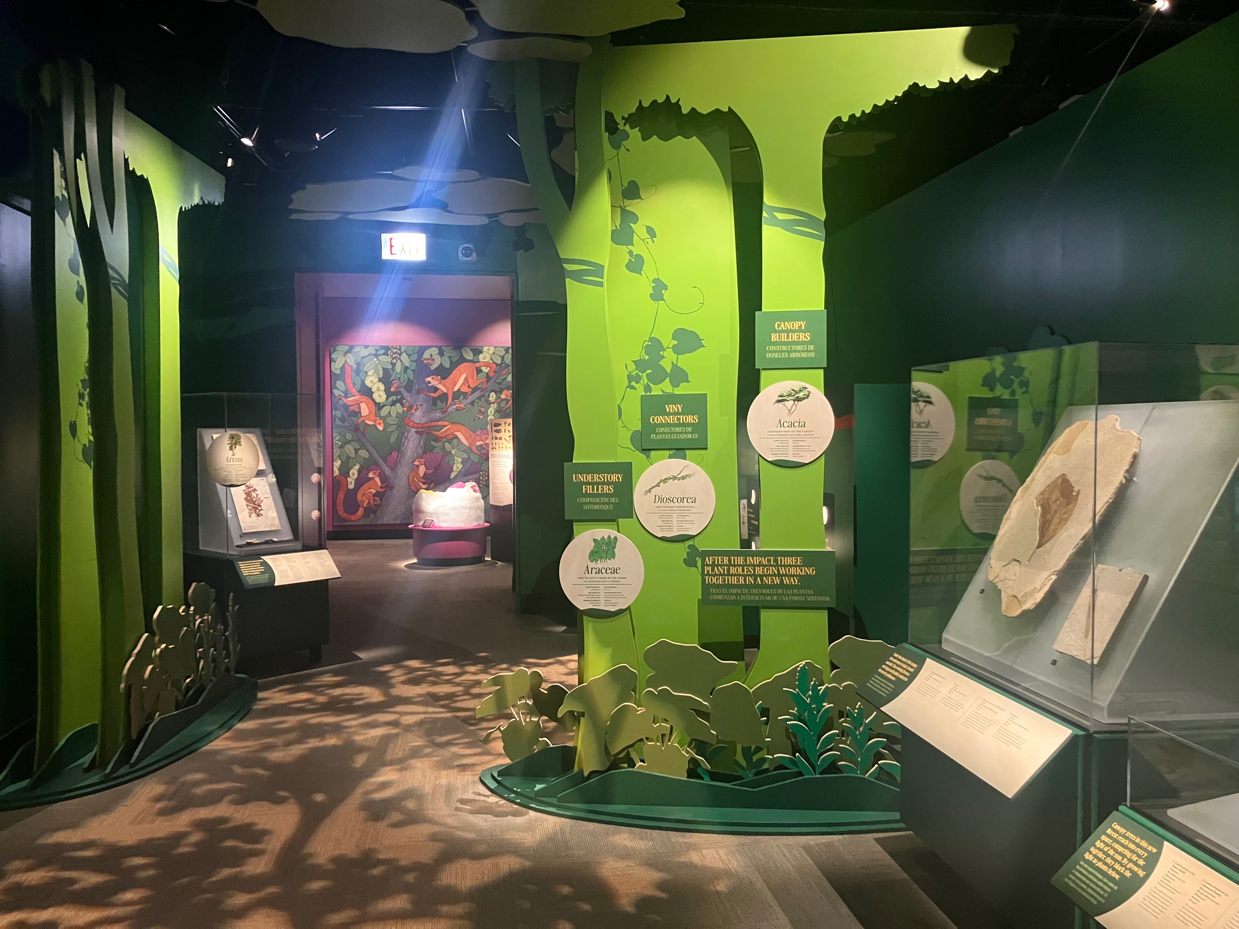
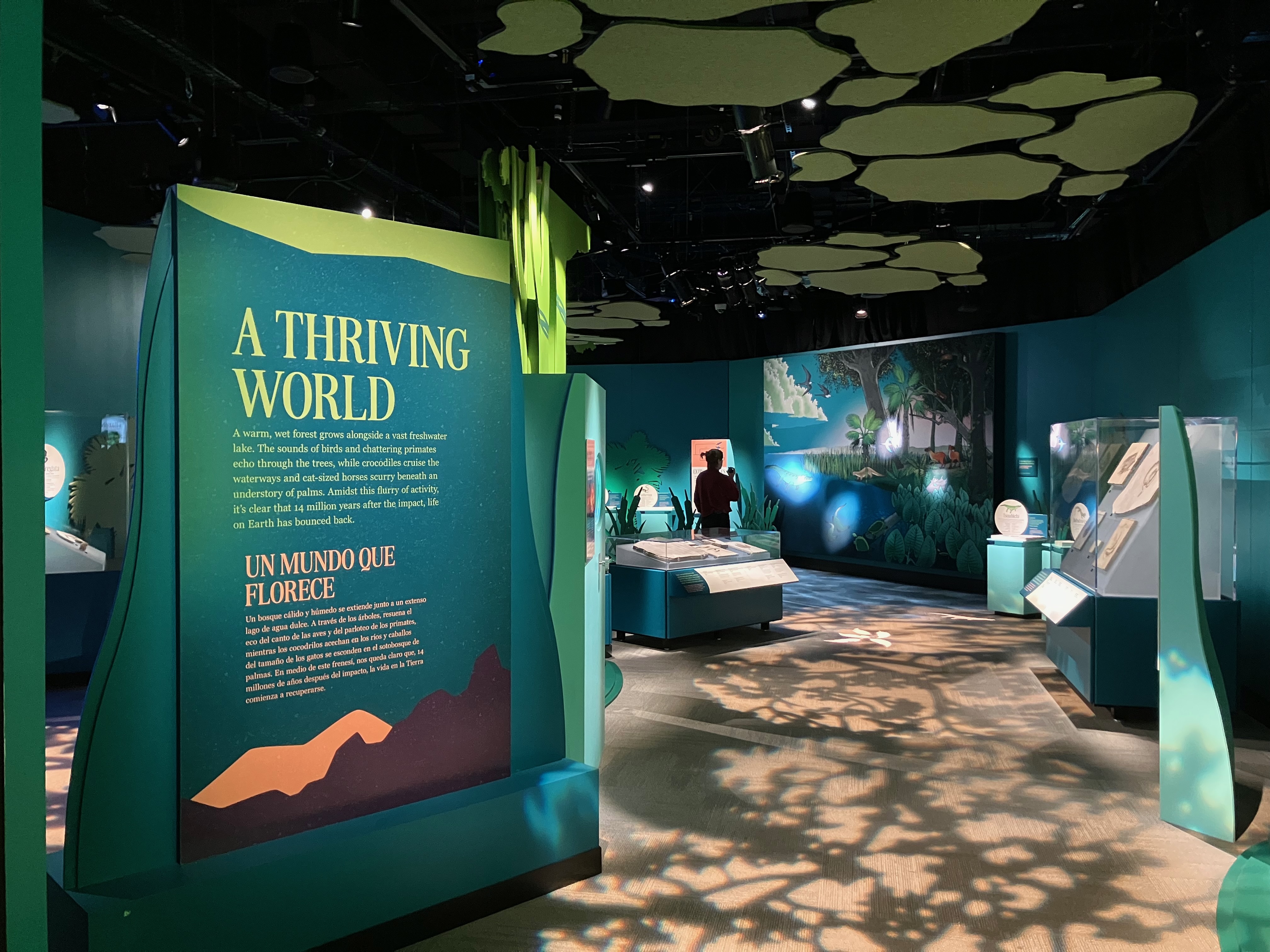
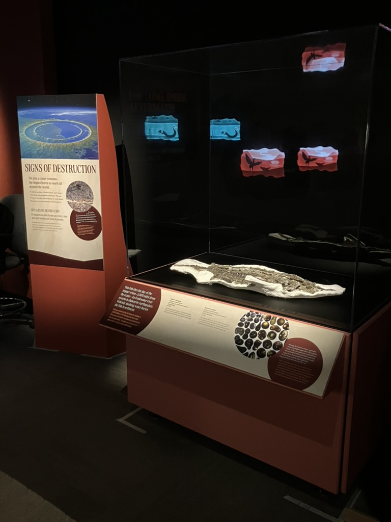
Deep Time does not require visitors to follow a defined path. The open floorplan allows visitors to move freely through the space, pinballing among the displays that most interest them. However, the exhibit still has a linear narrative: the chronological progression of life over time. To accomplish this, the designers created a number of visual cues to inform visitors of where each display fits on the timeline. Each island display has a tall post that lists the geological period and numerical date. These posts—along with all the graphics and other design elements—are color coded by period. Mass extinctions are marked by opaque walls that physically divide the space. And in case visitors missed all of that, every graphic panel includes a timeline running along the top.
I thought all these techniques for marking time in an open hall were pretty clever, but apparently most visitors would disagree with me. The evaluators found that only 33% of visitors looked at any of the time indicators while exploring the exhibit. While they speculate that visitors could still intuit the chronological narrative without using those indicators, this strikes me as disappointing. I really like the idea of an evolution exhibit where you can look at ecosystems up close while also stepping back to take in the big picture, but evidently this easier said than done.
The climate message is understated
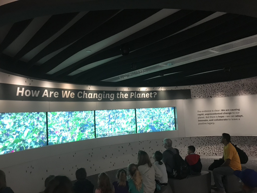
Deep Time contains a strong message about how humans are changing the Earth in unprecedented ways. As I wrote in 2019:
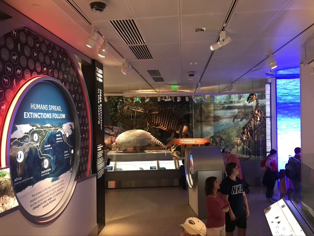
The hardest-hitting message [in Deep Time] is about the modern climate crisis. The fact that industrial activity is profoundly warming the climate—a change that comes with dire consequences—is presented in clear, matter-of-fact language. It’s not preachy, it’s not political, it’s just the truth. The exhibition does not explicitly say we should stop harming the planet (although we should), but it clearly presents the evidence that we are, and that we have the ability to stop. This information is centered on an overlook called “the bridge.” The centrality of this location and its proximity to the dinosaurs makes the climate narrative unmissable. The nature of the modern media landscape is such that many NMNH visitors may well have never seen this message presented in non-political terms. I’m eager to see the results.
For some observers, the climate content in Deep Time was a sort of Trojan horse. Visitors would be lured in by fossils, only to be hit with the bad news about humans’ detrimental effect on the planet. I’d argue that this is entirely appropriate: humans are part of the story of life on Earth, and the changes we’re causing in the present are best understood in the context of comparable global changes in the past.
Nevertheless, when asked to articulate the “main message” of Deep Time, only 15% of visitors mentioned climate change (although 48% mentioned the connectivity of humans to all other life). Meanwhile, the tracking data shows that while 23% of visitors entered the bridge area, engagement was unexpectedly low, with a median dwell time of just 47 seconds. These results seem decidedly mixed, but the demographic information about the visitors in the study is particularly informative here. 74% of the individuals given the evaluation have a bachelor’s degree or higher—well above the national average, and a group that is typically better informed about the climate crisis. Indeed, evaluators found that 69% of participants were “alarmed” about climate change generally. As a rule, museum visitors tend to focus on displays about topics they are already somewhat familiar with. So if the participants in the study have above-average awareness of anthropogenic climate change but are picking up on the message in the exhibit at fairly low rates, that suggests to me that this content is not reaching visitors as well as it could be—especially for those who most need to see it.
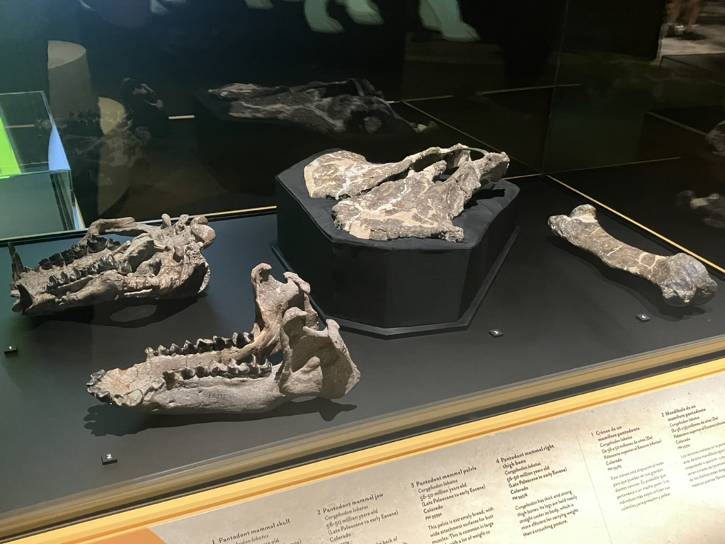
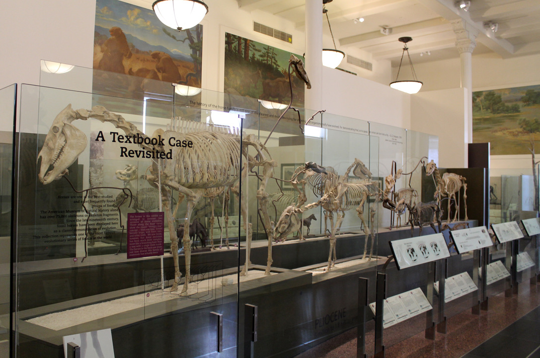
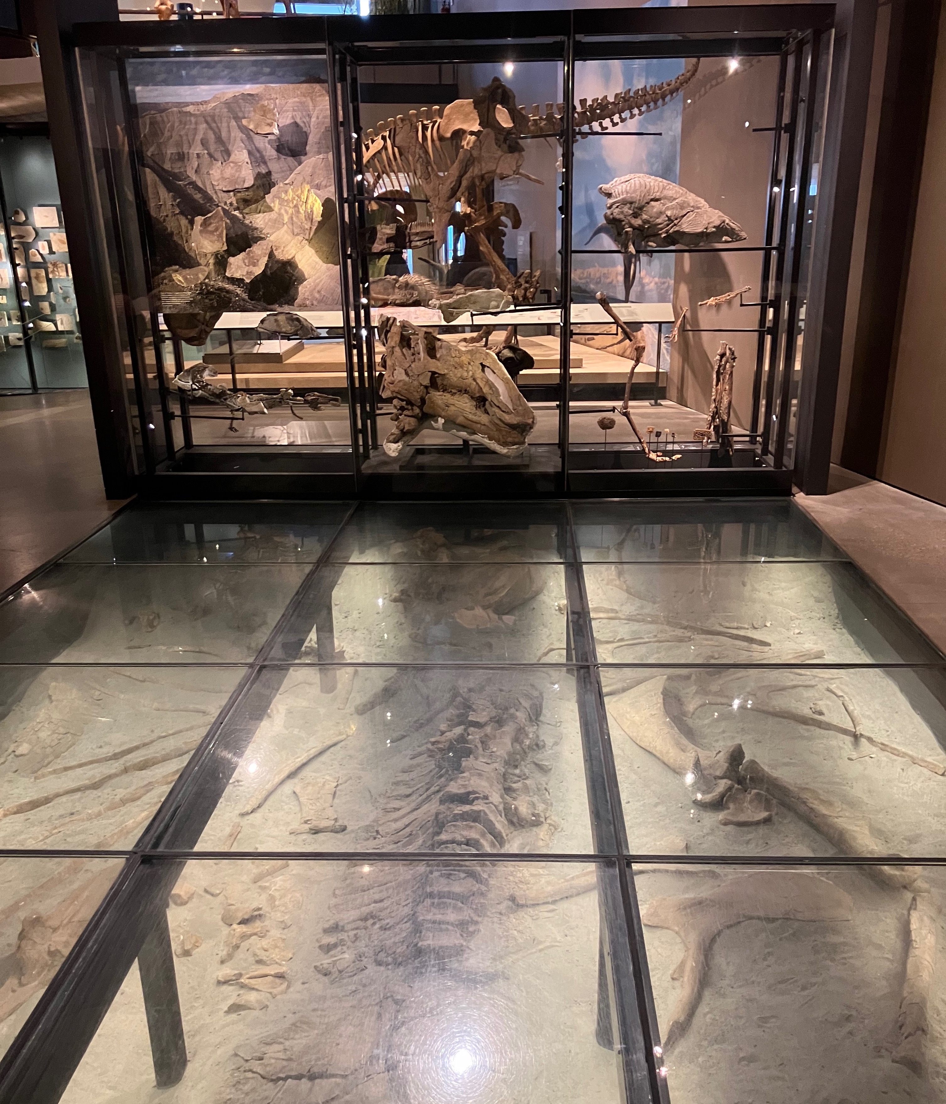
Specimens are the show-stoppers
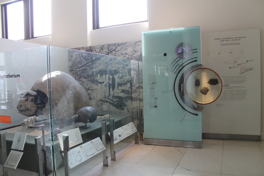
The final takeaway that I’d like to point out is that the evaluators found that the fossil specimens were by far the most popular and memorable elements of Deep Time. “Seeing fossils” was the most common response (55%) among visitors asked for their favorite part of the exhibit. This far surpassed the number of visitors who mentioned videos (5%) or interactives (3%). To be fair, the mounted skeletons are the largest and most visible parts of Deep Time. The exhibit has just a couple comparably large video displays, and I’d argue that it only has three proper interactives (it has plenty of touchscreens where visitors select which video they’d like to play, but does that really count as interactivity?). There are over two dozen touchable bronze models, however, which also didn’t rank as highly as the fossils.
I think this is encouraging. Media, replicas, and interactives are all important parts of an exhibit creator’s toolbox, but ultimately the real specimens are what set museum experiences apart from other kinds of attractions. It’s nice to see that those specimens—when artfully and thoughtfully displayed—are still the main draw.


