Over the last few years, I’ve gradually been assembling what I imaginatively call the Big Spreadsheet. It’s a record of every single vertebrate fossil on display at a number of natural history museums, mostly in the United States (so far I haven’t been bold enough to include invertebrates or plants). The Big Spreadsheet tracks basic “tombstone” information about each fossil—what it is, where it was found, how old it is, and so forth. Where possible, I’m also tracking collectors, preparators, original display dates, remounts, and trades with other institutions, among other things.
The Big Spreadsheet differs from things like the Paleobiology Database in that I’m specifically focused on what is or has been on public display. Museums only display a fraction of their collections, and the decisions concerning what is worth displaying are made by people with varying preferences and goals. Perhaps the objective is to showcase what’s unique or unusual in the collection. Or perhaps it’s to comprehensively tell the story of evolution. Maybe there’s a focus on local fossils, fossils collected by specific people, or fossils that represent species that visitors would (or wouldn’t) recognize. There’s no one right way to make a fossil exhibit, but the choices that individuals make nevertheless influence how audiences understand the history of life on Earth and how we come to know about it.
My hope is that the Big Spreadsheet will eventually be complete enough that it can be used to tease out quantitative answers to the questions that vex those of us that are interested in how the public thinks about prehistory. For example, maybe it could illustrate which taxa are over or under-represented in public displays, or if narratives are skewed toward certain localities. Maybe we could see the influence certain individuals (say, the Sternbergs) have had on the public’s view of paleontology. Or maybe we could track the degree to which western museums exploit specimens extracted from colonized lands.
I don’t think the Big Spreadsheet is ready for any of those questions yet. But it is interesting to take a peek at how certain museums measure up to one another with their display collections. The charts below divvy up the data from some of the biggest natural history museums: the American Museum of Natural History (AMNH), the National Museum of Natural History (NMNH), the Field Museum of Natural History (FMNH), the Royal Ontario Museum (ROM), and the Natural History Museum in London (NHM).
Here we can see the overall number of vertebrate fossils on display at each of these museums, and how they sort out by type. One obvious conclusion is that AMNH has an outrageously high number of fossils on display compared to its peers. Note that the difference between a mounted skeleton and an in situ skeleton is sometimes a judgement call (many skeletons displayed in relief are not fully removed from their matrix, but have been partially reposed or have missing elements added).
This chart shows how many fossils on display at each museum are “originals” versus replicas (I’ve counted anything that includes at least some real material as original). These five museums mostly display original fossils, although the ratio is highest at FMNH and lowest at NHM and NMNH. Fish fossils really throw the score, however—these numbers would look different if we were only considering big, charismatic tetrapods.
This chart compares the percentage of fossils on display from each era of the Phanerozoic (the last 541 million years). The Paleozoic gets shorted across the board—it represents about 50% of the Phanerozoic but the percentage of Paleozoic vertebrate fossils on display never tops 20%. Meanwhile, the Cenozoic (12% of the Phanerozoic) seems quite over-represented—that is, if temporal proportionality is ever a goal in creating these displays.
Here, we compare the percentage of fossils on display by region. Any passing familiarity with the history of science will make the focus on North America and Europe rather unsurprising.
This last chart breaks down the percentages by animal type. I’m sure the categories will make some readers squirm, but I’m going for culturally meaningful categories here, not evolutionary meaningful ones. It strikes me that just looking at the numbers of fossils in each category doesn’t necessarily capture the impact on visitors. For instance, dinosaur and mammal skeletons tend to take up a lot more space than fish. I wonder if there’s a way to control for square footage of gallery space and come up with an “impression score” of some kind for each of these groups.
If anyone’s interested in collaborating on the Big Spreadsheet, please give me a shout! I’m particularly keen on connecting with folks with a better statistical background, as well as anyone interested in tallying up fossils on display in the western United States and Canada.
The video above was kindly shared by Dave Dolak. He shot it on the last day Life Over Time was open to the public, for use in his historic geology course at Columbia College. It is by far the most complete visual record of the exhibit I’ve come across, including in the Field Museum’s own archives. Many thanks to Dave, as well as former student Marcin Warzick, for creating and sharing this video.
What was Life Over Time?
For those not versed in Field Museum lore, Life Over Time was the predecessor to the museum’s current paleontology exhibition, Evolving Planet. If you visited between 1994 and 2004, this was the version you saw. It was the shortest-lived and generally weirdest iteration of the museum’s fossil halls, but it remains a compelling showcase of a particular era in the philosophy behind natural history exhibits.
Life Over Time had a free-wheeling and whimsical tone, and there were examples of this approach almost anywhere you looked. In one gallery, a fish-headed croupier invited visitors to spin a giant roulette wheel to see the average species’ chance of escaping extinction. An automated puppet show put a cartoony spin on the Proterozoic oxygenation crisis. On various video monitors throughout the exhibit, CBS anchor Bill Kurtis provided “weather reports” describing the conditions during each geologic period. There was a cow skeleton in a dentist’s office, and even a bouncy, ridable trilobite.
The primary force behind this approach to exhibit-making was Michael Spock. Recruited from the Children’s Museum of Boston, Spock joined the Field Museum in 1986 as the Vice President of Public Programs. At the time, galleries were organized after the way the museum’s academic curators thought about their subjects. Spock’s approach was very different—as he put it, exhibits should be “for someone, not about something.” He encouraged his staff to experiment with new ways to be relatable and approachable to the museum’s primary audience (generally, families with children). Life Over Time and the other exhibits made during Spock’s tenure were all about meeting visitors where they were—answering the questions they had, rather than the questions curators wanted to answer.
Nevertheless, it was apparently possible to go to far. Many of the allegorical displays (like the cow dentist) were confusing to visitors. Lab-like spaces, which featured lots of interactives but few specimens, were consistently bypassed because they felt like classrooms. Upkeep was also a problem. The high-concept interactives throughout Life Over Time weren’t always designed with durability in mind, and frequent replacement of loose parts was getting expensive and time-consuming.
So between 2004 and 2006, Life Over Time was transformed into Evolving Planet. The new exhibit occupies the same space and features several of the same star attractions (the coal forest, Apatosaurus, and Megatherium, among others), but was otherwise completely rewritten and redesigned. The number of fossils on display nearly tripled, and the comic, allegorical displays were replaced with more literal depictions of life in the past. Overall, Evolving Planet swung the pendulum back just a bit. It’s still fun, colorful, and visitor-centric, but the focus is more on the real fossils and the museum’s in-house research.
In 1943, sawmill operator Daniel Edward Jones and his wife Vivian went prospecting for uranium west of their home in Delta, Colorado. In a gully near Potter Creek, they came upon a nearly seven foot-long dinosaur bone eroding out of the ground. It’s unclear exactly how and when they managed to excavate and remove the gigantic fossil, but sometime before 1955, the Joneses collected the bone and donated it to the Smithsonian Institution. That bone—identified as the humerus of a Brachiosaurus altithorax—has been on display at the National Museum of Natural History ever since.
The Potter Creek humerus (USNM V 21903) never made much of a splash scientifically. It wasn’t mentioned in any research paper until 1987, when Jim Jensen figured it alongside several other Brachiosaurus bones he collected at the same locality. The referral to Brachiosaurus has been questioned (e.g. Taylor 2009), but without any closely related dinosaurs known from Late Jurassic North America, researchers have generally been happy to use the available name.
Arguably, the Potter Creek humerus has a greater legacy as an object on display, and more specifically as an object to be touched. Since 1955, the fossil has been in easy reach of visitors, and has often been accompanied by signage inviting visitors to touch it. Extrapolating slightly from available visitation statistics and multiplying by the number of years on display, this fossil could easily have been touched by over 200 million people—possibly as many as 400 million. I’m unaware of any other dinosaur specimen that has been handled by that many individuals.
Let’s take a look at how the most-touched dinosaur bone of all time (if you know of other contenders for that title, please let me know!) has been interpreted over the years.
This humerus (upper arm bone) of the sauropod dinosaur Brachiosaurus alithorax was found by Mr. D.E. Jones of Delta, Colorado. It is from the Morrison formation, of late Jurassic age (about 130,000,000 years ago), in Montrose County, Colorado. Brachiosaurus was a giant among dinosaurs, much larger than the familiar Brontosaurus; it may have weighed as much as 55 tons. It is distinguished from other dinosaurs by the fact that its front legs were somewhat longer than its hind legs. This feature, the great length of the neck, and the projecting nostrils on top of the head seem to have been adaptations to its presumed life habits. Brachiosaurus was a plant eater that walked along the bottoms of lakes, lifting its head to breathe above the surface of the water. Brachiosaurus is known from North America, Africa, and Europe. This humerus is 6 feet 10 inches long, its position in the body of Brachiosaurus is shown in the sketch, where the humerus is drawn in red. Note the much smaller humerus in the nearby skeleton of the dinosaur Diplodocus.
As mentioned, the Potter Creek humerus was first put on display at NMNH in 1955. It was mounted on a wooden pedestal in front of the Diplodocus skeleton, near the front of the museum’s spacious fossil hall. As seen in the photo above, the bone’s damaged shaft was not restored, although some sort of consolidant must have been applied to keep it from crumbling all over the floor.
The 181-word text panel accompanying the fossil was likely written by curator Charles Gazin, who had led the Vertebrate Paleontology division since 1946. The text is quite long and meanders through several distinct topics—addressing what the specimen is, who found it, how old it is, where it was found, how big the animal was, what the animal looked like, how the animal behaved, where else the animal lived, the exact size of the bone, and finally how it would fit into a complete skeleton. The text does not address any qualities of the fossil that visitors can actually observe until the very end.
Consideration of how visitors use museum exhibits—and how exhibits can best meet visitors’ needs—was in its infancy at this time. At NMNH and most of its peer institutions, labels were written by curators—experts in their fields but not necessarily in best practices for communicating with broad audiences. Exhibit text was by experts, for experts, and any visitors not up to parsing dense paragraphs like this one were left to make their own meaning of the exhibits.
It is notable, however, that this label compares the Potter Creek humerus to the nearby Diplodocus. As was typical of natural history exhibits at the time, the NMNH fossil hall wasn’t arranged in any particular order. Specimens were placed on platforms or in free-standing cases. This modular design allowed the hall to be rearranged with relative ease when new specimens were acquired, but it did not lend itself to any sort of overarching narrative for the displays. This passing reference to another specimen was as close to narrative cohesion as exhibits of this era could get.
This is a humerus (arm bone) of the sauropod Brachiosaurus alithorax. The position of the bone and the appearance of the animal are shown in the accompanying drawing. A close relative of Diplodocus and Camarasaurus, Brachiosaurus was the bulkiest land animal that ever lived, weighing about 55 tons. Like other sauropods, he spent most of his time in ponds, lakes, or rivers. If you want to be able to tell your friends that you touched a dinosaur bone, here is your chance.
The NMNH fossil halls were updated in 1963 as part of a decade-long, Smithsonian-wide modernization project. For the first time, an exhibit design specialist worked with the curators to compose the paleontology exhibits. Designer Ann Karras considered how visitors would move through the space, and attempted to create a coherent story of the evolution of life over time. Text panels were part of the aesthetics and organization of the exhibition, and were written with consistent style and terminology.
The text accompanying the Potter Creek humerus may have been written by Barbara Craig, and by modern standards, it’s pretty good (ignoring the now-debunked idea that sauropods spent their time in the water, and the choice to use a masculine pronoun for a dinosaur of unknown sex). The header is a call to action, inviting visitors to touch the fossil. The remaining 82 words are snappy and useful—the object is clearly identified, and the accompanying illustration is referenced right away. Visitors can find the information they want (what am I looking at? What should I do here?) right away, without having to fight through excessively long or wordy prose. It’s remarkable how well this label adheres to the standards for exhibit text that Beverly Serrell would first put forward over twenty years later.
Photo by Michael Brett-Surman.Photo by Flickr user grafxmangrafxman.
Size in dinosaurs—how big is enormous?
Early dinosaurs were relatively small—about the size of the smaller Camptosaurus displayed to your left. However, these “small” dinosaurs were already larger than most land animals of their time. Although some lines of dinosaurs never got much larger, most produced huge forms. The average live weight of a dinosaur was about 5 tons. No other land-dwelling reptiles have ever approached this size and only about 2 percent of land-dwelling mammals have done so. The smallest dinosaur known, though no larger than a chicken, was still larger than 80 percent of all land mammals living today.
Brachiosaurus leg bone
The bone displayed below and in green in the drawing is from the upper part of the front leg of Brachiosaurus, one of the largest of all dinosaurs. Although Diplodocus had a longer neck and tail, Brachiosaurus was much taller and more massive and outweighed Diplodocus by several tons. Bones of a still larger animal similar to Brachiosaurus have been found in Colorado.
The dinosaur exhibits at NMNH were next updated in 1982. This time, the Potter Creek humerus was relocated to the right side of Diplodocus. With all of the mounted skeletons in a central corral and behind a plexiglass barrier, the role of the humerus as a designated touchable fossil was exceptionally clear. During the renovation, a fiberglass cowl was affixed to the damaged part of the humerus. This restoration makes the bone appear thicker than it actually is.
The accompanying text was written by postdoctoral research associates Jessica Harrison and George Stanley, under advisement from curator Nicolas Hotton. Their task was to balance the needs of visitors with demands for precise language from scientists. The resulting label is twice as long as the previous version and, I would argue, not nearly as useful. The primary text isn’t about the humerus at all—instead it discusses the range of dinosaur sizes and compares them to modern animals. The humerus is finally mentioned toward the bottom of the graphic, where it is once again compared to Diplodocus. For some reason, the donor is listed as Tony Jones.
Photo by the author.Photo by the author.
How much heavier?
Sauropod dinosaur (arm bone)
Brachiosaurus altithorax
Lived 152 million years ago
Morrison Formation, Montrose Co., Colorado
USNM 21903
Donated by Eddie and Vivian Jones
You can see by it’s arm bone that Brachiosaurus (right) was bigger than Diplodocus (in front of you). The Brachiosaurus humerus is two times as thick as that of Diplodocus. That means it came from an animal that weighed nearly five times as much, about 140,000 lbs (64,000 kg)!
The most recent renovation of the NMNH fossil halls was completed in 2019. For the first time, the Potter Creek humerus is mounted vertically, in the orientation it would have held in a living Brachiosaurus. While requiring a sturdier and more sophisticated mounting structure, this display gives visitors a clearer understanding of the fossil before them.
Angela Roberts Reeder was the lead writer of the current exhibit text, assisted by several co-writers. At 51 words, this is the shortest label for the Potter Creek humerus yet. Some of the basic information—the animal’s name, how old the fossil is, and where it was found—is collapsed into a standardized and compact “tombstone” ID block. The remaining text covers a single subject: the mathematical relationship between the bone’s width and the living weight of the animal it belonged to.
This is considered good practice. According to Serrell, visitors are primarily concerned with the objects on display, not the exhibit text. They will look for text if they expect it to answer their immediate questions and improve their understanding. Visitors will quickly scan the available text, and if it doesn’t seem to be helping them, they will move on. Therefore, exhibit text needs to get to the point, and fast. Short labels aren’t about dumbing things down—they’re about finding the right words to communicate important ideas to the largest possible number of people.
Reeder’s label for the Potter Creek humerus is a great example. It immediately answers the most likely questions: “what is this thing?” and “how big was the dinosaur it came from?” Then, taking advantage of that momentary attention, it enhances visitors’ understanding by explaining how scientists can know the size of an animal from a single bone. The standardized ID block resolves most further questions without making visitors hunt though a long paragraph. Rather than trying to tackle too many concepts at once, this label omits any information on the life appearance or habits of Brachiosaurus.
Looking at the four generations of interpretation of the Potter Creek humerus, there are some recurring themes. The size of the bone and the animal it belonged to has always been referenced. And there is always an accompanying illustration showing where the bone fits into a complete Brachiosaurus. However, the earlier labels addressed the life habits of living sauropods with greater specificity (and as it turns out, inaccuracy—Brachiosaurus did not spend all its time wallowing in lakes in rivers). The newer labels are somewhat more technical, in that they focus on comparative measurements among fossils. This is surprising—I would have expected that earlier generations of paleontologists would have been more concerned with comparing figures and less interested in the total biology and ecology of extinct animals.
I was also surprised that there was not a clear trend toward shorter text. Instead, the length of the label has oscillated with each generation. And it’s worth noting that the earliest label is not burdened with excessive scientific jargon. The language has always been clear—what varies is how it is organized and how long it is overall.
References
D’Emic, M.D. and Carrano, M.T. 2019. Redescription of brachiosaurid sauropod dinosaur material from the Upper Jurassic Morrison Formation, Colorado, USA. The Anatomical Record 303:4:732–758.
Jensen, J.A. 1987. New brachiosaur material from the Late Jurassic of Utah and Colorado. Great Basin Naturalist 47:592–608.
Marsh, D.E. 2014. From Extinct Monsters to Deep Time: An ethnography of fossil exhibits production at the Smithsonian’s National Museum of Natural History. http://circle.ubc.ca/handle/2429/50177
Serrell, B. 2015. Exhibit Labels: An Interpretive Approach (2nd Edition). Rowman and Littlefield.
Taylor, M.P. 2009. A re-evaluation of Brachiosaurus altithorax Riggs 1903 (Dinosauria, Sauropoda) and its genetic separation from Giraffatitan brancai (Janesch 1914). Journal of Vertebrate Paleontology 29:3:787–803.
An overview of the Hall of Vertebrate Origins. Photo by the author.
Spending a day at the American Museum of Natural History is always a joy. Particularly in its fourth floor fossil halls, AMNH stands head and shoulders above peer museums in the sheer breadth of collections on display. Something in the ballpark of 600 fossil vertebrate specimens are included, including no less than 135 mounted skeletons. Many of these represent taxa that cannot be seen anywhere else in North America. With each visit, however, I feel more and more that the AMNH fossil halls are showing their age. This is not surprising—the current exhibition opened in stages between 1994 and 1996. Strange as it seems to aging millennials like myself, that was 30 years ago. By comparison, the prior iteration of the fossil halls was completed in 1956, and was 31 years old when renovation planning began in 1987.
The “Brontosaur Hall,” part of the midcentury iteration of the AMNH fossil exhibits. Photo courtesy of the AMNH Research Library.
In their time, the current fossil halls were a monumental accomplishment—taking nine years to complete and costing $44 million (which would be more than $90 million today). Steering the ship was Lowell Dingus, a paleontologist by training who assumed the role of Project Director for the renovation. Dingus led a twenty-person team of AMNH researchers, writers, and preparators dedicated to the project, and Ralph Appelbaum Associates was hired to design a new look for the halls.
Initially, the intention was to only replace the two oldest halls, which featured Cenozoic mammal fossils. Some of these displays had not been altered since the 1920s, and others were boarded over because so many specimens had been removed for study or conservation. But when George Langdon and William Moynihan took over museum leadership positions, they decided to expand the project to include the two dinosaur halls. With the further addition of a new Hall of Vertebrate Origins (in a space previously occupied by the library) and a fourth floor Orientation Center, the project rapidly ballooned to cover 40,000 square feet of exhibit space and the entire story of vertebrate evolution.
On the design side, the team sought to restore the original architecture in each hall, ensuring that both the specimens and the spaces they occupied would come, as Dingus put it, “as close to their original grandeur as possible.” In many cases, century-old architectural elements—such as windows and molded ceilings—were still intact behind panels that had been installed over them during previous renovations. These features were painstakingly restored, or when necessary, recreated. Classic decorative elements, from the colonnades to the elegant chandeliers, were reintroduced.
The former “Brontosaur Hall” is now the Hall of Saurischian Dinosaurs. Photo by the author.
Dingus also had transformative plans for the fourth floor’s interpretation and organization. Rather than the traditional walk through time that characterized the midcentury exhibits, the renovated halls would be arranged according to phylogenetic classification: visitors were meant to explore the vertebrate family tree as they moved through the fourth floor galleries. Each large hall represented a major branch, and was further divided into smaller alcoves representing specific groups, like turtles, artiodactyls, or ornithomimid dinosaurs.
While this organization closely matched how paleontologists think about life on Earth (particularly those at AMNH who helped pioneer the cladistic methodology), it is unfamiliar to most visitors. For Dingus and his colleagues, this wasn’t a flaw—it was the point. “Is it enough simply to discuss what visitors want to know about,” Dingus wrote at the time, “or do exhibitions have a responsibility to broaden their audiences’ horizons by presenting challenging information?”
Dingus was planting a big, blue AMNH flag on one side of an ongoing debate about the role of museums and the purpose of their exhibits. “There is a prominent, contemporary school of exhibition design that advocates giving the visitor only what he or she asks for,” he wrote. “I vehemently disagree with this philosophy. We cannot pitch all the information to the lowest common denominator of interest and intellect.”
Dingus was likely referring to the philosophy championed by Michael Spock, who was at that time the Vice President for Public Programming at the Field Museum of Natural History. Spock had previously gained industry attention for his exploratory, interactive exhibitions at the Boston Children’s Museum. At the Field Museum, his approach was to make exhibitions “for someone, rather than about something.” Under Spock, projects began by asking community members what they were curious about, rather then by dictating what was important. Spock-era exhibits were filled with interactive and touchable displays meant to illustrate scientific concepts—some more successfully than others. They also tended to embrace a “less is more” aesthetic, taking deep dives into a few examples rather than trying to represent the full breadth of the museum’s collection.
For better or worse, Dingus’s fossil halls at AMNH could not be more different than the ones Spock oversaw at the Field Museum. There are no levers to pull, no “Dial-a-Dinosaur” phones, and certainly no rideable trilobites (all features of the early 90s Field Museum). Instead, the focus is on the fossils, and—as mentioned—there are far more of them on display than at any comparable museum. The closest things to interactives are the computer terminals, which allow visitors to select from menus of scientist-narrated videos.
A display of fossil horses at AMNH. Photo by the author.
As it happened, Spock’s version of the Field Museum fossil halls barley lasted a decade, while Dingus’s AMNH exhibits remain mostly unchanged today: aside from the Patagotitan in the Orientation Center, the next largest addition might be a Tiktaalik cast skull in one case in the Hall of Vertebrate Origins. So how have the AMNH halls fared?
I sympathize with Dingus’s aim to “promote science literacy and develop a better awareness of how science can help illuminate the world.” That said, the AMNH fossil halls are clear example of a debunked educational style known as the “deficit model”—briefly, this is an approach to teaching that assumes students are empty vessels that can be simply filled with information. Moreover, I’m not convinced that the phylogenetic arrangement of the halls is particularly helpful for most visitors. The AMNH fossil halls are perfect for college students already learning about the diversity of life. But for most everyone else, the organization is opaque at best and a hindrance to understanding at worst. Making sense of phylogeny requires a lot of groundwork up front—even something as basic as knowing which direction to read a tree is not common knowledge. The Meryl Streep-narrated video in the Orientation Hall attempts to bridge this gap, but it’s overlong and not terribly engaging. Meanwhile, the multi-entrance, cyclical shape of the fourth floor means that only a fraction of visitors are actually starting in the Orientation Hall.
An example of a graphic with bizarre kerning and layout choices. Photo by the author.
Within the galleries, the central pillars that update visitors on where they are in the tree are generally ignored. Part of the problem is that displays which highlight the three-fingered hand, the stirrup-shaped stapes, and other seemingly minor features that unify evolutionary groups are not especially compelling. And although I appreciate the wide open and well-lit spaces, I think the design of the halls might be working against the interpretation. It’s hard to tell where one grouping ends and another begins when every surface is either white or made of glass.
Speaking of unhelpful design, there are some bewildering graphic design choices in these halls. On a single graphic, text may switch from center to left to right justification, randomly change in font and/or size, or be interrupted by illustrations placed in the middle of paragraphs. Sometimes paragraphs or even sentences run across multiple surfaces, and some text is printed on the glass barriers in front of fossils, making it even harder to read. I don’t want to harp on this forever so I’ll just link to some more chaotic examples here, here, here, and here.
A corner devoted to the Edentates, which is no longer considered a real evolutionary group. Photo by the author.
Simply put, I’d be very surprised if many visitors are engaging with the phylogenetic organization, or even wondering why the fossils they’re looking at are displayed together. Remember: most visitors come in mixed-aged groups. The trip to the museum is a social experience, and interactions occur among visitors as much as they occur between visitors and the exhibits. The best museums anticipate and meet the needs of these visitors. Too much information, or irrelevant information, is just as bad as too little. I’m all for “broadening horizons” with “challenging” content, but the exhibit needs to be accessible first.
Even if the AMNH fossil halls are pitched above most visitors’ levels of interest, background knowledge, and patience, is the information at least reliable? Much of it is, but phylogeny is inherently volatile, and many groupings (to say nothing of particular genera and species) in the exhibit have been out of date for decades. Visitors in 2024 are being told that tyrannosaurs are a kind of carnosaur (they’re actually coelurosaurs), that pangolins, aardvarks, and sloths form a group called Edentates (they’re actually distantly related), and that primates and rodents are closely related to bats (they’re not). But other groupings in these halls have fared better: the exhibition definitively states that birds are a kind of dinosaur, an idea that enjoys near-universal acceptance today but was reasonably disputable in the early 90s.
Early 20th century tail-draggers. Photo by the author.
On top of the outdated information scattered throughout the halls, about a dozen of the mounted dinosaur skeletons are in old-fashioned, tail-dragging poses. These were known to be inaccurate at the time of the last renovation, but the budget only covered remounting two of them (the Apatosaurus and the Tyrannosaurus).
And just to be exhaustive in covering issues with the existing halls, many paleontologists over the years have discovered that the museum has no easy way to open the large glass cases that house some of AMNH’s most unique and significant fossils. Specimens like the Barosaurus, the Gorgosaurus pair, and the Corythosaurus mummy can only be accessed with the help of hired glaziers, and the museum requires scientists to cover the expense. This is well beyond most research budgets, and as a result, many of these world-famous and one-of-a-kind specimens have not been studied closely in decades.
So it’s fair to ask, why haven’t the AMNH fossil halls been updated yet? To be clear, the museum’s scientific and exhibitions staff are fully aware of everything I mentioned above. I’m sure the biggest hurdle is that a thorough renovation would be really, really expensive. For comparison, the NMNH renovation that took place between 2014 and 2019 cost $110 million ($70 million to restore the century-old east wing and $40 million for the exhibition itself). There’s also the cost in visitation to consider: if AMNH is anything like its peers, a big part of its operating budget comes from visitor admissions (for readers outside the United States, most of our museums are private nonprofits and do not get direct government support). Take away the most popular exhibition in the building for any length of time, and that income drops sharply.
A cast of Tyrannosaurus rex in the AMNH traveling exhibition T. rex: The Ultimate Predator. Photo by the author.
From context clues, I don’t think a top-to-bottom renovation of the permanent fossil halls is coming any time soon. AMNH only recently hired a new fossil reptile curator, Roger Benson, in 2023. And the museum just opened a brand-new wing called the Gilder Center, which took five years and $465 million to build. The museum also just announced that it has temporary custody of Apex, a privately-owned Stegosaurus skeleton. According to a press release, Apex will eventually be the centerpiece of a new passageway connecting the Gilder Center to the permanent fossil halls (the real skeleton until 2028 or so, then a cast). I’d be surprised if we hear anything about a full-scale renovation until after Apex has left the building.
To their credit, the AMNH exhibitions team hasn’t exactly been idle when it comes to dinosaur displays. Over the last two decades, they’ve been rolling out a series of fossil-centric traveling exhibitions, including The World’s Largest Dinosaurs, Dinosaurs Among Us, Extreme Mammals, and T. rex: The Ultimate Predator. Each of these temporary shows has been up-to-date with new science and high-tech exhibtry. When the time comes, I’m sure this team could do great work on new permanent fossil galleries.
But for now, what are your hopes for the eventual AMNH renovation? What do you want to see changed or introduced? What should stay the same? Please leave a comment with your ideas!
References
Dingus, L. 1996. Next of Kin: Great Fossils at the American Museum of Natural History. New York, NY: Rizzoli International Publications, Inc.
Honan, W.H. 1990. Say Goodbye to the Stuffed Elephants. The New York Times Magazine.
Spiegel, A.N., Evans, E.M., Frazier, B., Hazel, A., Tare, M., Gram, W., and Diamond, J. 2012. Changing Museum Visitors’ Conceptions of Evolution. Evolution: Education and Outreach 5:1:43-61.
Torrens, E. and Barahona, A. 2012. Why are Some Evolutionary Trees in Natural History Museums Prone to Being Misinterpreted? Evolution: Education and Outreach 1-25.
A look down Deep Time’s main drag. Photo by the author.
It’s no secret that I love Deep Time, the National Museum of Natural History’s recently renovated paleontology hall. From it’s spacious, open aesthetic to it’s narrative that connects charismatic fossils to global environmental change, this is one of the best presentations of the history of life in any medium, bar none. But like any creative project, it’s not perfect. Creating an exhibition on this scale requires the combined efforts of hundreds of individuals, constantly fighting against the realities of budget and time. Inevitably, compromises have to be made. But I’m happy to report that this year, some of Deep Time’s most significant shortcomings has been corrected.
Part of a reading rail near the woolly mammoth and other ice age fossils, as it appeared in 2019. Photo by the author.
Exhibitions of any size have a graphic design “system.” Within the exhibition, there is a limited number of graphic panel types, and each type contains a particular kind of information. Ideally, visitors will understand—consciously or not—what kind of information can be found on what kind of panel. Deep Time makes heavy use of reading rails—long, rectangular panels mounted at an angle in front of specimen displays. These reading rails are all laid out in approximately the same way. There’s a header on the left side (“Bridges Allowed Migration” in the example above) that summarizes the topic of the display. Most of the real estate on each rail is taken up by short paragraphs and images that contextualize the fossils nearby, usually with stories about the time and place they lived in, or the evolutionary lineage they belong to.
Above these contextual stories is a narrow strip that graphically reminds visitors of the time period the display in front of them is concerned with. And above that strip is a white band which identifies the specific fossils on display. Each specimen gets an ID block (sometimes called a tombstone), which lists the common name, scientific name, age, location of discovery, and catalog number. It’s well established from studies of how people use exhibits that ” what is this thing?” is the number one question visitors have at any given time. So it’s good design practice to place the ID blocks in a standardized location that visitors can find at a glance. This is one of many areas where Deep Time is a stellar example of a thoughtfully-constructed exhibition.
The trouble comes from the skeletal diagrams that accompany each ID block (for the tetrapods at least—not all of the fish, invertebrate, and plant fossils have them). The problem isn’t with the quality of the illustrations, which are excellent—I believe all or most of these were drawn by the irreplaceable Scott Hartman. The diagrams are shaded to show which parts of the fossil specimen on display are real and which are reconstructed. As originally designed, real elements were white and reconstructions were gray (see example above). Unfortunately, the color distinction was too subtle. This coupled with the small size of the diagrams (about two inches long) made them basically unusable for their intended purpose. The key included with each diagram—a gray square marked “cast”—was also confusing. I wouldn’t be surprised if many visitors did not even notice that the diagrams were color coded and assumed that the “cast” squares were telling them that every single fossil was a replica.
Close-up of the re-designed ID blocks for Leptomeryx and Poebrotherium. Photo by the author.
At some point between March and November of this year, every graphic panel in the exhibition that includes ID blocks was reprinted with subtle but significant design changes. Each skeletal diagram is now much larger, about twice it’s original size. The reconstructed sections are now yellow instead of gray, and the key beneath each diagram includes two squares: white for real and yellow for cast. This is a tremendous improvement. The intended message of these diagrams—that most of the fossils on display are a mixture of real and reconstructed parts—is much more obvious. And for anyone interested in which particular parts are original fossil, the larger images make that possible.
Close-up of the new schematic drawing of the Hell Creek display. Photo by the author.
In addition to the re-designed skeletal diagrams, new schematic drawings of the displays have been added to many of the rails. These are simple line drawings of the specimens as they appear on exhibit, with numbers that correspond to the ID blocks. Another shortcoming of the original design is that the skeletal diagrams are all in standardized, walking poses, which do not match the often dynamic poses of the mounted skeletons. Although there are numbers associated with the specimens in each display, I imagine many visitors still struggled to match the images on the rail with the fossils in front of them. The schematic drawings help bridge that gap, but there is still an extra step involved. Visitors must match the number of the specimen in the display to the number on the schematic drawing, then match that number to the nearby ID block. I think a better approach might be to create skeletal diagrams with same poses as the mounted skeletons.
Close-up of the new schematic drawing for the Neogene rhino display. Photo by the author.
I noticed one more change to the Deep Time reading rails. Many of the rails throughout the exhibition include a note in the corner that discusses the mix of real and replica fossils on display. This is a common preoccupation for visitors, so it makes sense to address it frequently. However, I was never sure that this recurring text as originally written was really answering the right question.
Are These Fossils Real?
Most of the fossils you see are real, but some are casts. Museum-quality casts and scanned replicas aren’t “fakes.” They’re exact copies of real fossils that capture minute details.
This original text from the 2019 version of the exhibition sounds kind of defensive. And by declaring a distinction between “replica” and “fake,” it’s bringing up a more existential discussion about the reality of physical things than I think most visitors are interested in grappling with. The new 2024 text is much improved:
Why Does the Museum Display Casts?
Some fossils are too fragile for exhibition and must be stored to protect them for further scientific study. The Museum displays exact casts so that you can learn about these fossils, too.
This text better addresses what most visitors are likely concerned with. It establishes that some, but not all, of the fossils on display are replicas. And it clearly states the reason that some of the real fossils in the museum’s possession are not on display. Technically, it doesn’t address the casts of fossils held by other institutions, but given that the idea that museums even have behind-the-scenes collections is news for a plurality of visitors, it’s reasonable not to get too in the weeds.
I want to commend the NMNH team for taking the time to make these improvements. Large museum exhibits are organized and funded as projects with discreet timelines, so it’s often difficult to go back and change things. This means that imperfect exhibits can languish for years or decades, so it’s great to see the museum identifying an issue and addressing it just a few years after opening.
A partially prepared tyrannosaur skeleton in a field jacket. Photo by the author.
Earlier this month, I had the a chance to see the “Dueling Dinosaurs,” which debuted at the North Carolina Museum of Natural Science (NCMNS) in April. Consisting of virtually complete skeletons of a tyrannosaur and Triceratops preserved side-by-side, this fossil is either the find of the century, or just another example of overhyped, overstudied, and overpriced Hell Creek dinosaurs—it depends on who you ask. But NCMNS has made it more than that, placing the fossil at the center of an ambitious project to improve science literacy by removing all barriers to the process.
Commercial collector Clayton Phipps discovered the skeletons in 2006, on private ranchland in Montana. Having never worked on anything so large before, Phipps teamed up with the Black Hills Institute for the initial preparation and assessment of the fossil. The skeletons were put up for auction in 2013, resulting in what has become a familiar din of competing voices. The sellers heralded the rarity and quality of the fossil, proclaiming it to be a clear example of dinosaurs that perished while locked in combat. Paleontologists countered that a fight-to-the-death scenario was unlikely, and without scientific study, the circumstances of the dinosaurs’ demise could not be known. Furthermore, in the event that the fossil went to a private buyer, there would be no opportunity to study it. The so-called Dueling Dinosaurs were poised to become yet another example of a high-profile specimen sold into private hands, where they could never contribute to scientific and public knowledge.
As it happened, the auction was a failure, and bidding never reached the reserve price. Behind the scenes, however, the Friends of the North Carolina Museum of Natural Science—a non-profit organization that supports the state-run museum—had put forth an offer of six million dollars for the fossil. To be clear, a mid-sized public museum like NCMNS absolutely does not have $6 million on hand for specimen acquisition. The funding came from private donations solicited by the Friends organization.
A partially prepared Triceratops skull in a field jacket. Photo by the author.
The offer was accepted, but there was another hurdle: a legal challenge over ownership of the land the fossil was found on. In Montana, surface rights (ranching, farming, etc.) and mineral rights (oil, coal, uranium, etc.) to the same parcel of land can be split among different owners. When the Dueling Dinosaurs fossil was collected, arrangements were made with surface landowners Lige and Mary Ann Murray, but other parties had partial claim to the mineral property. Those individuals—Jerry and Bo Severson—sued, arguing that fossils are minerals and should belong to them. In 2020, the Montana Supreme court ruled that for legal purposes, fossils are “land” and therefore belong to surface landowners. With the sale completed, the next stage in the Dueling Dinosaurs story could begin.
Concept render of Dueling Dinosaurs lab and exhibit by HH Architecture. Source
Having already pushed for the acquisition of the fossil, NCMNS Head of Paleontology Lindsay Zanno took charge of the project. Her vision was to create a completely open fossil preparation lab. Rather than being behind glass, the scientists working on the Dueling Dinosaurs would be available for conversation with the public whenever the museum was open. As Zanno explained in an interview, “I conceived the Dueling Dinosaurs project to take the public on a live scientific journey, to illuminate how science works, to show who scientists are and what we look like, and to increase trust in the scientific process.”
To accomplish this, NCMNS hired local firm HH Architecture. They designed the state-of-the-art lab to Zanno’s specifications within the Nature Research Center, the second wing of NCMNS that opened in 2012. The addition also includes two flanking exhibit galleries and street-facing, floor-to-ceiling windows, which allow passerby to see into the lab.
LED images of the three hypotheses cycle across a central display in the first gallery. Photo by the author.
Visitors enter the Dueling Dinosaurs exhibit on the Nature Research Center’s ground floor. The first gallery introduces visitors to the ecosystem of Late Cretaceous Montana. Green panels and walls situate visitors in this verdant environment. After passing small cases with turtle, crocodile, fish, and plant fossils (the purchase of the Dueling Dinosaurs included access to the discovery site, but these are on loan from the Denver Museum of Nature and Science), visitors reach a large display introducing the central mystery of the Dueling Dinosaurs. The exhibit presents three possible scenarios that could have resulted in the dinosaurs being preserved together: duel (a fight to the death), dinner (the tyrannosaur perished while scavenging on Triceratops), or disaster (the animals died separately and were washed together in a flash flood). Color-coded LED outlines of the dinosaurs illustrate the three scenarios in front of an illustrated backdrop.
While these scenarios are presented as being equally plausible, most paleontologists agree that the “disaster” scenario is the likeliest of the three. The real purpose of the exhibit’s presentation is to introduce visitors to the process of stating a hypothesis and finding supporting evidence. Remember, a major part of the rationale behind acquiring the fossil and creating this is exhibit was to show the public what scientists do, and why scientific conclusions are trustworthy. This inquiry-based display attempts to coax visitors through the process of considering the available evidence, and letting it lead them to a conclusion.
Projected images and text augment a sculpture of the fossils. Photo by the author.
Visitors’ next stop is the lab itself, but traffic is controlled by a roughly 4-minute media presentation at the far end of the first gallery. Relief sculptures of the Dueling Dinosaurs skeletons at 50% scale are the centerpiece of this display. Projected images to the left and right—and on the sculpture itself—illustrate the story of where the fossil came from and what scientists hope to learn from it. Certain moments, like a laser scan across the fossil, suggest at least a little inspiration from the SUE show at the Field Museum. The animated tyrannosaur and Triceratops that appear throughout this and other media pieces in the exhibition were created by Urvogel Games, the people behind the dinosaur simulator game Saurian.
Once inside the lab, nothing but a short plexi barrier separates visitors from the preparators at work. As a former/occasional fossil preparator myself, I can tell you that this space is really, really impressive. It’s not enormous, but it’s big enough to comfortably hold four large jacketed matrix blocks. A 10 ton capacity crane looms overhead, and pneumatic hook-ups for air scribes and dust collectors are within reach throughout the space. I was particularly impressed by a rig that can rotate large jackets on their vertical axis, allowing them to be prepared from multiple directions. No less than seven preparators have been hired to staff this lab, so visitors should find people working all the time. Part of the preparators’ responsibility is to be available to answer questions. Typically, one person is posted by the barrier while the rest of the team works in the background.
An overview of the public lab. Photo by author.
The second gallery space is not about the Dueling Dinosaurs specifically, but about the tools and techniques paleontologists use to learn about the past from fossils. The most prominent displays are a cast of Nothronychus (a dinosaur described by Zanno and colleagues) and a nest of oviraptorosaur eggs from Utah. Visitors can touch the tools used by fossil preparators, perform a simulated CT scan of a Thescelosaurus skull, and look through a microscope at growth lines in a sectioned dinosaur bone. I was told this gallery wasn’t quite finished, which might be why it felt unfocused to me. A more prominent header and summative statement at its entrance about the purpose of the gallery might help.
“Science has an accessibility problem,” Zanno said in an interview, “and mistrust in science is rising. We have to bring science out of the back corners and basements…and let our community see who we are and what we do.” The Dueling Dinosaurs exhibition has done exactly that—visitors could not be closer to the process of preparing and studying these fossils without being handed an air scribe. So how is that working out?
Visitors explore interactive stations in the second gallery. Photo by the author.
I detected a hint of frustration coming from the team members I spoke to. Too many visitors are fundamentally misunderstanding what they are seeing in the lab. They assume the preparators are actors and the fossils are fake, and are often incredulous when told otherwise. The concept that a museum is a place where new science happens is also surprising to a plurality of visitors. One strategy the team has employed is to set up a table of matrix and fragments for the preparator on interpretive duty to sort through. That way, they are clearly working on something when visitors enter and are less likely to be mistaken as an actor or volunteer. Still, if visitors are struggling to recognize real scientists in a real lab when presented with them, the need for access to science in action may be even greater than anticipated.
This might be a “when you have a hammer, everything looks like a nail” situation, but I think some reframing of the exhibition and how its presented could go a long way. Right now, the experience is titled “Dueling Dinosaurs,” which is undoubtedly compelling, but elicits its own set of expectations and assumptions about what visitors will see and do. Why not present the experience as what it really is—an opportunity to meet real paleontologists in their place of work? Would it be possible to reverse the order of visitor flow, so they see the gallery about how paleontology is done first, then visit the lab, then finish by learning about the Dueling Dinosaurs as a case study?
A media-based interactive allows visitors to apply different color patterns to an animated Triceratops, rendered in real time. Photo by the author.
Preparing the fossil is expected to take about five years. The goal is to keep the skeletons in their death positions and eventually display them in relief, somewhat like the model in the media presentation. How much matrix to remove is a moving target. The tyrannosaur’s skull has already been CT scanned multiple times with disappointing results. More matrix will need to be cleared to get a good image of the inside of the skull. Meanwhile, extensive skin impressions are preserved across both skeletons, and the team hopes to leave much of this in place. The process is being slowed somewhat by the need to scrape and chip away irreversible glue that was applied by the original preparators.
Aside from determining whether the dinosaurs actually died fighting (don’t count on it), one of the most anticipated answers the project is expected to provide is the identity of the tyrannosaur. When the fossil was at the Black Hills Institute, Pete Larson concluded that it was a Nanotyrannus—a controversial name applied to fossils that many paleontologists think are actually juvenile Tyrannosaurus rex. Indeed, when the fossil was up for auction, it was marketed as a young T. rex, probably for the sake of name recognition. The NCMNS team will eventually weigh in after studying the skeleton more thoroughly.
The lab itself is expected to remain in place once the Dueling Dinosaurs are prepared. The museum already has other very large fossils awaiting preparation.
If you’re able to visit Raleigh, I highly recommend visiting the Dueling Dinosaurs, the open prep lab, and the rest of NCMNS (the museum is free). You can also monitor the preparation process online. Many thanks to Jennifer Anné, Paul Brinkman, Elizabeth Jones, Christian Kammerer, and Eric Lund for speaking to me about the exhibition. Any factual errors are my own.
Tylosaurus and Archelon skeletons soar overhead in the Peabody Museum’s brand-new lobby. Photo by the author.
For decades, the Yale Peabody Museum of Natural History (YPM) was a museum frozen in time, with no comprehensive updates to its paleontology halls since the 1950s. Then, around 2010, serious discussions began about overhauling the dinosaur and fossil mammal exhibits. Fundraising started in 2015, and in 2018, the museum announced that it had received a $160 million donation—enough to renovate not just the paleontology halls, but the entire museum. YPM closed its doors at the beginning of 2020, and on March 26 of this year, it reopened to the public once again.
Technically, this is a soft opening. The third floor—which houses the museum’s classic taxidermy dioramas—has not yet opened, and a scattering of cases around the museum are empty as of this writing. Still, there is plenty to see: during the renovation, YPM gained a new, multi-story lobby (connecting the museum to the academic building next door), as well as new collections facilities, classrooms, and 50% more exhibit space. And most importantly, the paleontology halls are open and just about complete.
A Geosternbergia cast demonstrates its quad-launching technique in the museum’s entryway. Photo by the author.
The remaking of the YPM exhibitions was a collaborative effort between internal staff (led by Kailen Rogers, Chris Norris, Susan Butts, Jacques Gauthier, and others) and two outside design firms—Centerbrook Architects and Planners provided the high-level design of museum and surrounding area , while Reich + Petch worked on specific exhibit elements and graphic design.
I spent a few hours at YPM last week, and the new halls were absolutely worth the wait. What I found most striking is that the paleontology halls feel at once new and familiar. The dimensions of the dinosaur and fossil mammal halls (officially, the Burke Hall of Dinosaurs and A World of Change) remain identical, and they are still anchored by Rudolph Zallinger’s magnificent fresco murals—The Age of Reptiles and The Age of Mammals. Charles Beecher’s relief mounted Edmontosaurus was left in place, and the overall layout and flow of the spaces have not been radically altered. On the other hand, white walls and new windows and skylights have transformed what had been fairly gloomy spaces into bright, open expanses. There are dozens of new specimens on display, in addition to plenty of returning ones. And a third gallery has been added to the paleontology wing: called The Human Footprint, this space explores how humans have interacted with the natural world over the past hundred thousand years or so.
The remounted Stegosaurus looks back toward Zallinger’s Age of Reptiles. Photo by the author.
The primary themes of the paleontology exhibits are displayed at the entrance to Burke Hall: “life affects the environment and the environment affects life” and “extinctions change everything.” Much like Deep Time at the National Museum of Natural History, YPM’s exhibits emphasize that the evolution of life on Earth did not occur in a vacuum, but as part of a continuously changing global system. This narrative does have a time axis—visitors follow along from the Edicaran to the present day—but the precise devisions of geologic time are often de-emphasized in favor of the broad environmental transitions that triggered evolutionary innovations.
This presentation of the evolution of life compliments the existing Zallinger murals. Painted between 1942 and 1967, these are among the most iconic images of prehistoric life ever created. Although some of the animal reconstructions are outdated, Zallinger was in other ways ahead of his time. Rather than giving the geologic periods hard borders, he artfully wove the sections together so that each one fades imperceptibly into the next. The viewer can see that the flora, fauna, and climate are changing over time, but it’s a gradient, not a ladder. Incidentally, it was not a given that the Zallinger murals would be preserved. Great credit is due to the YPM team for not only retaining the murals, but utilizing them as a key part of the new exhibition’s narrative.
Brontosaurus reclaims its place as the centerpiece of the dinosaur hall. Photo by the author.
One clear advantage of a wall-to-wall renovation is that the exhibits are much better organized than before. In the old dinosaur hall, visitors encountered an essentially random succession of displays: from modern sea turtles to Triassic trees and from a Cretaceous mosasaur to a Quaternary mastodon. Now, the displays run chronologically, and more or less in sync with the Zallinger mural. Visitors can follow the history of life in the sea on the west side of the hall, and the history of terrestrial life on the east side. I also suspect that placing Brontosaurus and a brontothere as central anchors in their respective halls was a deliberate choice.
A very large Megacerops stands on a central platform in the reimagined Cenozoic hall. Photo by the author.
Research Casting International remounted several historic skeletons with characteristic artistry and skill. I will have a separate article about the mounted skeletons sometime soon, but the remounts are Brontosaurus, Stegosaurus, Deinonychus, Archelon, Moropus, Megaloceros, a mastodon, and a dodo. Brand new mounted skeletons include Tylosaurus, Poposaurus, and a Geosternbergia family of four (plus a few secret mounts outside the neighboring Marsh Auditorium). At least fifteen existing mounts have returned. As Postdoctoral Fellow Advait Jukar explained to me, the goal for the mounted skeletons was to portray “living, breathing animals, rather than looking like they’re posing for a portrait.” For example, the aggressive rutting posture of the Irish elk was directly inspired by the classic bull moose diorama at the American Museum of Natural History.
Mounted skeletons aside, there are some really extraordinary fossils in these halls. Some of the specimens that caught my eye include a geode bird egg with an embryonic skeleton inside, the bizzare Arsinotherium from Egypt’s Fayum region, a Nothrotheriops with patches of hair and skin, and the early Jurassic dinosaurs Podokosaurus and Anchisaurus.
Remounted Irish elk and mastodon in the Human Footprint gallery. Photo by the author.
While many of the fossils speak for themselves, the halls are also populated with several new models and replications, which imbue the extinct species on display with life and personality. The towering Gastornis created by Blue Rhino Studio is the clear standout—I like that it looks like its gazing longingly back toward the Mesozoic dinosaurs in the adjacent hall. Other highlights include a slab of Edicaran weirdos and the mammal Rapenomamus attacking a Psittacosaurus at the feet of Brontosaurus (I would have liked to see a baby sauropod as the prey, but maybe that would be too much for squeamish visitors).
Meanwhile, the YPM team made some selective forays into the realm of media and digital interactives. Most (possibly all?) of these take the form of slideshows on large touchscreens. These are an effective way to condense a lot of information into a limited space, and allow for some visitor choice in what topics interest them. I thought an interactive where visitors could explore the propagation of horses, humans, and tomatoes around the world was particularly well done.
Gastornis is a highlight of the Cenozoic Hall. Photo by the author.
I would expect an institution like Yale to be protective of its legacy and history, so I was surprised to find a prominently placed rebuke of superstar 19th century paleontologist O.C. Marsh in the dinosaur hall. As Advait described it, this is an “and” statement: Marsh was instrumental in shaping our understanding of prehistory and evolution and he collected from Native land without permission, looted graves, and was academically dishonest.
The call-out of Marsh wasn’t the only unexpectedly progressive element in the new exhibits. A brontothere fossil is interpreted with a poem by a trans teenager, which criticizes imperialistic scientists for imposing their way of knowing upon the world. Elsewhere, a display of fossils from the Santa Fe Formation in Argentina is accompanied by printed labels solely in Spanish—perhaps a statement about whose voices should be heard when interpreting the natural heritage of a given region. Natural History Conservator Mariana di Giacomo told me that these displays are part of an effort to include a wider range of perspectives in YPM exhibits. Other examples include musings from artist Ray Troll on being a “highly motivated fish” and psychologist Eli Lobowitz’s take on why kids love dinosaurs.
Deinonychus and Poposaurus are the largest saurian carnivores on display. Photo by the author.
My critiques of the new paleontology halls are pretty limited. There are more typos and inconsistencies in the labels than there ought to be, particularly in the age ranges given for certain specimens. I overheard multiple visitors concluding that the Edmontosaurus skeleton was a T. rex, and I suspect an image of Tyrannosaurus placed in front of the Edmontosaurus is to blame. In one area, the writer uses terms like “stem reptile,” “early stem land egglayer,” and “stem amniote” as common names for various species. Even with some specialized knowledge I don’t understand what distinction they were trying to make, and I can’t imagine those terms are helpful for most visitors.
The most pervasive issue is the inconsistent quality of 2-D life reconstructions used on graphics throughout the halls. With a few exceptions, it appears that the exhibition’s creators used whatever images were available, including stock renders and illustrations pulled from Wikipedia. For many people (especially children) unaccustomed to interpreting bones, life reconstructions can be more meaningful than the actual fossils. It’s worth budgeting for original, quality artwork whenever possible. Put that $41 billion Yale endowment to use!
A graphic with a particularly uninspired illustration from a stock image provider. Photo by the author.
Speaking of Yale’s effectively bottomless pockets, the best news about the new YPM is that it’s 100% free. This is an excellent precedent to set: there’s no better way to welcome a broader audience and remove barriers from engagement with science than doing away with admission fees. I hope other museums follow YPM’s lead on this front and work to free themselves from reliance on admission income.
The south-facing entrance to the Hall of Human Origins. Photo by the author.
As covered in the previous post, the National Museum of Natural History’s Hall of Human Origins, which opened in 2010, is an exceptionally well-conceived and well-crafted exhibition. In certain circles, however, there has been a persistent strain of criticism that I feel like I would be remiss not to address.
Shortly after the Hall of Human Origins opened, articles in the New Yorker andThinkProgress called attention to the fact that the exhibition was created with $15 million from David Koch (the full title of the exhibition is the David H. Koch Hall of Human Origins). Koch, who died in 2019, and his brother Charles are probably best known as billionaires who support a range of libertarian causes, including right-wing political candidates and climate change deniers. Their fortune comes from Koch Industries, a massive energy (read: oil) and manufacturing conglomerate.
David Koch bankrolled socially and environmentally destructive policies for decades, and I don’t think it’s a stretch to say that few individuals have left such a damaging anti-science legacy. But credit where it’s due: the Koch Foundation has also supported museums, public broadcasting, and other institutions associated with education and the arts. Many of these contributions are related to Koch’s personal interest in fossils, especially dinosaurs and human ancestors.
The Humans Change the World sub-section. Photo by the author.
In a ThinkProgress piece published a few months after the Hall of Human Origins opened, author Joe Romm suggested that the exhibition’s creators downplayed the seriousness of anthropogenic climate change at Koch’s behest. According to Romm, the hall’s “huge flaw is that it leaves visitors with the distinct impression that human-caused global warming is no big deal.” Additional articles inThinkProgress,Hyperallergic, and Equinox made similar accusations. Each article zeroed in on a recurring theme in the exhibition’s text: that hominin evolution was driven in part by a need to adapt to a changing climate. As Ryan Little put it in Hyperallergic, the exhibition “craftily insinuates that fluctuating climates, whenever, wherever, and however they occur, are a source of astonishing human ingenuity, while also managing to suggest…that in the grand geological scheme of things, climate change is no big deal.”
There is absolutely a conversation to be had about the pros and cons of museums accepting money from problematic sources (NMNH caught heat a few years earlier when it accepted funding and specimen donations from Kenneth Behring). And there is always cause to be vigilant about corporate interests making their way into public institutions. Nevertheless, a recent re-visit to the Hall of Human Origins has convinced me that any critics suggesting that the exhibition downplays climate change—or that Koch had any influence over its content—are fundamentally misguided.
One of multiple graphic panels describing present-day climate change, why it’s happening, and how we know. Photo by the author.
There are two issues in play here. First, I think the authors are missing the bigger evolutionary picture. There is nothing new or untested about the concept of a connection between the changing Earth and the evolution of life on it (that is, interaction between the geosphere and biosphere). Examples are seemingly innumerable. Hoofed mammals evolved long legs for running and large, grazing teeth when grasslands replaced forests in the Miocene. Radiations of new species evolved when North and South America collided, allowing animals access to new habitats. Dire wolves got smaller when the climate got colder and food was harder to come by. And that’s just in the last 30 million years. Why wouldn’t human ancestors evolve in response to a changing environment, when it’s been a primary driver of evolution throughout our planet’s history?
The second issue is that it’s plainly incorrect to say that the Hall of Human Origins does not address recent anthropogenic climate change, or clearly state its cause. There is an entire 1,500 square foot sub-gallery called “Humans Change the World,” which investigates how garbage, livestock, habitat destruction, and yes, carbon dioxide emissions are damaging the planet. The famous hockey stick graph of global temperature, with its spike in the last century, appears at least three times, including at the exhibition’s south-facing entrance. The exhibition states, repeatedly, that “the global climate is warming as a result of increasing levels of atmospheric greenhouse gases generated by human activities.”
A media piece with the caption, “We’ve produced so much CO2 that we’ve warmed the planet.” Photo by the author.
It would be difficult for a visitor to explore the Hall of Human Origins and miss the references to anthropogenic climate change. It would be even more difficult to conclude that the exhibition is somehow putting a positive spin on it—the images of belching smokestacks and piles of garbage are not subtle. And yet, that is exactly what multiple authors have alleged, as recently as 2019. This is fascinating to me, because it speaks to the power of the narratives visitors bring with them to any museum experience.
In the previous post, I mentioned an evaluation of the Hall of Human Biology and Evolution at AMNH, which found that visitors were imposing teleologic narratives onto the exhibition, in spite of deliberate efforts to counteract this. Visitors expected evolution to be a linear, progressive process, and they unwittingly interpreted what they’re seeing in a way that matched those expectations. Perhaps a similar phenomenon is occurring in the Hall of Human Origins. Many of us are used to seeing Koch’s name associated with aggressive lobbying against climate change mitigation. In that context, the narrative that an exhibition bearing his name would have a similar message is compelling, even sensible. But it isn’t borne out by the actual content on display.
At the heart of the Deep Time exhibition, a theater demonstrates how humans are causing unprecedented change to the planet, while also highlighting potential solutions. Photo by the author.
Again, it’s reasonable to be wary of corporate interests making their way into public institutions. Perhaps museums that accept funding from questionable sources have a responsibility to go above and beyond in assuring their audiences that those funding sources are not influencing exhibition content (or anything else they produce).
To their credit, this seems to be something NMNH has taken very seriously. As discussed, the Hall of Human Origins devotes considerable floorspace to the message that climate change is an unavoidable part of humanity’s legacy. And in 2019, the museum went even further. The massive paleontology exhibition known as Deep Time was also funded in part by the Koch Foundation, and bears David Koch’s name. Here, a central overlook (visible from everywhere in the hall) is devoted to the message that human industrial activity is warming the climate, and that this change comes with dire consequences. Even more so than in the Hall of Human Origins, this statement is presented in clear, matter-of-fact language. The centrality of this location and its proximity to the dinosaurs makes the climate narrative unmissable.
As the third most-visited museum in the world (behind the Louvre and Musée d’Orsay), NMNH is uniquely situated to reach audiences that may never have seen the evidence for climate change presented in a clear, non-political context. They have clearly risen to the occasion, and I just think they deserve some credit for it.
Scott, M. and Giusti, E. 2013. Designing Human Evolution Exhibitions: Insights from Exhibitions and Audiences. Museums and Social Issues 1:1:49–68
Sideris, L. 2019. The Last Biped Standing? Climate Change and Evolutionary Exceptionalism at the Smithsonian Hall of Human Origins. Equinox Publishing.
A bronze Homo heidelbergensis figure crouches over a hearth, offering visitors a piece of meat. Photo by the author.
I don’t know how well you remember the twenty-aughts, but it was a high point for conflict over teaching evolution in the United States. Thanks to lobbying by the Discovery Institute and others, denial of evolution had become an ideological litmus test for conservatives. Organized strategies to impose religious fundamentalism on public school classrooms cropped up nationwide, and these efforts were taken to court on multiple occasions. It was in the midst of all this that the National Museum of Natural History (NMNH) developed and opened its Hall of Human Origins—in sight of Capitol Hill, no less.
In this politically charged climate, one might imagine an exhibition about human evolution would need to be highly didactic, or even combative. But rather than taking an antagonistic stance, the Hall of Human Origins leads with a question: what does it mean to be human? The exhibition presents fossil evidence for how the human species came to be, but also invites visitors to make connections with their own lives and experiences. Fourteen years out from the hall’s March 17, 2010 opening, it’s instructive to look back at the exhibition’s development. How did this visitor-centric interpretive approach come to be, and how has the museum’s audience responded to the exhibition? And in hindsight, would the exhibition’s creators do anything differently?
Origins
More than 50 million visitors have passed through the Hall of Human Origins, but lead curator Rick Potts jokes that about a million of those visits should probably be attributed to him. Indeed, the exhibition and its unique interpretive approach have been on his mind for decades. He first formulated the question “what does it mean to be human?” when teaching anthropology courses at Yale in the early 1980s. The question always inspired a great discussion, and Potts thought it might make an interesting basis for an exhibit about human evolution.
Potts pitched his idea for a human evolution exhibition immediately upon taking a position at NMNH in 1985. Smithsonian secretary Robert Adams liked the concept, but progress on the exhibition stalled within a few years. It was difficult to get any major exhibition off the ground at NMNH during the 80s and 90s because of the lack of consistent leadership. With eleven permanent and acting directors between 1981 and 2003, there was no way to build up momentum for big, multi-year projects. Eventually, Cristián Samper settled into a comparatively lengthy directorship (2003–2012), and greenlit the human evolution exhibition under the working title, What Does it Mean to be Human?
An L-shaped, 15,000 square foot space (which previously contained parts of the North American Mammals and Native American Cultures exhibitions) was designated the future home of the Hall of Human Origins. The core project team began meeting regularly in 2007. Kathleen Gordon was the exhibition developer and Junko Chinen was project manager. Briana Pobiner, Jennifer Clark, and Matt Tocheri joined Potts as in-house scientific advisors. As with most permanent exhibitions at NMNH over the past 25 years, content was developed internally while the 3-D and graphic design was produced in collaboration with the Toronto-based design firm Reich + Petch.
One of the team’s first tasks was to articulate what an exhibition based around a question would actually be about. The objective was to welcome visitors’ perspectives, but the hall itself couldn’t be a blank canvas. Exploring ways in which the exhibition could address varied perspectives led to some dead ends. One early idea was to feature a section about creation stories from around the world. But while the intention was to be inclusive and respectful of visitors coming to the exhibition from religious backgrounds, the section came across as a straw man, set up in order to be knocked down by the scientific perspective taken by the rest of the exhibition. Choosing which creation stories to include was also a problem, as was the use of terms like “story” and “myth” in the first place.
Instead, the team decided to fill out the exhibition with potential answers to a variation on the central question: What makes us human? Walking upright. Making tools. Living in social groups. Communicating with symbols. Creative expression. These are all valid answers. And crucially, they are potentially meaningful to everyone, regardless of whether the visitor is approaching the question from a more scientific perspective, or a more spiritual one. The exhibition presents the evidence for how and when each of these traits evolved, but leaves it up to the visitor to decide which they feel is most important to their humanity. By encouraging each visitor to take part in the process of making meaning, the exhibition implicitly rejects the prevailing perspective that there are only two ways to view the origins of humanity, and that those perspectives are mutually exclusive.
Organizing the exhibition around “things that make us human” also helped the team discourage the misconception that evolution is progressive or teleological. Visitors are often predisposed to think of evolution like a ladder, where each stage is a more advanced, improved form of what came before. An evaluation of the Hall of Human Biology and Evolution at the American Museum of Natural History found that many visitors viewing the dioramas saw a progression from the small, dark-skinned Homo erectus to the tall, white Neanderthals. The exhibition’s designers had specifically tried to avoid this by arranging the dioramas cyclically, and by including labels explaining that evolution does not have a preordained direction or goal—populations merely adapt to maximize their success in the present environment. Nevertheless, preconceived ideas are powerful, and even these mitigative efforts were apparently not enough. In contrast, the NMNH Hall of Human Origins is not strictly chronological, nor does it focus on one hominin species at a time. This reduces the temptation to plot each display onto a directional axis. It also helps that the hall runs in two directions, and can be entered from either end.
Design
Overview of Hall of Human Origins. Photo by the author.
The design of the Hall of Human Origins feels respectful, even reverent. A palette of tans, browns, and other earth tones keep the space from looking garish, and evokes the importance of exploring the deep ancestry of our species. A core design element is a wall of densely-packed horizontal layers, a refrence to the stratigraphic context in which fossils are found. The wall is punctuated by larger-than-life relief sculptures, each one related to one of the key attributes of humanity covered by the exhibition. For example, a hominin with a spear facing an elephant represents how tool use opened up new food sources.
For Briana Pobiner, it was particularly important that the hall’s design put a human face on science. Many people think of science as something cold and distant, but warm up to it when they get to know the individuals behind it. To that end, the exhibition includes three “snapshots in time”—interactive media installations where a scientist on screen (one of which is Pobiner herself) guides visitors through a particular archaeological puzzle. The hall also includes 24 “how do we know” graphics. Each one includes a photo of a scientist in some way affiliated with the Human Origins Program and who contributed to the exhibition content, with a first-person account of how scientists interpret evidence and reach a conclusion. Pobiner says that teachers are particularly fond of these, and sometimes ask students on field trips to find all of them.
One ring to rule them all. Photo by the author.
The Hall of Human Origins includes nearly 300 objects. Most are casts, as hominin fossils are typically held in their countries of origin. There are a couple dozen originals, however, including archaeological artifacts and a Neanderthal skeleton from Shanidar Cave, in Iraq. This individual was one of several excavated in the 1950s during a collaborative project between the Smithsonian and the Iraqi Director General of Antiquities. The Iraqi government permitted this single skeleton to be held at NMNH, and it remains the only Neanderthal in the western hemisphere. Among the replicas on display is a partial skeleton of Homo floresiensis. Often called “the Hobbit” by its discoverers, this species was brand new to science when the exhibition was under development. Pobiner clued me in to an easter egg I had missed for fourteen years: the Hobbit has a gold ring on its finger.
Reconstructions
Bronze figures of a Neanderthal woman and child. Photo by the author.
Many natural history exhibits have the advantage of large, iconic objects that grab visitor attention, like sauropods, elephants, or whales. But hominin fossils are small, often fragmentary, and difficult to interpret. They wouldn’t be able to carry an exhibition for non-specialists on their own. In order to visualize the lives of past hominins, the team turned to paleoartist John Gurche.
The Hall of Human Origins was not Gurche’s first project with the Smithsonian. Between 1980 and 1985, he painted the iconic Tower of Time for the (now retired) Fossils: History of Life exhibition, as well as a backdrop for a lungfish diorama and a series of fossil horse reconstructions. This also wasn’t his first foray into reconstructing extinct hominins. Among many other projects, Gurche was briefly attached to Potts’s first attempt to get a human evolution exhibition off the ground, and he produced a life-sized model of Lucy the Australopithecus afarensis for the Denver Museum of Nature and Science in 1996.
For the Hall of Human Origins, Gurche created a new Lucy diorama, eight full-color busts, and five bronze figures with landforms. The busts are astonishingly life-like. Each one was sculpted in clay over a replica skull—first the muscle, then the skin. These sculptures were molded in fiberglass and cast in a silicone mix that could be tinted with different skin tones. The eyeballs are acrylic, and required a painstaking 30-step process to create. Finally, the hairs (hundreds of thousands per bust) were punched in one at a time. “If people react to your sculptures by feeling a little creeped out because they sense a living presence there,” Gurche wrote, “you know you’ve done well.”
A promotional image of Gurche’s eight hominin busts. From humanorigins.si.edu.
Gurche began the bronzes in a similar way, sculpting their anatomy layer by layer over a posed cast skeleton. Choosing the behavior to depict for each species was a major point of discussion for the exhibition team. Each figure needed to capture the essence of that species, while also representing a recognizable aspect of the human experience. It was decided early that Paranthropus boisei and Homo erectus should be subtly interacting, since they coexisted in Tanzania and Kenya. In the final exhibition, the Homo erectus is looking warily at Paranthropus as she carries a dead gazelle back to her family. Homo floresiensis is shown being knocked over by an unseen predator, highlighting the species’ vulnerability. And the Neanderthal woman is showing a child how to make clothing by perforating a hide with an awl and clamping it in her teeth. No detail was too small—for example, the Neanderthal woman is squatting because many Neanderthals have ankle joint wear similar to modern populations that spend a lot of time squatting.
Response
In spite of large headers proclaiming it “treasured remains” of “a real Neanderthal,” this display receives less attention than the development team would like. Photo by the author.
In the years since the Hall of Human Origins opened, the team that created it has gotten a good idea of which aspects are working, and which are not. The bronzes are extremely popular, both as photo ops and as interactive experiences. A display doesn’t need a button or a lever to be interactive—the bronzes are practically crying out to be touched. The fact that they share space with visitors—rather than being captured behind glass—forces people to confront them, size them up, and consider how they are like and unlike themselves. I’m particularly enchanted by the Homo heidelbergensis (top of the page), who appears to be calling visitors to interact by offering a piece of meat. The bronze figures are also toddler magnets. Even at a non-verbal age, children are drawn to them. Museum Educator Margery Gordon recalls there was some internal concern about nudity, but ultimately few, if any, visitors complained.
By timing and tracking visitors, NMNH staff have determined that the “Morphing Station” photo booth is the most popular element in the exhibition. This interactive media piece takes photos of visitors and overlays them onto the face of one of the eight busts, showing what each person might look like as a member of another species. This concept was actually proposed by the science team, and the Reich + Petch designers were surprised that they wanted something so frivolous. But in fact, the photo booth perfectly matched the team’s goal to center each visitor and encourage them to engage with their evolutionary past on their own terms.
Meanwhile, the real Neanderthal skeleton has proven to be the biggest challenge for capturing visitor attention. The development team placed it in the center of the exhibition, and hoped that it would be a must-see focal point. However, conservation requirements mean that the Neanderthal case is dimly lit, and each bone is individually packed in cushioning foam. Hard to see and harder to interpret, the disarticulated skeleton continues to be overlooked by a majority of visitors. The team has re-designed the graphics and lighting around the Neanderthal multiple times in an effort to communicate that this is a rare chance to see a real skeleton.
The educational efforts undertaken with the Hall of Human Origins did not end in 2010. A Broader Social Impacts Committee, with a rotating membership of scientists, clergy, teachers, and others, was formed in 2009 and continues to meet. In-gallery and online talks about how the study of human evolution intersects with social issues are held regularly. A 1200 square foot version of the exhibition travels to libraries, community centers, and even seminaries. And Pobiner continues to work with educators to create better tools for teaching students about evolution. Persistence, it seems, is key in ensuring the exhibition’s content continues to reach new audiences.
When the Hall of Human Origins began development, about 40% of Americans agreed that humans developed over millions of years from other forms of life. This number hadn’t meaningfully changed since Gallup and other polling organizations began asking the question in the early 1980s. But in the last decade, that number has climbed to 55%. Miller and colleagues suggest that this change is related to declining religious affiliation. It’s also possible that agenda-setting right wing lobbyists have moved on to other anti-science projects, like climate change denial and rejection of vaccines. Whether this trend continues remains to be seen, but if more people are indeed open to exploring where our species came from, then there is more need than ever for experiences like the Hall of Human Origins.
Many thanks to Human Origins Education Program Specialist Briana Pobiner and Curator of Biological Anthropology Rick Potts for speaking with me as I was writing this article. Opinions and any factual errors are my own.
References
Gurche, J. 2013. Shaping Humanity: How Science, Art, and Imagination Help Us Understand Our Origins. New Haven: Yale University Press.
Miller, J.D., Scott, E.C., Huffaker, J.S. 2021. Public acceptance of evolution in the United States, 1985–2020. Public Understanding of Science 31:2.
Pobiner, B. 2016. Accepting, understanding, teaching, and learning (human) evolution: Obstacles and opportunities. American Journal of Biological Anthropology. 159:61:232–274
Potts, R. 2010. Presenting Human Evolution to the Public: The Smithsonian’s Hall of Human Origins. Anthronotes 31:1
Scott, M. and Giusti, E. 2013. Designing Human Evolution Exhibitions: Insights from Exhibitions and Audiences. Museums and Social Issues 1:1:49–68
Two weeks ago, another volley was fired in the ongoing Spinosaurus wars. Long known only from remains that were destroyed during World War II, this North African dinosaur has been the subject of numerous scientific publications over the last decade thanks to a newly discovered partial skeleton, which was first described in 2014. With its long, narrow snout, daschund-like hind limbs, and a six-foot ornamental sail on its back, Spinosaurus was an extreme and unusual dinosaur, and it’s easy to see why it’s of such interest to paleontologists, laypeople, and children alike.
Reconstructed Spinosaurus skeleton at the Hong Kong Science Center. Photo by Hong Kong Tourism Board
Nevertheless, the profound weirdness of Spinosaurus has also made it contentious. What was this animal doing that necessitated the evolution of such bizarre features? Paleontologists agree that it was a specialized fish-eater, as evidenced by its long snout, straight, conical teeth, and nostrils high up on its head (enabling it to breath while keeping its mouth submerged). But while some authors (e.g. Hone and Holtz 2020) imagine Spinosaurus as a heron-like animal, snatching fish from the shallows while wading or standing on the shore, others (e.g. Ibrahim et al. 2020) see evidence for a creature that was at home in the water, swimming after its prey. Naturally, there is also a full gradient of options between the extremes.
The newest publication, by Paul Sereno and colleagues, ground-truths some details of Spinosaurus anatomy. The authors compared parts like the feet and the tail vertebrae to modern animals, and also employed a digital model of Spinosaurus to virtually test its buoyancy and stability in water. Their primary conclusion: largely due to the tall sail on its back, Spinosaurus would have struggled to swim in deep water.
This is valuable data that helps refine our understanding of Spinosaurus, specifically by constraining the list of ways it could have obtained its fishy prey. Sereno and colleagues argue that Spinosaurus didn’t dive or pursue fish in open water, but their results don’t preclude the possibility that it spent most of its time around water or even in the water (indeed, there is still ample evidence that it did).
I hope it’s clear that I have no qualm with the content of the paper itself. Instead, what drove me to start hacking at my keyboard today was the title: “Spinosaurus is not an aquatic dinosaur.” Within the paper, Sereno and colleagues define an “aquatic” animal as one “adapted for life primarily, or solely, in water with severely reduced functional capacity on land.” Bony fish, whales, penguins, and sea turtles are provided as examples. The authors go on to clarify that crocodiles and waterfowl do not meet the criteria for aquatic life. Hippos, sea otters, and pond turtles would also not qualify as aquatic based on this definition. The authors provide the term “semiaquatic” to cover these sorts of animals, and ultimately conclude that Spinosaurus itself was semiaquatic.
Hippos spend most of their time fully or nearly submerged, but by the definition in Sereno et al. 2022, they are not aquatic. Photo by cloudzilla, CC BY.
I would argue that this use of the word aquatic is counterintuitive to all but the most dedicated specialists, and that its use in the title obfuscates the authors’ own conclusions. The definition of aquatic in common parlance is “of, in, or pertaining to water.” A hippo, for example, would be uncontroversially considered aquatic by most people, since it spends much of its time nearly or fully submerged. Therefore, I find no fault with the legions of people who saw the title and inferred that the authors were arguing that Spinosaurus did not spend time in or near water at all. Some might say that people ought to read the paper before drawing conclusions, but the title should be the first step on that journey. It certainly shouldn’t misrepresent the contents of the paper. This paper could have just as easily been titled “Spinosaurus was a semiaquatic dinosaur” and there would be no confusion.
I don’t mean to call out this paper specifically, and I certainly don’t think the habits and habitat of Spinosaurus are of crucial public interest. However, I do see this paper’s title as emblematic of a bad habit among specialists, scientific or otherwise. It’s an insistence on using a technical definition for a word or phrase, even if that word or phrase is widely understood to mean something else.
In a 2011 paper about barriers to public understanding of climate change, Somerville and Hassol provided a list of terms that have scientific meanings that are distinct from their popular meanings (below). Later, a crowd-sourced spreadsheet expanded the list. A case in point: for biologists, a mutation refers to any change in a gene. But for most English speakers, a mutation is inherently negative, and can have deadly consequences (or makes things really big really fast). A correct context for mutation is critical to understanding what evolution is, and how it works.
Table of frequently misunderstood scientific terms from Somerville and Hassol 2011.
In a particularly consequential example, the World Health Organization and other authorities avoided calling the COVID-19 virus “airborne” for well over a year. Why? In part, because they were adhering to a definition of airborne that excludes particles above a certain size, or which haven’t been demonstrated to linger in the air for a certain amount of time. A virus can be in the air, but not be technically airborne. Of course, anyone who isn’t an infectious disease expert would reasonably—but incorrectly—conclude that a virus that is “not airborne” isn’t transmitted by breathing. Many factors contributed to the failure to contain COVID-19, but the use of counterintuitive jargon in messaging for a wide audience certainly did not help.
There is, I suppose, a certain nobility in declaring that “words have meaning,” and attempting to lead by example in their use. Likewise, there are certain words that have no common alternative, and must be introduced in order to communicate (synapsid and multituberculate come to mind). But new ideas stick better when they are built on existing knowledge—replacing ideas your audience already has is much harder. If you think the science you are communicating is important and worth knowing, why not meet your audience where they already are? Attention spans are short, so we need to use the limited attention we get wisely.
References
Fabbri, M., Navalón, G., Benson, R.B.J., Pol, D., O’Connor, J., Bhullar, B.S., Erickson, G.S., Norell, M.A., Orkney, A., Lamanna, M.C., Zouhri, S., Becker, J., Emke, A., Dal Sasso, C., Maganuco, S., Auditore, M., and Ibrahim, N. 2022. Subaqueous foraging among carnivorous dinosaurs.Nature 603:852–857.
Museum admission, archive visits, travel, and so forth can be expensive. If you can, please consider supporting this blog by leaving a tip. Any amount is appreciated!
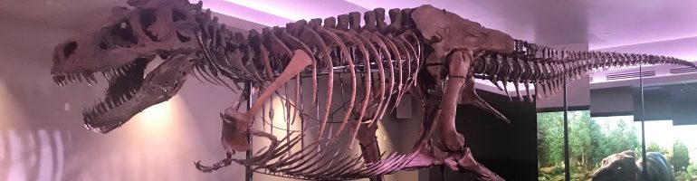
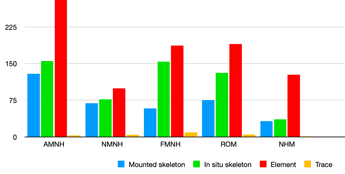
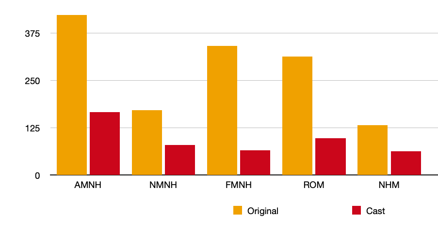
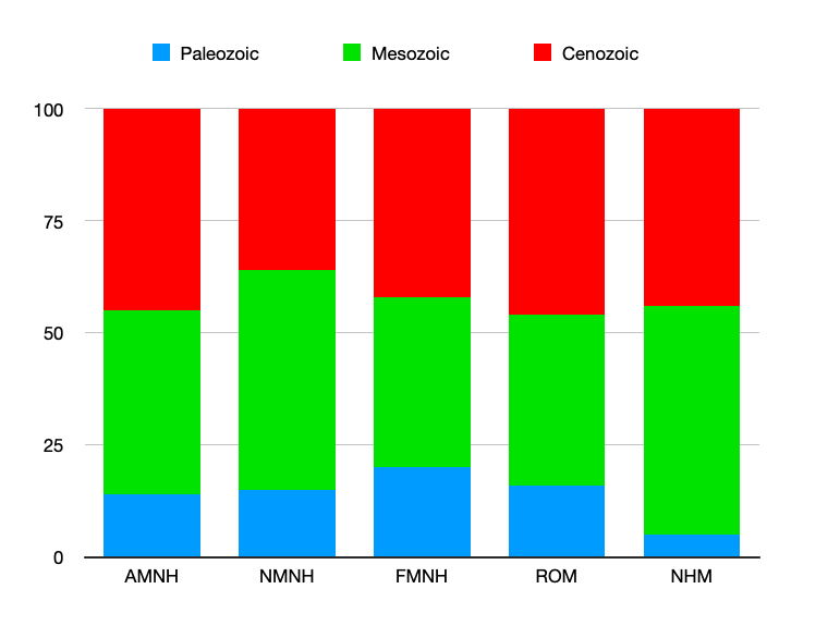
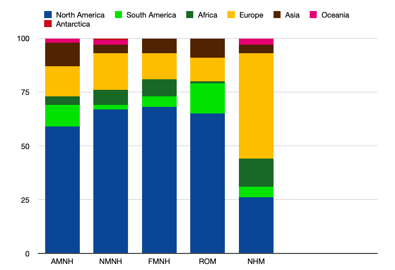

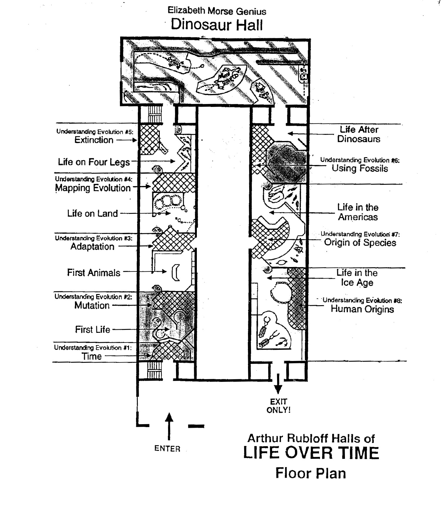


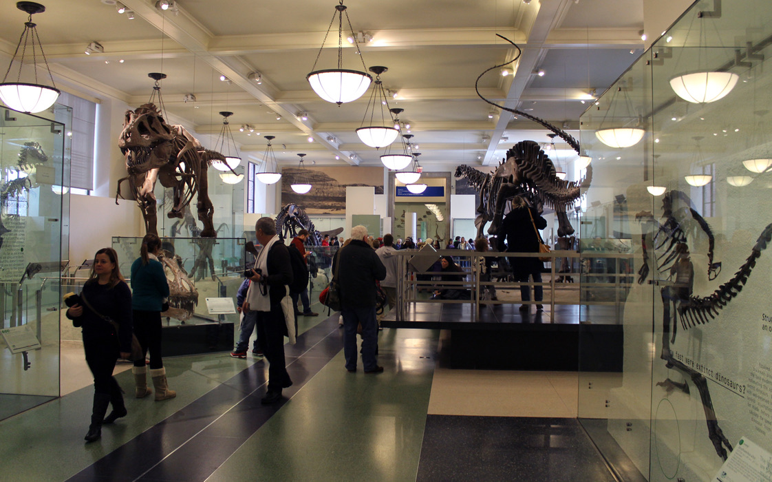

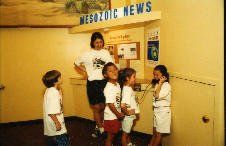
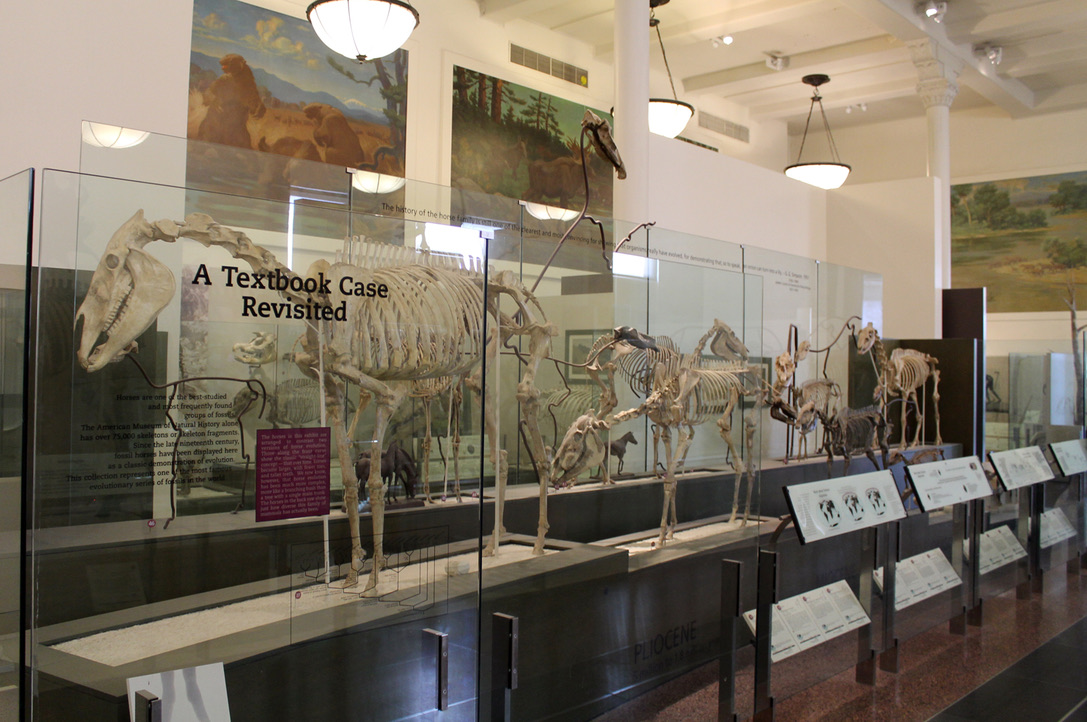
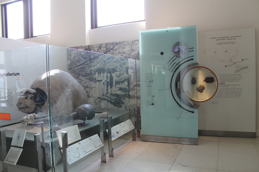
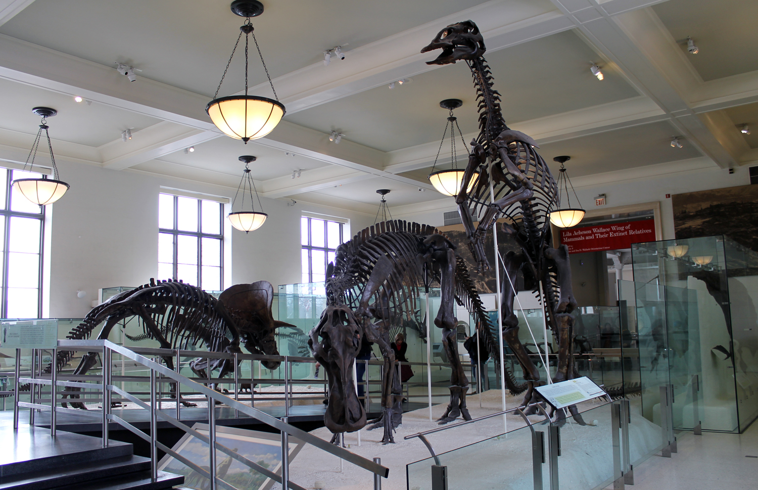
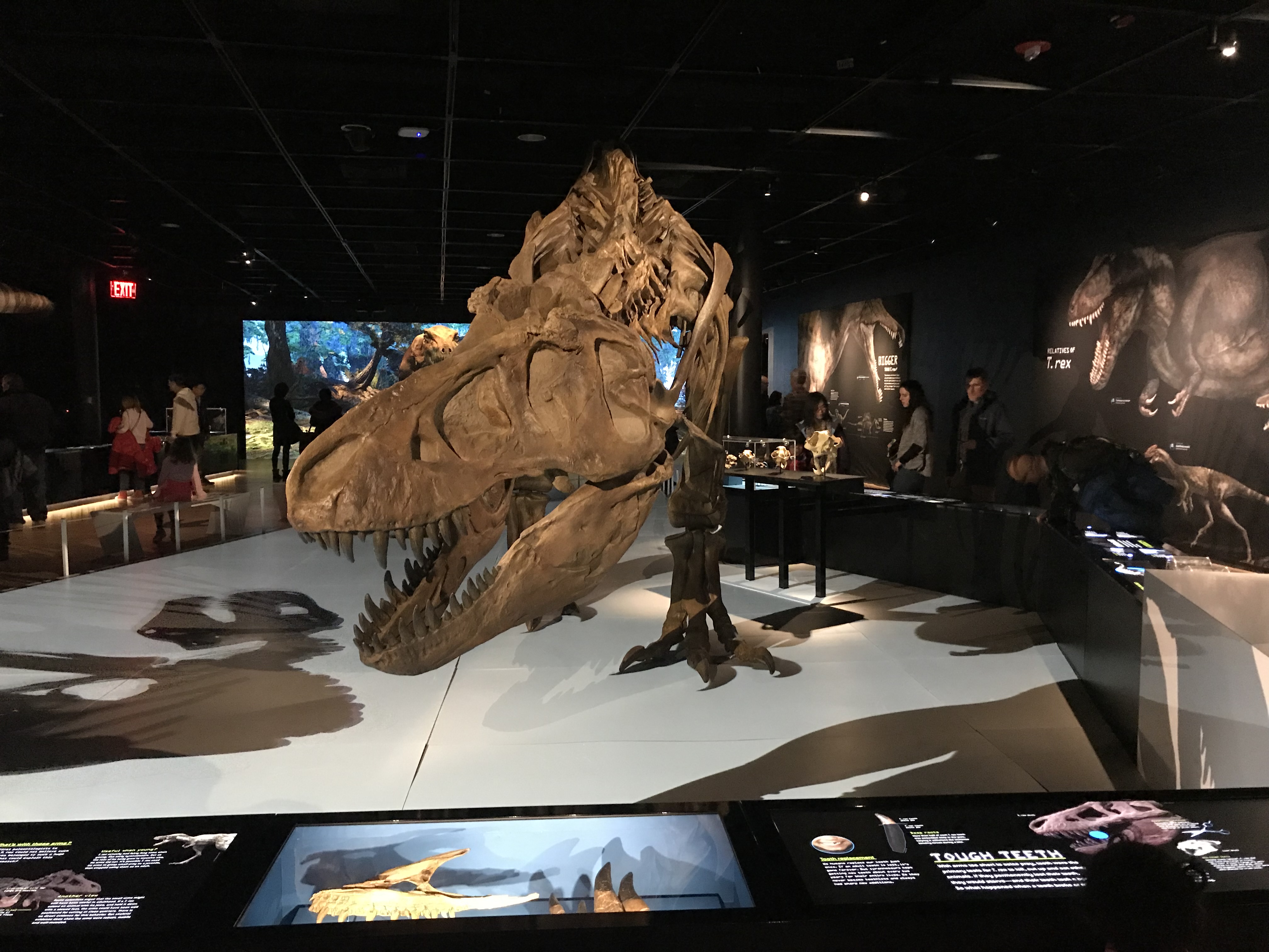
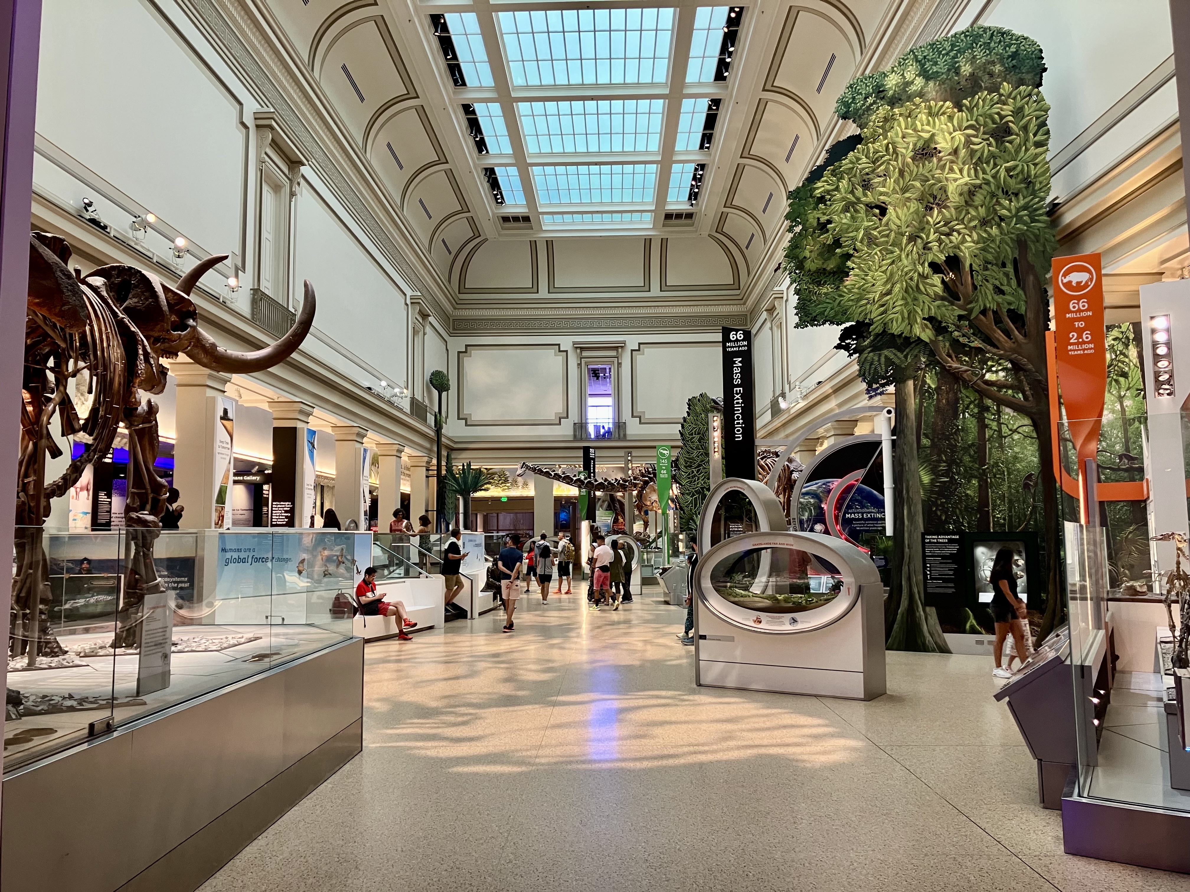
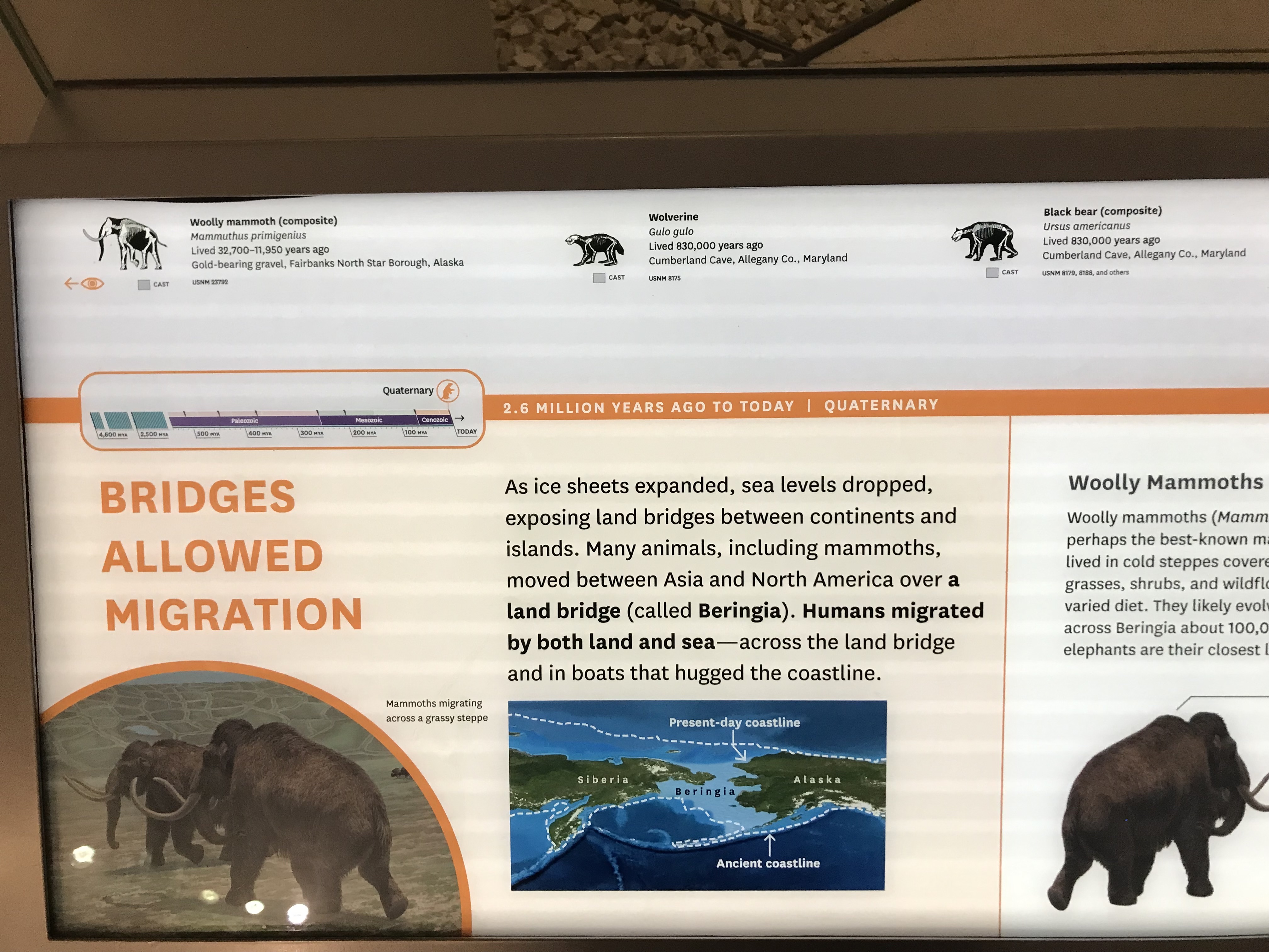
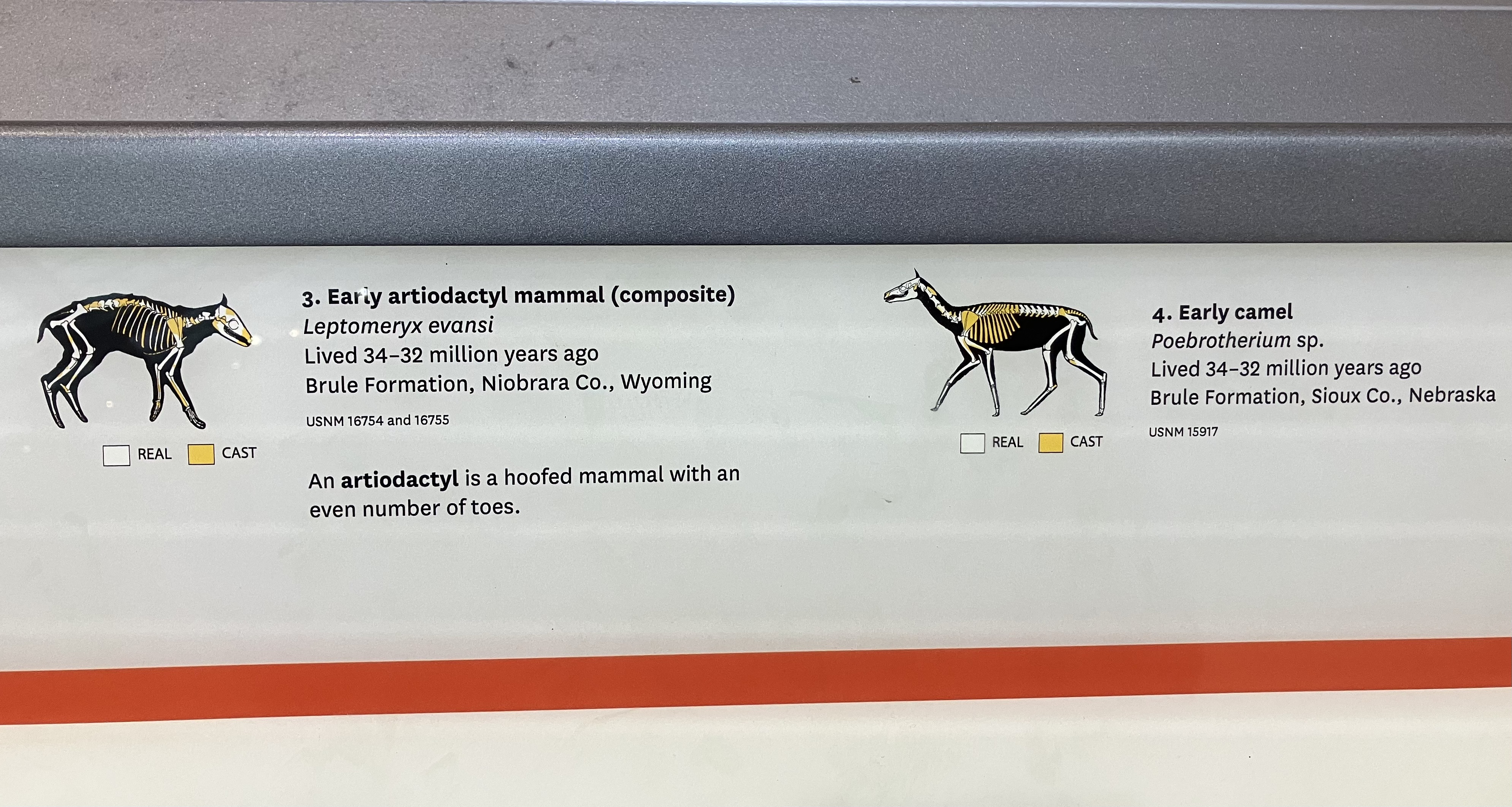
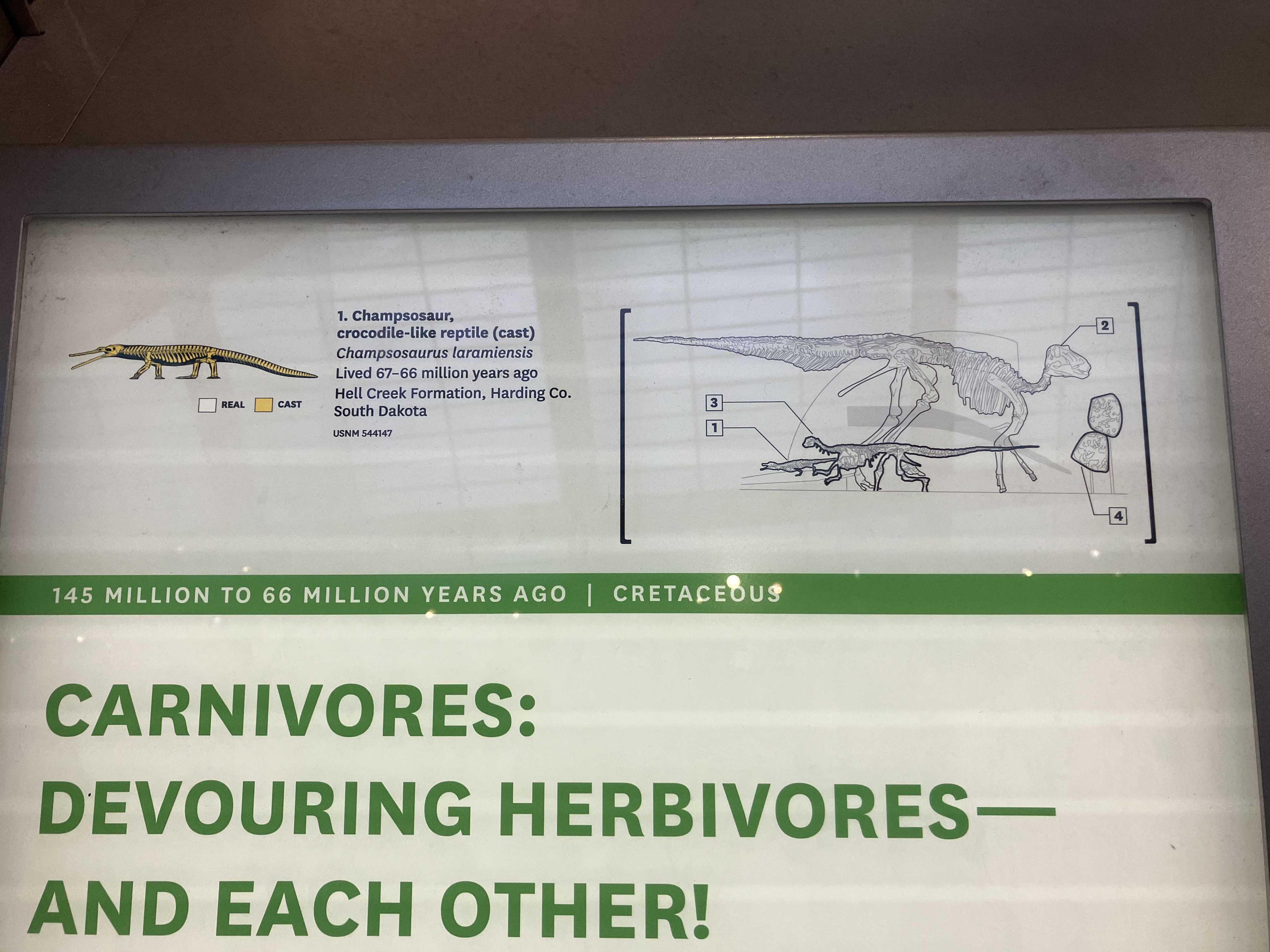


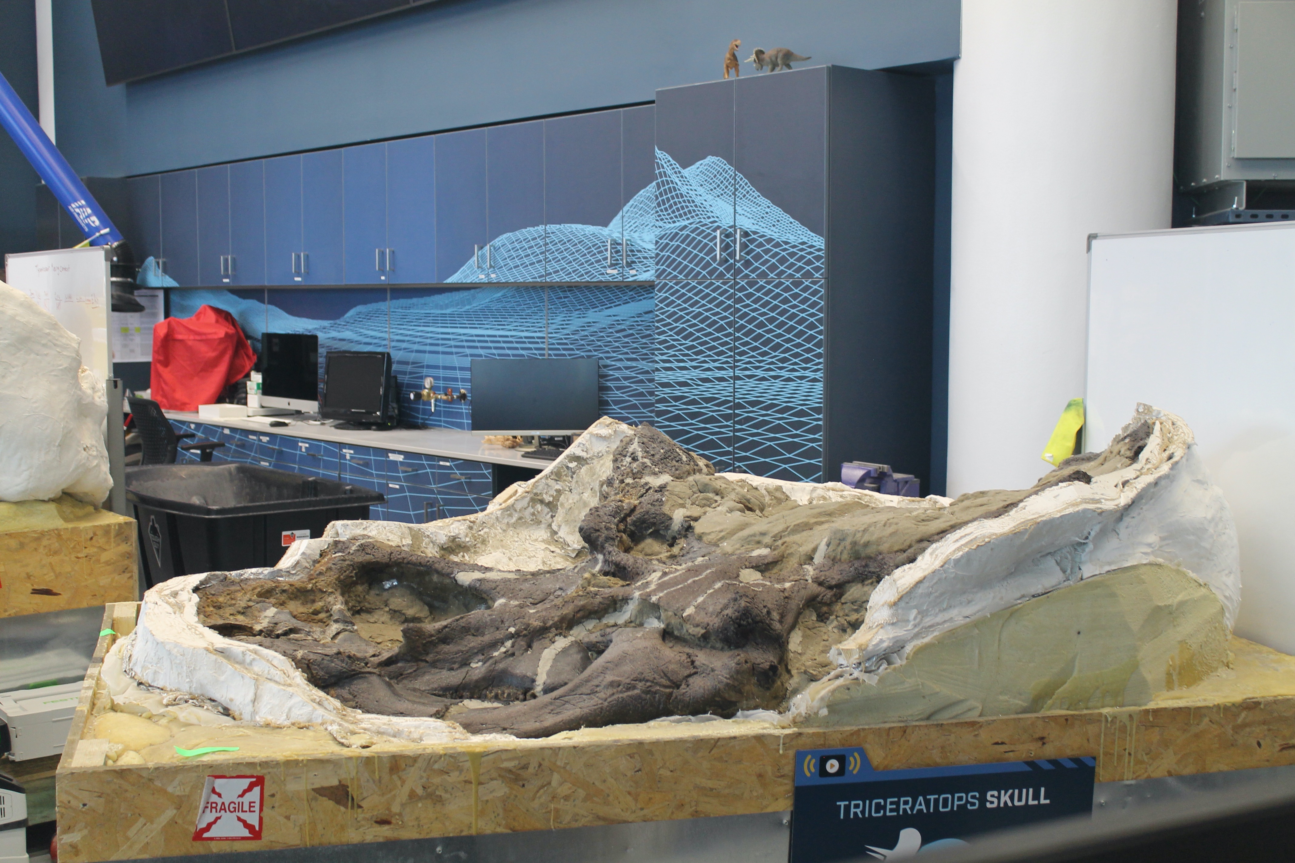
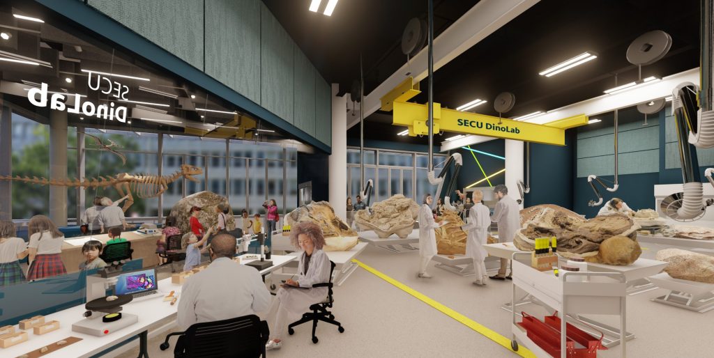
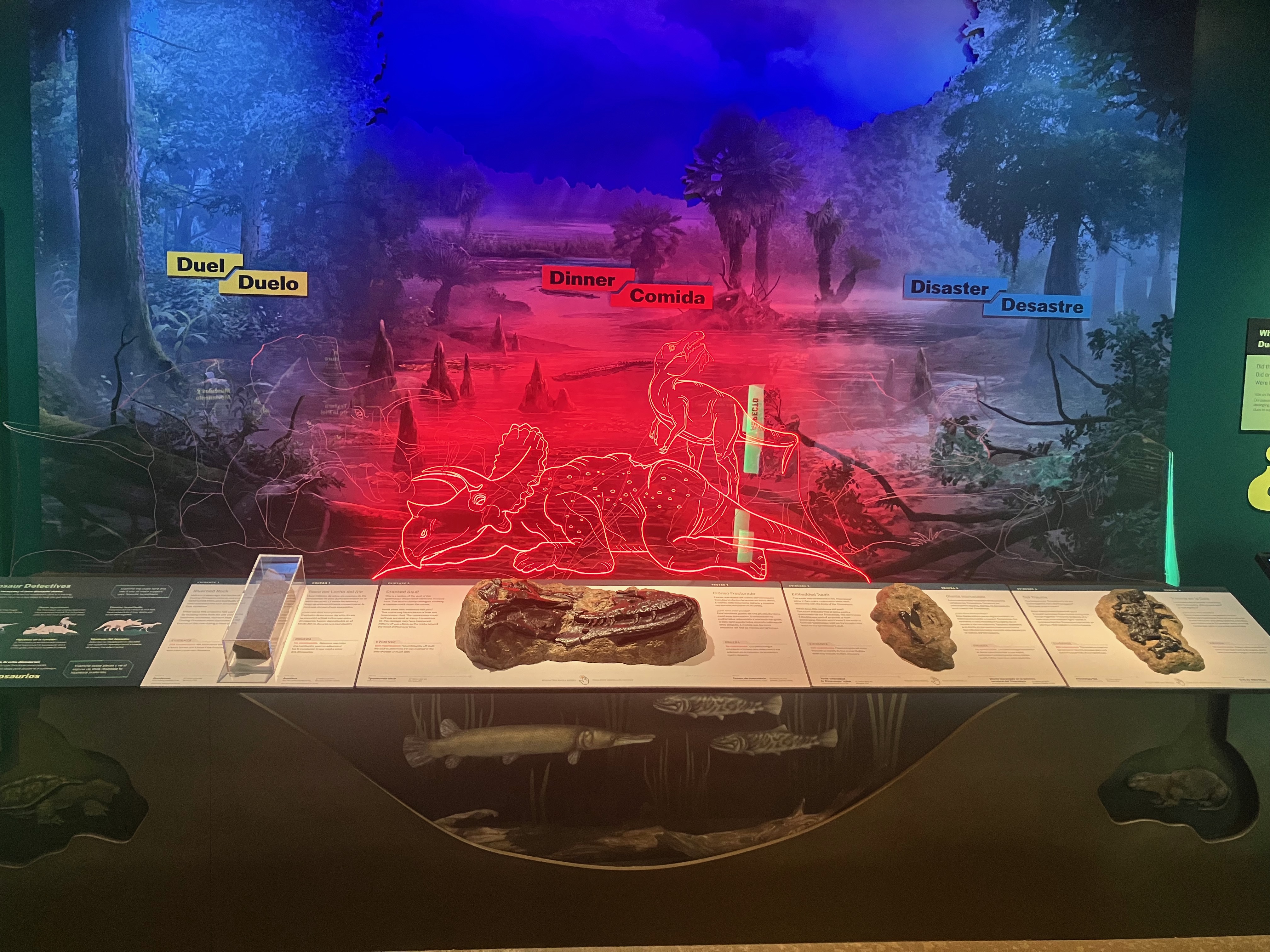

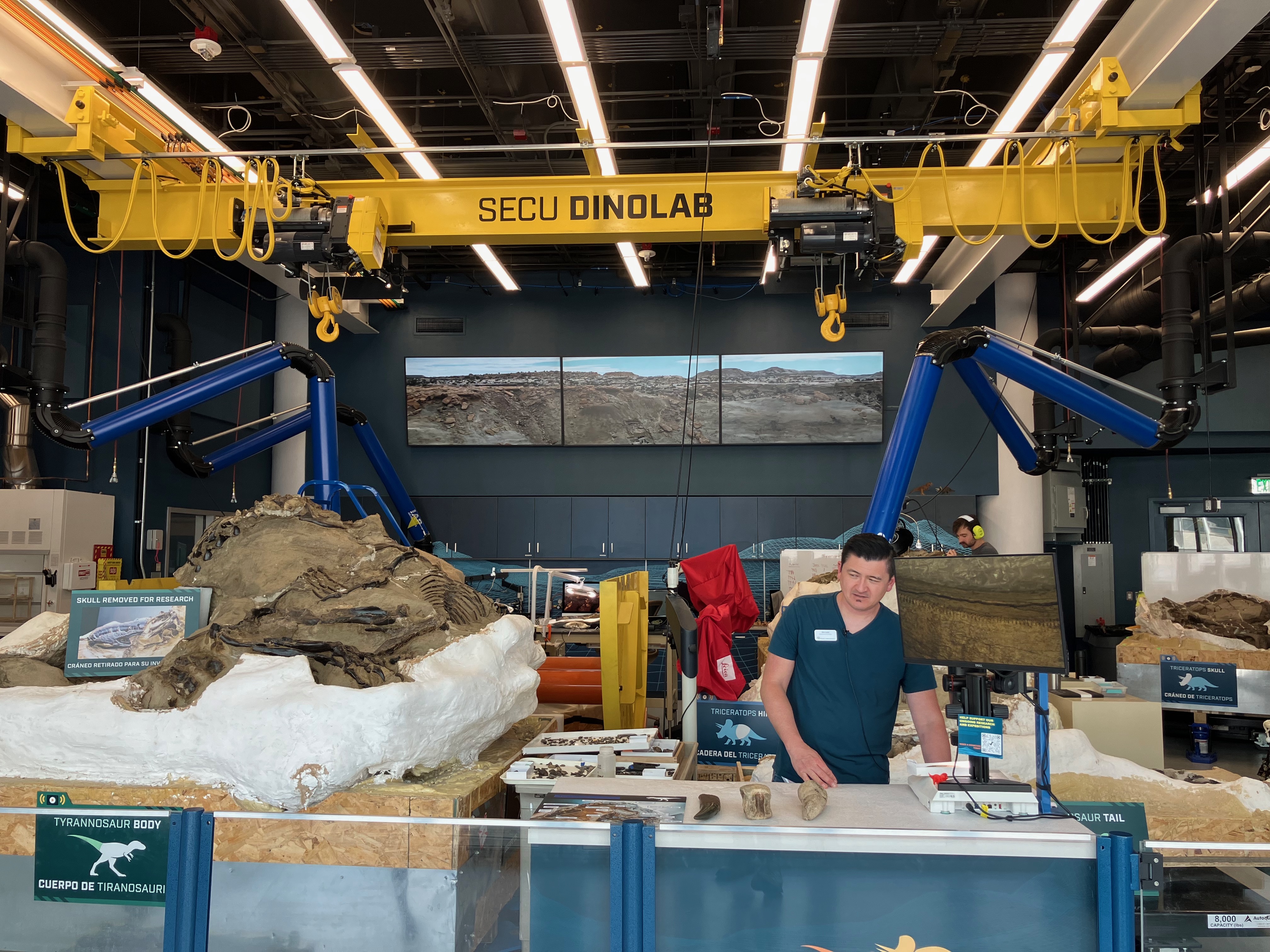


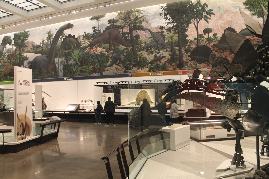
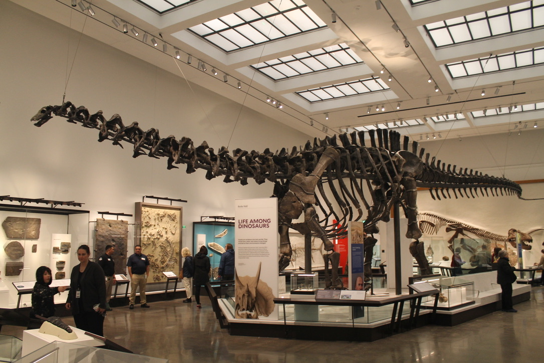
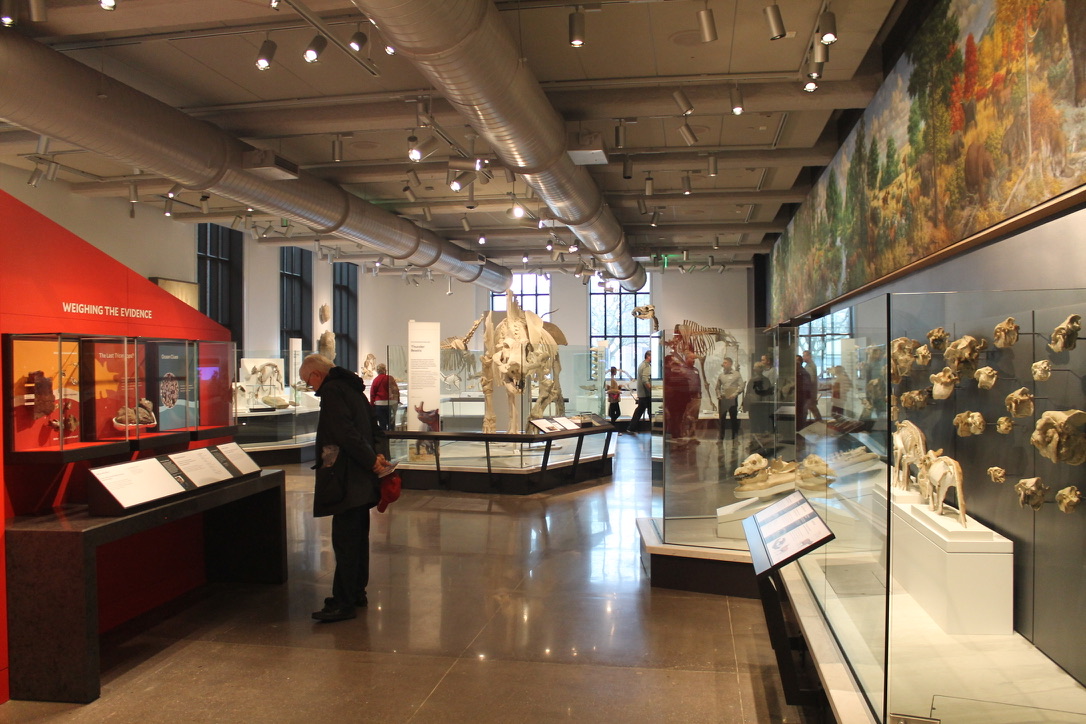


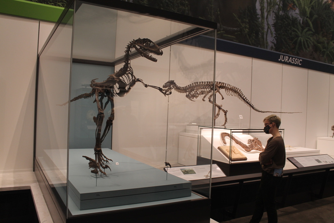


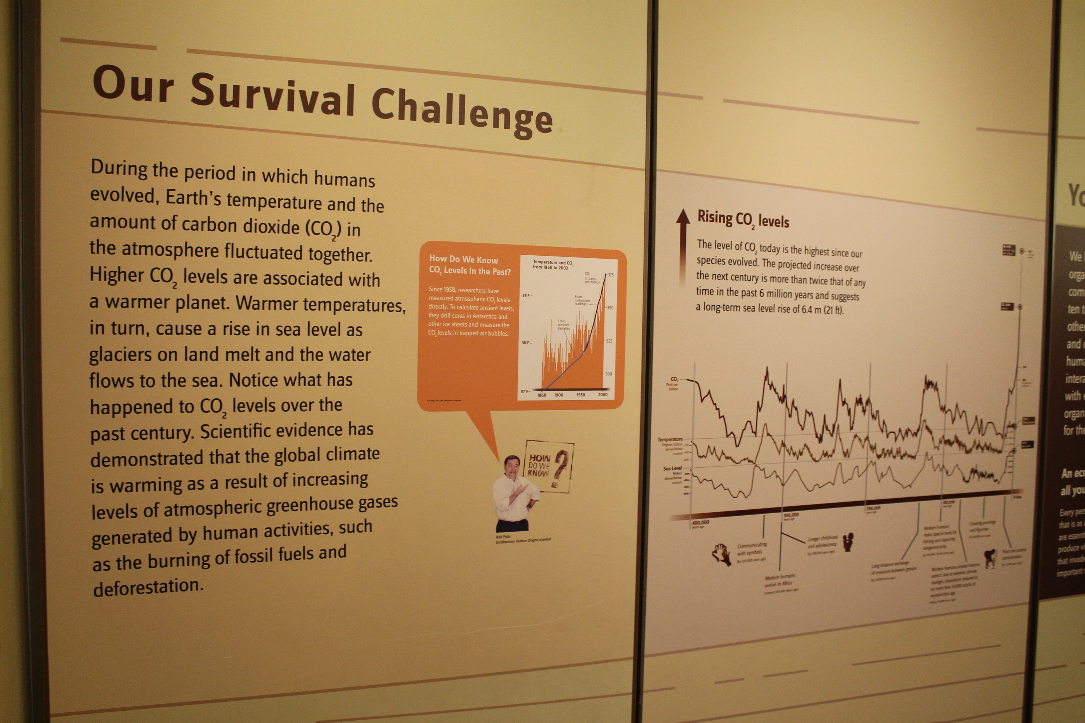
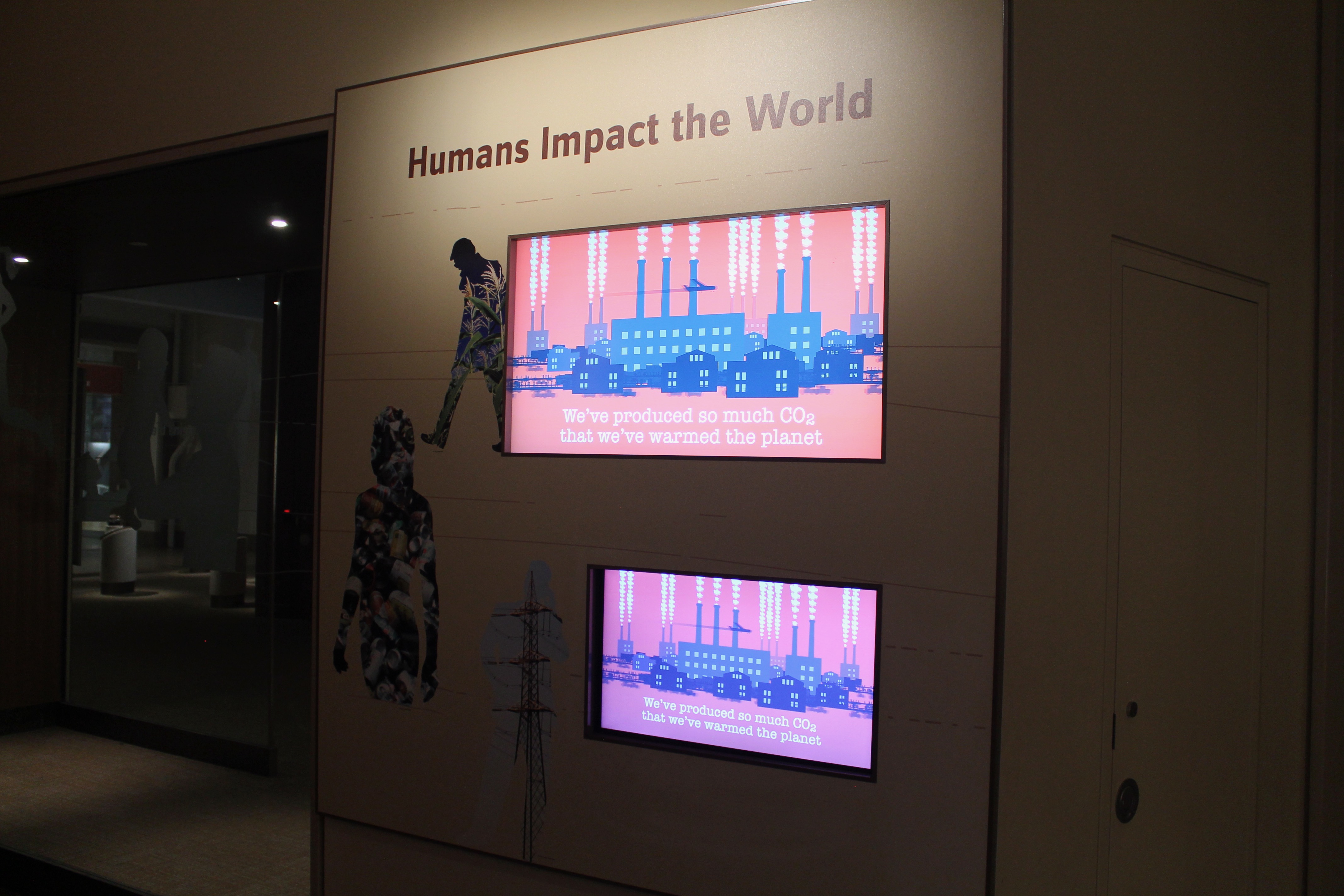
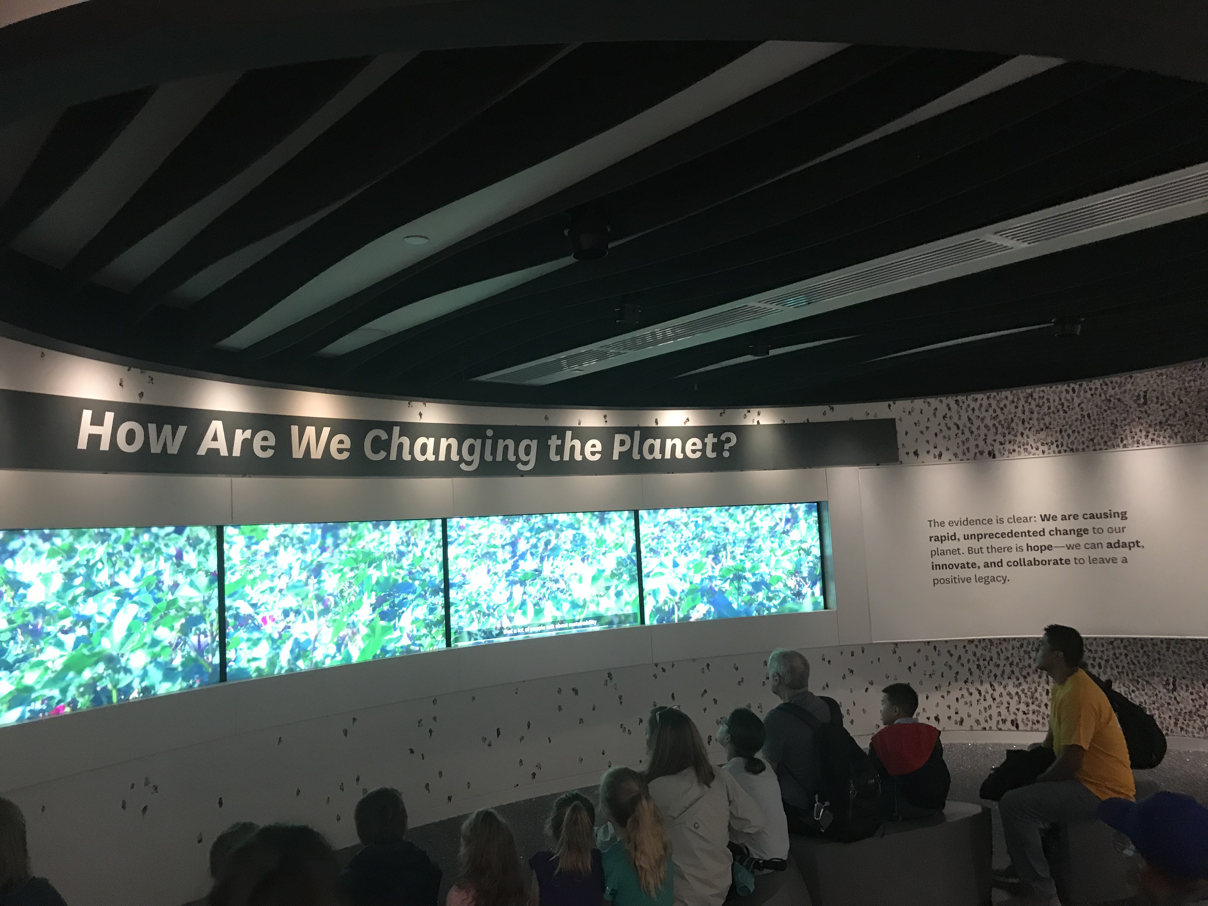


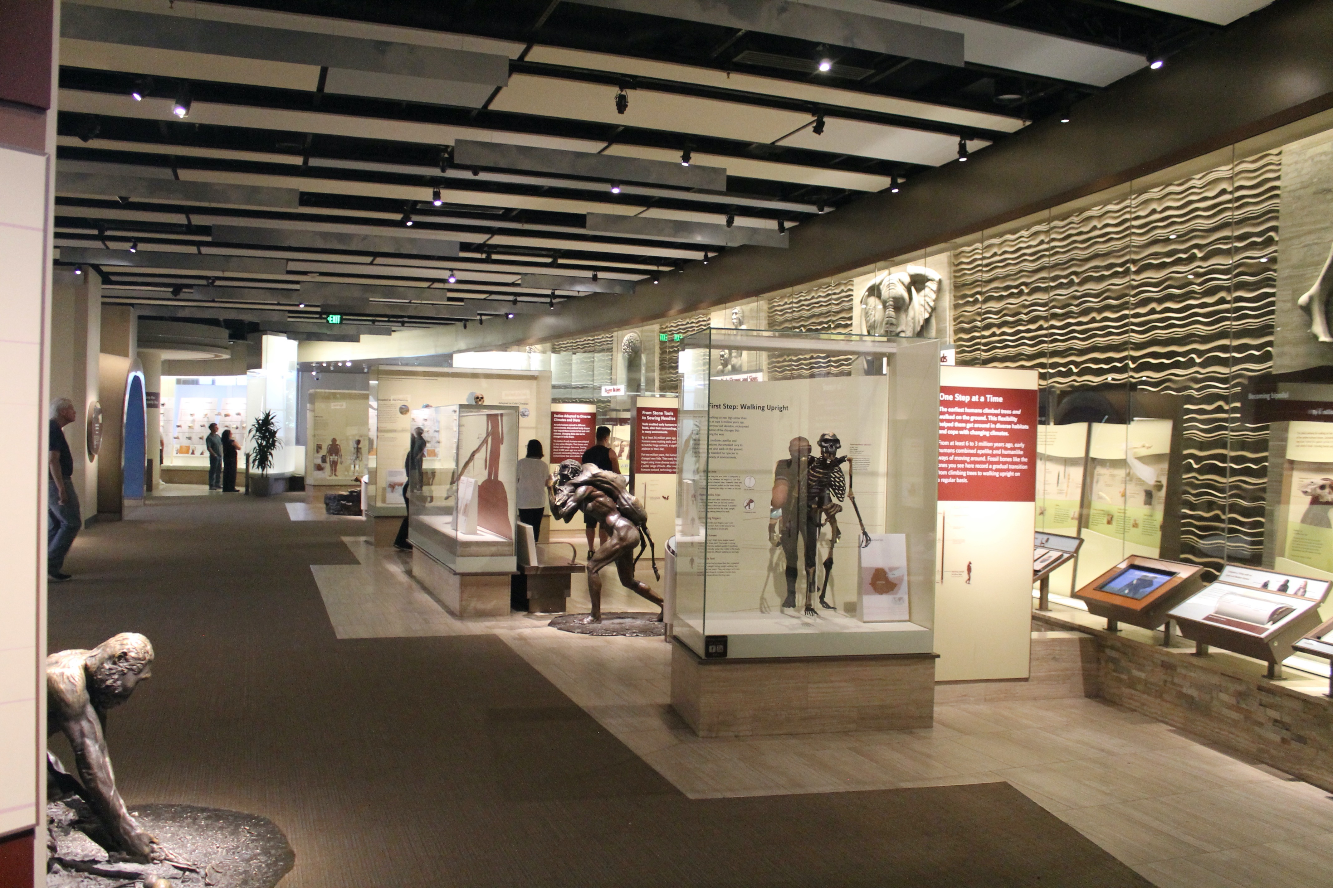


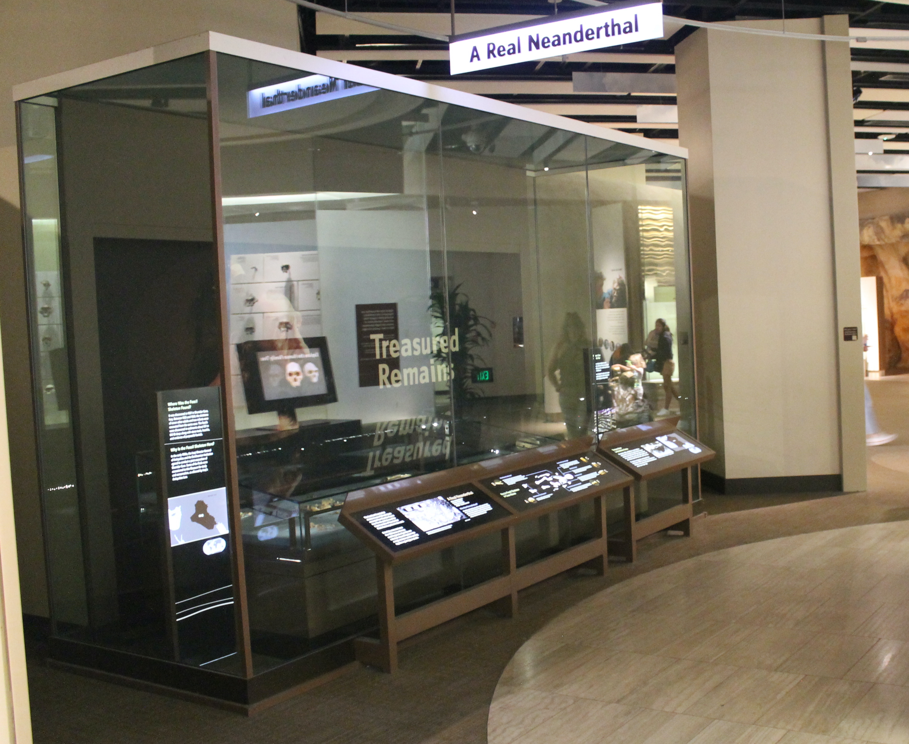

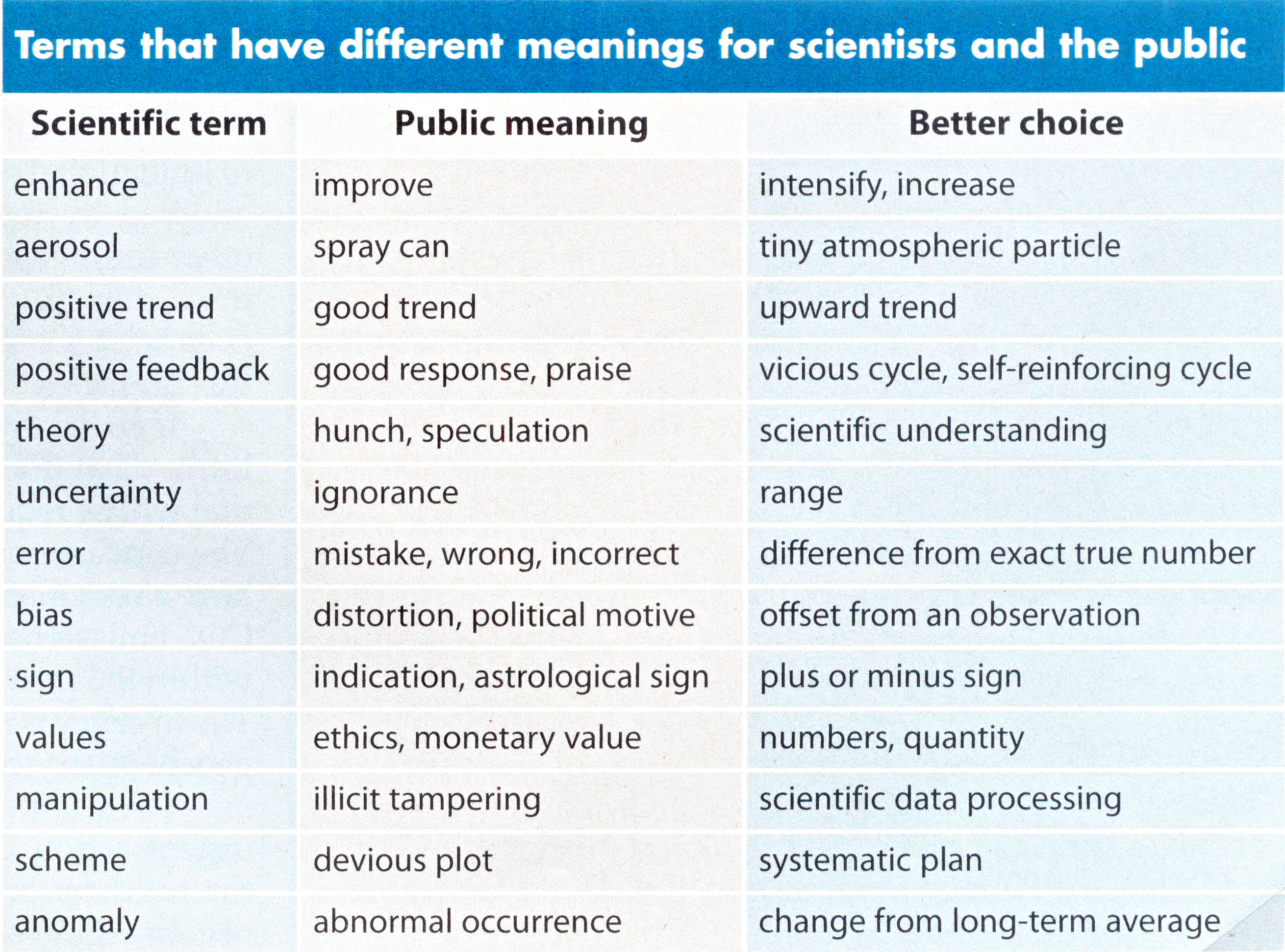


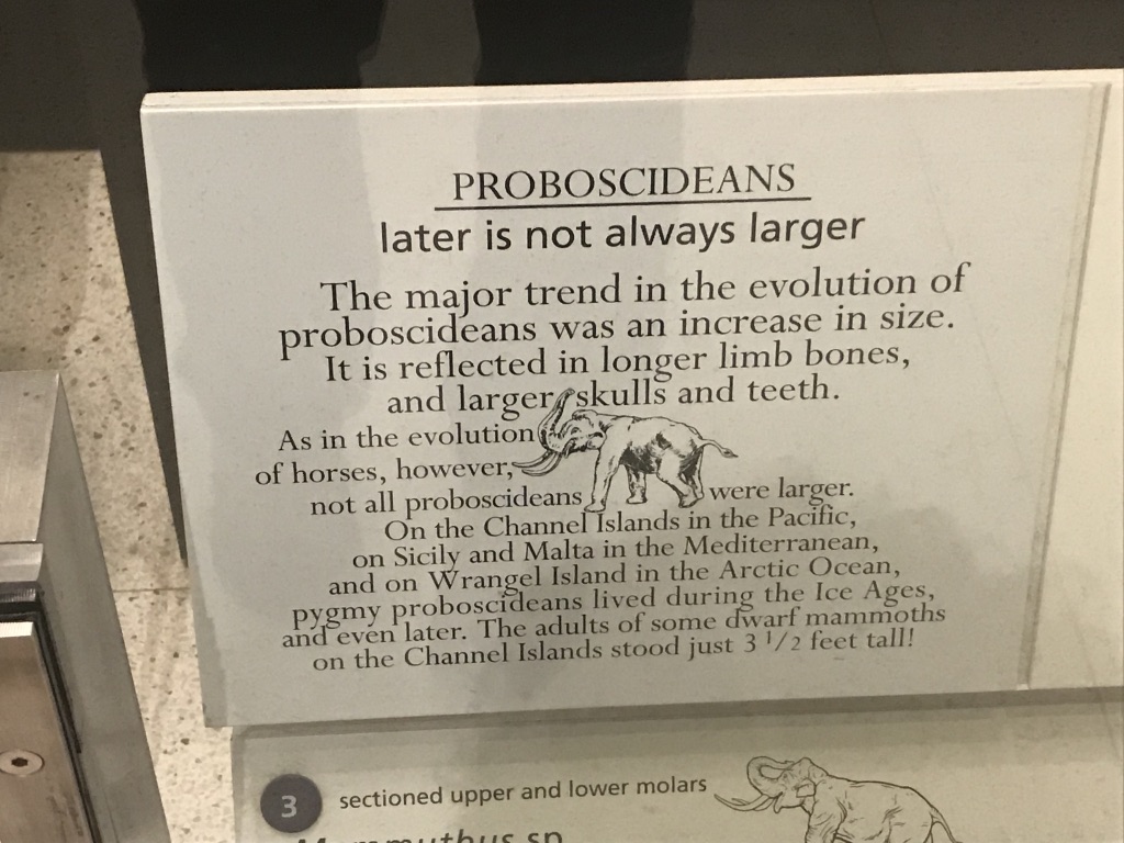
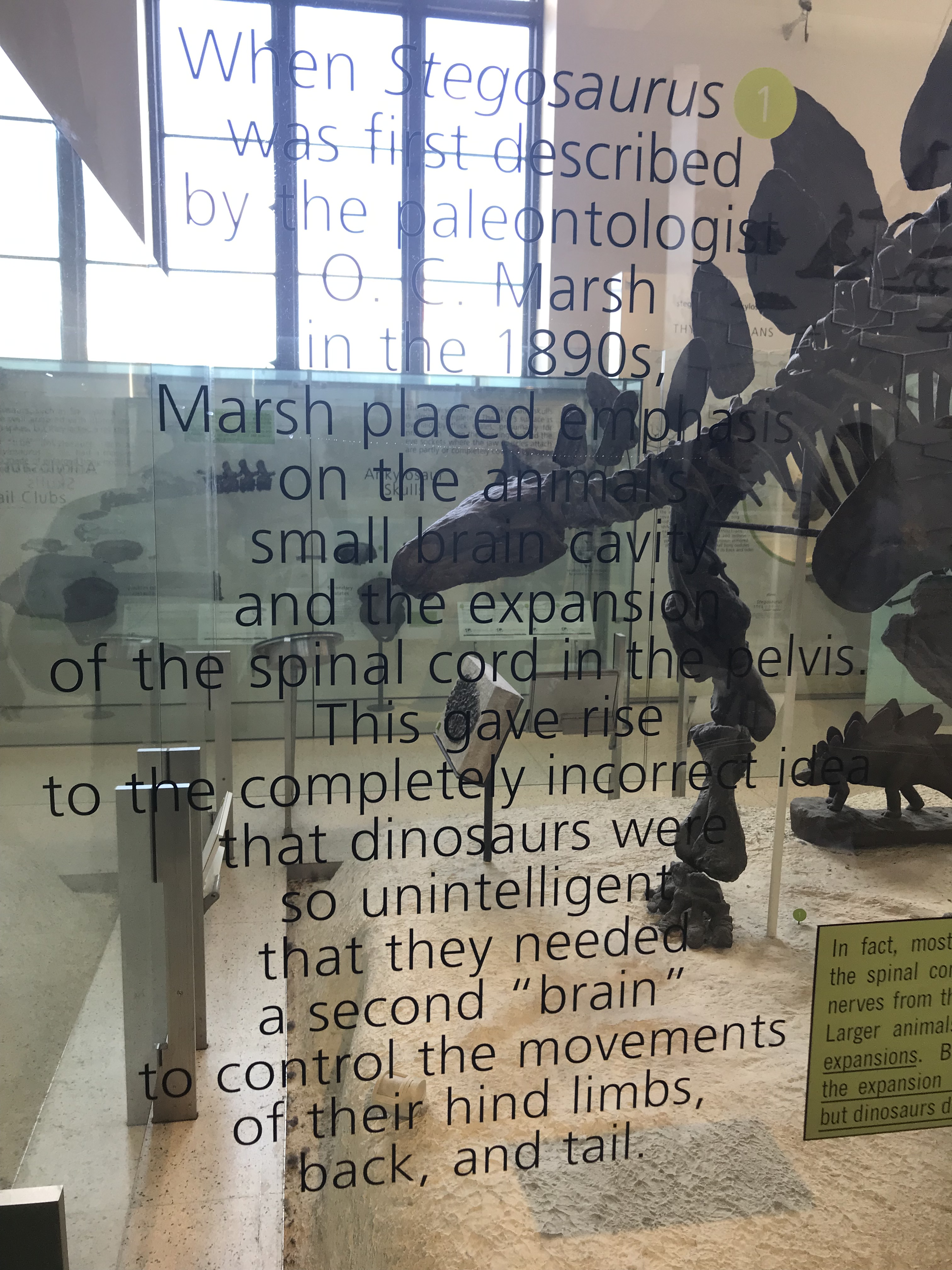
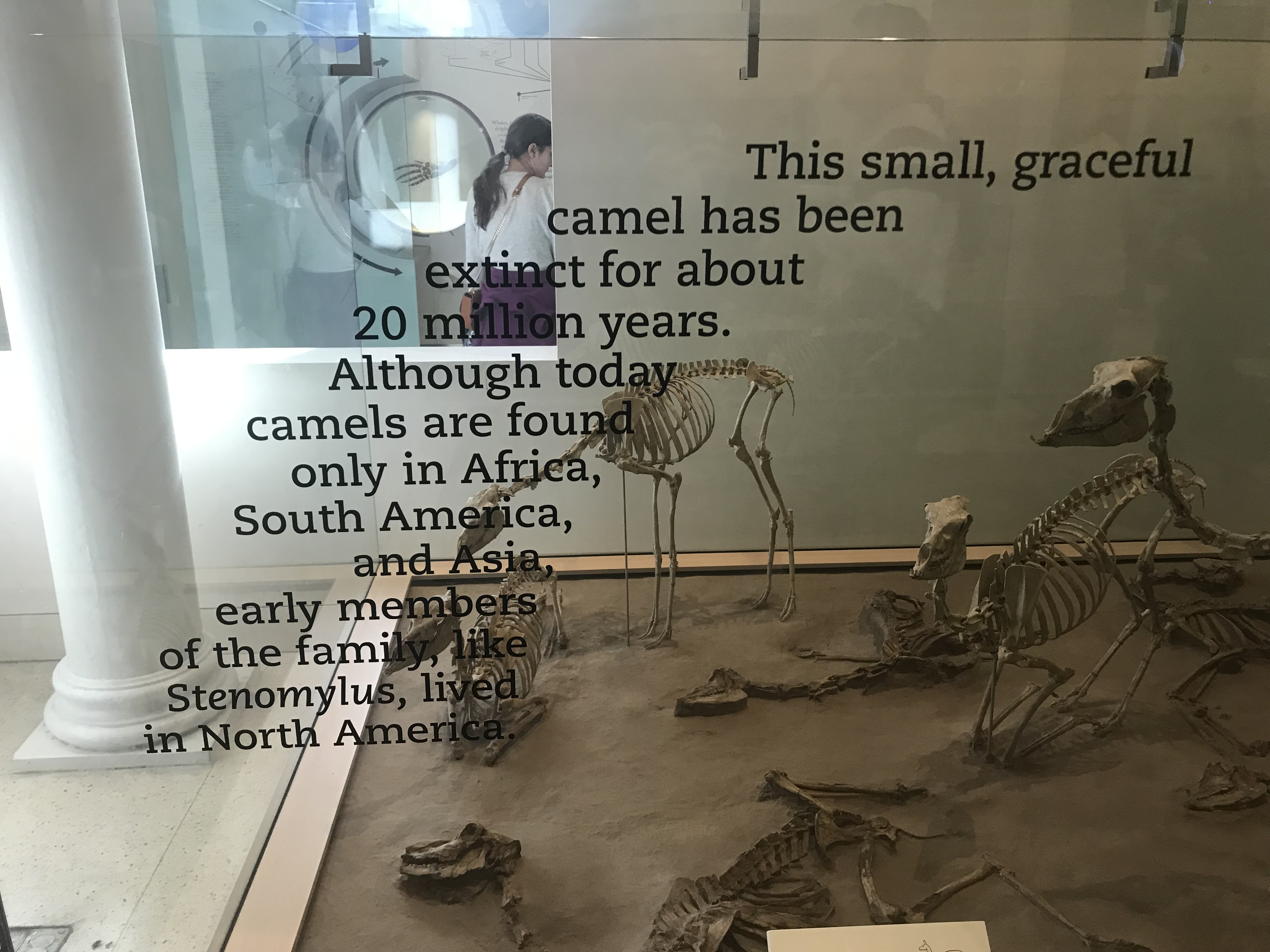