Category Archives: paleoart

Iguanas, Poodles, and Pantodonts

The blog has been quiet this year, and a major reason for that is that my day job has been anything but. So in lieu of discussion about exhibits from decades past, here’s a bit about the decision making that went into some brand new ones that I worked on this year! New, in-depth articles about traditional Extinct Monsters fare are in progress, I promise.

Reptiles Alive

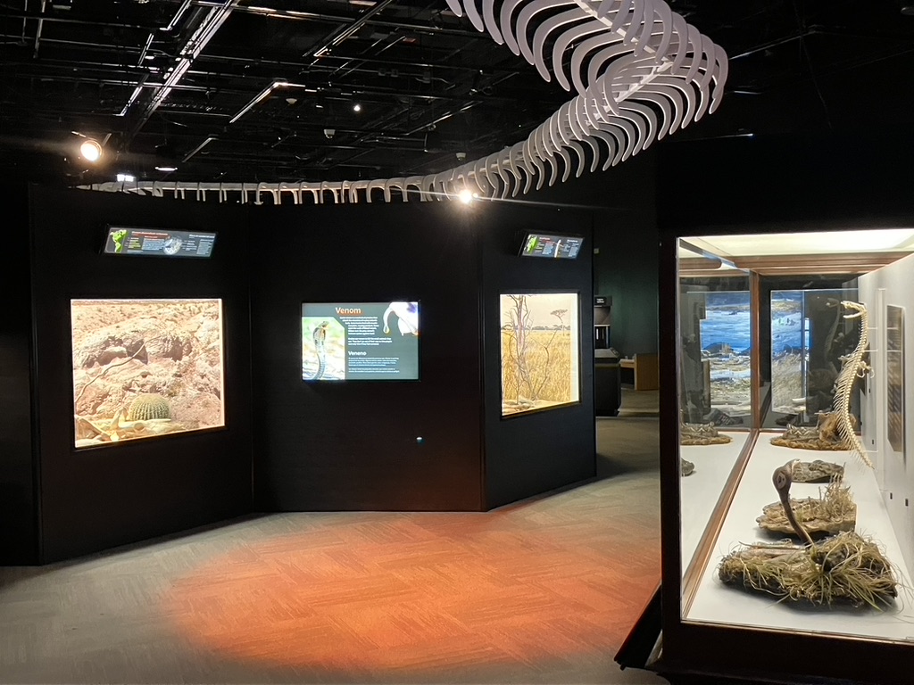
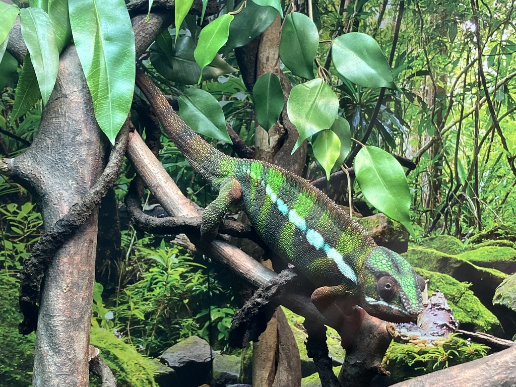
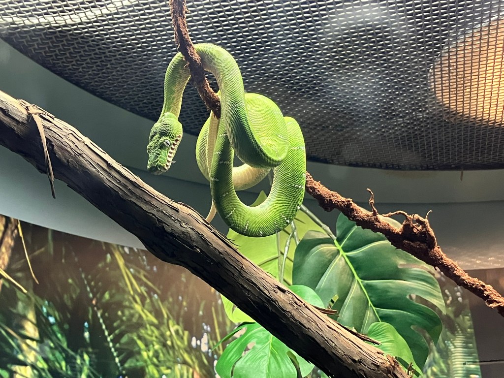
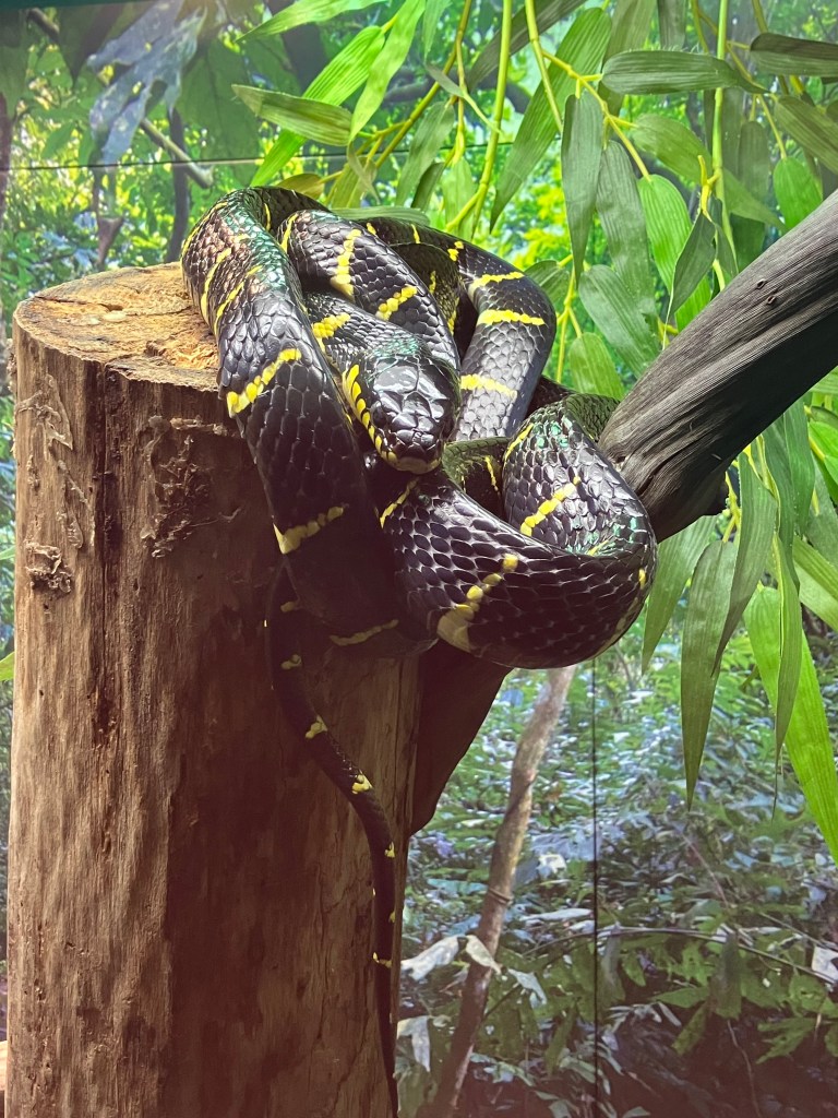
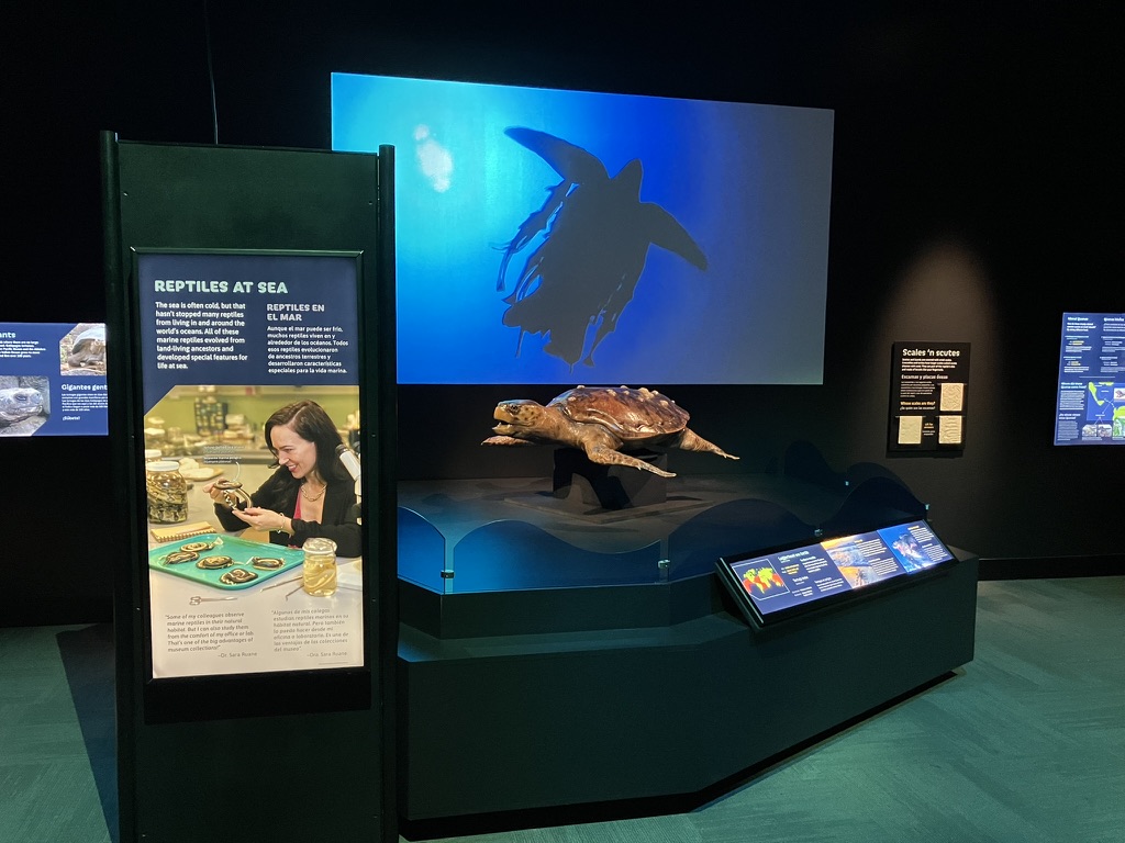
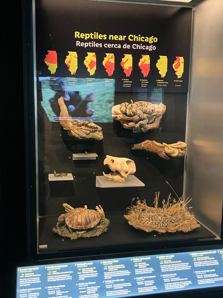
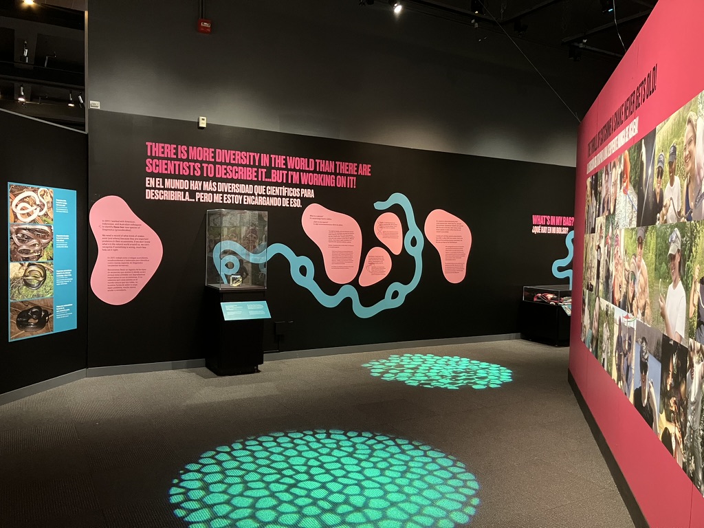
As the title suggests, Reptiles Alive is an exhibition that features live reptiles. This was a collaborative project between the Field Museum and Clyde Peeling’s Reptiland, a zoo in Allenwood, Pennsylvania. Reptiland provided the animals, their enclosures, and their human caretakers, while we designed and built a full-sized exhibition around them. I wrote and developed the new material alongside Associate Curator of Herpetology Sara Ruane.

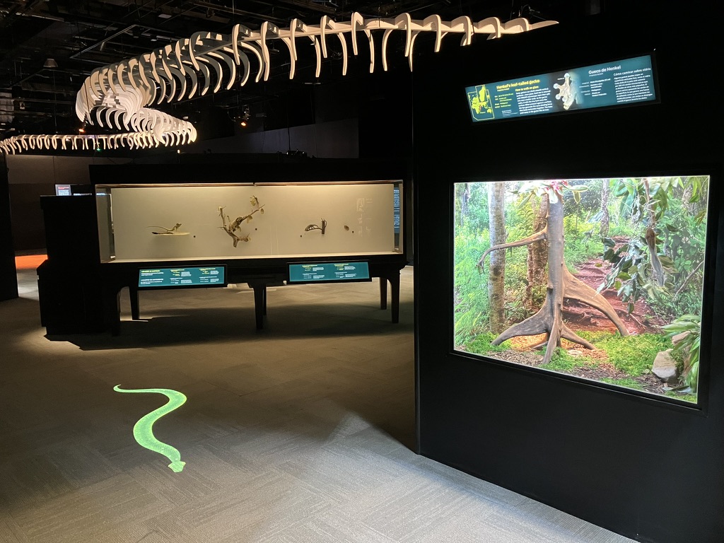
Reptiles Alive is straightforwardly about getting people excited to see and learn about incredible animals. Often, an exhibition calls for a grand narrative or lofty learning goals, but I thought the best approach for this one was to simply follow the “rule of cool.” Does a fact or image or display idea make people say, “wow, that’s amazing?” Then it it belongs in the show. Sometimes “because it rules” is a perfectly valid reason to do something—that’s why we have a 110-foot black mamba skeleton hanging from the ceiling.

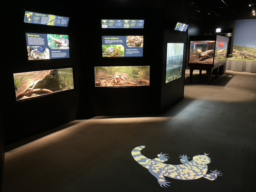
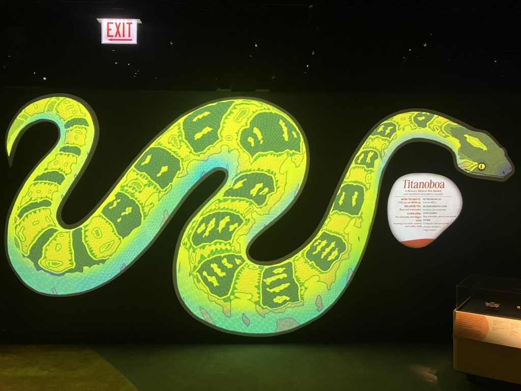
Reptiles Alive is organized Planet Earth-style. Each section features a biome type, but isn’t constrained to a particular part of the world. This allowed us to have some fun with the design and create unique soundtracks and lighting for each area: baking sunlight radiates over the desert section while animated snakes slither across the floor in the tropics.

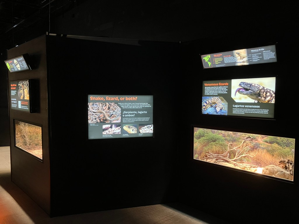
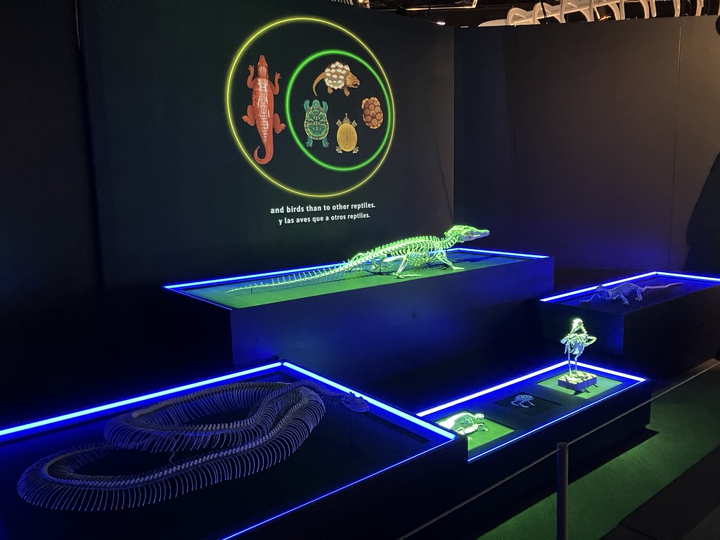
The other benefit of the biome-based organization is that we didn’t have to get bogged down with phylogeny in every label. Reptile classification is full of nested categories and apparent contradictions: for example, a snake is a kind of lizard, but there are are also legless lizards that aren’t snakes. Rather than distracting visitors with constant definitions and explanations, we opted to move the entire classification discussion to a single, prominent “object theater” near the exhibition’s entrance. Spotlights shine on mounted skeletons in different combinations as a narrator walks visitors through the main reptile groups and how to recognize them, while also clarifying that amphibians are not reptiles (but birds are). In under two minutes, visitors gain a shared vocabulary they can use as they explore the rest of the exhibition.

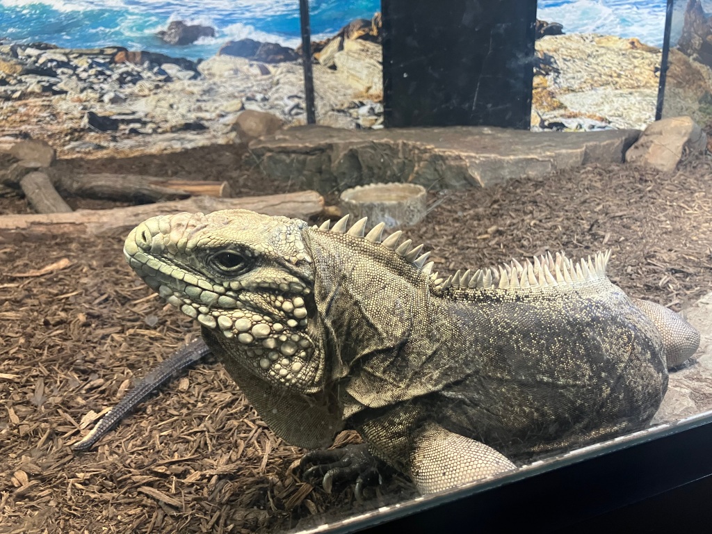
Naturally, the live animals are the stars of the show. Gwangi, a 38-year-old, puppy-tame Cuban rock iguana, is my favorite, but it’s also a lot of fun watching the European glass lizard dig in and out of his bedding, or seeing the reticulated python splash around in the water. We also made use of the museum’s collection of spectacularly life-like model reptiles from the early 20th century, and commissioned a few new ones as well. The models introduce visitors to creatures they might never have heard of, as well as one with a role in Field Museum lore.

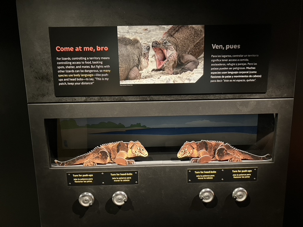
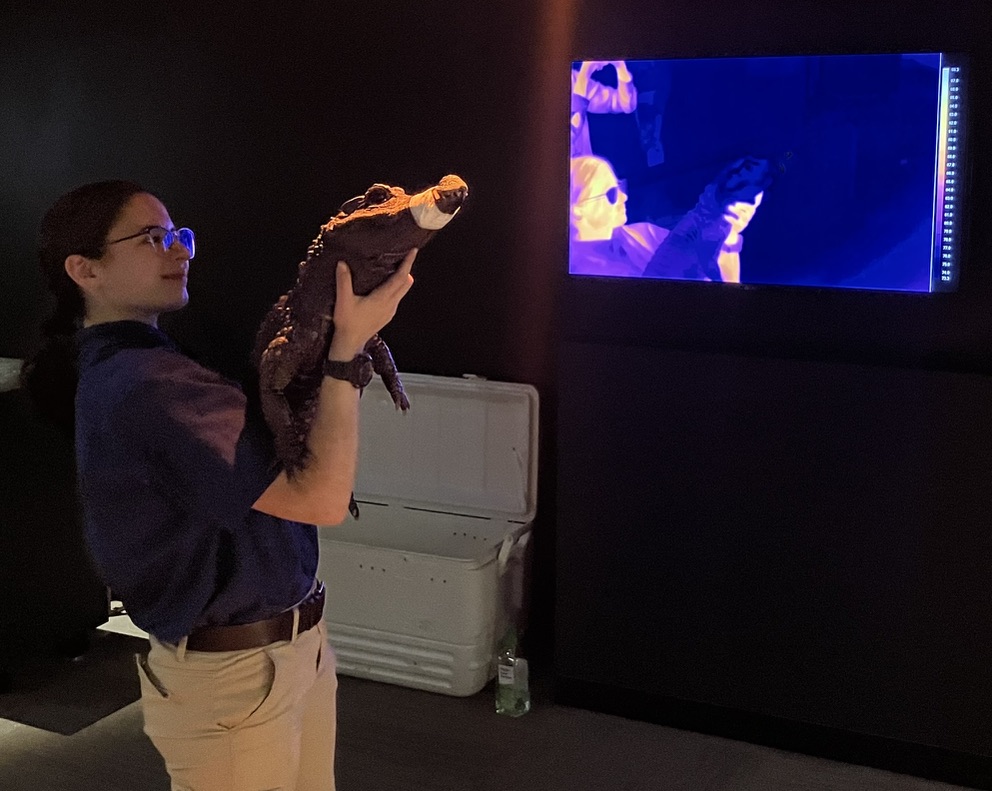
There are no touchscreens in Reptiles Alive. Instead, we went all-in on simple, tactile interactives. Whether you’re puppeteering a pair of iguanas to demonstrate lizard body language or testing your puny human strength against the bite force of a Nile crocodile, the action being performed always directly illustrates the concept under discussion. The fanciest piece of hardware in the exhibition is a thermal camera. It’s one thing to tell visitors that reptiles are cold-blooded, but it’s quite another to see the zookeeper hold a room-temperature snake up to the camera. The human glows orange while the snake matches the blues and purples of the space around it.

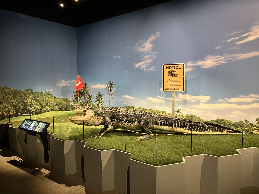
The final display originated as a joke. We wanted to make a big diorama, but detailed botanical models are just about the most expensive and time-consuming thing you can make. Thinking about reptile habitats without much vegetation, I glibly offered that we could recreate the “gator on a golf course” scene from Happy Gilmore. But we soon realized that was the perfect ending for our exhibition: draining swampland to build golf courses is an example of how humans are invading reptile habitats. That means we’re going to encounter reptiles more often, and we’ll need to learn to live alongside them. Hopefully, visitors that came in fearing reptiles will leave with respect and admiration for them.

Reptiles Alive runs until April 2026.
Changing Face of Science: Sara Ruane

In 2022, the Field Museum launched The Changing Face of Science, a series of exhibitions that profile scientists affiliated with the museum who are women or people of color. The series is intended to inspire young visitors and show how how diverse perspectives and backgrounds can contribute to science.

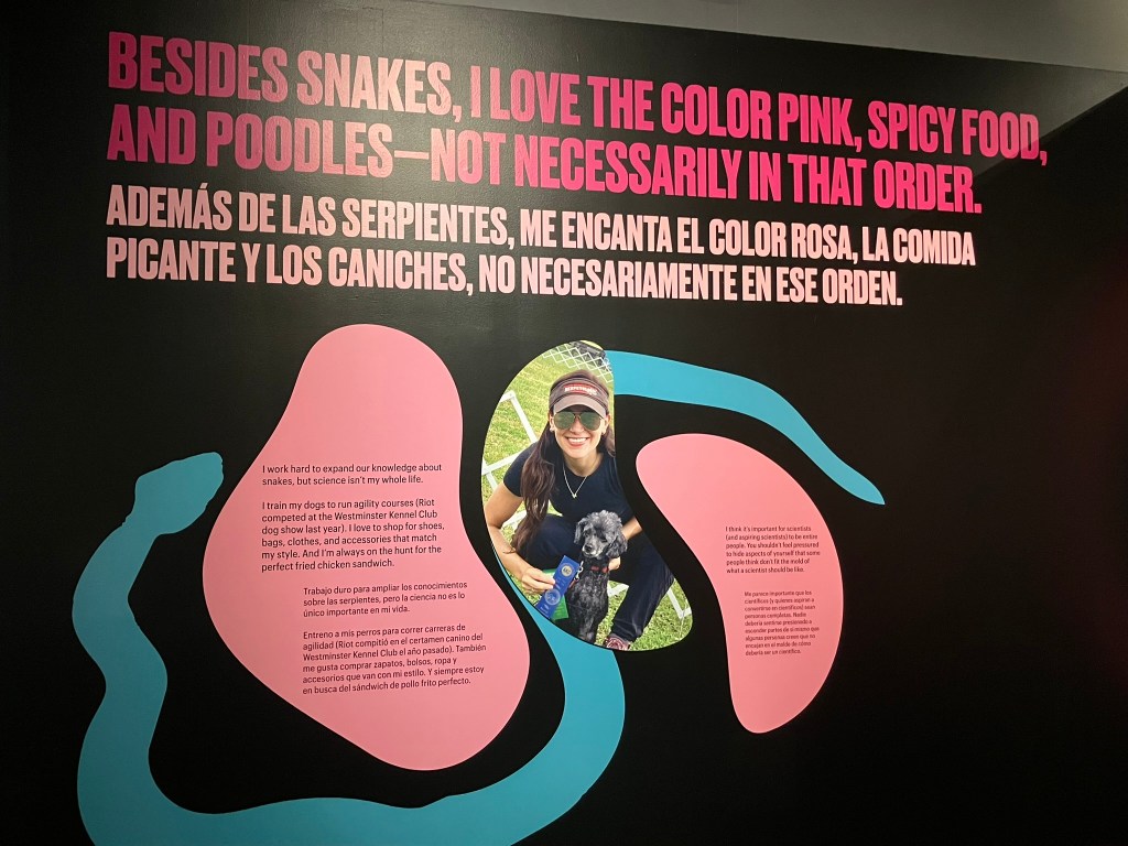
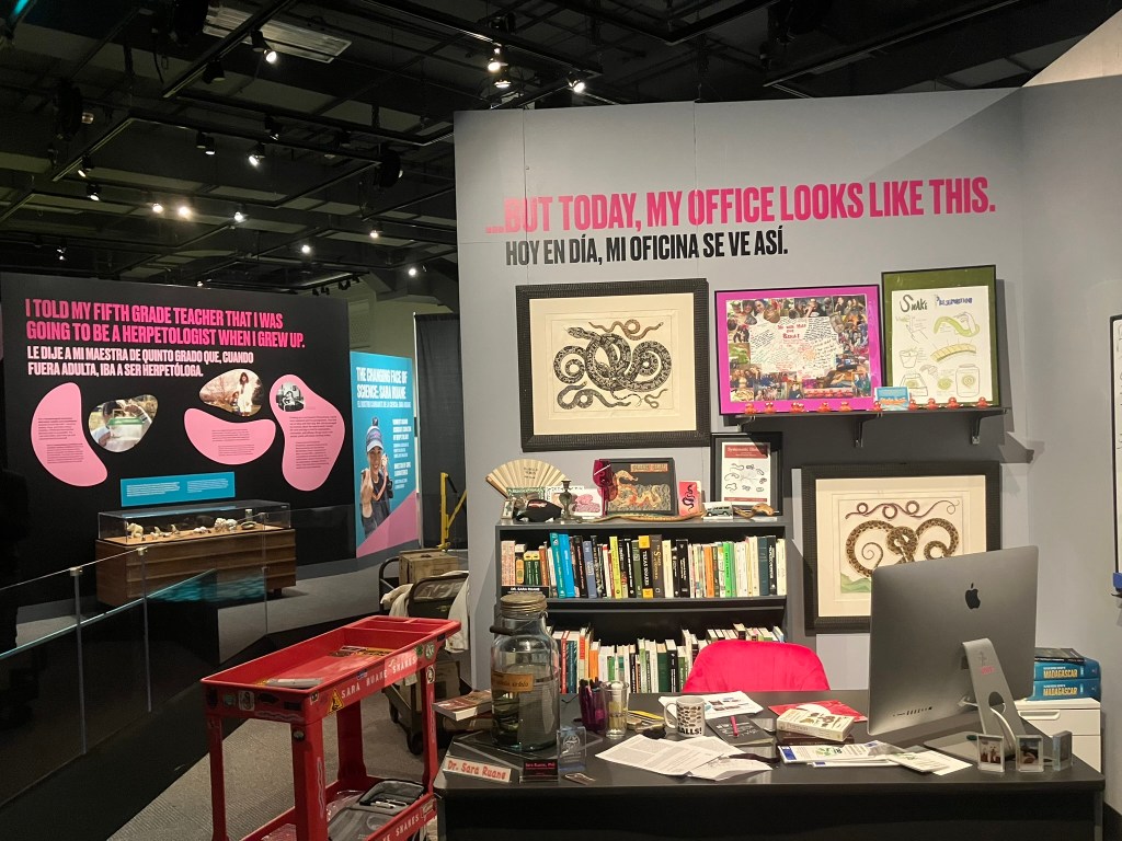
The latest entry in the series features aforementioned herpetology curator Sara Ruane. Sara studies the diversity and evolution of snakes, and has been fascinated by reptiles from a young age. However, Sara also wanted the exhibition to communicate that being a scientist is only part of who she is. Sara loves training her toy poodles, shopping for designer bags, and curating her unique fashion sense—you can be a great scientist while also being a complete person.

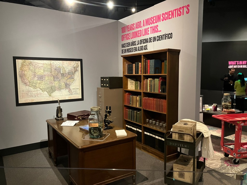
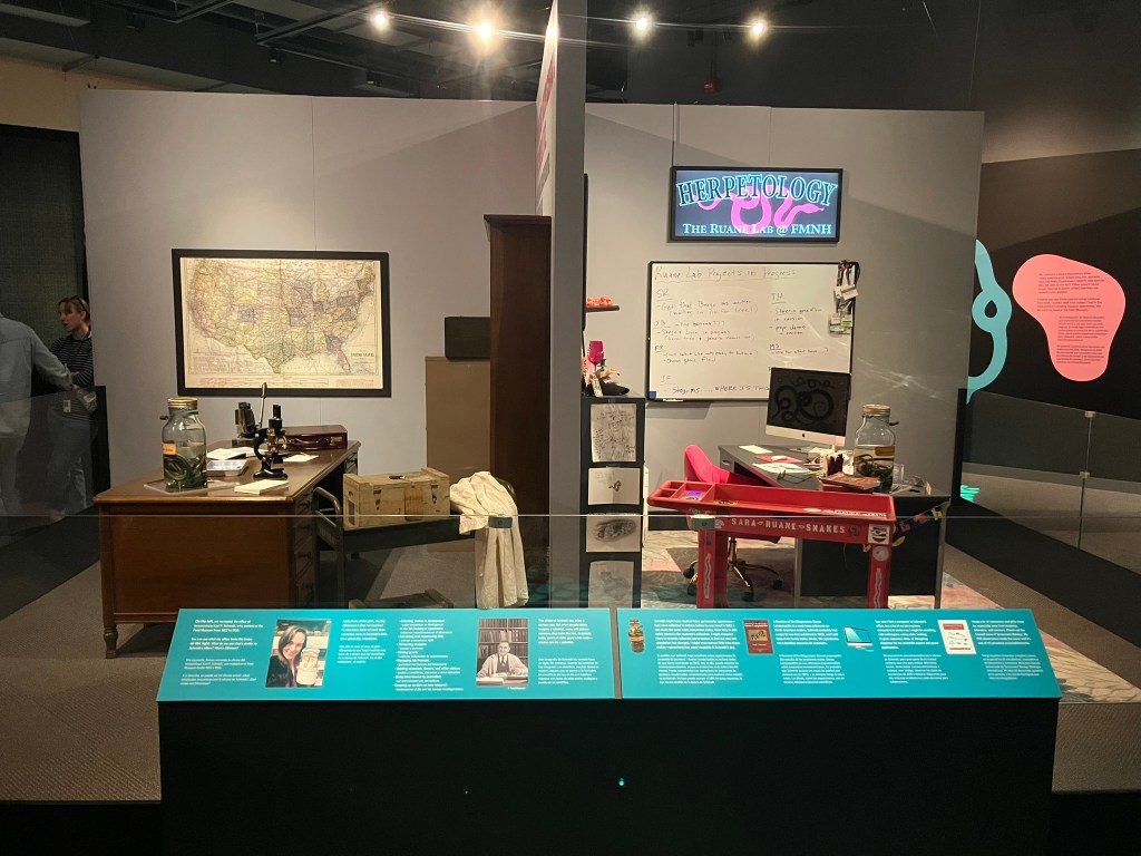
Displays include a recreation of a tabletop “museum” (that Sara made for her family at age six) and the contents of her fieldwork bag (which include everything from a Leatherman multitool to lipgloss). The centerpiece is a pair of office dioramas. One is Sara’s office today, and the other is that of Karl Schmidt, who was the Field Museum herpetology curator a century ago. I think it’s fair to say that we had a blast reconstructing Schmidt’s office, using his original desk and much of his actual book collection. Visitors are encouraged to compare the two spaces: Schmidt’s office is more traditionally professorial, while Ruane’s is full of fun decorations and mementos. But both scientists have the same jar of garter snakes on their desks (museum specimens are an eternal resource), and are referencing the same book (books are also eternal).

Sara’s exhibition runs until January 2026.
After the Age of Dinosaurs

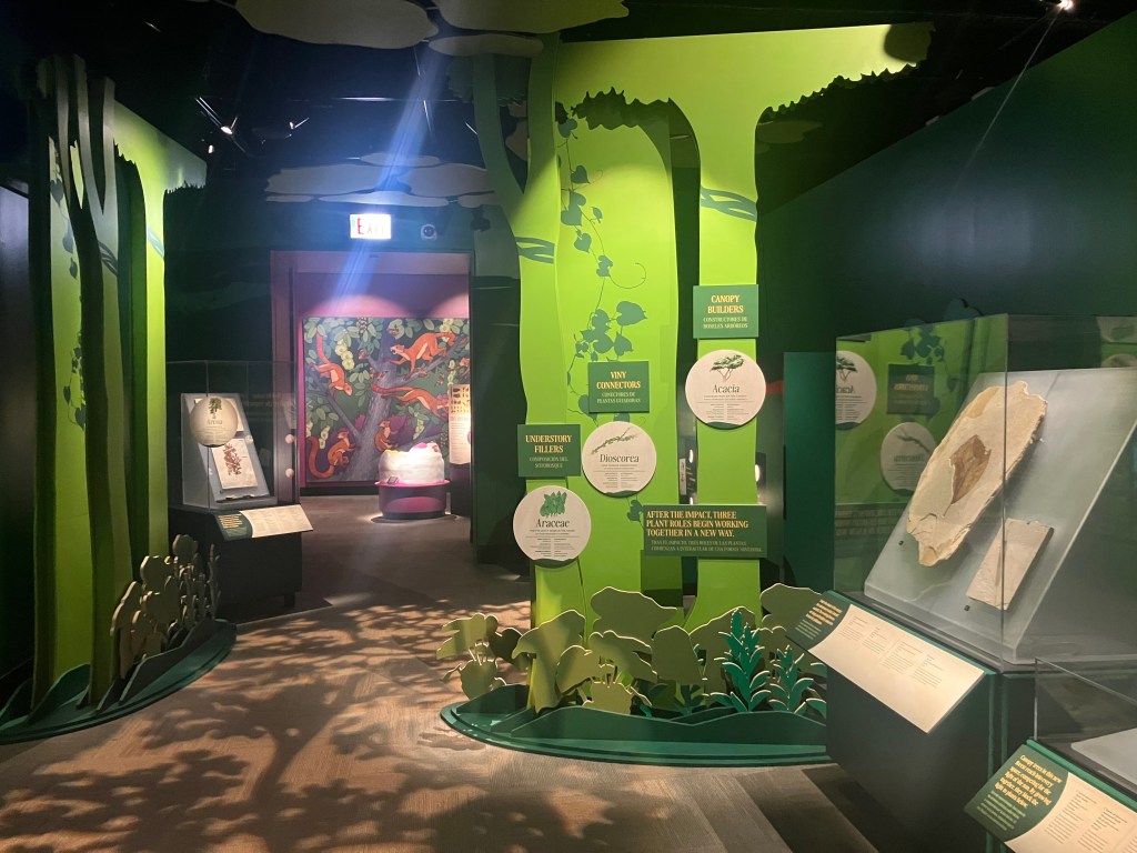
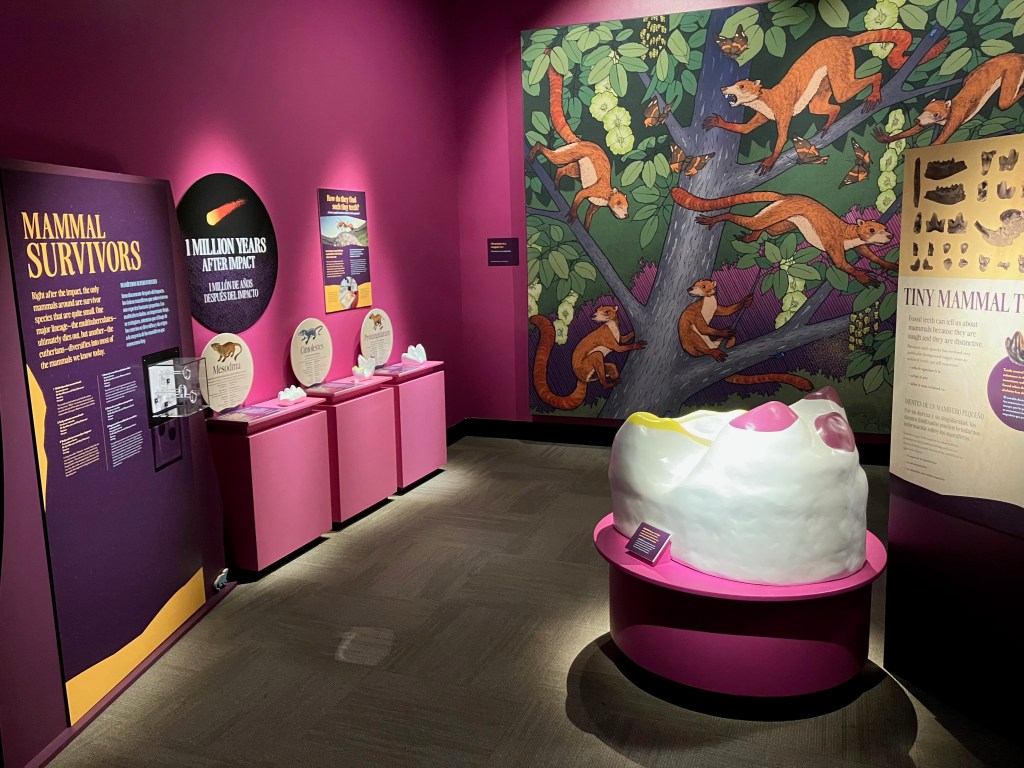
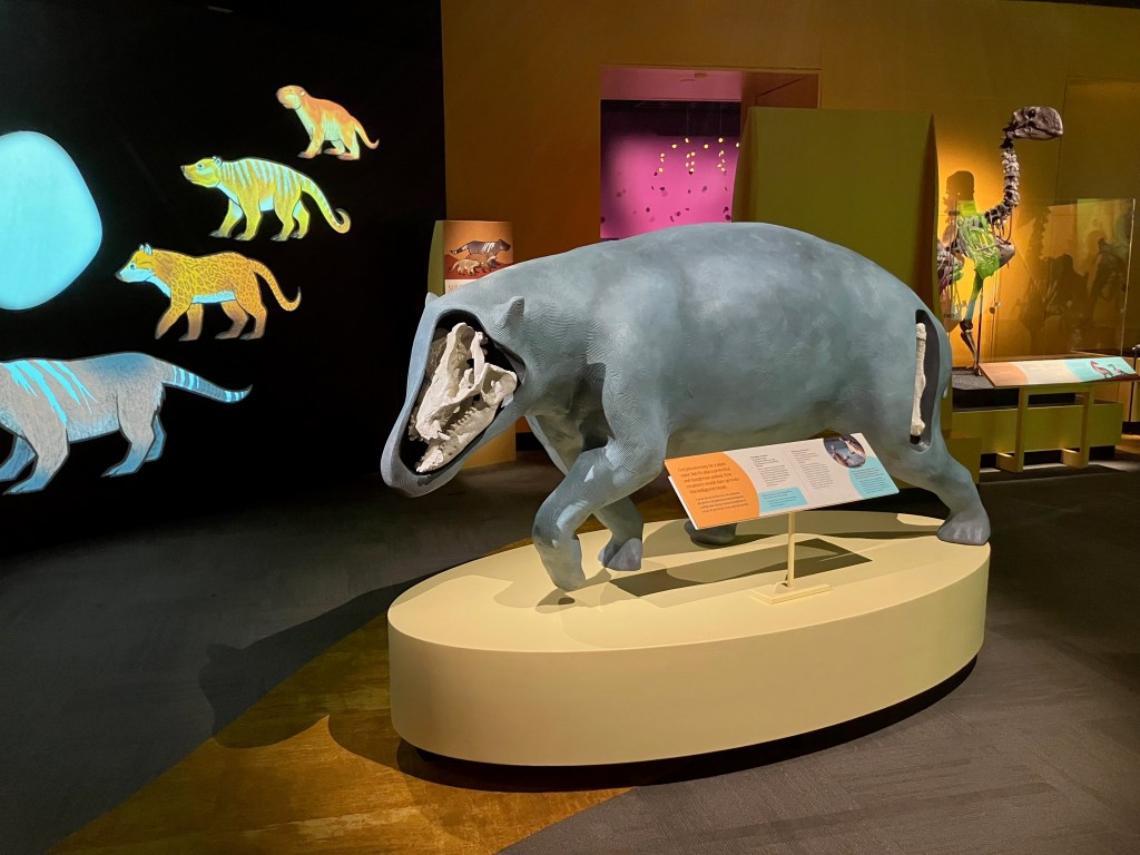
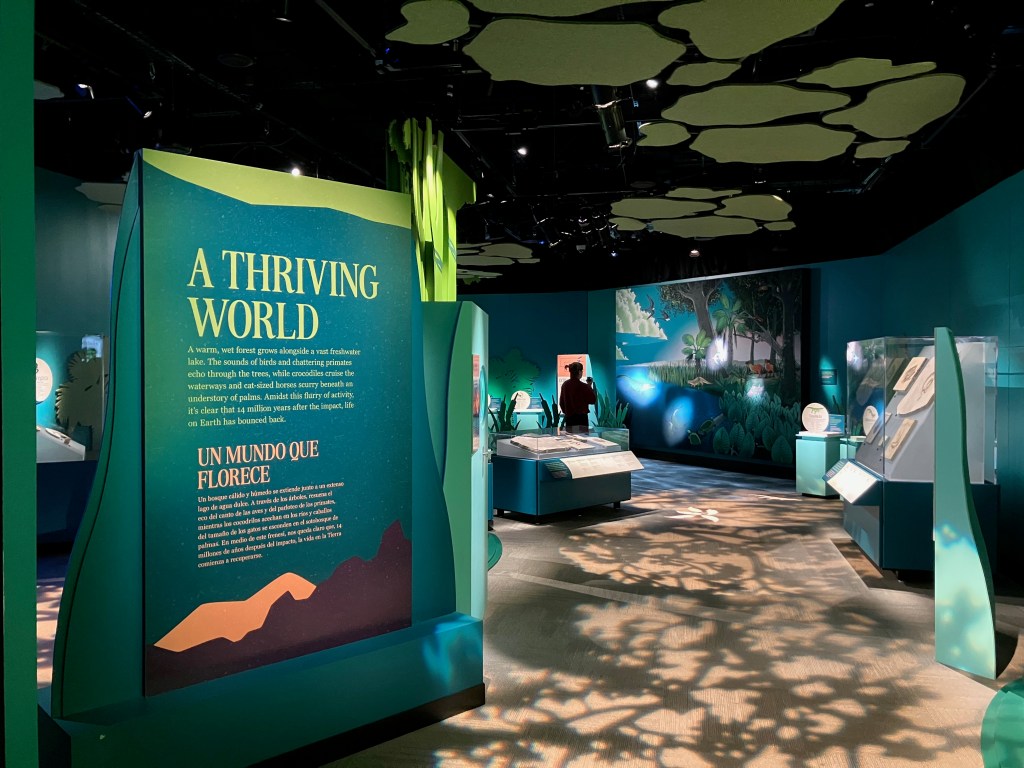
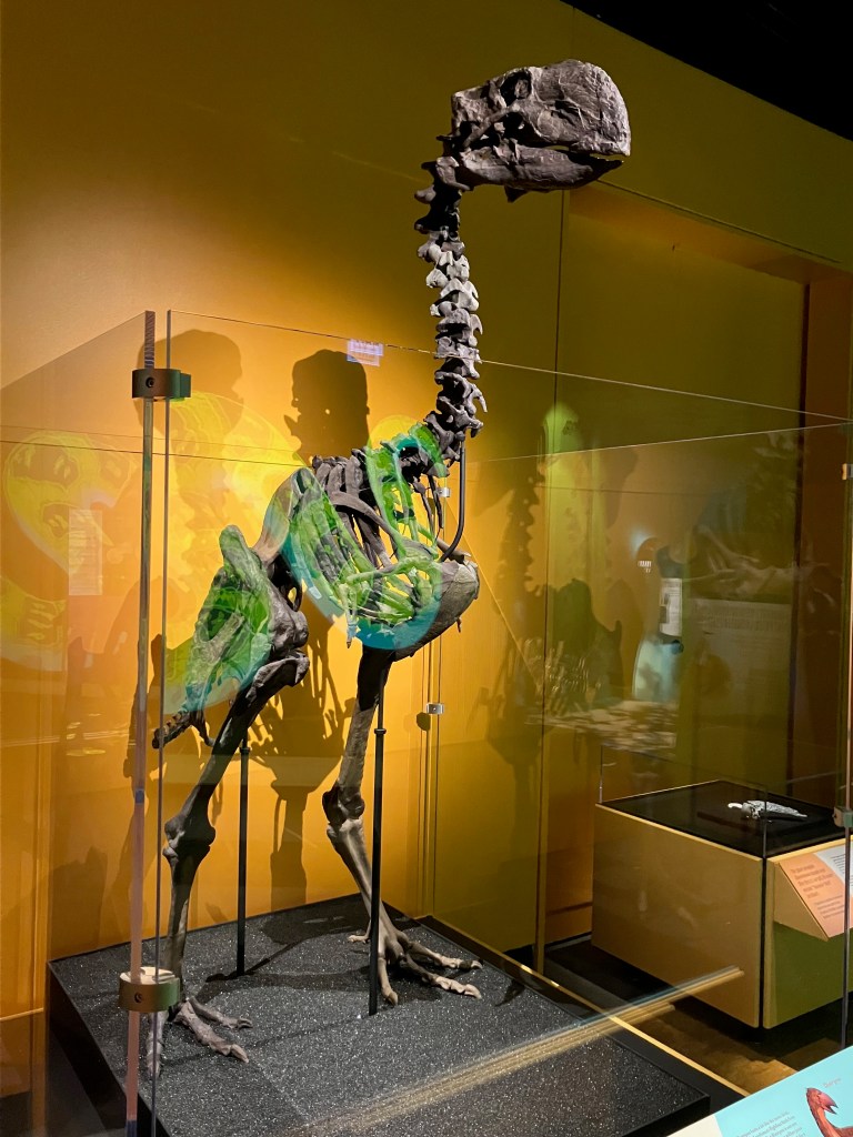
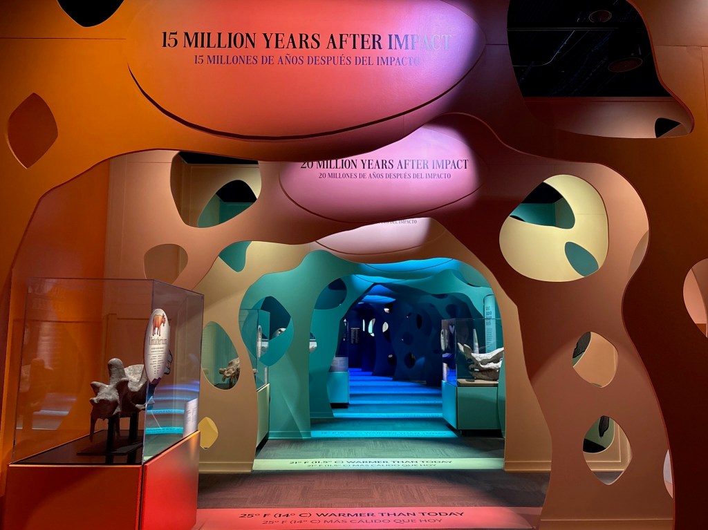
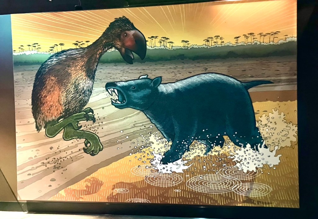
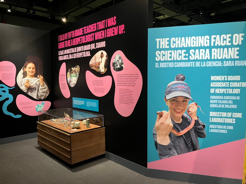
That brings us to After the Age of Dinosaurs. This exhibition is about the immediate aftermath of the end-Cretaceous extinction, and how the world’s ecosystems reassembled after that global catastrophe. But a summary of the subject matter doesn’t fully encapsulate what this show is about. The early Paleogene was famously a time of giant birds and little horses. Taking some inspiration from Alice in Wonderland, we played with the idea that sizes are askew and nothing is as it seems. The exhibition is colorful, whimsical, and full of displays that are just a little weird.

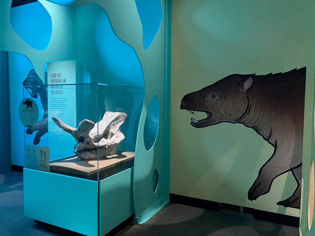
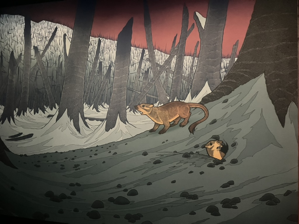
My colleague Marie Georg led the development of this exhibition—I joined a little later on to flesh out and write the second half. Curators Ken Angielczyk and Fabiany Herrera advised on the science, along with nearly a dozen other specialists. Meanwhile, the team worked with Chicago poster artist Jay Ryan to create the look of the show. Jay’s style is bright and bold, with a bit of a pop art feel. He brought those signature qualities to the six murals and nearly sixty standalone illustrations he created for After the Age of Dinosaurs, and the rest of the exhibition’s design follows suit. The result is a paleontology exhibit that looks nothing like the Field Museum’s permanent Evolving Planet, or really any other major fossil exhibit that I’m aware of.

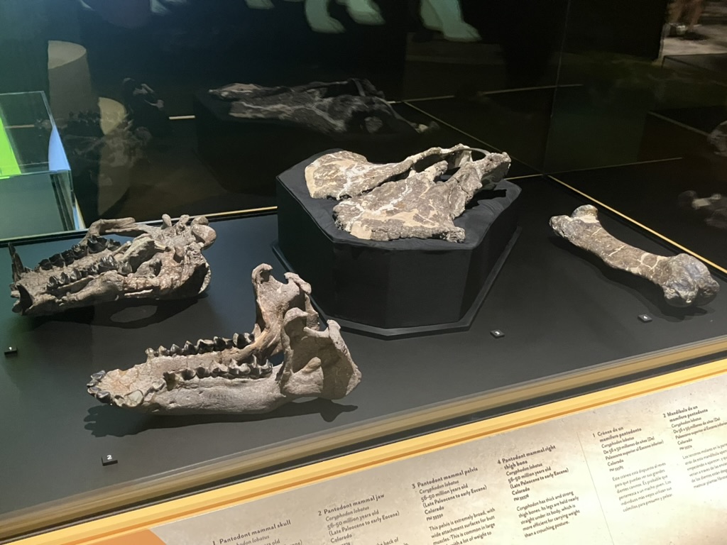
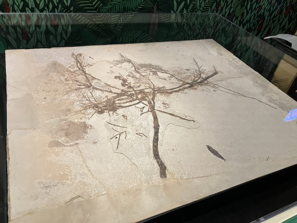
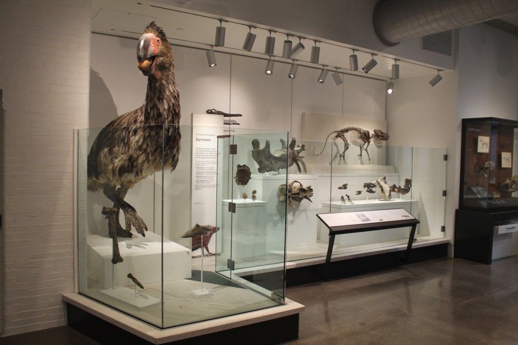
The fossils on display include both brand-new specimens collected during the 2024 field season and classics from the collection that we’d been waiting for an excuse to show off. Visitors can see the largest Megacerops skull ever found, the world’s only known cattail fossil, the oldest grapes from the western hemisphere, a perfectly-preserved passerine bird that was just named this year, and at least four fossils that are in press and so haven’t been formally named yet. The highlight for me is the Diatryma cast skeleton, which was acquired in a trade with the American Museum of Natural History in 1937. This set of disarticulated parts had never made it onto display before, so it was exciting to see it assembled into a standing mount for the first time.

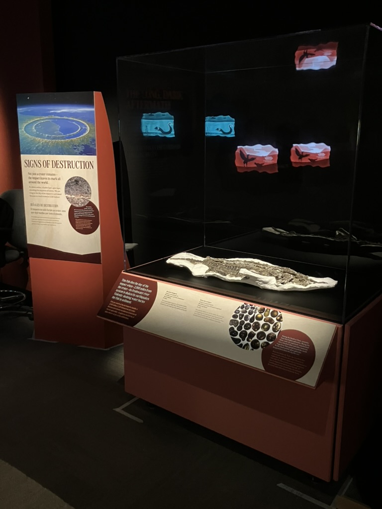
Since so many early Paleogene fossils are on the small side, large media and media-adjacent displays often take center stage. After the Age of Dinosaurs opens with a dramatic presentation of how the asteroid impact devastated global ecosystems, animated in a paper cut-out style by Rachel Oftedahl. A projection of ash billowing through a burnt-out forest adds a somber mood to the next gallery. Look closely at the life-sized projections of pantodonts later in the exhibition and you’ll see their eyes periodically blink. And in the Green River section, visitors can add to the ubiquitous forest soundtrack by standing in spotlights shaped like different animals—these trigger unique sounds that add to the gallery-wide chorus. I’m excited to see how visitors respond to these semi-hidden, playful elements within the exhibition, and how they contribute to the experience overall.

After the Age of Dinosaurs runs until January 2027.
1 Comment

Filed under exhibits, FMNH, mammals, museums, paleoart, reptiles

Creating a home for the Chicago Archaeopteryx

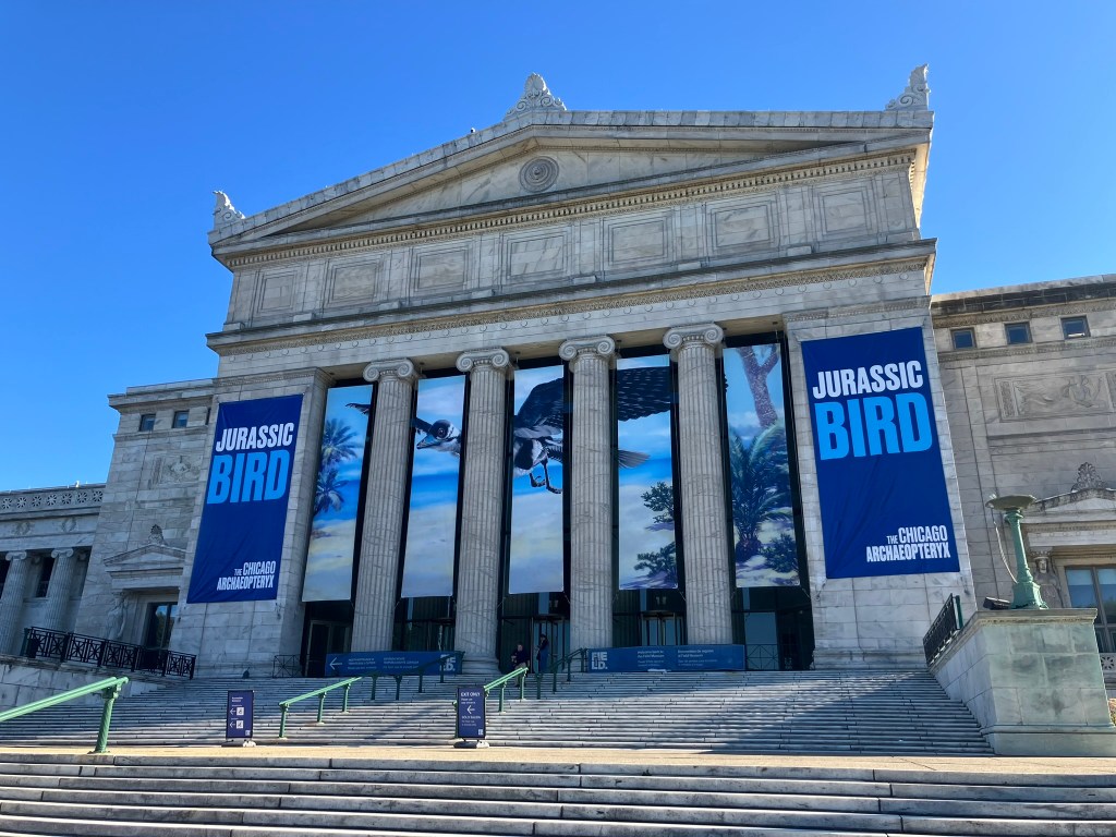
Archaeopteryx banners adorn the Field Museum’s north entrance. Photo by the author.

August 17, 2022. I had just finished a very long drive from Denver to Chicago and wasn’t planning on coming in to the museum that day, but then I heard the news: the fossil was here. The acquisition of the 13th Archaeopteryx by the Field Museum was, by necessity, shrouded in secrecy. There was no reason I needed to know the exact arrival date until the last minute, but I didn’t want to miss the first look at such a historically significant fossil.

That’s how I found myself crammed into the Geology Department’s tiny X-Ray room with a dozen other people. Masks on tight, we all waited with bated breath as Preparator Connie Van Beek pulled up the first images of the slab on the computer. Most of the known Archaeopteryx specimens were commercially prepared before being acquired by museums, but the Field Museum’s new fossil was still sealed in the rock. Aside from the exposed wing feathers—the tell that this was indeed an Archaeopteryx—nobody knew what this block of limestone contained. Would it only preserve the limbs, like the Maxberg and Haarlem specimens, or was there a complete skeleton in there? As we waited for the X-Ray to appear, nobody dared utter the s-word (skull, that is).

Then the image blinked onto the screen. It was a bit faint (these are paper-thin bird bones, after all) but the entire thing was there. Four limbs, a torso, a tail and—folded back in the classic dinosaur death pose—the unmistakable smear of the head and neck. The room erupted into spontaneous applause.

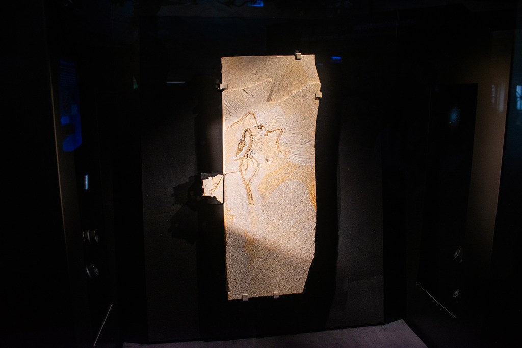
After 1,300 hours of meticulous fossil prep, the Chicago Archaeopteryx is now on display. Photo by the author.

Two years and one month later, the Chicago Archaeopteryx became a permanent resident of Evolving Planet, the Field Museum’s paleontology exhibition. I had the pleasure of serving as the Exhibition Developer for this project, working alongside a brilliant and creative group including Associate Curator Jingmai O’Connor, preparators Akiko Shinya and Connie Van Beek, and all my colleagues in the Exhibitions department. This post is a peek into the thought process behind our new Archaeopteryx display.

Hey, look at me!

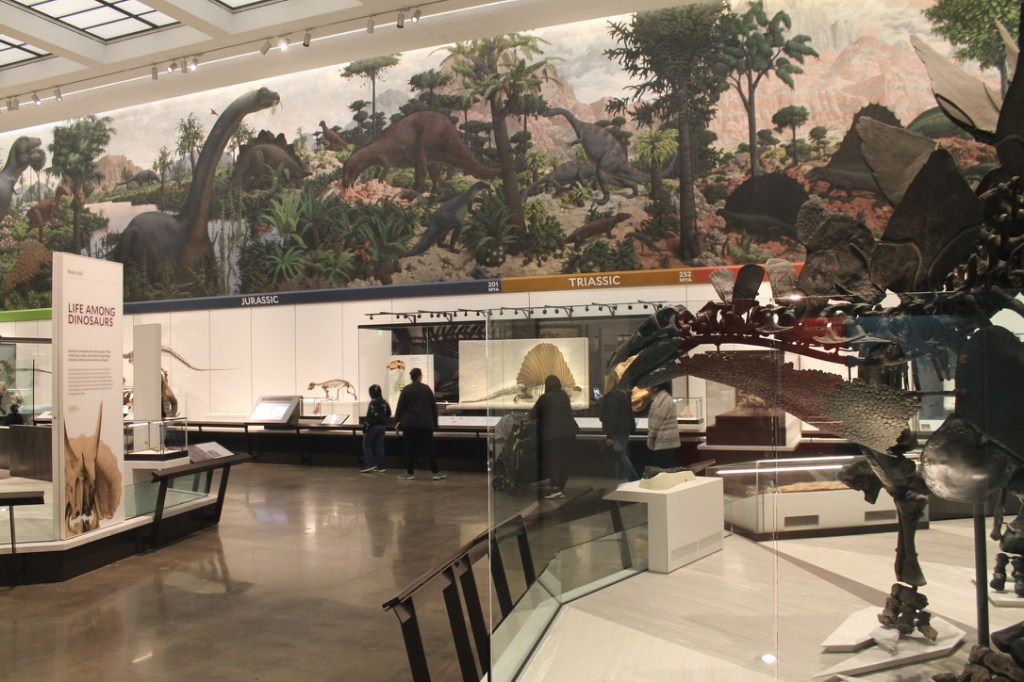
A Parasaurolophus-eye view of the Evolving Planet dinosaur hall. Photo by the author.

Once it was decided that the Archaeopteryx should be incorporated into Evolving Planet (rather than being displayed somewhere else in the building) the first order of business was figuring out where exactly to put it. Evolving Planet is arranged chronologically—visitors start at the origin of life 4.5 billion years ago and work their way up to the present. Hailing from the Late Jurassic, Archaeopteryx would need to go somewhere in the central dinosaur hall, which covers both the Jurassic and Cretaceous Periods. But unlike the rest of the exhibition, the dinosaur hall isn’t strictly chronological. There are multiple competing organization schemes in there—the murals on the walls are in Jurassic and Cretaceous clusters, but the central corrals are arranged by evolutionary groups (except when they’re not). And then there’s the big case of marine fossils that span the entire Mesozoic.

I may have lost some sleep over this. Should Archaeopteryx be near the Jurassic Apatosaurus and Stegosaurus (even though it lived on the other side of the world), or near the other theropod dinosaurs? Or maybe it should be with the marine fossils, since it was found in marine limestone. Ultimately, I realized that there was no perfect way to introduce a substantial new display into a space that had already been renovated multiple times, but it wouldn’t ruin visitors’ experience if Archaeopteryx didn’t fit seamlessly into the established flow.

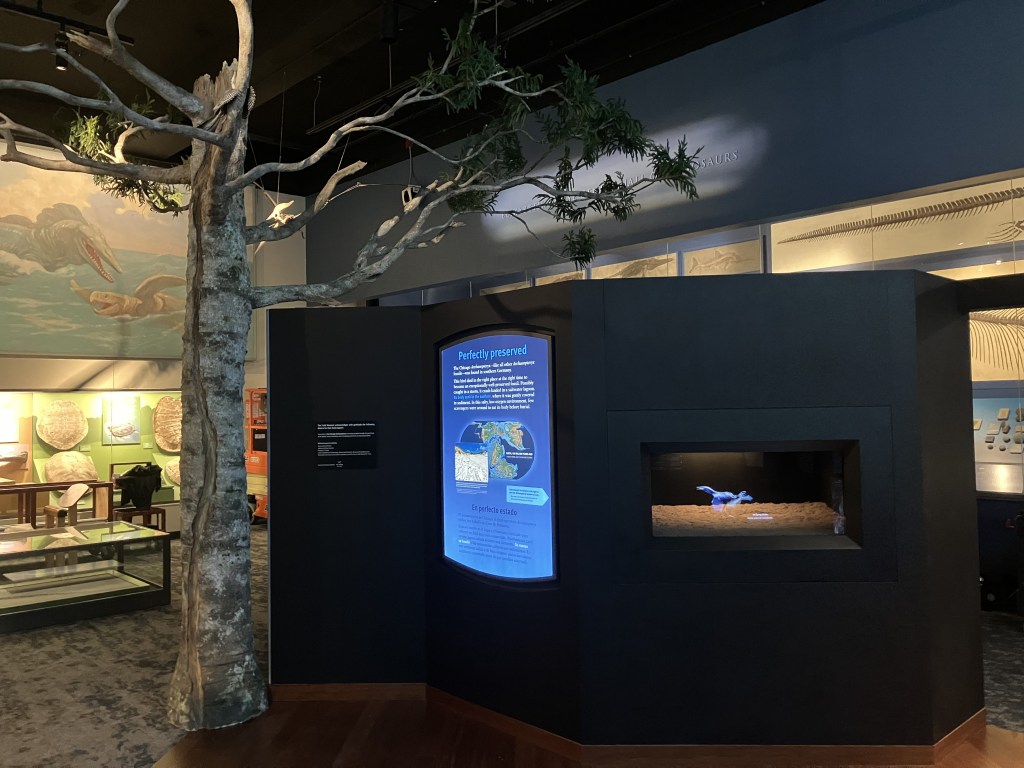
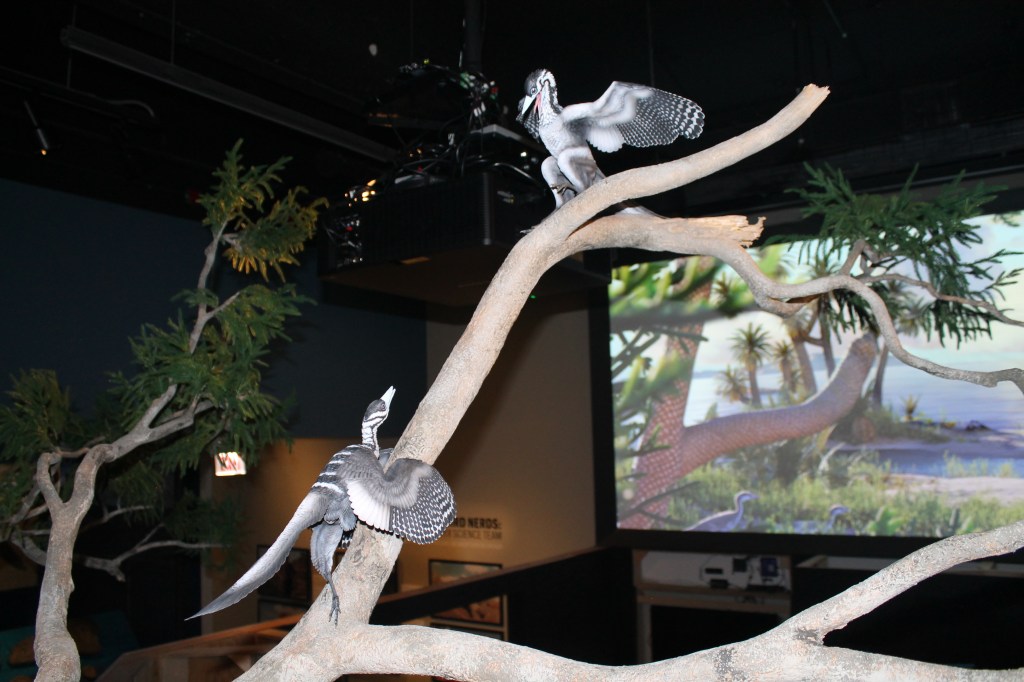
A replica tree and an animated mural beckon visitors to the Archaeopteryx display. Photo by the author.

There was a more pressing issue influencing where to place Archaeopteryx: the fossil itself is really small. The bird, now splayed across an 18-inch flat slab, is no larger than a pigeon. It may be the most complete Mesozoic dinosaur in the Field Museum’s collection and a contender for the best-preserved Archaeopteryx yet found, but its size makes it easy to overlook alongside a half dozen giant skeletons. When Senior Designer Eric Manabat and I first met to discuss the new project, we immediately agreed that the display would need a physical presence comparable to the other dinosaurs.

With that in mind, we decided the best place for Archaeopteryx was the largest open space in the dinosaur hall. That way, we could maximize the amount of interpretive content surrounding the fossil, and also create displays that would signal to visitors that this was something worth paying attention to.

We propose that our Archaeopteryx may have been swept out to sea in a storm. My headcanon is that this tree was struck by lightning during the same event, and has the scar to prove it. Photo by the author.

As designed, the Archaeopteryx display has two layers of interpretation. The outer ring, visible from anywhere in the dinosaur hall, showcases the world the first bird lived in. A physical Brachyphyllum tree full of Archaeopteryx models stands in the foreground, and an animated backdrop fills in the rest of the Solnhofen habitat (please notice the coniferous branches peeking into the corners of the animation, which are meant to be an extension of the model tree). We used the habitat reconstruction as the “attractor” because visitors frequently cite these immersive recreations as their favorite parts of our paleontology exhibits.

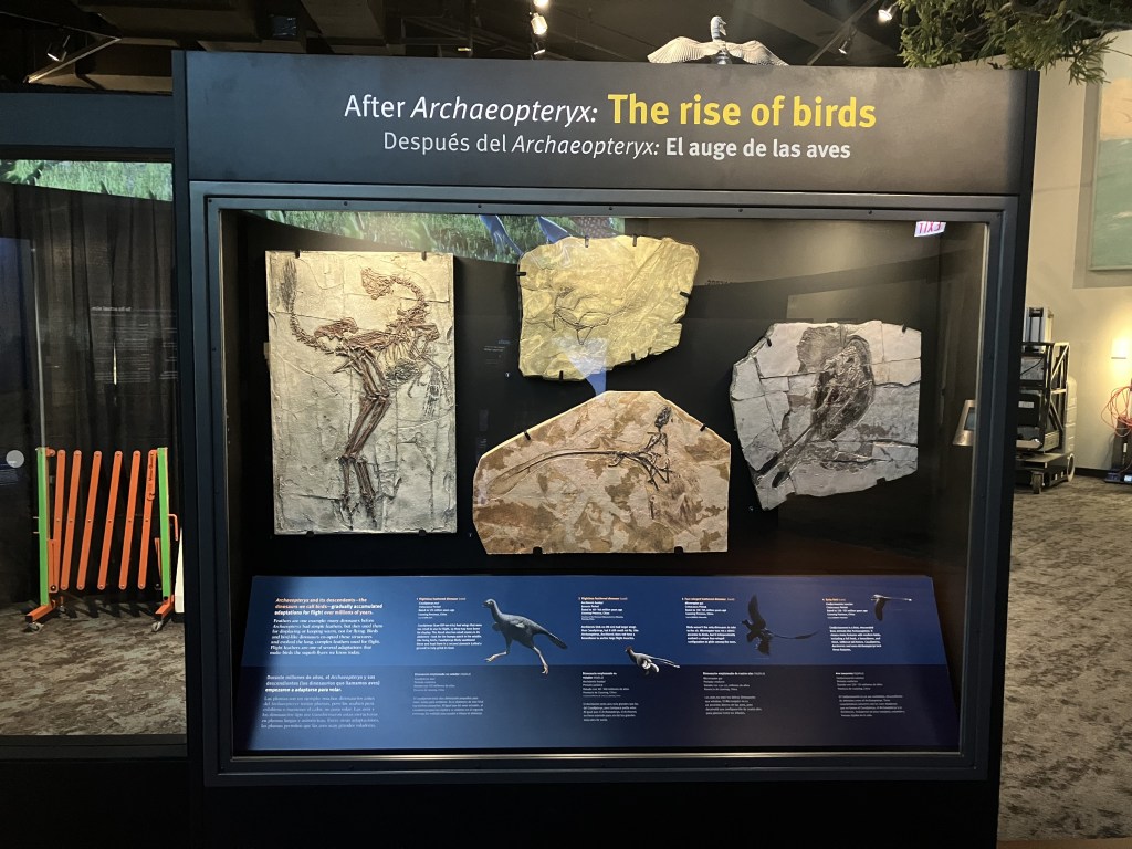
Casts of Caudipteryx, Anchiornis, and others tell the story of how birds continued to evolve after Archaeopteryx. Photo by the author.

Once visitors enter the exhibit space, the focus changes to Archaeopteryx itself: how it died and was preserved, how it fits into our understanding of dinosaur evolution, and what’s special about this particular fossil. We wanted to create an enclosed, intimate space so visitors could get up close to the fossil and admire it’s delicate details. A program of changing lights helps direct attention to features like feathers, teeth, and claws. And for visitors who prefer a tactile experience, we have a touchable copy of the fossil at three times actual size.

Recreating the World

A moment from the animated mural. © Field Museum.

Much like the permanent and traveling SUE exhibitions, a new reconstruction of the star dinosaur was a major part of the Archaeopteryx project. This time, we worked with the animation studio PaleoVisLab to create the definitive Archaeopteryx and a world for it to inhabit. I joined Jingmai O’Connor, Latoya Flowers, Wesley Lethem, and others in weekly meetings with paleontologist Jing Lu and animation lead Heming Zhang for nearly a year as they brought the first bird to life.

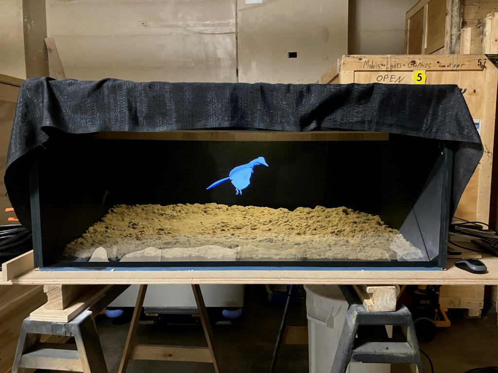
The PaleoVisLab team actually created two animations. The first is a simulated “hologram” which illustrates the taphonomic circumstances that resulted in such a perfectly preserved fossil. This animation resides in a pepper’s ghost chamber, designed and built by Latoya and Wesley. It was fun integrating a 160 year-old magic trick into our exhibit, and I appreciate the cosmic coincidence that the pepper’s ghost technique was first popularized within a few years of the discovery of the first Archaeopteryx.

A prototype of the pepper’s ghost chamber. Getting the image to float in space correctly took months of iteration. Photo by the author.

The second, far more daunting animation was the moving mural. We knew we wanted a big, impressive recreation of Archaeopteryx in its world, but we fretted about how it would fit among the century-old Charles Knight murals that adorn the walls of the dinosaur hall. We wanted something that looked dynamic and modern, but it needed to coexist respectfully with the classic oil paintings, and not attempt to overshadow them. I think we managed to toe the line, and the completed piece even has a few nods to Knight’s Solnhofen scene (which is still on display). The pair of Compsognathus in the lower left corner is the most obvious example.

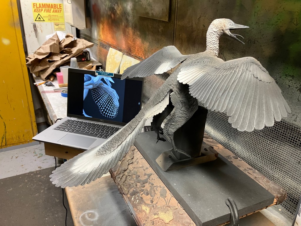
A 3-D printed Archaeopteryx in the early stages of painting. Photo by the author.

Heming could not be restrained from from putting astonishing (one might say insane) amounts of detail into every animal and plant in the scene. I particularly remember the day he turned up for the weekly call and enthusiastically showed us that he had modeled both male and female dragonflies, with hundreds of individual lenses on their compound eyes and even different genitalia. Every creature—from the tiny Homoeosaurus scurrying across the sand to the Aspidorhynchus that jumps out of the water for less than two seconds—was carefully reconstructed from the skeleton up. Naturally, the Archaeopteryx got the most attention. Our model is specifically based on new information gleaned from the Chicago specimen—note the shape of the head in particular.

The physical bird models in and around the tree are 3-D prints of the digital version, which was a new approach for us. This solved a problem we had on the SUE project, where we had different artists simultaneously creating images in different media that somehow had to match. But the 3-D prints also created new challenges: the spindly legs and toes were too fragile to actually hold the model’s weight, so we had to come up with some creative ways to mount them in the tree. Janice Lim constructed the mounts and painted the models so that they perfectly match their animated counterparts. And while I’m shouting out artists, illustrations by Ville Sinkkonen, Gabriel Ugueto, Liam Elward, and Scott Hartman also appear in the exhibit.

These fighting birds poised above the entrance are my favorite part of the exhibit. Photo by the author.

For me at least, the primary goal of the Archaeopteryx display was to get as many visitors excited about this rare fossil as possible. Given that it doesn’t have the size, name recognition, or ferocious appearance of T. rex or Spinosaurus, getting people to pay attention to a little bird with a hard-to-pronounce name wasn’t a sure thing. The solution was to create as many “entry points” as possible. Maybe you’re interested in animals and how they behave. Maybe you’re interested in history, and how our scientific understanding of the world came to be. Maybe your curiosity is activated by seeing something in motion, or by touching things, or by encountering something unique and special. My hope is that whatever interests you bring with you, we’ve created a space where there’s something for you to get excited about.

Leave a comment

Filed under dinosaurs, exhibits, FMNH, museums, paleoart

Review: the new Peabody Museum

Tylosaurus and Archelon skeletons soar overhead in the Peabody Museum’s brand-new lobby. Photo by the author.

For decades, the Yale Peabody Museum of Natural History (YPM) was a museum frozen in time, with no comprehensive updates to its paleontology halls since the 1950s. Then, around 2010, serious discussions began about overhauling the dinosaur and fossil mammal exhibits. Fundraising started in 2015, and in 2018, the museum announced that it had received a $160 million donation—enough to renovate not just the paleontology halls, but the entire museum. YPM closed its doors at the beginning of 2020, and on March 26 of this year, it reopened to the public once again.

Technically, this is a soft opening. The third floor—which houses the museum’s classic taxidermy dioramas—has not yet opened, and a scattering of cases around the museum are empty as of this writing. Still, there is plenty to see: during the renovation, YPM gained a new, multi-story lobby (connecting the museum to the academic building next door), as well as new collections facilities, classrooms, and 50% more exhibit space. And most importantly, the paleontology halls are open and just about complete.

A Geosternbergia cast demonstrates its quad-launching technique in the museum’s entryway. Photo by the author.

The remaking of the YPM exhibitions was a collaborative effort between internal staff (led by Kailen Rogers, Chris Norris, Susan Butts, Jacques Gauthier, and others) and two outside design firms—Centerbrook Architects and Planners provided the high-level design of museum and surrounding area , while Reich + Petch worked on specific exhibit elements and graphic design.

I spent a few hours at YPM last week, and the new halls were absolutely worth the wait. What I found most striking is that the paleontology halls feel at once new and familiar. The dimensions of the dinosaur and fossil mammal halls (officially, the Burke Hall of Dinosaurs and A World of Change) remain identical, and they are still anchored by Rudolph Zallinger’s magnificent fresco murals—The Age of Reptiles and The Age of Mammals. Charles Beecher’s relief mounted Edmontosaurus was left in place, and the overall layout and flow of the spaces have not been radically altered. On the other hand, white walls and new windows and skylights have transformed what had been fairly gloomy spaces into bright, open expanses. There are dozens of new specimens on display, in addition to plenty of returning ones. And a third gallery has been added to the paleontology wing: called The Human Footprint, this space explores how humans have interacted with the natural world over the past hundred thousand years or so.

The remounted Stegosaurus looks back toward Zallinger’s Age of Reptiles. Photo by the author.

The primary themes of the paleontology exhibits are displayed at the entrance to Burke Hall: “life affects the environment and the environment affects life” and “extinctions change everything.” Much like Deep Time at the National Museum of Natural History, YPM’s exhibits emphasize that the evolution of life on Earth did not occur in a vacuum, but as part of a continuously changing global system. This narrative does have a time axis—visitors follow along from the Edicaran to the present day—but the precise devisions of geologic time are often de-emphasized in favor of the broad environmental transitions that triggered evolutionary innovations.

This presentation of the evolution of life compliments the existing Zallinger murals. Painted between 1942 and 1967, these are among the most iconic images of prehistoric life ever created. Although some of the animal reconstructions are outdated, Zallinger was in other ways ahead of his time. Rather than giving the geologic periods hard borders, he artfully wove the sections together so that each one fades imperceptibly into the next. The viewer can see that the flora, fauna, and climate are changing over time, but it’s a gradient, not a ladder. Incidentally, it was not a given that the Zallinger murals would be preserved. Great credit is due to the YPM team for not only retaining the murals, but utilizing them as a key part of the new exhibition’s narrative.

Brontosaurus reclaims its place as the centerpiece of the dinosaur hall. Photo by the author.

One clear advantage of a wall-to-wall renovation is that the exhibits are much better organized than before. In the old dinosaur hall, visitors encountered an essentially random succession of displays: from modern sea turtles to Triassic trees and from a Cretaceous mosasaur to a Quaternary mastodon. Now, the displays run chronologically, and more or less in sync with the Zallinger mural. Visitors can follow the history of life in the sea on the west side of the hall, and the history of terrestrial life on the east side. I also suspect that placing Brontosaurus and a brontothere as central anchors in their respective halls was a deliberate choice.

A very large Megacerops stands on a central platform in the reimagined Cenozoic hall. Photo by the author.

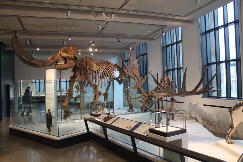
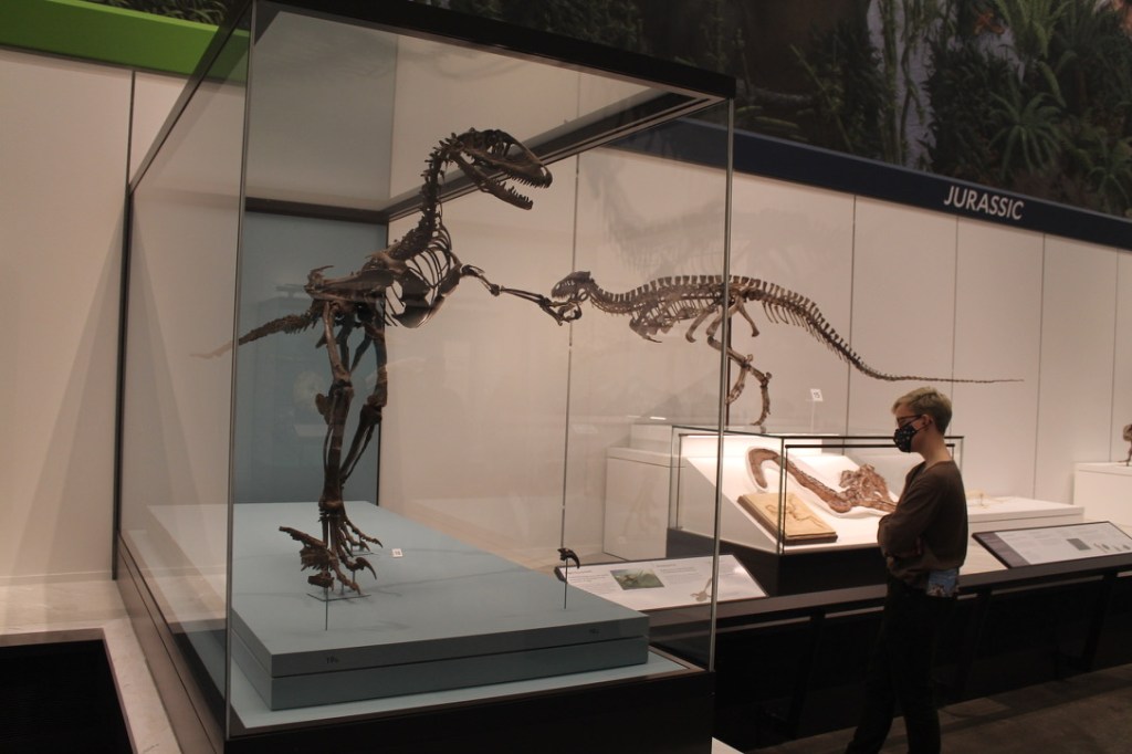
Research Casting International remounted several historic skeletons with characteristic artistry and skill. I will have a separate article about the mounted skeletons sometime soon, but the remounts are Brontosaurus, Stegosaurus, Deinonychus, Archelon, Moropus, Megaloceros, a mastodon, and a dodo. Brand new mounted skeletons include Tylosaurus, Poposaurus, and a Geosternbergia family of four (plus a few secret mounts outside the neighboring Marsh Auditorium). At least fifteen existing mounts have returned. As Postdoctoral Fellow Advait Jukar explained to me, the goal for the mounted skeletons was to portray “living, breathing animals, rather than looking like they’re posing for a portrait.” For example, the aggressive rutting posture of the Irish elk was directly inspired by the classic bull moose diorama at the American Museum of Natural History.

Mounted skeletons aside, there are some really extraordinary fossils in these halls. Some of the specimens that caught my eye include a geode bird egg with an embryonic skeleton inside, the bizzare Arsinotherium from Egypt’s Fayum region, a Nothrotheriops with patches of hair and skin, and the early Jurassic dinosaurs Podokosaurus and Anchisaurus.

Remounted Irish elk and mastodon in the Human Footprint gallery. Photo by the author.

While many of the fossils speak for themselves, the halls are also populated with several new models and replications, which imbue the extinct species on display with life and personality. The towering Gastornis created by Blue Rhino Studio is the clear standout—I like that it looks like its gazing longingly back toward the Mesozoic dinosaurs in the adjacent hall. Other highlights include a slab of Edicaran weirdos and the mammal Rapenomamus attacking a Psittacosaurus at the feet of Brontosaurus (I would have liked to see a baby sauropod as the prey, but maybe that would be too much for squeamish visitors).

Meanwhile, the YPM team made some selective forays into the realm of media and digital interactives. Most (possibly all?) of these take the form of slideshows on large touchscreens. These are an effective way to condense a lot of information into a limited space, and allow for some visitor choice in what topics interest them. I thought an interactive where visitors could explore the propagation of horses, humans, and tomatoes around the world was particularly well done.

Gastornis is a highlight of the Cenozoic Hall. Photo by the author.

I would expect an institution like Yale to be protective of its legacy and history, so I was surprised to find a prominently placed rebuke of superstar 19th century paleontologist O.C. Marsh in the dinosaur hall. As Advait described it, this is an “and” statement: Marsh was instrumental in shaping our understanding of prehistory and evolution and he collected from Native land without permission, looted graves, and was academically dishonest.

The call-out of Marsh wasn’t the only unexpectedly progressive element in the new exhibits. A brontothere fossil is interpreted with a poem by a trans teenager, which criticizes imperialistic scientists for imposing their way of knowing upon the world. Elsewhere, a display of fossils from the Santa Fe Formation in Argentina is accompanied by printed labels solely in Spanish—perhaps a statement about whose voices should be heard when interpreting the natural heritage of a given region. Natural History Conservator Mariana di Giacomo told me that these displays are part of an effort to include a wider range of perspectives in YPM exhibits. Other examples include musings from artist Ray Troll on being a “highly motivated fish” and psychologist Eli Lobowitz’s take on why kids love dinosaurs.

Deinonychus and Poposaurus are the largest saurian carnivores on display. Photo by the author.

My critiques of the new paleontology halls are pretty limited. There are more typos and inconsistencies in the labels than there ought to be, particularly in the age ranges given for certain specimens. I overheard multiple visitors concluding that the Edmontosaurus skeleton was a T. rex, and I suspect an image of Tyrannosaurus placed in front of the Edmontosaurus is to blame. In one area, the writer uses terms like “stem reptile,” “early stem land egglayer,” and “stem amniote” as common names for various species. Even with some specialized knowledge I don’t understand what distinction they were trying to make, and I can’t imagine those terms are helpful for most visitors.

The most pervasive issue is the inconsistent quality of 2-D life reconstructions used on graphics throughout the halls. With a few exceptions, it appears that the exhibition’s creators used whatever images were available, including stock renders and illustrations pulled from Wikipedia. For many people (especially children) unaccustomed to interpreting bones, life reconstructions can be more meaningful than the actual fossils. It’s worth budgeting for original, quality artwork whenever possible. Put that $41 billion Yale endowment to use!

A graphic with a particularly uninspired illustration from a stock image provider. Photo by the author.

Speaking of Yale’s effectively bottomless pockets, the best news about the new YPM is that it’s 100% free. This is an excellent precedent to set: there’s no better way to welcome a broader audience and remove barriers from engagement with science than doing away with admission fees. I hope other museums follow YPM’s lead on this front and work to free themselves from reliance on admission income.

More on fossils at the Peabody soon!

10 Comments

Filed under dinosaurs, exhibits, fossil mounts, mammals, museums, opinion, paleoart, reviews, science communication, YPM

The Hall of Human Origins, 14 years later

A bronze Homo heidelbergensis  figure crouches over a hearth, offering visitors a piece of meat. Photo by the author.

I don’t know how well you remember the twenty-aughts, but it was a high point for conflict over teaching evolution in the United States. Thanks to lobbying by the Discovery Institute and others, denial of evolution had become an ideological litmus test for conservatives. Organized strategies to impose religious fundamentalism on public school classrooms cropped up nationwide, and these efforts were taken to court on multiple occasions. It was in the midst of all this that the National Museum of Natural History (NMNH) developed and opened its Hall of Human Origins—in sight of Capitol Hill, no less.

In this politically charged climate, one might imagine an exhibition about human evolution would need to be highly didactic, or even combative. But rather than taking an antagonistic stance, the Hall of Human Origins leads with a question: what does it mean to be human? The exhibition presents fossil evidence for how the human species came to be, but also invites visitors to make connections with their own lives and experiences. Fourteen years out from the hall’s March 17, 2010 opening, it’s instructive to look back at the exhibition’s development. How did this visitor-centric interpretive approach come to be, and how has the museum’s audience responded to the exhibition? And in hindsight, would the exhibition’s creators do anything differently?

Origins

More than 50 million visitors have passed through the Hall of Human Origins, but lead curator Rick Potts jokes that about a million of those visits should probably be attributed to him. Indeed, the exhibition and its unique interpretive approach have been on his mind for decades. He first formulated the question “what does it mean to be human?” when teaching anthropology courses at Yale in the early 1980s. The question always inspired a great discussion, and Potts thought it might make an interesting basis for an exhibit about human evolution.

Potts pitched his idea for a human evolution exhibition immediately upon taking a position at NMNH in 1985. Smithsonian secretary Robert Adams liked the concept, but progress on the exhibition stalled within a few years. It was difficult to get any major exhibition off the ground at NMNH during the 80s and 90s because of the lack of consistent leadership. With eleven permanent and acting directors between 1981 and 2003, there was no way to build up momentum for big, multi-year projects. Eventually, Cristián Samper settled into a comparatively lengthy directorship (2003–2012), and greenlit the human evolution exhibition under the working title, What Does it Mean to be Human?

An L-shaped, 15,000 square foot space (which previously contained parts of the North American Mammals and Native American Cultures exhibitions) was designated the future home of the Hall of Human Origins. The core project team began meeting regularly in 2007. Kathleen Gordon was the exhibition developer and Junko Chinen was project manager. Briana Pobiner, Jennifer Clark, and Matt Tocheri joined Potts as in-house scientific advisors. As with most permanent exhibitions at NMNH over the past 25 years, content was developed internally while the 3-D and graphic design was produced in collaboration with the Toronto-based design firm Reich + Petch.
Organization

Map of the Hall of Human Origins. From humanorigins.si.edu.

One of the team’s first tasks was to articulate what an exhibition based around a question would actually be about. The objective was to welcome visitors’ perspectives, but the hall itself couldn’t be a blank canvas. Exploring ways in which the exhibition could address varied perspectives led to some dead ends. One early idea was to feature a section about creation stories from around the world. But while the intention was to be inclusive and respectful of visitors coming to the exhibition from religious backgrounds, the section came across as a straw man, set up in order to be knocked down by the scientific perspective taken by the rest of the exhibition. Choosing which creation stories to include was also a problem, as was the use of terms like “story” and “myth” in the first place.

Instead, the team decided to fill out the exhibition with potential answers to a variation on the central question: What makes us human? Walking upright. Making tools. Living in social groups. Communicating with symbols. Creative expression. These are all valid answers. And crucially, they are potentially meaningful to everyone, regardless of whether the visitor is approaching the question from a more scientific perspective, or a more spiritual one. The exhibition presents the evidence for how and when each of these traits evolved, but leaves it up to the visitor to decide which they feel is most important to their humanity. By encouraging each visitor to take part in the process of making meaning, the exhibition implicitly rejects the prevailing perspective that there are only two ways to view the origins of humanity, and that those perspectives are mutually exclusive.

Organizing the exhibition around “things that make us human” also helped the team discourage the misconception that evolution is progressive or teleological. Visitors are often predisposed to think of evolution like a ladder, where each stage is a more advanced, improved form of what came before. An evaluation of the Hall of Human Biology and Evolution at the American Museum of Natural History found that many visitors viewing the dioramas saw a progression from the small, dark-skinned Homo erectus to the tall, white Neanderthals. The exhibition’s designers had specifically tried to avoid this by arranging the dioramas cyclically, and by including labels explaining that evolution does not have a preordained direction or goal—populations merely adapt to maximize their success in the present environment. Nevertheless, preconceived ideas are powerful, and even these mitigative efforts were apparently not enough. In contrast, the NMNH Hall of Human Origins is not strictly chronological, nor does it focus on one hominin species at a time. This reduces the temptation to plot each display onto a directional axis. It also helps that the hall runs in two directions, and can be entered from either end.

Design

Overview of Hall of Human Origins. Photo by the author.

The design of the Hall of Human Origins feels respectful, even reverent. A palette of tans, browns, and other earth tones keep the space from looking garish, and evokes the importance of exploring the deep ancestry of our species. A core design element is a wall of densely-packed horizontal layers, a refrence to the stratigraphic context in which fossils are found. The wall is punctuated by larger-than-life relief sculptures, each one related to one of the key attributes of humanity covered by the exhibition. For example, a hominin with a spear facing an elephant represents how tool use opened up new food sources.

For Briana Pobiner, it was particularly important that the hall’s design put a human face on science. Many people think of science as something cold and distant, but warm up to it when they get to know the individuals behind it. To that end, the exhibition includes three “snapshots in time”—interactive media installations where a scientist on screen (one of which is Pobiner herself) guides visitors through a particular archaeological puzzle. The hall also includes 24 “how do we know” graphics. Each one includes a photo of a scientist in some way affiliated with the Human Origins Program and who contributed to the exhibition content, with a first-person account of how scientists interpret evidence and reach a conclusion. Pobiner says that teachers are particularly fond of these, and sometimes ask students on field trips to find all of them.

One ring to rule them all. Photo by the author.

The Hall of Human Origins includes nearly 300 objects. Most are casts, as hominin fossils are typically held in their countries of origin. There are a couple dozen originals, however, including archaeological artifacts and a Neanderthal skeleton from Shanidar Cave, in Iraq. This individual was one of several excavated in the 1950s during a collaborative project between the Smithsonian and the Iraqi Director General of Antiquities. The Iraqi government permitted this single skeleton to be held at NMNH, and it remains the only Neanderthal in the western hemisphere. Among the replicas on display is a partial skeleton of Homo floresiensis. Often called “the Hobbit” by its discoverers, this species was brand new to science when the exhibition was under development. Pobiner clued me in to an easter egg I had missed for fourteen years: the Hobbit has a gold ring on its finger.

Reconstructions

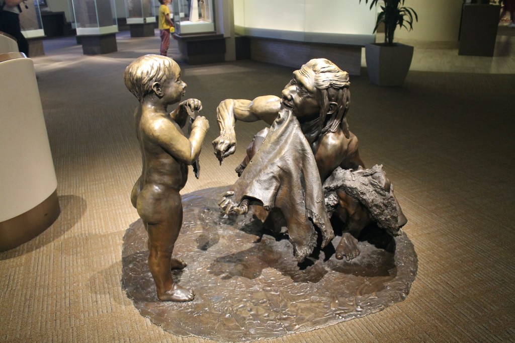
Bronze figures of a Neanderthal woman and child. Photo by the author.

Many natural history exhibits have the advantage of large, iconic objects that grab visitor attention, like sauropods, elephants, or whales. But hominin fossils are small, often fragmentary, and difficult to interpret. They wouldn’t be able to carry an exhibition for non-specialists on their own. In order to visualize the lives of past hominins, the team turned to paleoartist John Gurche.

The Hall of Human Origins was not Gurche’s first project with the Smithsonian. Between 1980 and 1985, he painted the iconic Tower of Time for the (now retired) Fossils: History of Life exhibition, as well as a backdrop for a lungfish diorama and a series of fossil horse reconstructions. This also wasn’t his first foray into reconstructing extinct hominins. Among many other projects, Gurche was briefly attached to Potts’s first attempt to get a human evolution exhibition off the ground, and he produced a life-sized model of Lucy the Australopithecus afarensis for the Denver Museum of Nature and Science in 1996.

For the Hall of Human Origins, Gurche created a new Lucy diorama, eight full-color busts, and five bronze figures with landforms. The busts are astonishingly life-like. Each one was sculpted in clay over a replica skull—first the muscle, then the skin. These sculptures were molded in fiberglass and cast in a silicone mix that could be tinted with different skin tones. The eyeballs are acrylic, and required a painstaking 30-step process to create. Finally, the hairs (hundreds of thousands per bust) were punched in one at a time. “If people react to your sculptures by feeling a little creeped out because they sense a living presence there,” Gurche wrote, “you know you’ve done well.”

A promotional image of Gurche’s eight hominin busts. From humanorigins.si.edu.

Gurche began the bronzes in a similar way, sculpting their anatomy layer by layer over a posed cast skeleton. Choosing the behavior to depict for each species was a major point of discussion for the exhibition team. Each figure needed to capture the essence of that species, while also representing a recognizable aspect of the human experience. It was decided early that Paranthropus boisei and Homo erectus should be subtly interacting, since they coexisted in Tanzania and Kenya. In the final exhibition, the Homo erectus is looking warily at Paranthropus as she carries a dead gazelle back to her family. Homo floresiensis is shown being knocked over by an unseen predator, highlighting the species’ vulnerability. And the Neanderthal woman is showing a child how to make clothing by perforating a hide with an awl and clamping it in her teeth. No detail was too small—for example, the Neanderthal woman is squatting because many Neanderthals have ankle joint wear similar to modern populations that spend a lot of time squatting.

Response

In spite of large headers proclaiming it “treasured remains” of “a real Neanderthal,” this display receives less attention than the development team would like. Photo by the author.

In the years since the Hall of Human Origins opened, the team that created it has gotten a good idea of which aspects are working, and which are not. The bronzes are extremely popular, both as photo ops and as interactive experiences. A display doesn’t need a button or a lever to be interactive—the bronzes are practically crying out to be touched. The fact that they share space with visitors—rather than being captured behind glass—forces people to confront them, size them up, and consider how they are like and unlike themselves. I’m particularly enchanted by the Homo heidelbergensis (top of the page), who appears to be calling visitors to interact by offering a piece of meat. The bronze figures are also toddler magnets. Even at a non-verbal age, children are drawn to them. Museum Educator Margery Gordon recalls there was some internal concern about nudity, but ultimately few, if any, visitors complained.

By timing and tracking visitors, NMNH staff have determined that the “Morphing Station” photo booth is the most popular element in the exhibition. This interactive media piece takes photos of visitors and overlays them onto the face of one of the eight busts, showing what each person might look like as a member of another species. This concept was actually proposed by the science team, and the Reich + Petch designers were surprised that they wanted something so frivolous. But in fact, the photo booth perfectly matched the team’s goal to center each visitor and encourage them to engage with their evolutionary past on their own terms.

Meanwhile, the real Neanderthal skeleton has proven to be the biggest challenge for capturing visitor attention. The development team placed it in the center of the exhibition, and hoped that it would be a must-see focal point. However, conservation requirements mean that the Neanderthal case is dimly lit, and each bone is individually packed in cushioning foam. Hard to see and harder to interpret, the disarticulated skeleton continues to be overlooked by a majority of visitors. The team has re-designed the graphics and lighting around the Neanderthal multiple times in an effort to communicate that this is a rare chance to see a real skeleton.

The educational efforts undertaken with the Hall of Human Origins did not end in 2010. A Broader Social Impacts Committee, with a rotating membership of scientists, clergy, teachers, and others, was formed in 2009 and continues to meet. In-gallery and online talks about how the study of human evolution intersects with social issues are held regularly. A 1200 square foot version of the exhibition travels to libraries, community centers, and even seminaries. And Pobiner continues to work with educators to create better tools for teaching students about evolution. Persistence, it seems, is key in ensuring the exhibition’s content continues to reach new audiences.

When the Hall of Human Origins began development, about 40% of Americans agreed that humans developed over millions of years from other forms of life. This number hadn’t meaningfully changed since Gallup and other polling organizations began asking the question in the early 1980s. But in the last decade, that number has climbed to 55%. Miller and colleagues suggest that this change is related to declining religious affiliation. It’s also possible that agenda-setting right wing lobbyists have moved on to other anti-science projects, like climate change denial and rejection of vaccines. Whether this trend continues remains to be seen, but if more people are indeed open to exploring where our species came from, then there is more need than ever for experiences like the Hall of Human Origins.

Many thanks to Human Origins Education Program Specialist Briana Pobiner and Curator of Biological Anthropology Rick Potts for speaking with me as I was writing this article. Opinions and any factual errors are my own.

References

Gurche, J. 2013. Shaping Humanity: How Science, Art, and Imagination Help Us Understand Our Origins. New Haven: Yale University Press.

Miller, J.D., Scott, E.C., Huffaker, J.S. 2021. Public acceptance of evolution in the United States, 1985–2020. Public Understanding of Science 31:2.

Pobiner, B. 2016. Accepting, understanding, teaching, and learning (human) evolution: Obstacles and opportunities. American Journal of Biological Anthropology. 159:61:232–274

Potts, R. 2010. Presenting Human Evolution to the Public: The Smithsonian’s Hall of Human Origins. Anthronotes 31:1

Scott, M. and Giusti, E. 2013. Designing Human Evolution Exhibitions: Insights from Exhibitions and Audiences. Museums and Social Issues 1:1:49–68

7 Comments

Filed under education, exhibits, mammals, museums, NMNH, paleoart, science communication

Is it real?

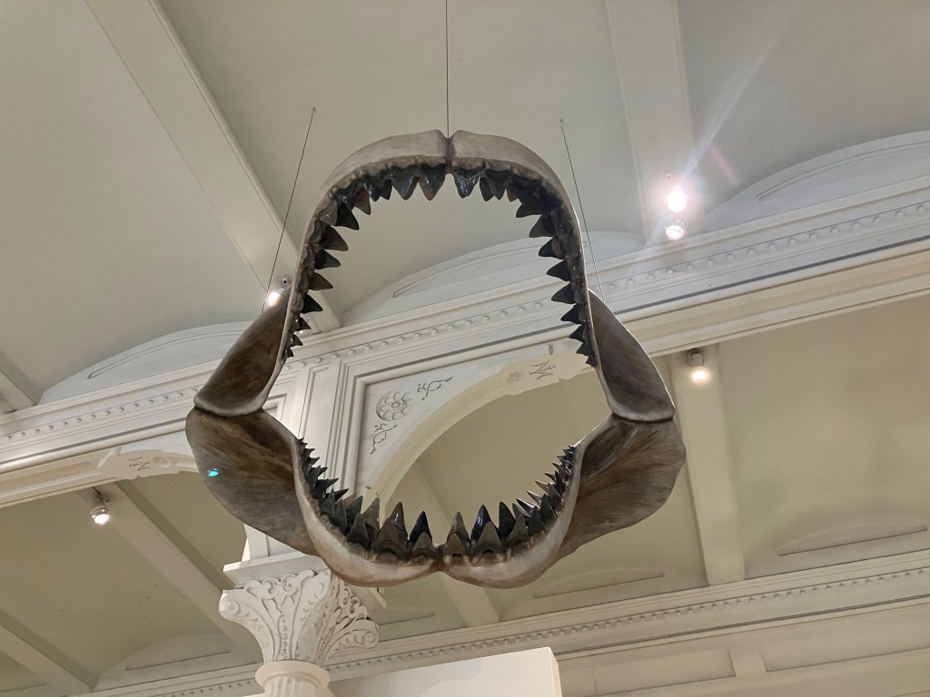
O. megalodon jaws a the American Museum of Natural History. Photo by the author.

You’ve probably seen the gaping jaws of Otodus megalodon (or “megalodon,” as it is colloquially known) in a natural history museum. Perhaps they’re set on the ground where they can frame a group photo, or maybe they’re suspended from the ceiling so you can imagine the rest of the shark rocketing toward you. In any case, every one of these O. megalodon jaws is a sculpted model with real (or cast) teeth embedded in it. Fossil jaws like this have never been found. Nor do scientists expect to ever find intact O. megalodon jaws—shark skeletons are made of cartilage, meaning they lack the mineral content and endurance of bone. Some fossilized shark skeletons are known, but they tend to be from smaller varieties. In the case of O. megalodon, we mostly just have teeth.

Why would a museum display a model of something that has never been found? Because paleontologists are quite confident that a real O. megalodon jaw would look just like this. For one thing, the general shape of modern lamniform shark jaws isn’t especially variable. Comparisons with modern sharks also allow scientists to determine where a fossil tooth fits into the mouth—in the front, to the side, or toward the back. There simply isn’t that much room for guesswork in the reconstruction, at least as far as the jaws are concerned.

I’ve been thinking about the accusation of “fake” again, as it pertains to fossil exhibitions (this is hardly new territory for this blog). One often hears from dissatisfied members of the public that the fossil skeletons on display at any given museum are fake—sometimes with the accusation that the real bones are “hidden” or “in storage” but occasionally with the conspiratorial angle that the creatures on display have been partially or fully invented. Museum workers do their best to explain: casts are exact copies made from molds of original fossils. Fossil skeletons are usually incomplete, but we can substitute casts from other individuals or mirror parts from the opposite side of the body. Plenty of mounted skeletons are made of original fossils, and at bigger museums, most of them are. And so forth.

Thalassomedon casts in pursuit of fish at the Denver Museum of Nature and Science. Photo by the author.

And yet, the cry of “fake” isn’t exactly wrong, either. Many displays contain some amount of sculpted material. In the case of the ubiquitous meg jaws, most of the object by volume is reconstruction. Lukas Rieppel cheekily describes early 20th century dinosaur mounts as “mixed media sculptures, having been cobbled together from a large number of disparate elements that include plaster, steel, and paint, in addition to fossilized bone.” He’s right, and what’s more, even complete skeletons don’t come out of the ground assembled on metal armatures.

So here’s my take: calling fossil mounts fake isn’t wrong, but it also isn’t relevant. The point of the O. megalodon jaws at the start of this post isn’t to show you the real fossil teeth—they’re kind of hard to see suspended fifteen feet off the ground. No, the point is to give the extinct shark that left those teeth behind form, life, and context. The visual and visceral experience of a 10-foot mouth rushing down at you provides a better understanding of what O. megalodon was all about then a case of teeth laid flat in a case ever could.

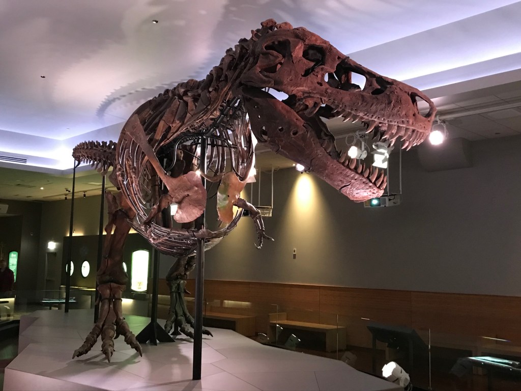
SUE in the Field Museum’s Evolving Planet exhibition. Photo by the author.

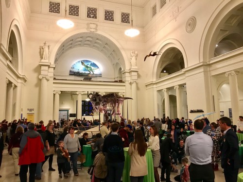
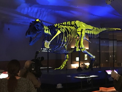
The same applies to just about any mounted fossil skeleton you’ve ever seen, whether it includes original material or is entirely cast. The purpose of these displays isn’t to show fossils as they were found. These are works of installation art, custom built for the space and in dialogue with their surroundings, including with visitors themselves. Take SUE the T. rex in their 2018 gallery on the Field Museum’s second floor. When SUE was in the cavernous, half-acre expanse of Stanley Field Hall, visitors often remarked that SUE looked small. In order to emphasize SUE’s size in the new space, the designers hid the skeleton behind a scrim wall. Instead of first seeing SUE from several hundred feet away, visitors don’t meet the T. rex until it’s looming over them, and they feel quite small in comparison. The T. rex skeleton and the space around it were arranged and composed in order to invoke a precise emotional response.

Often, the display evokes a specific hypothesis. The rearing Barosaurus in the AMNH rotunda is a classic example. We don’t know for sure whether Barosaurus could rear up on its back legs, or whether it would defend its offspring from a charging Allosaurus. But this is the story the exhibit’s creators chose to tell, using articulated fossil casts as their medium. In short, a display like this lets visitors without a detailed background in skeletal anatomy and animal behavior see the fossils the way that scientists do.

Bison diorama at the Denver Museum of Nature and Science. Photo by the author.

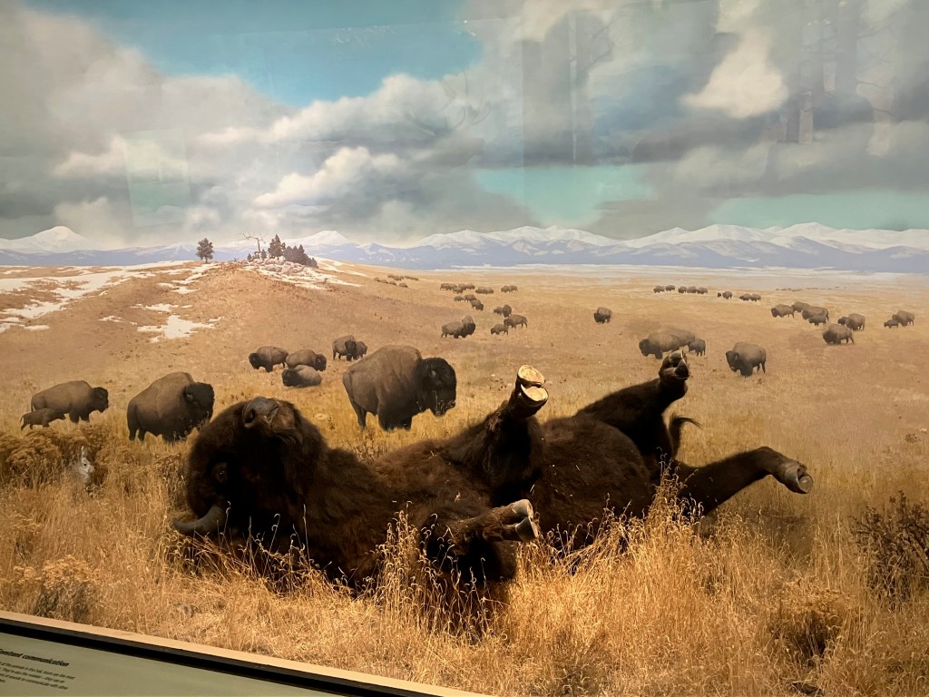
It’s worth drawing a comparison between mounted fossil skeletons and the other iconic natural history display, the taxidermy diorama. Imagine looking at this exquisite diorama of a rolling bison at the Denver Museum of Nature and Science, and dismissing it because it’s not real. The bison is, for the most part, a fabrication: it’s mostly clay or foam by volume, and it’s built over a wood and metal armature. It has no bones, muscle, blood, or viscera, and the only original part, the hide, has been treated with an assortment of preservatives. Meanwhile, the grass may well be paper or fabric, the background landscape is a painting, and the warmth from the sun is an electric light. This diorama is almost completely fake, but to say so is to entirely miss the point. If physical reality is all that matters, this display has nothing to offer that you can’t get from a leather sofa.

A well-made taxidermy diorama uses artificial materials to evoke the attitude, behavior, context, and essence of a living animal. A reconstructed fossil skeleton does precisely the same thing (although it is limited to the part of the extinct animal that we know best). So the next time someone dismisses a fossil exhibit as “fake,” try reframing the conversation. The reality of these displays doesn’t come from the material they’re made from, it comes from the combined knowledge and skill of preparators, artists, and scientists.

References

Rieppel, L. 2019. Assembling the Dinosaur: Fossil Hunters, Tycoons, and the Making of a Spectacle. Cambridge, MA: Harvard University Press.

Poliquin, R. 2012. The Breathless Zoo: Taxidermy and the Cultures of Longing. University Park, PA: The Pennsylvania State University Press.

6 Comments

Filed under AMNH, art history, DMNS, exhibits, fish, FMNH, fossil mounts, museums, opinion, paleoart

Telling SUE’s story (part 1)

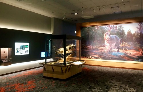
SUE’s new digs combine immersive media with elegant and austere design language. Photo by the author.

SUE—the Field Museum’s Tyrannosaurus rex—has been busy lately. In 2018, the skeleton was moved from Stanley Field Hall to a dedicated gallery within the Evolving Planet exhibition. A new traveling exhibition about SUE began its North American tour earlier this year. I was involved with both these projects as an Exhibition Developer, and in this post (divided into two parts), I’ll share my experiences and some of the choices I made along the way. Basically, the sort of things I’d want to know about an exhibit at another museum.

Before I continue, I’d like to emphasize that authorship of the new SUE exhibits is shared among dozens of talented professionals. In addition to my SUE co-developers Susan Golland and Meredith Whitfield, these exhibits were imagined and willed into existence by a small army of project managers, designers, scientists, mount-makers, programmers, and more. And all of us are standing on the shoulders of the researchers, preparators, artists, and educators who have contributed to our understanding of this incredible fossil since it was unearthed 30 years ago.

Why move SUE?

In January 2018, the Museum held an event for members to say a temporary goodbye to SUE. Photo by the author.

The role of a developer differs depending on the institution, but at the Field Museum we are essentially storytellers (or perhaps story organizers). Working closely with curators (staff scientists) and designers, we craft a narrative that can be expressed through physical space, and write most of the words visitors read or hear. One thing we do not do is decide which projects the Museum takes on and when. As I understand it, however, the decision to relocate SUE was a long time in coming.

After acquiring SUE as a partially prepared skeleton in 1998, Museum leadership decided that the mounted skeleton should be on display within two years. With a large team, that was enough time to prepare the fossil and publish a monograph, but renovating the existing paleontology halls to make room for a T. rex would have been impossible. So SUE debuted in Stanley Field Hall, with an understanding that this was a temporary solution (Edit: The choice to display SUE in Stanley Field Hall was actually a bit more complicated, with many factors besides schedule involved).

Thanks to Phil Fraley’s well-designed armature, SUE was taken down in just two weeks. Photo by the author.

While SUE’s position as a centerpiece in Stanley Field Hall was instantly iconic, the display could provide only minimal context for the fossil. And even though SUE is the size of a bus, visitors were right to point out that the skeleton looked small in the four-story, half-acre expanse. A dedicated gallery would be needed to properly represent SUE’s role as a rosetta stone for dinosaur science, to contextualize T. rex within the history of life on Earth, and to give SUE the presence they deserved.

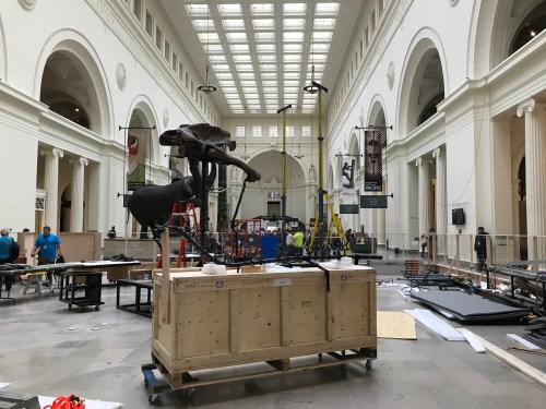
As it turned out, the opportune moment to create such a gallery wouldn’t arrive until nearly two decades later. A multi-part plan was established in 2016: the SUE move would occur concurrently with a rebranding and redecorating of Stanley Field Hall, with hanging gardens and a Patagotitan cast filling the vertical space better than the Tyrannosaurus ever could. Meanwhile, the temporary (and now traveling) exhibition Antarctic Dinosaurs would keep fossil fans happy during the 9 months SUE was off display.

You can make a dinosaur do anything on paper, but assembling the real bones always comes with unexpected surprises. Photo by the author.

Naturally, any change to a beloved display was bound to be controversial. After all, SUE had been a mainstay in Stanley Field Hall for a generation of visitors (I’m old enough to remember the Brachiosaurus, so SUE always seemed like a newcomer to me). If anything, public relations staff leaned into the controversy, since it was a magnet for media attention. At times, the press generated by the SUE move felt comparable to adding an entire wing to the museum. The team working on the new gallery kept quiet, confident that visitors concerned about the change would come around once they saw what we were up to.

An encounter with SUE

The new SUE gallery occupies a space called Hall 25A, between the two arms of the U-shaped Evolving Planet exhibition. This hall didn’t exist when SUE first arrived at the Field Museum—it was one of four light wells that were original to the building, which weren’t filled in until the early 2000s. Finding space for a new exhibit is challenging in a century-old museum, but Hall 25A’s location was a lucky break. It could be connected directly to the existing dinosaur hall, so that the SUE gallery appeared precisely where it should during a visitor’s walk through time.

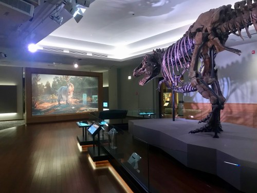
Our overall goal with the new gallery was to give visitors a dramatic encounter with SUE, contextualized within the Cretaceous world. Accordingly, designer Eric Manabat arranged the space with drama in mind. Visitors no longer get their first look at SUE from 300 feet away. Instead, SUE is hidden behind a scrim wall—visitors move around the wall and find themselves quite suddenly looking up into the face of the T. rex (SUE certainly doesn’t look small anymore).  Updates to the mounted skeleton—overseen by Pete Makovicky, Bill Simpson, and Tom Cullen—also give SUE a more imposing presence. The addition of SUE’s real gastralia (rib-like bones embedded in the belly muscles) and adjustments to the ribs and shoulders provide a better sense of how massive Tyrannosaurus was. SUE is also standing up straighter, and the jaws are now open.

SUE’s skeleton is visible through the translucent scrim wall, and we made sure the fleshed-out reconstruction was posed and scaled to line up perfectly. Photo by the author.

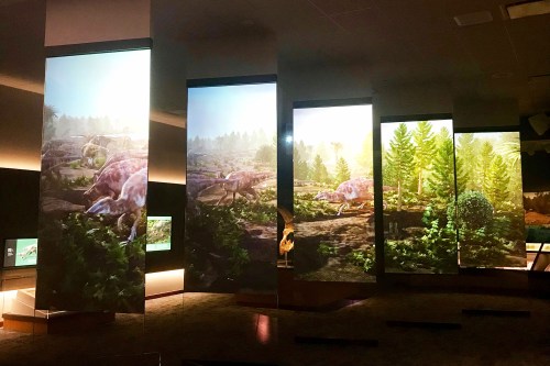
The look and feel of modern natural history exhibitions often leans toward one of two extremes. They either take design cues from art galleries, placing objects against a minimalist, neutral backdrop, or they are highly immersive recreations of a particular setting. The new SUE exhibition does a bit of both. The physical space is austere and elegant, although the use of wood paneling makes it warmer and more inviting than a typical art gallery. The immersion comes in the form of multimedia. Animated scenes of the waterlogged forests where Tyrannosaurus lived are projected on a staggered row of screens, creating a living backdrop behind the skeleton. A primordial soundscape of birds, frogs, and insects can be heard throughout the hall.

I think this multimedia overlay makes the SUE gallery particularly unique, because it’s constantly changing. The animated scenes take you to three locations in SUE’s habitat on a 20-minute cycle: an upland forest at dawn, the shore of the inland sea during a midday rainstorm, and a lowland river in the late afternoon. When the visuals change, the soundscape and the color of the overhead lights change with them. Visitors are themselves part of the ebb and flow of the gallery. They move among and between the screens, placing themselves in the scenes and pointing out minute details. Every time there’s a bout of dinosaur action, visitors gather to watch, then disperse around the hall once more.

At one point during the light show, all the real fossils included in the mount are highlighted. Photo by the author.

The exhibit’s biggest surprise comes during the “nighttime” portion of the media loop, when a narrated light show provides a tour of SUE’s skeleton. Projection mapping is used to highlight pathologies and other key features, helping visitors see details that they might have overlooked. Media Producer Latoya Flowers’s work on the show is spectacular, and it’s no wonder that visitors sometimes break out into spontaneous applause upon seeing it.

Bringing SUE to life

How could we not pay homage to Charles Knight’s timeless standoff between Tyrannosaurus and Triceratops? Above: Artwork by Charles Knight. Below: render by Atlantic Productions, © Field Museum.

As one might imagine, creating the animated scenes was one of the most involved aspects of the project, as well as one of the most fun. These scenes were produced by the London-based studio ZooVFX, known for their work on Flying Monsters and Natural History Museum Alive, among other effects-heavy educational programs. However, this was was not simply a matter of sending the animators some parameters and accepting whatever they gave us. The process was deeply collaborative, and the Field Museum team of scientists, developers, and designers teleconferenced with ZooVFX at least once a week for well over a year.

Like any animation project, the process of creating these vignettes began with storyboards. We settled on the T. rex behaviors we wanted to depict: hunting, scavenging, drinking, defecating, and a standoff with Triceratops (basically, unsuccessful hunting). A scene with SUE sleeping was also considered, but curators decided that posing a sleeping T. rex would require too much speculation. We didn’t want constant, cacophonous dinosaur action in the gallery, so the moments with SUE are interspersed with longer periods of calm.

Next came designing and modeling (Vladimir Venkov was the primary artist at ZooVFX) the ten animal species to be featured. Naturally, the curators led this process. I think it’s fair to say that we strove for “safe” dinosaur reconstructions, insofar that they adhere to what is most definitively known from the fossil record. Your aesthetic preferences may vary, but they work well in the context of this exhibit.

The staggered, two-sided screens allow visitors to place themselves in the scenes, and also recall the ribs and vertebrae of the mounted skeleton. Photo by the author.

Animating SUE was relatively straightforward, but establishing the gaits of Triceratops and Edmontosaurus required a lot of iteration. The first walk cycle attempts were too mammalian, and lacked the bilaterally asymmetrical gait of four-legged reptiles. Edmontosaurus was particularly tricky because its back legs are much larger than its front legs, but its stiffened spine doesn’t allow the body to twist very much. Fossil trackways proved very helpful: when the animators matched the dinosaurs’ footfalls  to the footprints, biomechanically plausible movement usually followed. The folks at ZooVFX were fantastic, providing something like twenty variations on a hurried hadrosaur before we found one that worked.

Once we had basic walk and run animations, it was time to choreograph the action scenes. Once again, the Edmontosaurus scene caused trouble. How do you sell SUE ambushing the herd when T. rex can’t actually run? The finished version reminds me more of a crocodile than a lion—SUE gets really close, ultimately only taking four steps to reach their unfortunate quarry. The audio sells it. Pete Makovicky asked that SUE’s jaws slam shut with a crack you feel in your bones, like a really, really big crocodile. One bite, and “deadmonto” is toast.

Other challenges included designing SUE’s poop (we consulted a Bristol stool chart and decided on a 2 or 3), and staging the fight between Tyrannosaurus and Triceratops. Naturally, we wanted a “Charles Knight moment” where the animals face off, but it had to be believable. I enjoyed the opportunity to script out the fight, move by move. In the final version, SUE’s attack is a moment too slow, so they find themselves temporarily cornered by their prey. SUE limps away with a stab wound in their left leg, matching the fossil skeleton’s infected tibia.

It’s nice in here. Photo by the author.

Susan Golland once called the new SUE gallery an oasis, which I think is a perfect descriptor. By the time visitors reach SUE, they’ve come two thirds of the way through Evolving Planet. It’s an extremely dense exhibition, covering the entire history of life with over 1,000 specimens. But then, they reach a big, open gallery that is all about a single specimen. There’s ample space to sit down and collect yourself. And the ever-changing media overlay means that you’ll actually see more if you take a break, rather than hurrying on ahead. I find the SUE gallery quite beautiful, and I hope that it does justice to such an extraordinary fossil.

Next time, we’ll look at updates to the SUE gallery since 2018, creating the traveling SUE exhibition, and realizing SUE in the flesh.

Awesome. Photo by the author.

1 Comment

Filed under dinosaurs, exhibits, FMNH, fossil mounts, paleoart, theropods

T. rex in Context: Deep Time’s Cretaceous Display

A little over a year ago, the National Museum of Natural History re-opened its paleontology halls after a five-year renovation. As I detailed in a previous post, the new exhibition—called Deep Time—is exceptional. Breathtaking to look at, intuitive to explore, and (of course) brimming with fascinating specimens, Deep Time sets a high standard for excellence in natural history exhibitions.

Today, I’d like to take a closer look at one display in Deep Time, the Cretaceous tableau, and elaborate on what makes it so effective. Many thanks to Designers Pauline Dolovich and Fang Pin Lee, Developer Siobhan Starrs, and Curator Matt Carrano for discussing their work with me.

The Cretaceous display tells a story through its carefully-composed design.

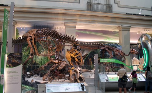
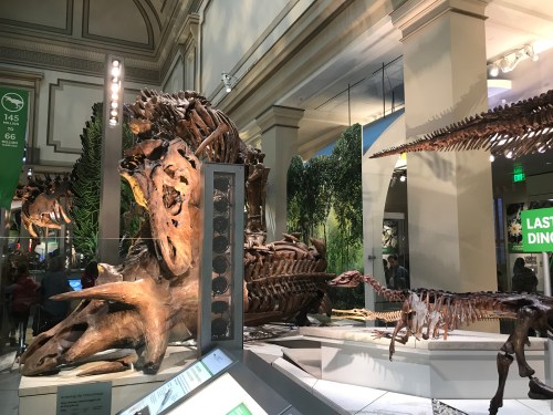
The Cretaceous display is home to Deep Time’s centerpiece, the Tyrannosaurus rex. As was well-covered by various media outlets in the months and years leading up to the exhibition’s opening, the “Nation’s T. rex” was discovered in 1988 on Army Corps of Engineers land, and is now on loan to the Smithsonian. Although it’s one of the most thoroughly-studied Tyrannosaurus specimens around, this is the first time the real skeleton has been assembled into a standing mount. Like many of the mounted skeletons in Deep Time, the T. rex strikes a dynamic pose that evokes the behavior of the living animal. In this case, the Tyrannosaurus is prying the head off a prone Triceratops.

Obviously, the T. rex draws a crowd. It’s hard to imagine any visitor passing through Deep Time without stopping to see it. But while the exhibit team acknowledged and emphasized the spectacular nature of the tyrant king, they also harnessed its star power to make a broader statement. Tyrannosaurus was part of a rich ecosystem of plants and animals, and while this apex predator had an impact on the entire community (eating some animals, providing leftovers for others), T. rex and other meat-eating dinosaurs were far outnumbered by the turtles, lizards, salamanders, and insects they lived alongside. By placing Tyrannosaurus within its ecological context, the display makes the seemingly fantastic dinosaur much more real. This reinforces one of the exhibition’s overarching themes: life in the past functioned much like life in the present, and studying past life can inform our understanding of the world today. It’s no accident that this cross-section of a prehistoric ecosystem is at the center of the hall, and includes its most popular specimen.

To avoid cluttering the historic architecture of the east wing, the designers integrated display lighting into the platforms.

While the Cretaceous display tells a complex story that is integral to the narrative of the exhibition as a whole, its footprint is remarkably compact. This efficient use of space is the result of a long and methodical design process. Designers Fang Pin Lee and Pauline Dolovich envisioned a broad avenue across the entire hall, which would accommodate large crowds (NMNH gets up to eight million visitors each year) and allow quick access to any part of the exhibition. This avenue needed to double as a central social space, where groups could congregate around built-in seating and look out onto the various displays. But more space for visitors means less space for specimens, and dinosaurs need a lot of room. Lee and Dolovich used digital renders and a miniature model to find the optimal position for the 40-foot Tyrannosaurus and its companions. This was a careful balancing act—they had to keep the T. rex visible from multiple approaches while working around the twin rows of structural columns down the center of the hall.

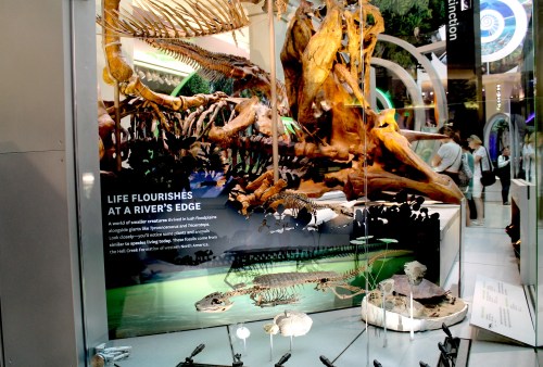
With ample space for visitor traffic, long sight lines, and some very large skeletons in the mix, there was precious little room in the Cretaceous display for text panels. This worked in the display’s favor, because it meant that much of the message had to be communicated through the design. For example, the Tyrannosaurus poised over its Triceratops meal evokes the predator’s role in the ecosystem, while conveniently reducing the footprint the two skeletons would require if displayed independently. Meanwhile, a cutaway in the platform next to the T. rex‘s foot contains an alligator, a turtle, clams, and aquatic plants. While only subtly implying the presence of a pond or river (the alligator skeleton is posed as though swimming along the surface, while lotus-like flowers “float” nearby), this area demonstrates these organisms’ ecological relationship to T. rex by placing them literally underfoot.

Stangerochampsa swims among floating Nelumbago leaves in an implied waterway.

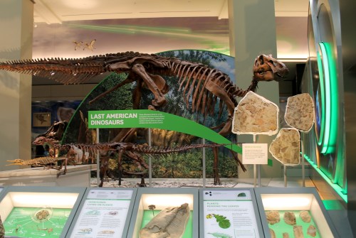
To the right of Tyrannosaurus, a densely-layered series of specimens and display elements provides a nuanced look at the Hell Creek ecosystem within a limited amount of space. In the back, a pair of large murals by Julius Csotonyi set the stage: this was a lush, green world dense with weedy flowering plants (as opposed to the open conifer forests dinosaurs are often depicted in). To the left, a lone Torosaurus is dwarfed by the forest around it. To the right, an Edmontosaurus group tramples through the undergrowth, disturbing the smaller Thescelosaurus and Polyglyphanodon. Skeletons of Edmontosaurus, Thescelosaurus, and the aquatic reptile Champsosaurus stand in front of the murals, alongside three slabs of fossil leaves.

A vivid green panel among the skeletons spells out the key takeaway: these plants and animals were part of a single ecosystem that existed in North America at the end of the Age of Dinosaurs. Similar header panels can be found throughout the exhibition, and the writers iterated on the text for years. These short phrases had to convey the context and significance of a display at a glance, even if these were the only words a visitor read. The team settled on the headline “T. rex in Context” for the Cretaceous display, but when test audiences began visiting the hall, this proved to be a mistake. Because the words appeared so close to the Edmontosaurus, visitors were concluding that the hadrosaur was a T. rex. With weeks to go before opening, the team opted to replace the headline with the tried-and-true “Last American Dinosaurs.

Those vertical mounts for the fossil leaf slabs are incredible.

The final layer in the Cretaceous display is the rail at the very front. Smaller specimens—the lizard Polyglyphanodon, several fossil leaves, and an assortment of microfossils—are mounted in cases, while a dinosaur bone with insect damage is out in the open where it can be touched. The text on the rail is almost superfluous, but it is cleverly divided by trophic level. One panel addresses primary producers, another herbivores, and a third carnivores and decomposers. The plants and small animals are given the same amount of attention as the dinosaurs, reinforcing that all of these organisms have their part to play in the community.

Taken together, the elements of the Cretaceous display encourage deep looking without requiring a great deal of reading. Visitors drawn by the star power of the Tyrannosaurus find themselves surveying the “beautiful density” of specimens and display elements. They may notice minute details, like platform tiles slanted and dislodged as though by the movement of the dinosaurs, or the broken Triceratops horn that has rolled away from the skeleton. Intuitively, they understand that they’re looking at the complete ecological context of T. rex, and that this ecosystem is just as diverse and complex as those of today. If they choose to read the text panels, visitors will learn details like the names of the animals or the feeding strategies of different herbivores, but most of the information is conveyed through the layout alone. This is the mark of an uncommonly well-designed museum display.

5 Comments

Filed under Deep Time, dinosaurs, exhibits, fossil mounts, marginocephalians, museums, NMNH, ornithopods, paleoart, theropods

Making The Third Planet

The Milwaukee Public Museum’s famous Hell Creek diorama. Photo by the author.

The late 19th century saw a wave of large natural history museums established in urban centers across the United States. From the American Museum in New York City to the Field Museum in Chicago, these institutions were born out of a desire to provide public access to knowledge and culture. Opening its doors in 1884, the Milwaukee Public Museum (MPM) was part of this trend, but it has always differed somewhat from its peers. For one thing, MPM was (and remains, in part) a municipal project, and its collections are publicly owned. More obvious to visitors, however, are the uniquely crafted, immersive exhibits that have always been a part of this institution’s identity.

Referred to by staff as the “Milwaukee style,” these exhibits de-emphasize cases of artifacts in favor of large-scale theatrical scenes that recreate particular times and places. While the museum boasts a collection of four million natural and cultural objects, the public-facing exhibits favor models, set pieces, and sound effects that immerse visitors in the story being told.  This approach started early.  In 1890, “father of modern taxidermy” Carl Akeley created his first habitat diorama (a muskrat colony) at MPM. 1965 saw the opening of the locally beloved Streets of Old Milwaukee, a walk-through recreation of shops and houses from the turn of the century. Other examples of the Milwaukee style include a 12,000 square foot, multi-story artificial rainforest, Guatemalan and Indian marketplaces populated by mannequins and taxidermy animals, and some of the biggest, most ambitious habitat dioramas to be found anywhere.

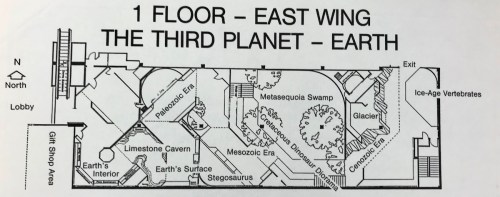
Map of The Third Planet from a 1980s student worksheet.

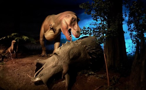
Most pertinent to this blog is the paleontology exhibit, called The Third Planet. Now over 35 years old, The Third Planet is dated scientifically but remains a masterful example of Milwaukee style exhibit design. Its most celebrated component is a 2,500 square foot diorama of a Tyrannosaurus eating a Triceratops in a Late Cretaceous cypress swamp. If you haven’t been to MPM, you may well have seen photos of this display endlessly reproduced in dinosaur books from the 80s and early 90s. Nevertheless, the inception of the exhibit was less about the dinosaurs and more about geology.

According to former Curator of Geology Robert West, The Third Planet was primarily conceived as an exhibit about plate tectonics. MPM’s previous geology and paleontology exhibit, called A Trip Through Time, opened in 1964 and omitted plate tectonics as a unified explanation for geological processes like mountain building, as well as the distribution of plants and animals in the fossil record. While the general principles of continental drift had been around for decades, it wasn’t until the 1960s that the idea became a universally accepted theory underlying all of earth sciences. A Trip Through Time was on the wrong side of that sea change, and West and his colleagues were keen to correct it.

In 1977, the community-led support organization Friends of the Milwaukee Public Museum provided $20,000 to start developing a new geology exhibit. This seed money allowed the museum to assemble a core concept team: content advisors West and fellow curator Peter Sheehan, designers Jim Kelly and Vern Kamholtz, and educators Barbara Robertson and Martha Schultz. The team began by visiting other museums as a benchmarking exercise, and eventually produced a draft script and statement of purpose for the new exhibit.

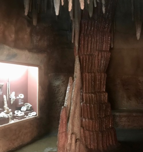
The limestone cavern is modeled after Cave of the Mounds in Blue Mounds, Wisconsin. Photo by the author.

Plate tectonics — and the idea that the Earth and life on it have been in constant motion throughout history — was to be the unifying theme of the proposed exhibit. Visitors would begin with an orientation film, then proceed on a walk through time, visiting a series of reconstructed habitats from the distant past. Highlights would include a limestone cavern, a Carboniferous coal swamp, life-sized dinosaurs, and the edge of an advancing glacier with an enterable ice cave. The overall budget was $1.9 million, a comparatively modest figure made possible by the extensive in-house production facilities already available at MPM. Funded in part by private donations and a National Science Foundation grant, the exhibit was green-lit to start production in early 1979.

While the scientists and collections staff worked on deinstalling A Trip Through Time and gathering specimens for the new exhibit, designers Kelly and Kamholtz started producing floor plans and miniatures. Script revisions were an ongoing process, informed by the availability of specimens and practical realities of construction.

MPM’s historic mastodon was joined by new mounts of a moa and an ice age bison constructed by Rolf Johnson. Photo by the author.

The in-house art department had the most daunting job. A team including Wendy Christiansen, Floyd Easterman, Mike Malicki, and Greg Septon created no less than six distinct immersive environments from scratch, and designed an assortment of life-sized animals to populate them. Bob Frankowiak, Carol Harding, and Syl Swonski painted the various murals and illustrations. Only a few pieces were purchased, among them a pair of dinosaurs from the famed Sinclair Dinoland exhibition at the 1964 World’s Fair. The Struthiomimus is a Dinoland original, while the Stegosaurus is a duplicate made from the original molds.

The Stegosaurus. Photo by the author.

The Tyrannosaurus diorama can be viewed from ground level or from a mezzanine. Photo by the author.

The exhibit artists put everything they had into the Tyrannosaurus scene. This was to be the first life-sized diorama of dinosaurs in their environment ever built, so it had to be spectacular. Artists created hundreds of individual fronds and leaves, pressed dozens of footprints into the simulated mud, and populated the scene with animals large and small. Although the bloody spectacle of T. rex digging into the side of Triceratops steals the show, the scene also contains a paddlefish, a Champsosaurus, a tiny mammal, a loon-like bird, and more. No detail was too small: the Tyrannosaurus even has drool (made from clear plastic lacquer) dangling from its teeth. Computer-controlled lighting (state-of-the-art in the early 1980s) cycles through different times of day, and a richly-layered soundtrack of animal calls brings the motionless tableau to life. All told, the diorama was nearly five years in the making from the earliest drawings to final installation.

The Ordovician reef. Photo by the author.

The Third Planet opened to the public on October 8th, 1983. 28,518 visitors attended opening events across three consecutive weekends, and media coverage was universally positive. The introductory film on plate tectonics even won a Golden Eagle Film Award in the Science category. Museum director Kenneth Starr (no relation to the former independent counsel) handled the occasional visitor complaint personally. In one amusing reply to a visitor complaining that the T. rex diorama was too gory, Starr wrote that “such is the way that life was and still continues to be in the natural world. We do no one any educational courtesy by portraying life a la Walt Disney and Fantasia.”

For the most part, The Third Planet is still exactly as it was 35 years ago. The most significant change was the addition of a mounted Torosaurus skeleton to the exhibit entrance in 1991, replacing the orientation film. The fossils were found by Bob and Gail Chambers during one of the museum’s “Dig-A-Dinosaur” summer field programs. Rolf Johnson coordinated a team of volunteers to prepare and mount the skeleton, all in view of the public. The now-classic Tyrannosaurus diorama was updated in 2017 with enhanced lighting and sound. According to regular visitors, the scene is now louder and more intense than ever. Two dromaeosaurs were removed from the diorama so that museum artists could outfit them with feathers, but they have yet to be reinstalled.

Torosaurus had a colossal head. At nine feet long and nearly as wide, it is rivaled only by modern whales. Photo by the author.

Nevertheless, much of the content in The Third Planet is decades out of date. This is largely the result of a major budget crisis MPM faced, and overcame, in the early 2000s. A CFO’s mismanagement put the museum eight figures in debt, and 40% of staff left or were laid off. The museum had to fight for its existence in a conservative-leaning state, fending off unhelpful suggestions to privatize, sell off collections, or close altogether.

Happily, MPM is now completely out of debt and looking toward the future. The museum’s collections facilities are in poor shape, and significant renovations would be needed for the institution to maintain its accreditation. Rather than continuing to lobby Milwaukee County (which owns the building the museum occupies) to update the structure, MPM is looking to move to a new, purpose-built location elsewhere in the city. Earlier this year, MPM revealed a series of conceptual images, all of which emphasize bright, open interiors and a mix of indoor and outdoor displays.

As explained in the museum’s FAQ document about the move, the best historic dioramas and exhibits would be moved to the new location. That means that, assuming MPM can find a location and funding for the new building, highlights of The Third Planet would surely be restored and re-contextualized in any future incarnation of the institution. At the very least, the prominence of dinosaurs and fossils in nearly all of the conceptual images makes it clear that paleontology exhibits will be part of MPM for a long time to come.

Many thanks to Archivist Ruth King for her generous assistance in accessing materials used for this article.

10 Comments

Filed under dinosaurs, exhibits, mammals, MPM, museums, paleoart

Tyler Keillor’s new tyrannosaurs

Paleoartist Tyler Keillor has not one but two new tyrannosaur sculptures on display in museums north of Chicago, and this past weekend I paid both of them a visit. Keillor has been reconstructing extinct animals since 2001, most frequently in collaboration with Paul Sereno. You may well have seen Keillor’s fleshed models of Rugops, Kaprosuchus, Eodromaeus, and others, all commissioned by Sereno to accompany press releases announcing new discoveries. Keillor also specializes in restoring incomplete fossil material, assembling physical or digital models of the complete, undamaged bones. The composite Spinosaurus skeleton from the 2014 National Geographic traveling exhibit was his work, as is the skull on the mounted skeleton of Jane the juvenile Tyrannosaurus at the Burpee Museum of Natural History.

Tyler Keillor’s Dryptosaurus at the Bess Bower Dunn Museum.

One of Keillor’s latest and most ambitious pieces debuted on March  24th at the brand-new Bess Bower Dunn Museum in Libertyville, Illinois. Standing at the entrance to the museum’s galleries, the life-sized Dryptosaurus is a show-stopping centerpiece. Never mind that no dinosaur fossils have been found in Illinois –  Dryptosaurus lived on the other side of the Cretaceous continent of Appalachia, which is as good an excuse as any to include a giant model dinosaur.

During the very well-attended opening event, Keillor gave a standing-room-only talk about creating the model. Dryptosaurus is only known from a handful of fossils, the most complete parts being the arm and leg. Working with Richard Kissel, who served as the project’s scientific advisor, Keillor had to make a number of educated choices to turn the available fossil material into a 20-foot fleshed model. The shape of the head, for example, is based on that of Jane, while the tiny, millimeter-sized scales are informed by recently published skin impressions of various tyrannosaurs. Less certain is the choice to give Dryptosaurus a two-fingered hand. For the time being, the three-fingered skeletons Research Casting International built for the New Jersey State Museum are no less reasonable.

Opening day at the Dunn Museum was mobbed – it’s great to see so many people excited about a new museum!

Keillor’s 2009 Dryptosaurus head is meant to be a male, while the new sculpture represents a female.

During the planning stages, Keillor prepared three possible poses for the museum to pick from. The Dryptosaurus could be standing tall, leaning forward with its mouth open, or crouching down next to a nest mound. Keillor favored the nesting pose, both because it was unusual and because the Dryptosaurus holotype fossils may have come from an animal that had recently laid eggs*. Unsurprisingly, museum staff opted for the more spectacular open-mouthed version.

The bulk of the model is foam, created on a milling machine using data from a digital model produced by Keillor. The foam body form is covered with nearly 200 pounds of epoxy putty, applied and textured by hand. Keillor casted the head as a separate piece, using the molds from a standalone Dryptosaurus head he produced for the Dunn Museum’s predecessor in 2009. The patches of fluff are made from a commercially-available synthetic fiber that resembles kiwi feathers.

*Edward Cope noted in the 1880s that the Dryptosaurus limb bones had large, hollow medullary cavities. Gravid female birds grow extra layers of bone in their medullary cavities to stockpile calcium, which they use to produce eggshells. We now know that several non-avian dinosaur species did the same. 

Little Clint at the Dinosaur Discovery Museum.

Keillor’s other new model is “Little Clint” the infant Tyrannosaurus rex, which debuted at the Dinosaur Discovery Museum in Kenosha, Wisconsin with absolutely no fanfare. The model is part of a new exhibit all about the discovery and interpretation of the pocket-sized T. rex fossils it’s based on. Frustratingly, there’s no mention of the exhibit on the museum’s website, and I would have never known about it if Keillor hadn’t mentioned it (I’m sure it’s not the museum’s fault, I too have known the joys of working within the constraints of a large municipal website). The model is roughly two and a half feet long, and is almost grotesque in its spindly proportions. Judging by photos accompanying the model, Keillor used a traditional build-up process, rather than the physical-digital hybrid techniques employed in the making of the Dryptosaurus.

Dryptosaurus and Tyrannosaurus both belong to the same group of theropod dinosaurs (tyrannosaurs), but in creating the two models Keillor went in two very different directions when reconstructing their soft tissues. Working with Richard Kissel of the Yale Peabody Museum, Keillor gave Dryptosaurus a patchy coat of shaggy integument, as well as fleshy lips that would easily cover the animal’s teeth if it were to ever close its mouth. However, Carthage College’s Thomas Carr, scientific advisor for Little Clint, requested a scaly hide with a crocodilian tooth-exposing grin.

Little Clint’s toothy grin.

It turns out feathers and lips on large theropods (and tyrannosaurs in particular) are fairly contentious subjects, at least among the sort of people who like to argue about these things on the internet. It is well-established that feathery integument was widespread among theropods, and even certain other dinosaurs. Several members of the tyrannosaur family have been found with fossilized fuzz impressions, including the Dryptosaurus-sized Yutyrannus. This means it’s reasonable to expect that all tyrannosaurs, including Tyrannosaurus rex, were feathered to some degree. However, a recent publication by Phil Bell and colleagues suggests the opposite: an assortment of small skin impressions from Tyrannosaurus and its closest relatives reveal only scaly skin. Meanwhile, ongoing research by Robert Reisz demonstrates that theropods had fleshy lips, but this is contradicted by Carr’s own findings that some tyrannosaurs had armored scales on their maxillary margins.

So which interpretation of tyrannosaur soft tissue is right? For now, there is compelling evidence for both interpretations. Perhaps more fossils or new analytical techniques will eventually steer the consensus in one direction or the other. Or maybe we will never know for sure what the faces of Dryptosaurus and Tyrannosaurus looked like. For now, Keillor’s models make fascinating companion pieces. They are windows into two possible versions of the deep past, reminding us to accept a little ambiguity now and then.

10 Comments

Filed under dinosaurs, exhibits, museums, paleoart, theropods

Paleontology Exhibits of California – Part 1

I’ve spent the last week on a whirlwind tour of southern California, visiting natural history museums, zoos, and botanic gardens, as well as seeing a fair assortment of marine mammals. Suffice it to say, my (endlessly patient) travel partner Stephanie and I ended the trip with a bit of sensory overload. I had planned to start off with a brief travelogue post and save more thorough analysis for later, but as usual I’ve gone and written much more than I intended.

La Brea Tar Pits and Page Museum

Howard Ball’s famous mammoth statues in La Brea’s lake pit.

The La Brea Tar Pits (a.k.a. the the tar tar pits) is an iconic fossil locality in downtown Los Angeles. I visited  in my single-digit years, but I remember the site better from documentaries like Denver the Last Dinosaur. The region’s asphalt seeps have been known to local people for thousands of years, and they were first commercially mined in the 1700s, when Rancho La Brea was a Mexican land grant. The animal bones commonly found in the asphalt were seen as a nuisance until 1875, when William Denton of Wellesley College identified a large tooth from Rancho La Brea as belonging to an extinct saber-toothed cat. Several years of largely unrestricted fossil collecting followed, until the Hancock family that had come to own the land gave exclusive collecting rights to the Los Angeles County Museum (now the Natural History Museum of Los Angeles County) in 1913.

Within two years, museum paleontologists had collected about a million bones, mostly from large Pleistocene animals like mammoths, ground sloths, wolves, and saber-toothed cats. This enormous abundance meant that the La Brea fossils were useful not only as research specimens but as trade goods. The LACM amassed much of its present-day fossil collection by trading La Brea fossils to other museums.

The Hancock family donated the 23 acres around the La Brea asphalt seeps to Los Angeles County in 1924. From that point on, the area functioned as a public park, where visitors could learn about ice age California and even watch ongoing excavations. Park facilities and exhibits expanded gradually over the ensuing decades. Sculptures of bears and ground sloths by Herman Beck were added to the grounds in the late 1920s. In 1952, a concrete bunker over one of the excavation sites became the first La Brea museum. The LACM board commissioned the site’s most iconic display – the trio of mammoth statues – in 1965, and sculptor Howard Ball installed them in 1968.

The George C. Page Museum, plus a man who wouldn’t move.

Finally, after years of planning and fundraising, the George C. Page Museum of La Brea Discoveries opened in 1977. The remarkable Brutalist building is adorned by a fiberglass frieze depicting ice age animals in a savanna environment. The aluminum frame holding up the frieze also contains an atrium of tropical plants, which the indoor exhibit halls encircle. Architects Willis Fagan and Frank Thornton designed the museum to fit organically into the established park setting, and to subliminally reflect the fossil excavations it celebrates. The building appears to be erupting from the ground, much like the asphalt and the fossils therein. The entrance is below ground level, so visitors must descend a ramp to meet the fossils at their point of origin.

The giant camel Camelops hesternus (front) with adult and juvenile mastodons (back). Those logs were also hauled out of the asphalt seeps.

Panthera atrox was apparently more like a giant jaguar than a lion. Small-by-comparison Smilodon fatalis in the back.

In many ways, the Page Museum is now a museum of a museum. Most of the interior exhibits, including the fossil mounts designed by Eugene Fisher*, are the same as they were in 1977. Photos show that the exhibit halls, prep labs, and collections areas have changed little in the last 40 years. And that’s okay! The museum building and the outdoor displays around it have been part of the Los Angeles landscape for decades, and cherished by generations of visitors. To the museum’s credit, the 1970s exhibits were well ahead of their time. Windows onto the prep lab and collections would be right at home in modern “inside out” museums, and an oft-repeated message that microfossils (such as insects, birds, rodents, and pollen) are more informative than megafauna fossils vis-à-vis paleoclimate and ancient environments is still very relevant to the field of paleontology today.

That isn’t to say there is nothing new to see. Newer signage around the park grounds does an excellent job re-interpreting older displays, especially those that are now considered inaccurate. For example, Howard Ball’s mammoth statues are probably among the most photographed paleoart installations in the world, but they completely misrepresent the way most of the animals found at La Brea actually died. Ball’s female mammoth is hip-deep in a man-made lake filling in an old asphalt quarry. As the signage (and tireless tour guides) explains, the animals trapped here thousands of years ago actually became stuck in asphalt seeps that were six inches deep or less. Meanwhile, while the classic friezes and murals throughout the Page Museum depict savanna-like landscapes, more recent analysis of microfossils demonstrates that the area was actually a fairly dense woodland.

Turkeys, condors, eagles, and storks are among the more unusual fossil mounts at the Page Museum.

There are two main reasons that the Page Museum is a must-see. First, it provides an in-depth view of a single prehistoric ecosystem. As mentioned, LACM traded La Brea fossils to all sorts of other museums, so chances are you’ve already seen a La Brea Smilodon, Paramylodon, or dire wolf. The Page Museum has these animals, but it also has rarely-seen creatures like ice age turkeys, condors, and coyotes. I counted 25 mounted skeletons in total, to say nothing of the hundreds of smaller specimens. My favorite display was a Smilodon skull growth series, where you can see how the adult saber teeth erupt and push out the baby sabers. In addition, the Page Museum stands right next to the La Brea fossil quarries, past and present. The museum and the park that preceded it were conceived as places where the public could see science in action. Researchers have been uncovering fossils at La Brea for over a hundred years, and visitors have been watching over their shoulders the entire time. That alone makes La Brea a very special place.

*All the La Brea mounts (at the Page Museum or elsewhere) are composites. To my knowledge no articulated remains have ever been recovered from the asphalt seeps. As Stephanie pointed out, the skull of the Equus occidentalis mount actually belonged to a significantly younger animal than the mandible. 

Natural History Museum of Los Angeles County

This Tyrannosaurus growth series is the centerpiece of the LACM Dinosaur Hall.

Our next stop was the Page Museum’s parent institution, the Natural History Museum of Los Angeles County (which I will continue to abbreviate as LACM for consistency). LACM actually features two fossil exhibits: the 2010 Age of Mammals Hall and the 2011 Dinosaur Hall. Both were part of a $135 million project to restore and update much of the LACM building, which first opened in 1913. While the two halls were developed concurrently by different teams, they are architecturally very similar. Parallel mezzanines flank spacious central aisles, which maximizes usable space in the two-story rooms and allows visitors to view most of the mounted skeletons from ground level or from above.

The primary strength of both the Age of Mammals Hall and the Dinosaur Hall is that they look really good. New skylights and newly uncovered bay windows yield plenty of natural light. Primary-colored panels provide interesting backdrops for the specimens, and fossil mounts on the ground and in the air keep visitors looking in all directions. These exhibits were clearly designed to look incredible from the moment you enter the room, and the abundant natural light means they photograph quite well.

Suspended skeletons make use of the vertical space and keep visitors looking all around the exhibit.

Triceratops and Mamenchisaurus at the front end of the Dinosaur Hall.

LACM’s mammal collection has been built up over the last century, while the dinosaur specimens were mostly collected by Luis Chiappe’s Dinosaur Institute in the decade preceding the exhibit’s opening. Nevertheless, both exhibits feature an uncommon diversity of beautifully-prepared fossils. I was particularly taken by the metal fixtures constructed to display incomplete skulls of Augustynolophus and Tyrannosaurus. The mounted skeletons were handled by two different companies: Research Casting International did the mammals and Phil Fraley Productions did the dinosaurs. I actually like the mammal mounts slightly better. There’s a greater range of interesting poses, and they don’t suffer from Fraley’s signature exploding chests.

The Poebrotherium, Hoplophoneus, and Hyracodon mounts are full of life and character.

A metalwork frame artfully shows the missing parts of this Augustynolophus skull.

All that said, there is a surprising divergence in the quality of interpretation between the Age of Mammals Hall and the Dinosaur Hall. On this front, the Age of Mammals Hall is better by far. There is an open floor plan that visitors can circulate freely, but everything comes back to three main ideas posted near the entrance: continents move, climates change, mammals evolve. In no particular order, the exhibit demonstrates how Cenozoic mammals diversified in response to the environmental upheaval around them.

On the ground floor, one tableau shows how dogs, horses, rhinos, and camels evolved to move swiftly across the emergent grasslands of the Miocene. Another area covers how mammals grew larger to adapt to an ice age climate. Overhead, a whale, sea cow, sea lion, and desmostylian illustrate four independent lineages that evolved to make use of marine resources. Exhibits on the mezzanine level focus on how paleontologists learn about prehistoric mammals. One area compares different sorts of teeth and feet. Another explains how pollen assemblages can be used to determine the average temperature and moisture of a particular time and place, while drill cores illustrate how a region’s environment changed over time. Although the exhibit as a whole has no time axis, it does an excellent job conveying how evolution works at an environmental scale.

The addition of dogs, camels, and rhinos makes for an informative twist on the classic horse evolution exhibit.

Struthiomimus is accompanied by a modern ostrich and tundra swan.

By comparison, the Dinosaur Hall doesn’t have any obvious guiding themes. The exhibit is a grab-bag of topics, and to my eyes, specimens and labels appear to be placed wherever they fit. Jurassic Allosaurus and Stegosaurus are surrounded by displays about the end-Cretaceous extinction. Carnotaurus of Cretaceous Argentina is paired with Camptosaurus of Jurassic Colorado. Mamenchisaurus shares a platform with distantly-related Thescelosaurus, which lived 80 million years later on the other side of the world. An explanation of what defines a dinosaur is confusingly juxtaposed with non-dinosaurian marine reptiles. If there’s any logic here, I didn’t see it. This is accentuated by the fact that the label copy is no more specific than a run-of-the-mill dinosaur book for kids. It all feels very generalized and unambitious, especially compared to the Age of Mammals Hall. I would have liked to see more information on what makes these particular specimens special, as well as how they were found, prepared, and interpreted. I suppose it’s up to the visitor whether an exhibit like this can get by on looks alone.

And so concludes day one of our trip. Next time, the Raymond M. Alf Museum and places south!

1 Comment

Filed under dinosaurs, exhibits, field work, history of science, LACM, mammals, museums, paleoart, reviews