Tag Archives: science education

A Game Changer?

Today, Google and 60 partner museums unveiled the new natural history arm of the Google Cultural Institute. Launched in 2011, the Cultural Institute is an effort to make culturally significant material accessible online. Up until this point, the primary focus has been on art and history. In conjunction with museums and other institutions around the world, Google has been uploading millions of images, archival documents, and virtual walkthroughs of significant places. The natural history project offers more of the same, but with 100% more dinosaurs.

I had no idea this was in the works, nor do I know much beyond what is said in the press release. After spending much of this morning exploring the site, however, you can color me impressed. The sheer amount of content is overwhelming: 300,000 annotated specimen photos, virtual walkthroughs of 50 museums, and 184 multimedia presentations on topics both general (cabinets of curiosities) and esoteric (native plants and fish of Korea). Unfortunately, accessing this content can be a bit of a chore. I was often confused by the user interface, and found many of the most interesting or useful items by accident.

Somewhere in the Ancient Americas exhibit.

Somewhere in the Ancient Americas exhibit at the Field Museum of Natural History. Google Cultural Institute

For me, the museum walkthroughs are the clear highlight. Using Google’s Street View technology, users can explore the included museums and get surprisingly close to individual displays. Some of these “virtual tours” are frustratingly limited to a few corridors between exhibits, but others provide darn near the full experience of actually being there. Of the museum walkthroughs I’ve looked at so far, the National Museum of Natural History and Berlin’s Museum für Naturkunde are particular standouts in this regard. A handful of museums have had virtual tours available online since at least the early 2000s, but this is the first time I’ve seen the concept escape the gimmick stage and become something potentially useful.

The quality of the multimedia presentations (“virtual exhibits”, if you must) is a bit mixed. The best ones make specific use of the partner museums’ collections, highlighting the scientific, cultural, or historical significance of particular objects. These presentations provide curatorial expertise and novel insights that are not easily found elsewhere. Other presentations, however, are frustratingly generalized, and don’t include much content that one couldn’t get from skimming a Wikipedia article.

yawn, another cgi sauropod. I'd rather see the mount.

Yet another middling CGI dinosaur. Yay, I guess? Google Cultural Institute

I would include the site’s flagship attractions – narrated 360-degree tours of selected exhibit halls – in the second camp. These three short videos each feature an exhibit that “comes to life” with the help of some acceptable-but-not-spectacular CGI. Take the video about the Giraffatitan at the Museum für Naturkunde. It’s awesome to be able to look all around the hall, but most of the video is taken up by an animated version of the dinosaur that doesn’t accomplish anything it’s Jurassic Park counterpart didn’t 23 years ago. The video starts to tell some interesting stories – convergent evolution between sauropods and giraffes, the rate of extinction caused by human activities far outpaces normal background extinction – but the goofy CGI Giraffatitan is very much in the way. Museums have so many strengths, so I’ll never understand the impulse to rely on things like animated dinosaurs that a) their audience can see elsewhere and b) Hollywood will always be able to do better.

A great deal of content to be found by the bold.

A great deal of content can be found by the bold. Google Cultural Institute

All in all, the new natural history project at the Google Cultural Institute is a very impressive starting point. Nevertheless, my optimism is tempered by the fact that the web is littered with apps and mini-websites developed by museums, then almost immediately abandoned. Too often, digital projects are taken on without a clear idea of who will continue to update it, what need is being addressed, or even who the website or app is for. The real test will be whether Google and the partner museums will continue to support the Cultural Institute with new content. This has been a recurring problem with museums’ digital endeavors, but perhaps the collaboration with Google (and its extensive infrastructure) will help.

Moreover, accessibility is an admirable goal, but there is a very wide gap between putting stuff online and creating something that lots of people (teachers, students, people who don’t live near museums) actually want to use. I’m encouraged by the range of material on the Cultural Institute site. Some content is fairly general, perhaps suitable for a 3rd grade science report, while other content is far more in-depth. I will be very curious to see what the public ends up using, and for what purpose. It would also be neat to see if this ended up being the start of a truly global digital collection, useful for educators and researchers alike. We’ll see if the Cultural Institute ends up being the catalyst that finally makes digital museums happen!

3 Comments

Filed under collections, dinosaurs, education, exhibits, museums, sauropods, science communication

Clash of the Texas Fossil Exhibits: PMNS

Life Then and Now

Life Then and Now at the Perot Museum of Nature and Science. Photo by the author.

In a recent interview at Love in the Time of Chasmosaurs, artist Brian Engh provided one of the best definitions of paleontology I’ve ever seen:

Paleontology is really just animals and plants doing animal and plant stuff, then dying and getting buried and all that stuff stacking up for unfathomable expanses of time.

This is how paleontology is portrayed in Life Then and Now, the fossil hall at the Perot Museum of Nature and Science. The exhibit clearly and cohesively portrays the world of the past as a collection of living ecosystems, and highlights both the fossil evidence and the means by which scientists interpret it. This is in stark contrast to the Morian Hall of Paleontology in Houston, which I found to emphasize style over substance. In the last post, I critiqued the Morian Hall’s art gallery format, arguing that it discouraged understanding and ultimately diminished the meaning and reality of the specimens on display. I was pleased that this discussion sparked lively conversations here and on twitter, but now it’s only fair that I follow up with an example of what I actually like to see in a natural history exhibit.

mosasaur and texas ornithiscians

The mid-Cretaceous, by land and by sea. Photo by the author.

The purpose of any exhibit structure is to provide meaning and context for objects – to help visitors see them as more than neat things to look at. It’s the museum’s job to give visitors the intellectual tools to contextualize displayed objects in a more sophisticated way. In terms of aesthetics and overall layout, this is clearly what the designers of Life Then and Now had in mind. The exhibit occupies a large, open, and well-lit space, with long sight lines around the room. There is a set of clear, over-arching themes, with individual stories playing back into the primary learning goals. Vignettes have large, informative headings that can be seen and understood on the move, but there is also plenty of detailed content for visitors who care to look more closely. Multimedia and interactives are deployed intelligently – they don’t exist for their own sake but cover content in novel and interesting ways.

All this serves to make the exhibit useful for visitors of a variety of ages and interest levels. For one thing, visitors are encouraged to engage with content at their own pace. They can see what the exhibit has to offer as soon as they enter the space, they can view specimens in whatever order interests them, and they always have a good idea of how much they’ve seen and how much there is left. Nevertheless, the core messages are never lost, even for fly-by visitors.  Most every display refers back to the exhibit’s key themes, and the main idea behind every vignette is visible from a distance. Meanwhile, the needs of advanced visitors are not forgotten. Specimens are not in cramped corners or obscured by dramatic lighting, but out in the open and visible from numerous angles.

benifet

One benefit of an open layout is that it encourages comparison. For example, why are these two megaherbivores shaped so differently? Photo by the author.

More specifically, the primary theme of Life Then and Now is that life of the past was not a pageant show of monsters but a set of living communities that operated under the same constraints that drive the evolution of plants and animals today. This is communicated by pairing fossil specimens with modern counterparts. Below, Pachyrhinosaurus and an extant moose both sport elaborate headgear used for competition and display. Elsewhere, extinct and extant animals illustrate intercontinental migration, herd living, adaptations for harsh climates, predator-and-prey arms races, and niche partitioning. Along the way, the process and mechanisms for evolution are brought up again and again. This hammers home the point that life is never static and always responding to environmental pressures, while simultaneously demonstrating that there is evidence for evolution everywhere you look. This is quite different from the Morian Hall, where I felt that the role of evolution in producing the variety of life on display was not made especially clear. The only thing missing from this presentation is a time axis. I wish the exhibit put more emphasis on the enormous expanses of time between the various fossil specimens on display, but I suppose it can be difficult to cover every angle.

vigniette

Visitors can see the main message of this vignette from a distance, or look more closely to find out more. Photo by the author.

Many, if not most of the vignettes also include the names and faces of the scientists involved in the discovery and interpretation of the specimens on display. This personalized approach matters for several reasons. It reminds visitors that science is a process, not a set of facts. It illustrates that there is more to a museum than its exhibits, and that the institution’s most important and unique resource is the in-house research staff who use the collections to create new knowledge. Finally, since the Perot Museum is generally pitched for younger visitors, it’s critical to show that science is done by real and diverse people, not caricatures in lab coats or pith helmets. A human face goes a long way toward making the process of doing science relatable (and for kids, something to aspire to).

Other important stories are told around the perimeter of the exhibit space. Near the entrance, a remarkably concise display covers the definition of a fossil and brings order to the diversity of life on Earth. This is accomplished with a series of stacked boxes printed on the wall. The largest boxes are labeled Trace Fossils and Body Fossils. Within Body Fossils, there are Plants, Invertebrates, and Vertebrates. Within Vertebrates, there are Fish and Amniotes, and within Amniotes there are Synapsids and Reptiles. So it continues, eventually illustrating that dinosaur bones are only a small part of the huge range of living things that are found as fossils. Since visitor research has shown that cladograms are often counter-intuitive to non-specialists, it’s nice to see an attractive and accessible alternative.

layered boxes instead of cladogram

Colorful, stacked boxes offer a more accessible alternative to a cladogram. Photo by the author.

In another corner, there is a small display devoted to dinosaurs in popular culture. While some might call this a waste of space, I think it’s helpful to draw contrasts between popular images of dinosaurs and the real animals that were part of the history of life on our planet. This display acknowledges the relevance of roadside statues and Jurassic Park while plainly separating them from the rest of the science-driven exhibit.

Quite possibly the best part of Life Then and Now (well, aside from the Alamosaurus – sauropods upstage everything) is the Rose Hall of Birds on the mezzanine level. It’s remarkable enough that the bird displays merge seamlessly with (and are in fact a part of) the dinosaur exhibit. But the Hall of Birds goes further, covering flight adaptations like unidirectional airflow and pneumatic bones, and how they first evolved for different reasons in dinosaurs. This is content that I wasn’t introduced to until grad school, but it’s all explained succinctly here, in language that is probably accessible to interested elementary school students. For some reason, this exhibit also includes digitized versions of bird-related literature dating back to the middle ages. It’s wonderful to see historic natural history acknowledged and celebrated in this context!

bird evolution!

Bird evolution explained. Photo by the author.

While Life Then and Now is barely half the size of the Morian Hall, I think it provides a much richer educational experience. While the exhibit certainly doesn’t reject what visitors expect to see (fighting dinosaurs!), it uses preconceptions and existing knowledge to make a series of important points about biology and evolution. As such, it’s an ideal blend of fun and science, visually attractive but built from the ground up on solid evidence. I can’t recommend it enough.

If any readers have visited the Perot Museum and/or HMNS, what did you think? Please don’t hesitate to weigh in!

Leave a comment

Filed under dinosaurs, exhibits, fossil mounts, opinion, reviews, science communication

Fossil sandboxes are terrible

Are these kids learning yet?

Are these kids learning yet? Source

Today, I need to take a moment to rail against one of the most reliably entertaining and beloved of museum attractions – fossil sandboxes. These activities are nearly ubiquitous at paleontology-related parks and museums, and some of them can be quite large and elaborate. There are a few variations, but they generally involve children using simple hand tools to dig through sand or loose gravel to uncover planted fossils (usually replicas, but I’ve seen a few places sacrifice real Pleistocene bones for this activity). Kids and families absolutely adore fossil sandboxes, and they generate all kinds of goodwill for the museums that feature them. In fact, many visitors have come to expect sandbox digs at paleontology exhibits, and become annoyed when one isn’t available.

I understand the appeal of sandboxes. For kids, they’re an opportunity to play pretend, engage in a physical activity after a day of looking at stuff, and generally have fun making a mess. Museum educators, myself included, are all about Gardner’s theory of multiple intelligences – the idea that different people learn best in different ways. While some easily absorb and retain information by reading or listening quietly, others prefer to solve a problem, talk through a topic with others, or engage in some sort of hands-on activity. That last one is called bodily-kinesthetic intelligence, and it is common among athletes and actors, among others. A fossil sandbox allegedly provides an activity for bodily-kinesthetic learners to develop and hone a physical skill related to the topic at hand. Kids get a chance to see and feel what it’s like to be a real paleontologist working in the field.

Except not really. A sandbox focuses kids’ attention, but that’s not the same thing as learning. What they’re doing has virtually nothing to do with actual paleontology. Digging is a comparatively minor part of field work – far more time is spent prospecting for fossils. When a team does start excavating, it’s conducted in a precise and organized manner, so that no taphonomic data is lost. By comparison, the sandbox arrangement conjures ideas of frantic treasure hunting, rather than piecing together and interpreting clues about past life. Furthermore, digging through loose sand is exceedingly rare in the field. If it were so easy to get at fossils, they would either have been found already or would have eroded away to nothing. A simulation is supposed to model a real event, or constrain that event to a limited set of variables. Sandbox digs do neither. Parents and caretakers might appreciate a place where kids can entertain themselves for a while, and educators can pat themselves on the back for providing a physically-involved experience. But there’s no use pretending that anybody is learning in what amounts to a themed playpen.

One alternative to the sandbox concept is provided by Thistle. He describes an activity in which he sets up a series of square meter “dig sites” within a room. Different specimens or artifacts are placed in each square. Participating students are then told that each square represents what was found in a layer of excavation, and are prompted to draw conclusions based on the different objects recovered from different strata. Students consider the spatial relationships among found objects, and discuss the roles of taphonomy and deep time. Unlike a sandbox dig, the results of this activity are comparable to those of a real excavation, and students are asking the same sorts of questions paleontologists would. Granted, Thistle’s activity requires much more guidance than a sandbox, but it’s a good example of something that participants might actually learn from.

The point is, we owe our audiences more than a mindless diversion with no bearing on actual science. And for that matter, we owe the scientists whose work we’re communicating more than a tacky, inaccurate simulation. If our goals are to inspire enthusiasm for science and to encourage young visitors to think scientifically, surely we can do better than a sandbox dig.

References

Thistle, P.C. 2012. Archaeology Excavation Simulation: Correcting the Emphasis. Journal of Museum Education 37:2:65-76.

6 Comments

Filed under education, exhibits, field work, museums, opinion, science communication

Framing Fossil Exhibits: Phylogeny – An Addendum

After I posted my slightly critical evaluation of the AMNH fossil halls last month, a reader suggested I take a look at Next of Kin by Lowell Dingus. Dr. Dingus was the project director for the 1995 renovation, and his book chronicles the decade-long process of overhauling these genre-defining exhibits. It also includes plenty of gorgeous photos of the AMNH fossil exhibits past and present. Although out of print, Next of Kin can be found online for next to nothing. If you find anything on this blog interesting, I would call this book required reading. I cannot recommend it enough.

Edwin Colbert designed this version of the Jurassic exhibit in 1956. This space is now the Hall of Saurichian Dinosaurs. Photo from Dingus 1996.

Next of Kin is full of fascinating information about the renovation, and the history of the halls in general. For instance, it was news to me that the original plan in 1987 was to modernize only the two fossil mammal halls. When William Moynihan took over as Director of AMNH the following year, however, he asked in a planning meeting why the dinosaur exhibits weren’t being renovated, and soon the project expanded to include all six halls on the 4th floor. Apparently the approaches to interpretation, aesthetics, and layout that characterize the exhibits today were already fully formed. The concept of a main pathway with branching alcoves representing individual clades was in place, so the exhibit team only needed to set the starting point back a ways to include the dinosaurs and the rest of the vertebrate family tree. Restoring the historic interior architecture, obscured since the 1950s, was also an early priority. Dingus relates how he wanted to eliminate the “black box” look of the midcentury exhibits and let natural light back into the halls. In my opinion, the well-lit, airy aesthetic is one of the standout features of the AMNH fossil halls, and one other museums might do well to emulate.

Dingus also points out a number of clever design choices that I missed during my last visit to the museum. For instance, the primate section was deliberately placed in the center of the mammal hall, to avoid the implications of directed evolution and human superiority that once marked the AMNH exhibits. Another cool feature is the use of minimalist metal armatures to suggest the size and shape of animals for which only limited material is available. This is an artful way to convey the dimensions of these species without resorting to fabricating most of the skeleton. Again, this is something I’d love to see more of at other museums.

Photo by the author.

Minimalist armatures suggest the size and shape of incomplete specimens. Photo by the author.

Still, I was most interested in reading Dingus’s rationale for the design and layout of the AMNH fossil halls. In my previous post, I argued that the phylogenetic arrangement was a worthwhile experiment, but in practice it may not be the most practical way to make the history of life meaningful to the museum’s primary audience. More than any other organizational scheme, phylogeny is the way biologists think about the natural world, and I applaud the effort to encourage visitors to look at fossils the way scientists do. However, even the most basic elements of evolutionary classification are specialized knowledge, and require a daunting amount of up-front explanation (especially when targeting multiple age groups). I don’t think this integrates well with the multi-entrance, non-linear exhibit space at AMNH.

During the initial planning stages of the AMNH renovation, Dingus and other staff toured several large-scale paleontology exhibits in North America and Europe. Dingus clearly did not like what he saw, lamenting that “some institutions rely heavily on easy-to-understand, anecdotal labels and robotic recreations of dinosaurs that appeal to the lowest common denominator of visitor intellect.” He rejected the “prominent contemporary school of exhibit design that advocates only giving the visitor what he or she asks for,” feeling strongly that his institution could do better. Referring to the renovation as a “scientific crusade,” Dingus was inspired to challenge his audience in a way that peer institutions did not. Dingus and his colleagues wanted to show visitors the real science behind paleontological reconstructions. The phylogeny-based arrangement was central to that goal, emphasizing rigorous anatomical analysis and empiricism in a field historically characterized by idle speculation.

Age of Man

The orientation hall is in the oldest of the 4th floor exhibit spaces. Until the 1960s, this space was occupied by the Hall of the Age of Man. Photo from Dingus 1996.

I agree wholeheartedly with all of this. There was a period in the 80s and 90s (I think the worst is behind us) when the trend toward visitor-focused, educational exhibits got mixed up with a push to make museums more competitive with other leisure activities. Customer enjoyment was valued above all else, even if it meant sacrificing the informative content and access to real specimens that made museums worthwhile institutions in the first place. The resulting displays were filled with paltry nonsense like simulators, pointless computer terminals, and the aforementioned robot dinosaurs*. These exhibits imitated amusement parks, but with only a fraction of the budget they quickly fell into disrepair and technological obsolescence. Despite being museums’ most important and unique resources, curators and research staff found themselves increasingly divorced from their institutions’ public faces.

*Fine, I admit robot dinosaurs are cool. But I’d prefer that they weren’t in museums.

Under these circumstances, a backlash is quite understandable. Nevertheless, it is a common mistake (which I am by no means accusing Dingus of making!) that a visitor-centered exhibit is the same as a frivolous one. When educators push for audience-focused exhibits, they have the same goal as curators: to communicate as much content as possible. Audience-focused exhibits aren’t about dumbing down or eliminating content. They’re about presenting content in a way that effectively reaches the museum’s diverse audience. The AMNH fossil halls would work well for an informed adult visitor with ample time to inspect every specimen and read every label. But this is not the typical audience for natural history museums, and unless AMNH is a major outlier, it’s not the core audience for these exhibits. Most visitors come in mixed-aged groups. The trip to the museum is a social experience, and interactions occur among visitors as much as they occur between visitors and the exhibits. The best museums anticipate and meet the needs of these visitors in order to provide a quality learning experience.

ponies

An updated version of the classic (and classically misleading) horse evolution exhibit. Photo by the author.

It’s admittedly fun to share horror stories about dumb comments overheard in museums. Who in this field hasn’t rolled their eyes at the parent who makes up an answer to their child’s question, when the correct information is on the sign right in front of them? And yet, some of the blame for this failed educational encounter should fall on the museum. Why was that parent unable to spot the relevant information with a quick glace? Can we design signage so that the most important information is legible on the move, or from across the room? Can we correct commonly misunderstood concepts in intuitive ways?

As Dingus argues, it’s important to aim high in the amount of information we want to convey. There’s nothing worse than a condescending teacher. But a carefully-honed message in common language will always be more successful than a textbook on the wall. Happily, this is the way the wind is blowing these days. In a strong reversal of the situation a decade ago, curators now work closely with educators on the front lines to produce exhibits that are both accessible and intellectually challenging. It’s been 20 years since AMNH opened the latest version of its fossil exhibits…perhaps a new and even better iteration is already on its way!

Reference

Dingus, L. (1996). Next of Kin: Great Fossils at the American Museum of Natural History. New York, NY: Rizzoli International Publications, Inc.

5 Comments

Filed under AMNH, education, exhibits, fossil mounts, mammals, museums, opinion, reviews, science communication, systematics

Framing Fossil Exhibits: A Walk Through Time

Half a year ago, I promised a series of posts comparing the common strategies for framing the history of life in museum exhibits. This post is the first step toward making good on that goal. Historically, fossil displays at major natural history museums amounted to little more than dinosaur pageant shows, and even today this is all many visitors want or expect. The challenge for exhibit creators is to contextualize the fossils as part of a greater narrative without being alienating, overwhelming, or perhaps worst of all, condescending. A large, permanent exhibit is an enormously time-consuming and expensive undertaking. The opportunity to build or thoroughly renovate an exhibition might occur only once in a generation, so there is exceptional pressure to produce something that succeeds and endures. Exhibits tend to be products of their time, however, and are strongly influenced both by contemporary scholarship and trends in museum theory.

One of the most enduring formats for exploring the fossil record is the “walk through time.” A chronological portrayal of the history of life is an obvious solution, and I don’t mean that in a disparaging way. Audiences are predisposed to understand the forward progression of time, so little up-front explanation is needed. It also helps that the geological timescale compartmentalizes the history of Earth into tidy units. Each Era, Period, or Epoch has a unique cast of characters and a few defining events that make it easy to sum up. There are plenty of examples of chronological fossil exhibits, including Prehistoric Journey at the Denver Museum of Nature and Science, The Third Planet at the Milwaukee Public Museum, and even traveling exhibits like Ultimate Dinosaurs. For this post, though, I’ll be using the Field Museum of Natural History’s “Evolving Planet” as my primary case study, since it so thoroughly embraces the “walk through time” format (and I have a good set of photos on hand to jog my memory).

Map of Evolving Planet. Source

Map of the Field Museum’s Evolving Planet galleries. Source

Evolving Planet is a 27,000 sq. ft. journey through the evolution of life. It opened in 2006, although it is notable that Evolving Planet relies heavily on the structure of the previous paleontology exhibit, “Life Over Time.” Major set pieces like the replicated Carboniferous coal swamp and the Apatosaurus mount remained in place while exhibit designers overhauled the aesthetics and narrative. The most important change is the explicit focus on evolution. Although evolution is key to all biological sciences and the evidence for it is overwhelming, many schools in the United States fail to teach evolution properly and at least a third of the population rejects it outright. As destinations for life-long learning, museums are well-poised to address this deficit in evolutionary understanding, and the Field Museum has enthusiastically risen to the occasion. Evolving Earth weaves the evidence for evolution into all aspects of the displays. The first thing visitors see is the thesis of the exhibit—everything that has ever lived is connected through and is the result of evolution—printed on an otherwise blank wall. Moving forward, visitors learn how evolution via natural selection works, and how we know. Along the way, common misconceptions, such as the idea that lineages improve over time, or that evolution is “just a theory” are proactively addressed and corrected.

eg

The thesis of Evolving Planet cannot be missed. Photo by the author.

This pedagogical approach defines a trend in exhibit design that began in earnest in the 1950s. Early natural history exhibits were designed by and for experts, combining expansive collections of carefully arranged specimens with a few “iconic” displays, such as dinosaur skeletons or taxidermy mounts. By the mid-20th century, however, visitor-centric ideas had begun to take root. Designers began to envision the routes visitors would travel through an exhibit space, and consider what they would look at first when entering a room, and why. Soon hierarchical signage (main ideas in big text, working down to sub-topics and specimen labels) became the norm. Exhibits were enriched with interpretive displays, like dioramas, and scholarly labels were replaced by conversational text and even multimedia. By the 1970s, most of the exhibit responsibilities once held by curators were now handled by exhibit designers and developers. No longer places to explore a collection and view objects at will, exhibits now had carefully structured narratives built around explicit educational goals. In the 80s and 90s, the very floorplans of new exhibits came to reflect this identity, as open halls were replaced with carefully directed switch-backing corridors.

Each geological time period in Evolving Planet is color-coded. Photo by the author.

Each geological time period in Evolving Planet is color-coded. Photo by the author.

Once we reach the Permian, the fossils can start to speak for themselves. Photo by the author.

Once we reach the Permian, the fossils can start to speak for themselves. Photo by the author.

Evolving Planet is, for better or worse, thoroughly rooted in the late 20th century tradition of exhibit design. As the map above shows, once visitors enter Evolving Planet, they are committed to a lengthy trek along a predetermined route. There are no shortcuts to the dinosaurs – you must traverse the entire history of life, starting with its origins in the Precambrian. Along the way, you’ll become familiar with the exhibit’s iconography. Every time you enter a new geologic period, you are greeted by a “Timeline Moment.” These include a chapter heading, a back-lit illustration, an update of where you are on the timeline, and a summation of the key evolutionary innovations and environmental changes of that age. All the walls and graphics in each section are also color-coded, making your progression to each new period very distinct. Finally, the path is occasionally interrupted by unmissable black and red area indicating that a mass extinction has occurred. The resulting experience feels like walking through a book. Information is relayed in a specific order, and visitors are expected to recall concepts that were introduced in previous sections.

A panoramic CGI recreation of the Burgess Shale fauna brings small, easily overlooked fossils to life.

A panoramic CGI recreation of the Burgess Shale fauna brings small, easily overlooked fossils to life. Photo by the author.

One challenge inherent to a chronological narrative of the history of life is that the physical evidence for early organisms simply isn’t very interesting to look at (for non-specialists, anyway). Large mounted skeletons of fossil vertebrates have a lot of presence, but they same can’t be said for stromatolites and wiggly-worm impressions. The designers of Evolving Planet address this problem in two ways. First, they built iconic contextual displays to stand in for fossils that aren’t suitably monumental on their own. The Cambrian section features a panoramic animated recreation of the Burgess Shale environment. Actual fossils are available, but the video is what makes visitors stop and take note. Likewise, the Carboniferous section is dominated by a walk-through diorama of a coal swamp, complete with life-sized giant millipedes and dragonflies. Like the predetermined pathway, these landmark displays are very much in keeping with late 20th century trends in exhibit design. It’s a conceptually odd but admittedly effective reversal of the classic museum: fabricated displays are supported by genuine specimens, instead of the other way around.

evolving earth

Mass extinction markers tell visitors to expect something different up ahead. Photo by the author.

The second strategy concerns the layout of Evolving Planet, which was inherited from the previous exhibit, Life Over Time. The space is shaped like a U, with switch-backing corridors flanking a more open dinosaur section in the middle. Curator Eric Gyllenhaal explained that “the heavy content, on the stuff that people were not familiar with, was the stuff that came first and came afterward, and that’s where we really got into the details of the evolutionary process” (quoted in Asma, pp. 226-227). Visitors are more focused and more inclined to read signs carefully early in the exhibit, so the developers used the introductory rooms to cover challenging concepts like the origins of life and the mechanisms of speciation. This is the “homework” part of the exhibit, and the narrow corridors and limited sightlines keep visitors engaged with the content, without being tempted to run ahead. Once visitors reach the Mesozoic and the dinosaurs, however, the space opens up. Among the dinosaur mounts, visitors are can choose what they wish to view, and in what order. This serves as a reward for putting up with the challenging material up front. The path tightens up again on the way out, but it’s not as pedagogically rigorous as the beginning of the exhibit. Some sections, like the human evolution displays, are actually cul-du-sacs that can be bypassed by visitors anxious to leave.

struggling to contain the dinosaurs

Although the dinosaurs get a third of the exhibit to themselves, the hall still struggles to contain them. Photo by the author.

The story of human evolution is relegated to a cul-de-sac late in the exhibit. Photo by the author.

The story of human evolution is relegated to a cul-de-sac late in the exhibit. Photo by the author.

Evolving Planet’s chronological narrative and linear structure complement each other nicely. The sequential path gives the exhibit designers significant control over the visitor’s learning experience, and when dealing with widely misunderstood concepts like evolution, the benefits are clear. The exhibit establishes clear learning goals, and designers can be reasonably confident that these goals are being met. Based on the other new permanent exhibitions at the Field Museum, I get the impression that the design team strongly favors linear exhibits. 2008’s “Ancient Americas”, for instance, closely mirrors Evolving Planet’s structure: a set path through a series of themed spaces, unified by consistent iconography. The designers are to be commended for absolutely owning this concept, and realizing it to its full potential.

Exhibit designers deliberately made the path to the exit much more obvious in the second half of Evolving Planet. Photo by the author.

Exhibit designers deliberately made the path to the exit much more obvious in the final stretch of Evolving Planet. Photo by the author.

The problem with a linear design, of course, is that it’s constraining.  All visitors enter with prior knowledge and a certain worldview or perspective, and are inclined to be more interested in some displays than others. Linear exhibits largely suppress this by forcing everyone through the same tube. Ironically, the strong emphasis on the sequence of geological time periods may also overstate their importance. While these divisions are defined based on real events like extinctions and faunal turnover, they are still human constructs with often messy borders. Relying too heavily on them understates the importance of long-term, short-term, and localized evolutionary events.

Museums should be educational, and exhibits should challenge visitors, particularly regarding the mechanisms of evolution and the scope and complexity of deep time. Still, there’s something to be said for free choice in elective education. Evolving Planet, and “walk through time” exhibits in general, skews more toward the former. It’s an effective option, but also a safe one. Next time, we’ll take a look at exhibits that frame paleontological science in less intuitive ways.

References

Asma, S.T. 2001. Stuffed Animals and Pickled Heads: The Culture and Evolution of Natural History Museums. New York, NY: Oxford University Press.

Diamond, J. and Evans, E.M. 2007. “Museums Teach Evolution.” Society for the Study of Evolution 61:6:1500-1506.

Marsh, D.E. 2014. From Extinct Monsters to Deep Time: An ethnography of fossil exhibits production at the Smithsonian’s National Museum of Natural History. http://circle.ubc.ca/handle/2429/50177

1 Comment

Filed under education, exhibits, FMNH, fossil mounts, museums, reviews, science communication

National Fossil Day 2014

Happy National Fossil Day! This will just be a quick photo post covering the events at the National Museum of Natural History today. The National Park Service started the day with a junior paleontologist swearing-in ceremony, where students from a dozen area schools learned about the importance of protecting and preserving public lands and natural resources.

Photo by

Photo by the National Park Service.

The main show was in the Q?rius education center, where museum staff and volunteers showed off their latest work and discoveries. Visitors could see tiny mammal bones and teeth plucked from matrix collected in Haitian caves, and work through a particularly inspired activity demonstrating how geologists correlate layers in different parts of the world.

nfd2

Photo by the author.

Photo by

Photo by the National Park Service.

Resident scientific illustrator Mary Parrish had a particularly fascinating display, showcasing the methods and materials she uses to create accurate paintings of prehistoric environments. Note the aluminum foil leaves used as models to paint from, as well as the hand-made macquettes used to block out scenes and experiment with poses. Also on view was a draft of the giant Hell Creek mural that will be on display in The Last American Dinosaurs, opening in November.

nfd3

Photo by the author.

Out in the lower level lobby, the National Park Service, Bureau of Land Management, US Forest Service, National Science Foundation, Calvert Marine Museum, and Maryland Dinosaur Park had activities and displays. Here’s our display of recently discovered fossils from Cretaceous Maryland, slightly overshadowed by the Nation’s T. rex. We talked with visitors about Maryland’s role in the history of dinosaur science, the importance of the early Cretaceous as the origin of the world we know today, and our citizen science programs at the Park in Laurel.

image

Photo by the author.

Photo by the author.

Our Deinonychus replica looks a little small next to the Nation’s T. rex. Photo by the author.

National Fossil Day is all about generating awareness and enthusiasm for fossils and the study of the Earth’s natural history. In that, I think the event was quite successful. We talked to nearly 400 people, all of them enthusiastic and eager to learn about local prehistory and the process of discovering the ancient past. It was also a fun opportunity to catch up with people – the Washington area paleontology scene isn’t very big!

Thank you to the National Park Service for coordinating this event, and to the Smithsonian for hosting it!


Leave a comment

Filed under citizen science, Dinosaur Park, dinosaurs, exhibits, museums, NMNH, paleoart, science communication

The Osborn problem

In both paleontology and the museum field, we’ve long contended with what one might call “the Osborn problem.” The legacy of Henry Fairfield Osborn, paleontologist and president of the American Museum of Natural History between 1908 and 1933, is quite important to both fields.  To paleontologists, he is known for accumulating at AMNH one of the largest and most exhaustive fossil collections in the world,  for financing and supporting the careers of legends like Barnum Brown and Charles R. Knight, and of course for naming and describing saurian celebrities like Tyrannosaurus and Velociraptor.

Osborn is also well-regarded by museum specialists for heightening the standards for public exhibitions, investing in lifelike habitat dioramas of taxidermy animals and spectacular mounted dinosaur skeletons in order to make science exciting for a wide audience. Osborn’s devotion to storytelling and drama in the exhibits he curated brought millions of visitors to AMNH and quite literally defined public expectations for what museums should offer to this day.

Henry Fairfield Osborn.

Henry Fairfield Osborn.

In recent decades, however, historical interest in Osborn has been mostly focused on his disreputable personal and political beliefs: Osborn was a flagrant racist and anti-Semite,  an admirer of Adolf Hitler and a strong supporter of research in eugenics. Osborn regularly used his clout to bring material harm to the American working class, lobbying for legislation including the Emergency Quota Act and the Immigration Act of 1924. For what it’s worth, Osborn was also apparently unbearably arrogant and truly dreadful to work with, going as far as to demand lower-ranked museum employees leave the elevator car when he got on.

All this puts paleontologists and museum specialists in an awkward position. Is it acceptable to admire Osborn’s positive achievements in light of his personal politics? After all, Osborn’s views were not terribly unusual among the aristocratic class of his day. Perhaps we shouldn’t condemn the man entirely for not “rising above his time and place” (as Stephen Ambrose argues regarding coming to terms with Thomas Jefferson the slave owner).

Unfortunately, Osborn’s case is complicated by the fact that his bigotry inspired (or at least contributed to) much of his work at AMNH*. To start, Osborn’s scientific work was based on an inaccurate orthogenetic interpretation of evolution. He professed that an ill-defined guiding force shaped life from lesser to greater forms, the effect of which could be seen by comparing “primitive” and “advanced” species, and of course, “primitive” and “advanced” expressions of humanity. While we cannot conclusively link Osborn’s pseudo-evolutionary ideas with his bigoted social agenda, it is certainly convenient for him that he saw people of “Nordic” descent as biologically superior.

*To clarify, none of the exhibits curated by Osborn remain on display and none of my comments here apply to the present day AMNH.

Critically, Osborn did not keep his ideas of natural hierarchy in the ivory tower. He explicitly intended that the exhibition halls of AMNH educate visitors not just about natural science but about the naturally graded order he believed to be characteristic of life on earth. Osborn thought that collections of biological specimens implicitly revealed an upward ascent of life, and that those on top had earned their place through innate superiority. Osborn pronounced that his exhibits would teach morality to new American immigrants, presumably by putting them in their place with the rather hideous racial hierarchy on display in the Hall of the Age of Man. As Donna Haraway puts it in her classic essay Teddy Bear Patriarchy, Osborn’s exhibits were a “gospel of wealth and privilege” that appropriated natural specimens to affirm the American elite’s place at the top of the pecking order.

Tyrannosaurus and others in AMNH Dinosaur Hall, 1927. Photo courtesy of AMNH Research Library.

Tyrannosaurus and others in AMNH Dinosaur Hall, 1927. Photo courtesy of AMNH Research Library.

Museums are understood to be sources of intellectual authority, and deservedly so. But exhibits have authorship, same as any other written work, and Osborn’s legacy demonstrates that the influence of authors and their worldviews can be a powerful force. For example, Osborn arranged the Hall of the Age of Man in what he saw as ascending order, from the ancient peoples of Africa, to North America, and finally Europe. Placed at the end of an exhibit series that started with Cambrian invertebrate fossils before passing through Paleozoic, Mesozoic, and Cenozoic fossil displays, the Age of Man gallery deliberately implied that European-descended humans were the culmination of the entire history of life on Earth.

Meanwhile, the exhibit on fossil horses curated by Osborn depicted small, multi-toed horses of the Eocene gradually becoming larger, losing toes and becoming better at being modern Equus. This orthegenetic representation runs counter to evolution via natural selection as originally proposed by Darwin, and as understood today. Indeed, other paleontologists, including O.C. Marsh, had established in the 19th century that horse evolution more closely resembled a tangled bush, with many overlapping morphological offshoots adapted to varying environmental circumstances. But Osborn had rejected Darwinian evolution in favor of his presumed hierarchy of life, and ensured that his inaccurate story was what was seen by millions of visitors.

So what does Osborn’s legacy mean to paleontologists and museum specialists today? Do we need to qualify every mention of his name with a denouncement of his worldview? Should we always write out “Tyrannosaurus rex Osborn, 1905″ as “Tyrannosaurus rex Osborn the racist jerk, 1905″? At minimum, Osborn’s exhibits are a sobering reminder to all us involved in science education that our field is not immune to bias. The  subjectivity of cultural and historical museum exhibits has been well-explored by scholars like Ames and Weil, but comparatively little reflection has been done on the authorship of exhibits on science and natural history. We rely on the “naturalness” of the objects we display to speak for itself, and to bear the burden of proof for the statements we make. The world around us is knowable, and science is the best tool to learn about it. But explaining what we have learned in any form (books, technical journals, museum exhibits) is an avenue for personal or cultural bias to slip in, and that is why it remains important to actively and regularly check our assumptions.

References

Ames, M.M. (2004). Museums in the Age of Deconstruction. In Reinventing the Museum: Historical and Contemporary Perspectives on the Paradigm Shift. Lanham, MD: AltaMira Press.

Brinkman, P.D. (2010). The Second Jurassic Dinosaur Rush: Museums and Paleontology in America at the Turn of the Twentieth Century. Chicago, IL: University of Chicago Press.

Colbert, E.H. (1968). Men and Dinosaurs: The Search in Field and Laboratory. New York, NY: E.P. Dutton and Co., Inc.

Haraway, D. (1984). Teddy Bear Patriarchy: Taxidermy in the Garden of Eden, New York City, 1908-1936. Social Text 11:20-64.

Kohlstedt, S.G. (2005). Thoughts in Things: Modernity, History and North American Museums. Isis 96:586-601.

Osborn, H.F. (1921). The Hall of the Age of Man in the American Museum. Nature 107:236-240.

3 Comments

Filed under AMNH, anthropology, history of science, mammals, museums, science communication

Beating the orthogenetic horse

According to the rad personalized 2012 review provided by WordPress, the top search engine terms leading people here over the last year were dinosours, horse evolutionary tree, horse evolution tree, horse phylogenetic tree and Daspletosaurus. It’s not too difficult to pick out the pattern there – horse evolution seems to be a major draw, even though I only mentioned it in a single post back in June. I aim to please, so I suppose a more detailed discussion of horse phylogeny is in order. First off, let me recommend Brian Switek’s thorough and thoughtful take on the subject. If you stick around here, you’re going to get more of a tirade.

Most depictions of horse evolution available online, including the one I posted a few months ago that is luring people to this site, are terrible. The typical linear presentation of horses progressively increasing in size from Eohippus to modern Equus, losing toes along the way, misrepresents not only what we know about horses as a group, but how evolution works in general.

This didn’t happen.

Evolution is, of course, neither linear nor progressive: it is primarily the result of populations adapting to thrive in their particular environments. As environments change over time species may evolve or go extinct, but there is no predetermined goal that lineages are reaching for. Modern Equus is not the most “highly evolved” horse – this is, in fact, a misleading if not meaningless concept, because a species’ success is dependent on its ability to thrive in that specific time and place. A modern horse is well adapted for grazing and running fast on open plains, but relocate one to the Eocene cloud forests where Eohippus thrived and it would do very badly.

Furthermore, it has been known for over a century that horses as a group did not consistently grow larger over time or otherwise become more Equus-like. Instead, horses diversified into a variety of forms over the group’s 55 million year existence, each group adapting to different environmental niches across the northern hemisphere. Large and small, forest-dwelling browsers and plains-dwelling grazers, these and all manner of other horses overlapped in time and space over the course of the Cenozoic. As J.W. Gidley of the American Museum of Natural History had worked out as early as 1907, horse evolution was not a linear progression but a tangled bush (just like the evolution of most other clades).

A modern horse phylogeny. From Macfadden 2005, via Laelaps.

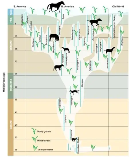
A modern horse phylogeny. From MacFadden 2005, via Laelaps.

So where did the orthogenetic depiction of horse evolution come from, and why is it still with us today? The answer highlights the importance of museum exhibits and specimen provenance in the public’s understanding of paleontology, with a dose of jealous personalities for good measure.

In 1859, Charles Darwin published On the Origin of Species, in which he articulated the process of evolution by natural selection virtually exactly as we understand it today. Darwin’s book incited a whirlwind of debate in both scientific and public circles because of its implication that the diversity of life could be attributed to natural forces, rather than an unknowable divine power. Within a decade, however, the vast majority of the scientific community was convinced by the soundness of Darwin’s theory, and to this day billions of individual observations of the natural world tell us that evolution is assuredly true.

One of the many lines of evidence covered in On the Origin of Species is the fossil record, with which we can trace the evolution and extinction of organisms over time, including the ancestors of modern life. However, Chapter 9 of Darwin’s book, “On the Imperfection of the Geological Record” (full text pdf) reads like like a lengthy apology for the incomplete nature of fossil preservation. Today, the use of organized, cladistic methodologies allow paleontologists to piece together detailed phylogenies from fossils, but in Darwin’s day, the evidence was patchier, and he opted to de-emphasise the fossil record’s usefulness to avoid such criticism. As Darwin put it, “we have no right to expect to find in our geological formations an infinite number of of those fine transitional forms.” Unfortunately for paleontology specialists, this led other biologists to believe that fossils could not make any independent contribution to the understanding of evolution. Largely shut out of the biggest biological discovery of all time, paleontologists became stewards of a “second-class discipline” (Sepkoski 2012, 9).

Paleontologists in the late 19th century.

Since biologists interested in evolution considered paleontology mostly irrelevant, late 19th-century paleontologists were left with three options. They could support evolution as best they could and accept that other biologists might not take notice, they could ignore theoretical discussion entirely and focus on purely descriptive studies of morphology, or they could be spiteful and seek alternatives to Darwinian evolution. The second course of action was the most popular well into the 20th century. E.D. Cope seems to be  an example of the third approach, favoring an odd sort of neo-Lamarckism in his book The Origin of the Fittest. Such conceptions of directional change, such as Cope’s Law, are counter to evolution as proposed by Darwin and as understood today. However, a handful of paleontologists stuck with it and endeavored to provide meaningful fossil evidence for evolutionary theory.

Throughout the 1860’s, paleontologist O.C. Marsh amassed an impressive array of fossil horses from Wyoming and elsewhere in the American west. Horse fossils had been found in Europe much earlier, but Marsh’s horse collection was much more complete, and was probably the best fossil record compiled for any vertebrate group at the time. In 1870, the influential British naturalist Thomas “Darwin’s Bulldog” Huxley visited Marsh in New Haven and was suitably impressed: Marsh’s fossils ranged from the Eocene up until the Pleistocene, providing a clear picture of how the horse family had evolved over time. While Darwin had been hesitant to make too big a deal about the fossil record as evidence for evolution, the horse fossils were blatant examples of animals changing over time.

During the same visit, Huxley gave a lecture in New York in which he cited the horse fossils as a fantastic new line of evidence in support of evolution. Unfortunately, Huxley’s lecture (while admittedly aimed at a general audience) tread into some severely teleologic territory. As quoted in The Gilded Dinosaur (Jaffe 2000, 162), Huxley told his audience that “the horse is in many ways a most remarkable animal in as much as it presents us with an example of one the most perfect pieces of machinery in the animal kingdom.” He went on to explain how horse ancestors, from the little four-toed Hyracotherium in the Eocene to increasingly large horses like Merychippus and Pliohippus, gradually perfected the design of the modern horse. According to Huxley, over the course of the Cenozoic horses got bigger, faster, leggier, and generally better at being horses as we know them today. Problematically, this essentialist narrative rather misses the point of evolution as described by Darwin. 

Marsh, like Huxley, was an early advocate of evolution,  but his narrative of horse evolution was more on the mark. Marsh concluded that the smaller early horses with brachydont teeth were well suited for life in the rainforests that covered the western United States 50 million years ago. Horses like we know them today emerged as a direct result of the Earth getting cooler and drier over the course of the Cenozoic, and by the end of the Pleistocene the lineages of forest horses were completely extinct. Equus is with us today not because it is the best horse for any circumstance, but because it was most successful during the ice ages that shaped the modern flora and fauna (it also helped that humans figured out that horses are useful and ensured their survival through domestication).

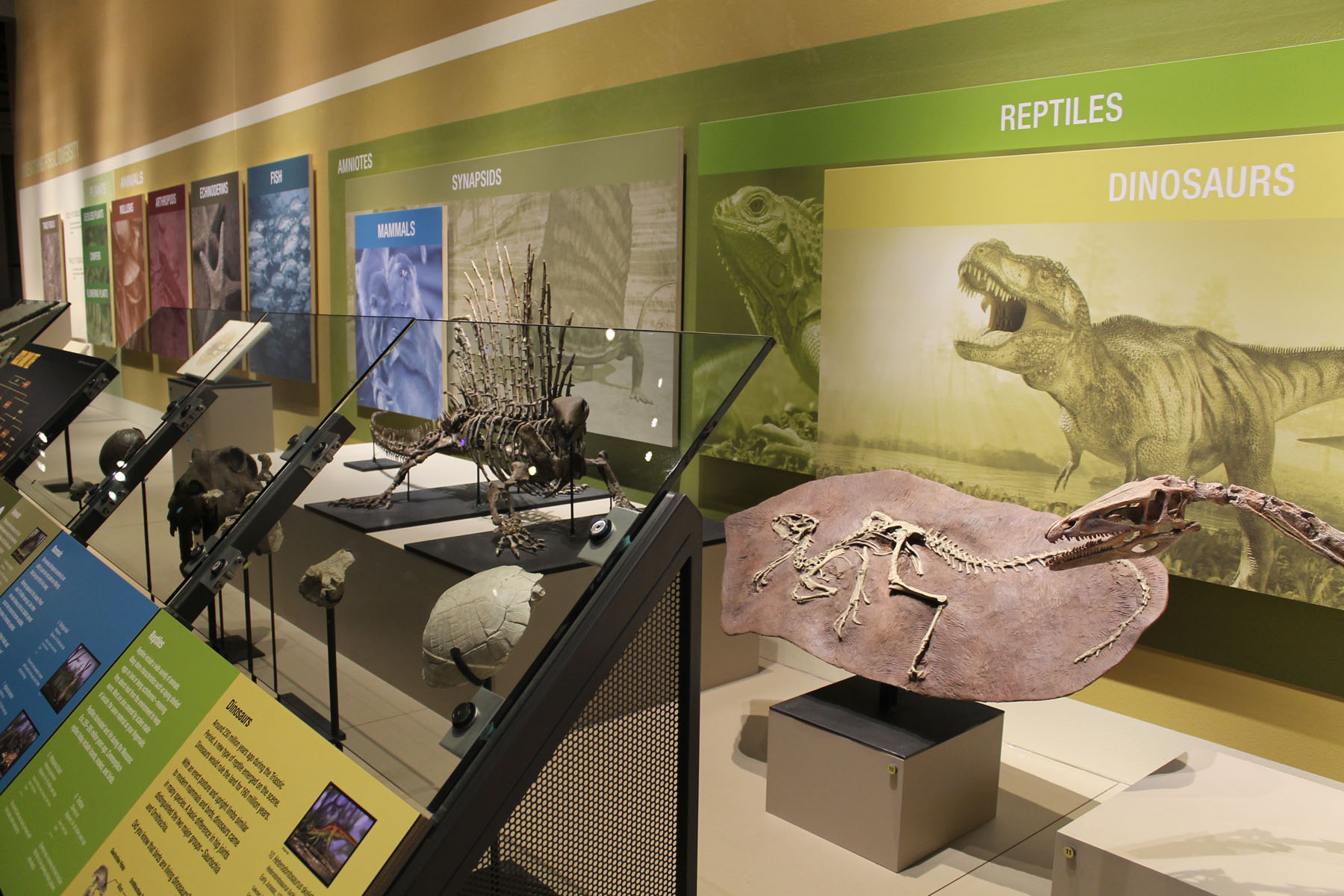
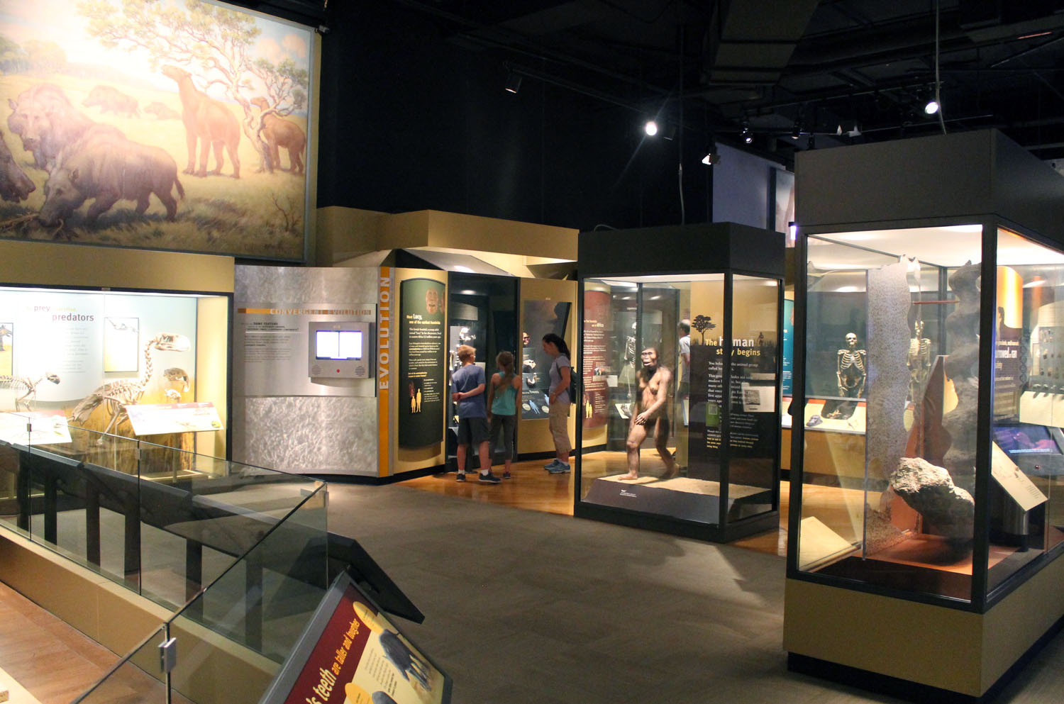
Unfortunately, Marsh was never enthusiastic about public education, and so the progressive view of horse evolution was the one that made it into the public sphere. The history of horses remained a popular example of evidence for evolution, trotted out over the years by prominent biologists like George Simpson and Stephen Gould. Indeed, it was the first good evolutionary story known from fossils, although by no means the last or the best. In the earliest 1900s, Henry Osborn had a major role in solidifying the orthogenetic horse evolution story in the public eye when he curated the exhibit on the subject at the American Museum of Natural History. It is on the basic premise of this exhibit that the textbook, museum, and web descriptions of linear horse evolution that persist to this day are based.

Photo by the author.

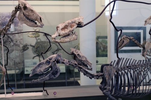
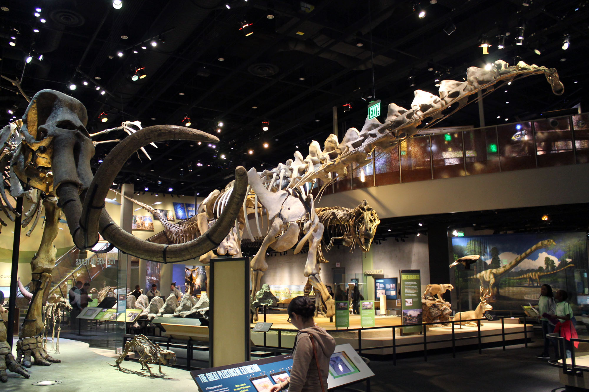
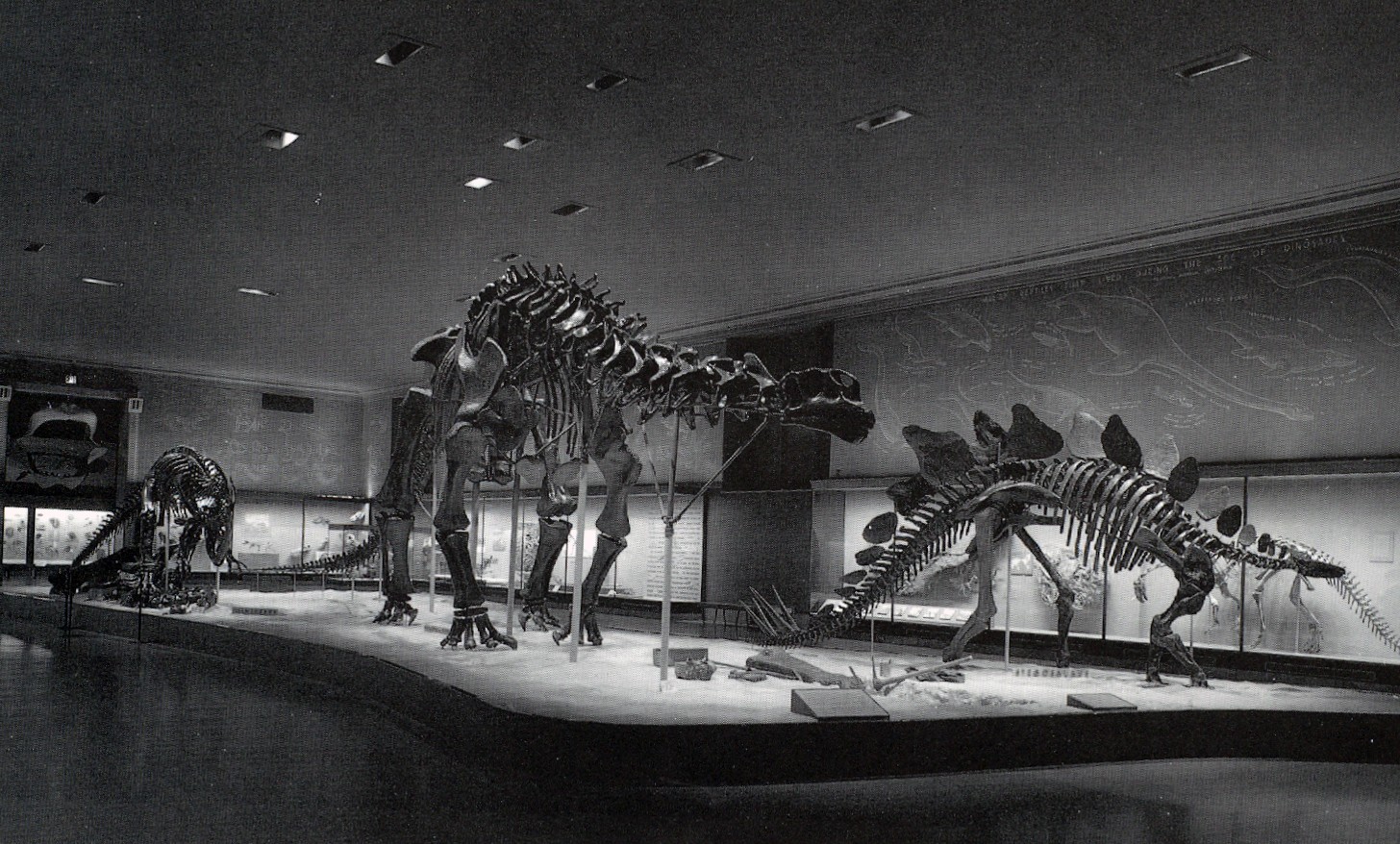
The fossil horses of AMNH. Photo by the author.

After the modern biological synthesis, paleontologists realigned with the rest of biology, and the odd pseudo-evolutionary ideas that persisted in paleontological circles began to fall by the wayside. However, orthogenetic ideas remain common in natural history exhibits on horse evolution to this day (in about 62% of them, according to MacFadden et al. 2012). The reason these exhibits have stuck around isn’t entirely clear. MacFadden and colleagues suggest suggest a lack of inertia or funding for the renovation of exhibits is a factor, but they also point out that even some newer exhibits fall back on linear horse evolution.

The biggest problem is that orthogenetic evolution makes more intuitive sense to non-specialists. We often use the word “evolution” to imply improvement, so it would follow that horses should get bigger and better over time. This is an important misconception to overcome, because, as if we need a reminder, only 15% of Americans believe humans evolved from other animals via strictly natural processes, and an even smaller number can correctly articulate how evolution works. Evolution is the fundamental principle underlying everything we see in the natural world, and it is imperative that a correct understanding of how it works is the basis of any biology education. With the proper background, the real story of horse evolution is a great example of how changing climates effect organisms and ecosystems over time. This is helpful for interpreting the ever-important subject of climate change, but it won’t click until the linear horse evolution story is trampled out for good.

References

Jaffe, M. 2000. The Gilded Dinosaur: The Fossil War Between E.D. Cope and O.C. Marsh and the Rise of American Science. New York, NY: Three Rivers Press.

MacFadden, B.J., Oviedo, L.H., Seymour, G.M. and Ellis, S. 2012. “Fossil Horses, Orthogenesis and Communicating Evolution in Museums.” Evolution, Education and Outreach 5:29-37.

Sepkoski, D. 2012. Rereading the Fossil Record: The Growth of Paleobiology as an Evolutionary Discipline. Chicago, IL: University of Chicago Press.

1 Comment

Filed under AMNH, history of science, mammals, museums, science communication, systematics

Communicating Systematics, Part 2

In the previous post, I discussed how phylogenetic trees, while powerful and informative to trained eyes, can be misinterpreted by lay audiences. These misunderstandings are easy to diagnose, but actually finding solutions to the problem is challenging.

In a perfect world, every child would be introduced to evolutionary theory early and often in their obligatory science education, and everybody would be able to interpret phylogenetic trees the way scientists do. This is unlikely to happen anytime soon, especially in the United States, so educators are going to have to get creative. One option is to provide additional information to aid in the interpretation of the diagram. On the surface, adding more information is always an attractive prospect, but unfortunately it does not always work as intended. Attention spans are perilously short, and the goal of a visual representation should be to make the content immediately intuitive and easier to understand.

If conventional shapes and symbols in evolutionary trees are not getting the intended message across to target audiences, then perhaps we need to rethink how we are structuring these trees. I don’t have a catch-all solution, but the following might be enough to at least start a conversation.

Change the shape of the tree

Torrens and Barahona argue that many misinterpretations of trees stem from ideas of essentialism and teleology that are deeply ingrained in and continually reinforced by western culture. Likewise, equating up with good and down with bad is a recurring, internalized motif. Therefore, trees that illustrate evolution and diversification proceeding upward or to the right only encourage presuppositions of linear, goal-oriented evolution.

One solution that has been experimented with (at AMNH, for example) is to draw trees as circles (see below). This eliminates the problem of associating up with good and bad with down, or upward movement with progress. A circular “tree” has no orientation, and thus does not imply any taxa to be better than the rest. Personally, I find circle diagrams confusing to read, but I appreciate what they are intended to accomplish. A diagram of evolutionary relationships could theoretically take any shape, since the crucial information is in the branching order, not the nature of the lines.

A circular tree. From eplanetscience.com.

Be careful with representation of ancestors

 Many phylogenetic diagrams place specific fossil taxa at nodes along the tree in order to illustrate the course of evolution. This is informative of general evolutionary trends, but it can also be confusing. As a case in point, I just did an image search for a horse evolution diagram to use as an example, and found that many of the top results came from creationist websites. These sites aren’t worth linking to (although they are easy enough to find), but they erroneously assume that fossil taxa are thought to be directly ancestral to modern Equus caballus.  Evolutionary scientists think no such thing, but looking at the image below I can see how that conclusion could be reached.

This diagram of the evolutionary history of horses can lead to the mistaken assumption that earlier species are thought to be directly ancestral to later ones. That polytomy that leads to three unlabeled nodes doesn’t help either.

In a proper cladogram, taxa are only placed at the ends of branches. Direct ancestry is (almost) never inferred, because the scarcity of the fossil record prevents us from ever knowing exactly what evolved into what when. The cladogram below shows the relationships between the seven modern-day species of Equus. Systematists have determined a series of branching relationships based on anatomical and molecular data, and even provide a suggestion of when these divergences occurred, via the time scale. Each node represents a common ancestor that definitely existed, but we will probably never find or identify their fossils.

A cladogram of modern horse species. From Hooper Virtual Natural History Museum.

In this case, I would prefer if books or exhibits for popular audiences nixed images like the first one and instead went with cladograms that do not suggest specific ancestor-descendant relationships. Obviously the cladogram could be spiced up with colors and illustrations, but it is important to use a format that represents precisely what scientists do and do not know.

Always clarify orientation

Proboscidea phylogeny from academic.reed.edu.

Individuals well-versed in evolutionary science automatically read trees from the basal node out to the tips. Typically, and in the elephant phylogeny above, that would be from the bottom up. It can therefore come as a surprise (it certainly did for me) that non-specialists frequently attempt to read phylogenetic trees from left to right. Viewers may assume that the horizontal order of taxa across the top is significant, representing either the course of evolution or time. Neither would be correct, as Mammut on the far left and Mammuthus on the far right were roughly contemporaneous, and Loxodonta africana and Elephas maximus in the middle are the only extant elephants. Although it may not occur to specialists, it is a simple and necessary precaution to label the orientation of the tree and avoid such confusion.

Avoid calling anything “more evolved”

This is more of a nomenclature issue than a visual one, but poor graphics can exacerbate this misconception. All contemporary species, from sponges to frogs to humans, have been evolving for the same amount of time. An amphibian or reptile is not “primitive”; it is just as adapted to its environment as we are. Using this sort of terminology is attractive as a shortcut when referring to less-diverse sister groups to more-diverse clades, but it misrepresents the nature of evolution and should be discouraged.

References

MacDonald, Teresa E. “Communicating Phylogeny: Evolutionary Tree Diagrams in Museums.” 2010. Paper presented at the NARST (National Association for Research in Science Teaching).

Torrens, Erica and Barahona, Ana. “Why are Some Evolutionary Trees in Natural History Museums Prone to Being Misinterpreted?” 2012 Evolution: Education and Outreach 1-25.

Leave a comment

Filed under mammals, museums, reptiles, science communication, systematics